

Stratton
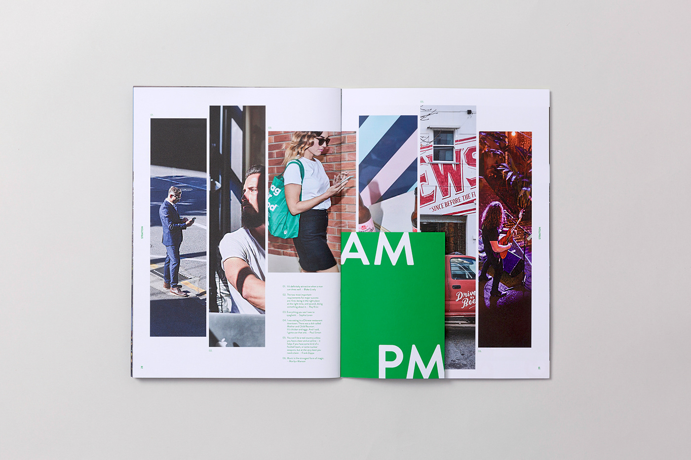
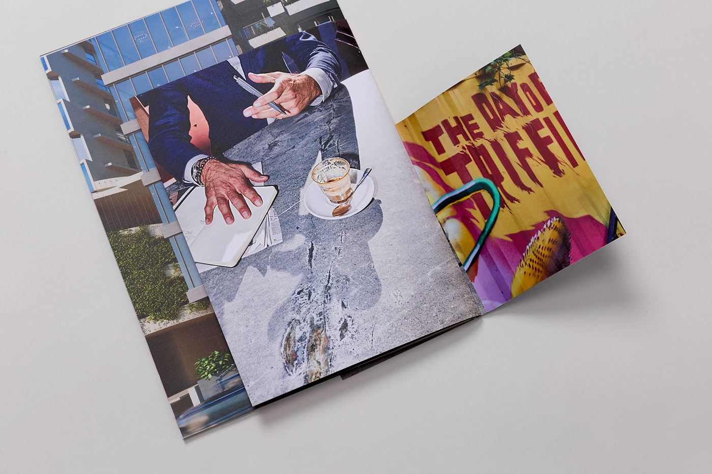
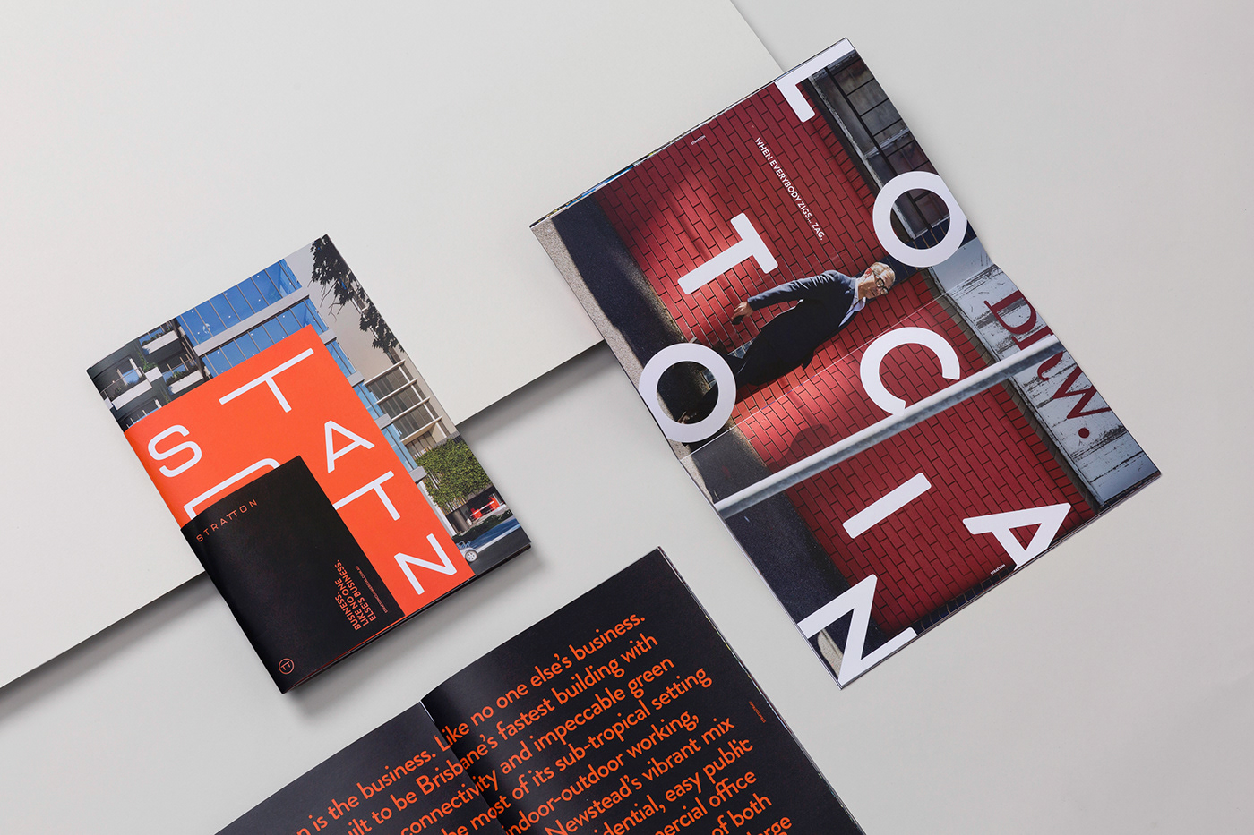
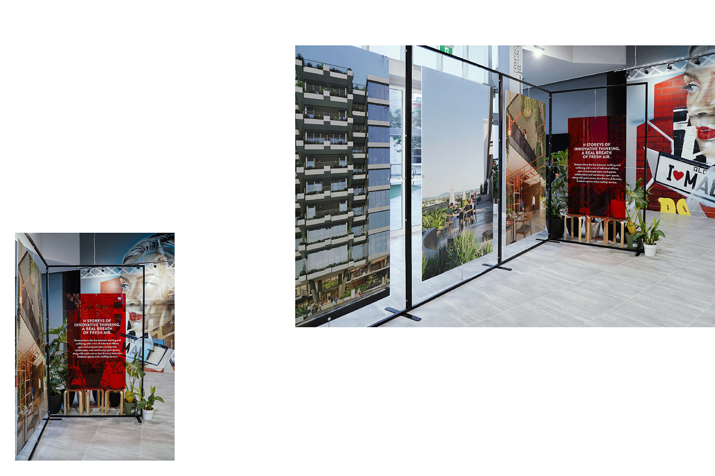
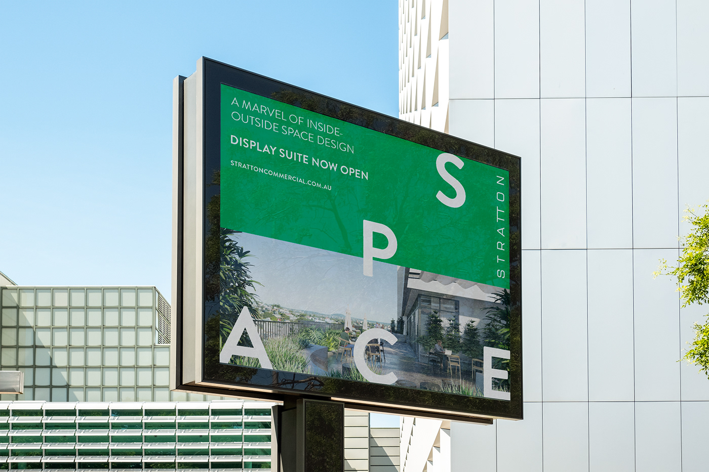
Commercial building brands are traditionally… conservative, crisp, understated, and… a little expected, blue, Berthold Akzidenz Grotesk-ish. They often say more about the owners than they do about their prospective tenants. Stratton wanted to shake that up, to be the antithesis of the old corporate world – to be the workplace for the movers and shakers, the start-ups growing fast, the boutique businesses who wanted to work differently and were looking for premises that mirrored their ambition. We came up with ‘the new rules of business’: When everybody zigs… zag; Build something you believe in; Collaboration is the new economy; Make it radically different & better; Employee wellbeing is business wellbeing and Get in first and prepare to be copied. The irreverence of the headlines needed a brand identity that was maverick but masterful, which set a strong foundation for every piece of collateral that would follow.


Client: Silverstone Developments
Art Direction, Branding, Graphic Design, Website, Videography & Sale suite by Theola
Location Photography by Anthony Geernaert
Collateral Photography by Foliolio
-
Follow us on Instagram @wearetheola


