
“.AM”
"The calm of the sea"
Art Direction
Creative Direction
Packaging Design
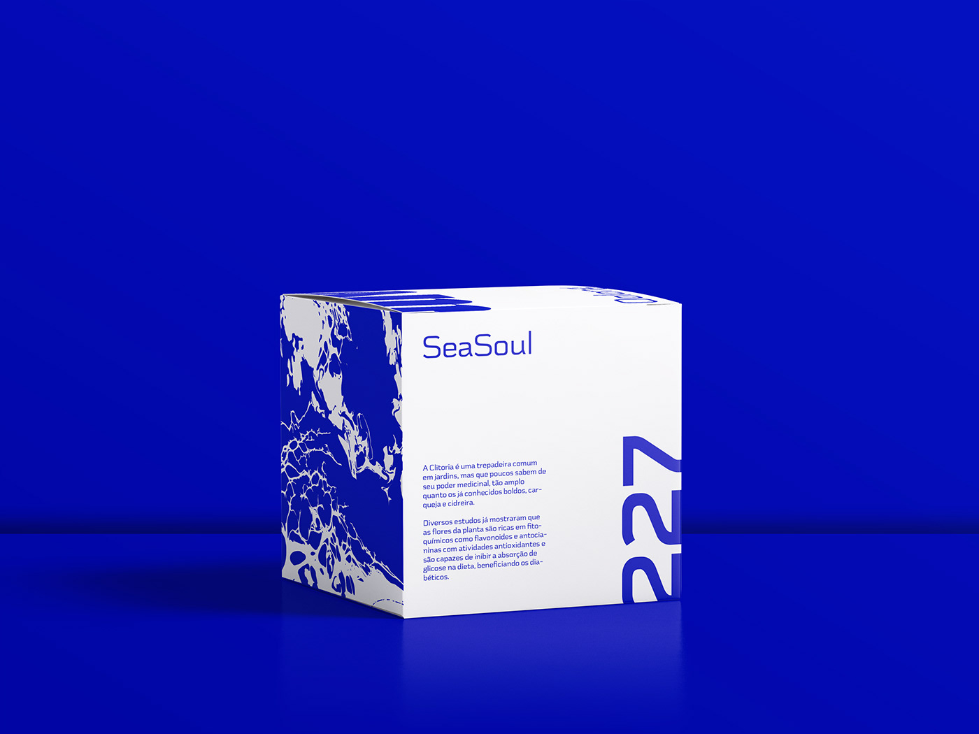
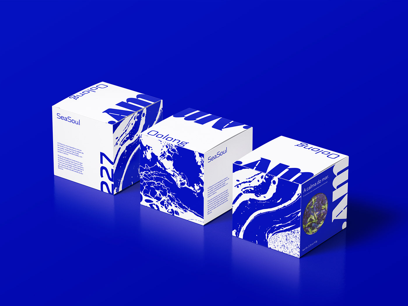
Positioning
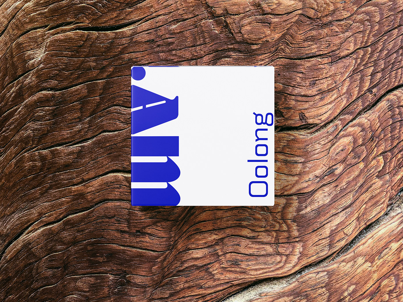
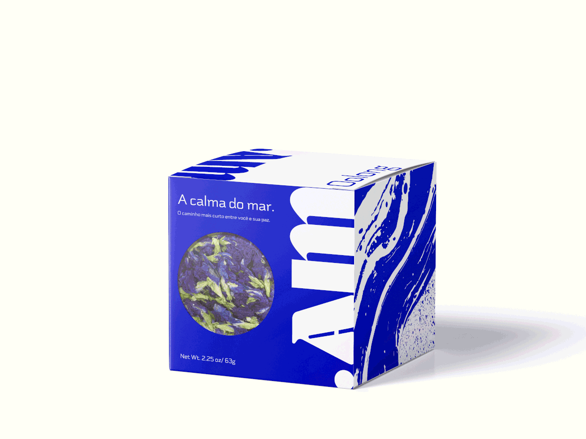
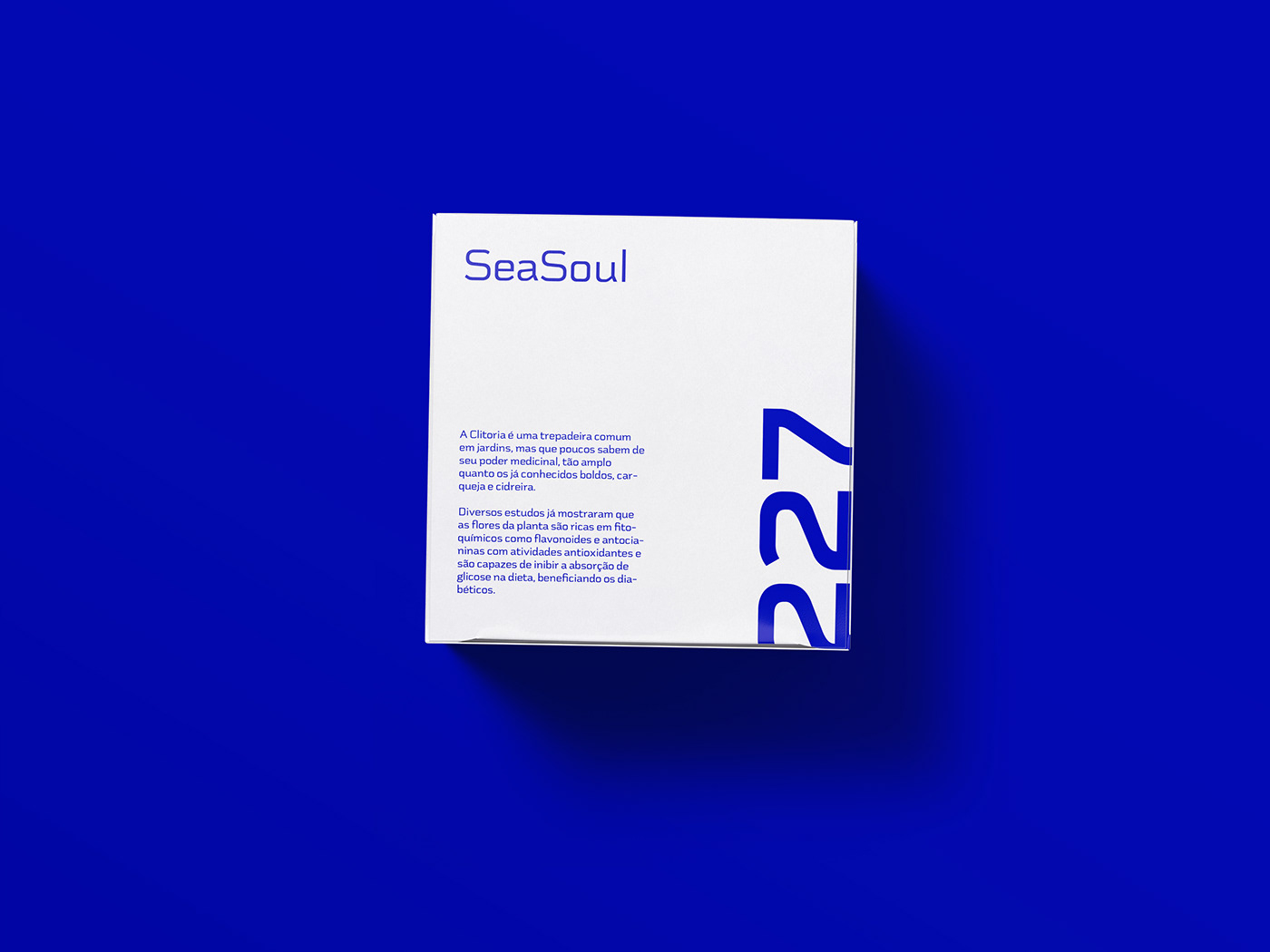
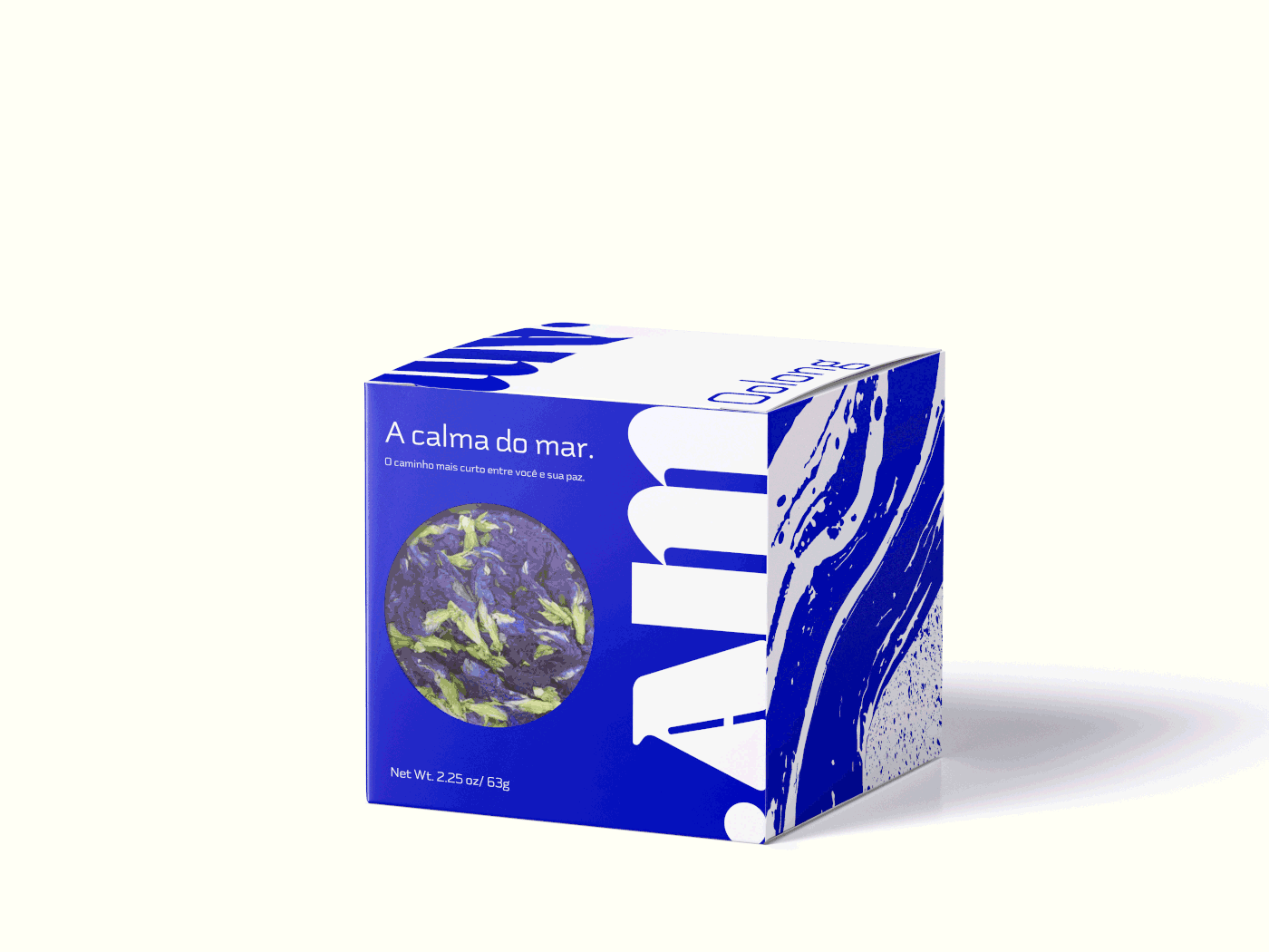
The sea… Ah the sea, always incredible and full of different meanings for all of us. The “.AM” project involved developing a logo along with a packaging to sell a specific type of tea, Oolong tea, blue tea. The brand is an interaction enthusiast and always looks for new ways to instigate the public.
They needed a modern, elegant and expressive logo that would match that specific product, Oolong tea. They are also passionate about the sea, and relate their calm to the calm that tea brings. A passionate challenge full of possibilities. A package that is a product with a unique logo for it.


“.AM” needed a new approach, a translation of this calm and beautiful spirit. Tea is the final product, but the goal is to show the peace it conveys, to translate this peaceful belief to the people who will consume it. So in the case study I found a balance between the illustrative translation of the calm of the sea and its most intense color, blue.
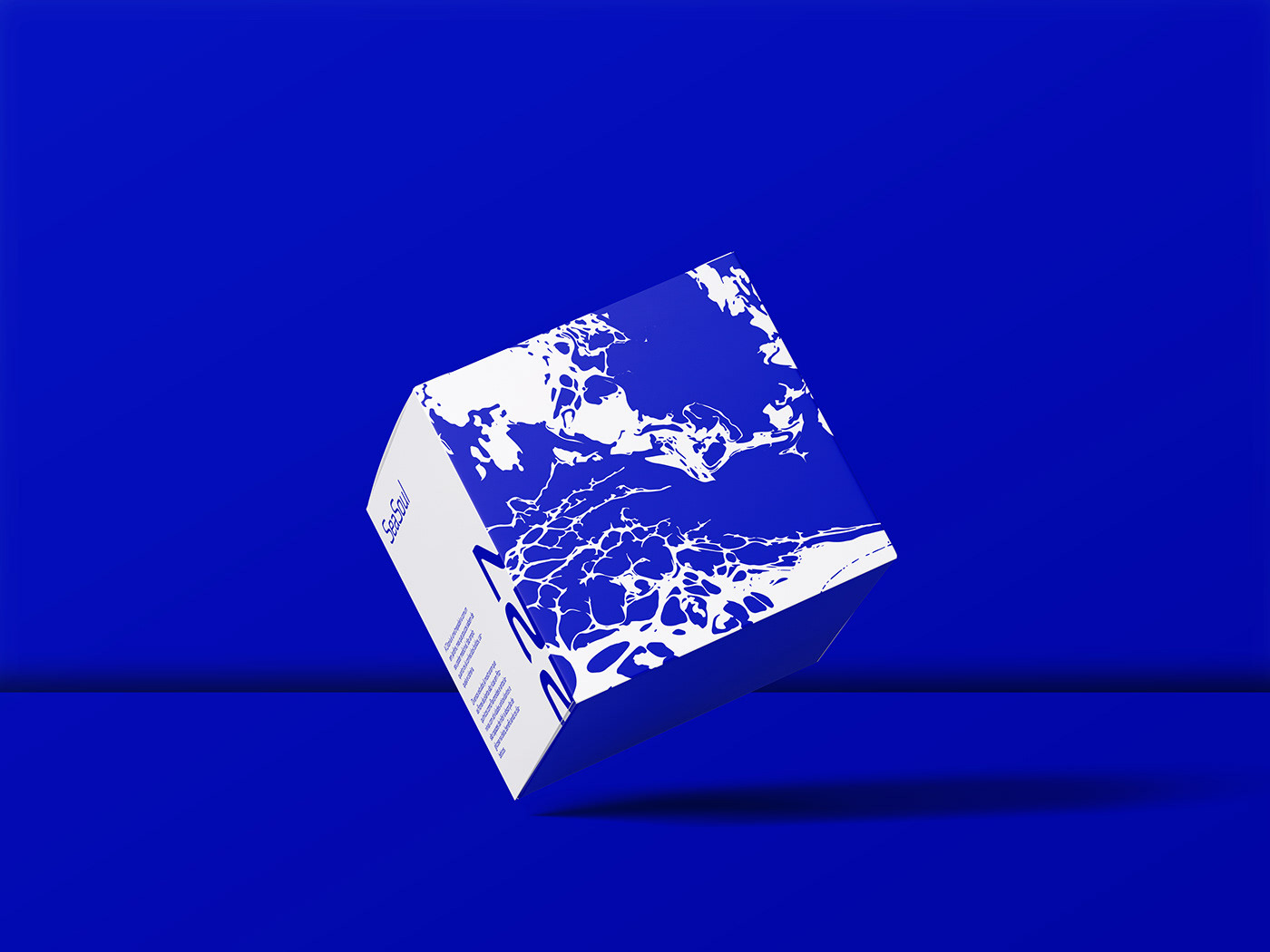
Thinking about this unique solution, I went on a modern path, with emotion and that is not linear for packaging. I defined two main patterns to embrace the side of the packaging, and I used a 1960's lettering feature to compose the logo that was going to print the box. Almost as a joke I developed a unique language for the box that is complete and allows you to read from different angles giving life to this fascinating project!


THANK YOU! ;)


