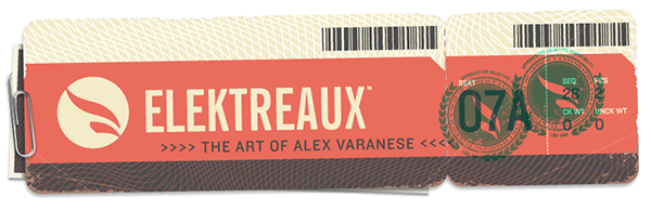
"Elektreaux" (www.elektreaux.com, pronounced "electro") is my new portfolio of traditional illustration, focusing on a more colorful palette, proper characters and settings, and a unique mix of 2D and 3D, architecture and pop culture, style and depth.
In addition to the characters and settings themselves, extensive work has gone into the brands that populate their world, designed to capture the detail and scale of their real-world counterparts and create the deepest possible sense of immersion.

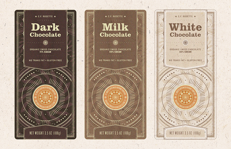
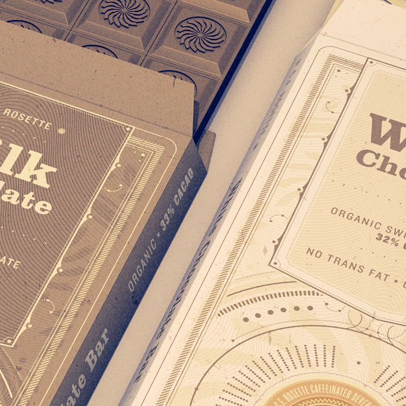
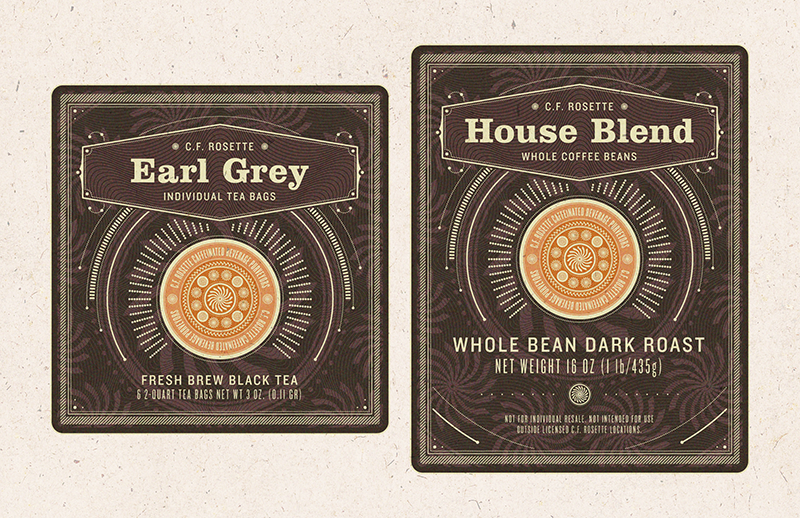
C.F. Rosette is a deliberately "corporate" coffee chain brand in the vein of Starbucks or Peet's, but with an emphasis on lavishly detailed products. The packaging style was strongly influenced by the maps, currency and other printed artifacts of 20th century Europe.