


See? It doesn't have to be racist.
Some of these brands have been around for over a hundred years, and yet, largely remain unchanged from their original racist stereotype logos. With simple changes, the brand brings itself to the modern time we live in, if we are brave enough to shed our old antiquated thoughts about it.
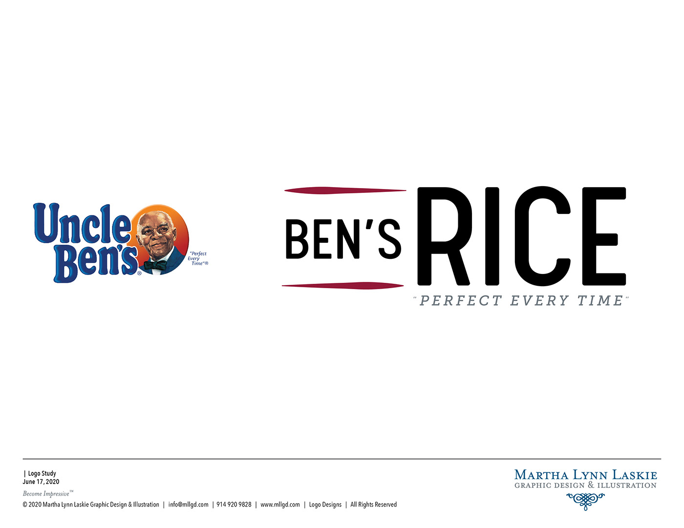

UNCLE BEN’S RICE PRODUCTS
While some think the “Uncle Ben” logo is somewhat iconic, its connotation remains largely from a bygone era and needs to updated. By simply taking out the face and the word “Uncle” the brand increases its look by leaps and bounds. The simple stroke tapering invokes chop sticks and the word “rice” can be easily replaced with a different products for each division.
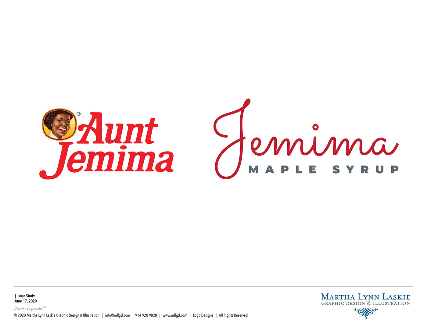
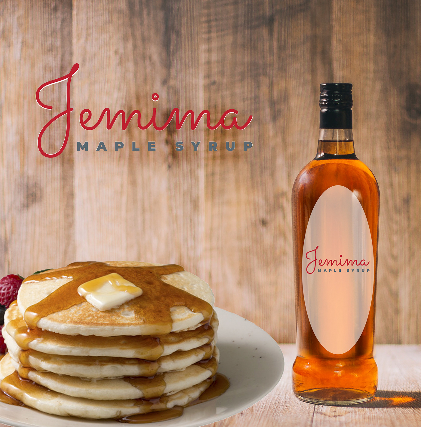
AUNT JEMIMA’S PANCAKE SYRUP
By updating the type and product design, its very easy to bring the Jemima brand up a level and give it a sophisticated look and feel. By utilizing glass products, you can reduce the use of plastic for packaging, there by increasing the use of the bottle and making it easier to recycle.


WASHINGTON REDSKINS FOOTBALL
Under a bit of scrutiny for a while now, the Washington Redskin’s owner has flatly refused to update the logo even though other teams have revised their look. (The Cleveland Indians have reverted back to their old “C” Logo and all the better for it.)
However, with a simple search, its easy to find an idea that references Native American culture while providing a way more dynamic logo and keep the same color pallet of brown and yellow. This Appaloosa horse logo is in reference to Native American wild ponies that once roamed the American plains and were a huge part of Indigenous peoples lives and culture.


