


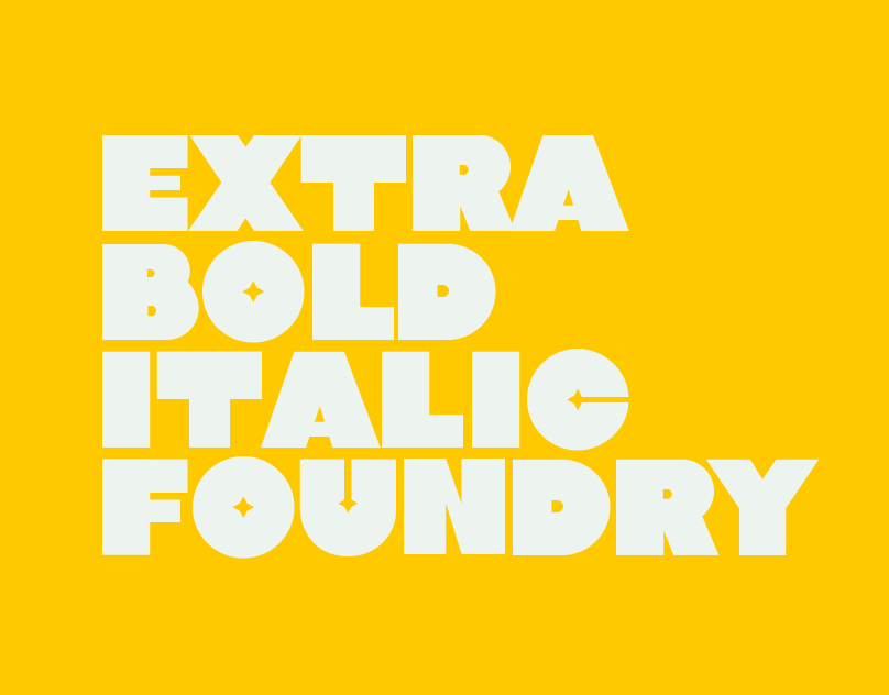
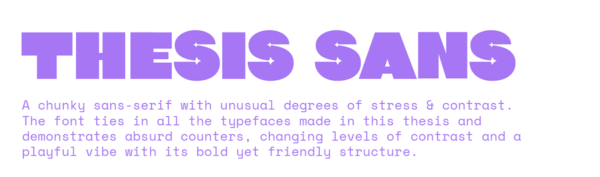
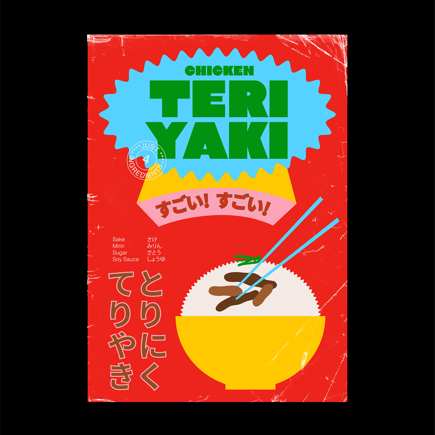
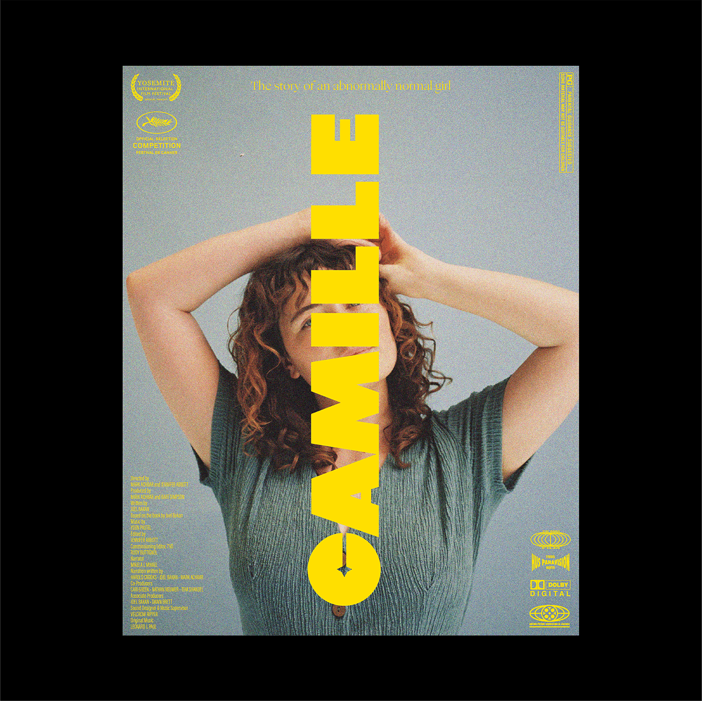
Extra Bold Italic Type Foundry is a graduate thesis project that explores the beauty of the in-betweenness and designing beyond the inelastic nature of traditional Latin typeface design. Through 5 typeface proposals, this thesis aims to break the binary nature of typeface design, and not just look at typefaces as vehicles for languages, but also as expressive graphical elements that are legible and intriguing.
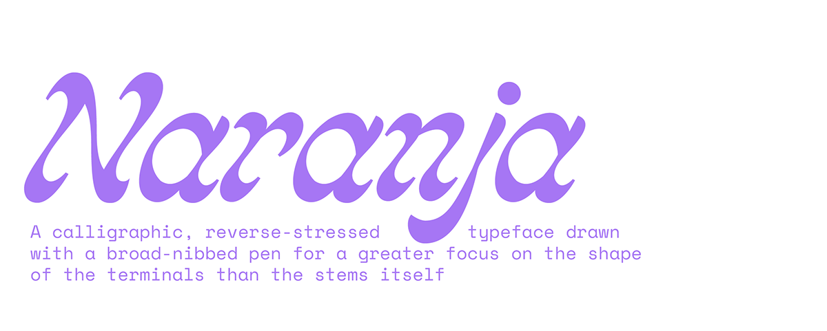
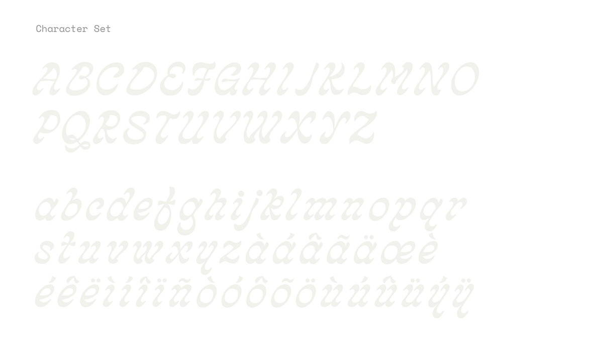
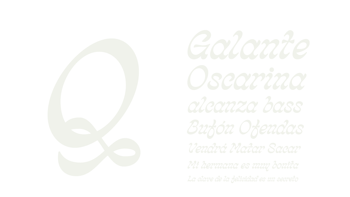
“Naranja” was my first typeface that rooted from altering traditional ways of drawing calligraphic strokes. The typographic nebula I spoke of earlier comprises numerous typefaces that have a strict calligraphic structure based on the angle and direction of the broad-nibbed pen. I started off traditionally but held the pen at a steeper, wider angle, thus producing flirty, flowy terminals and an italic form that lends itself to elegant, yet surprising letterforms.

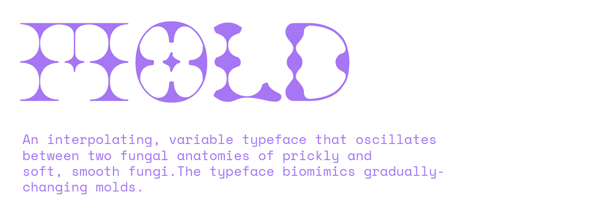
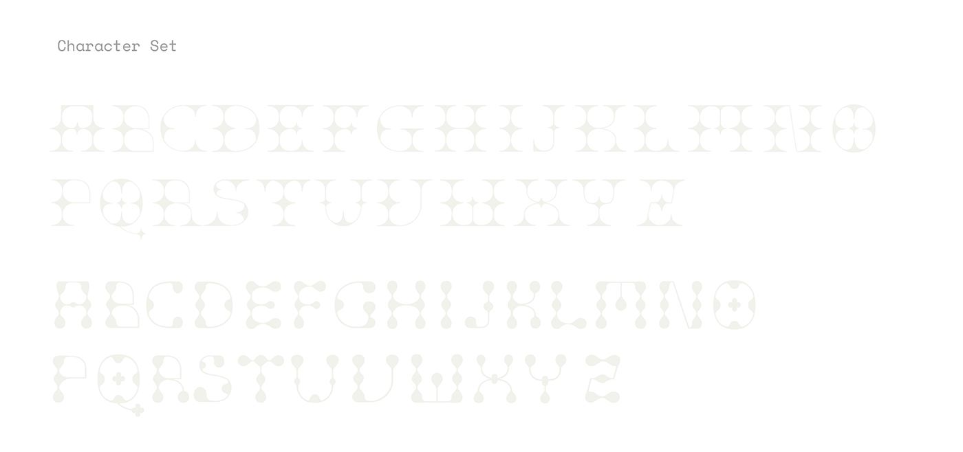
I come from a biotechnology background, and often get asked if my biological studies background influences my work in any way. It did, only once–solely through this next typeface I made. Throughout the five years of biotechnology, I worked extensively with fungi that changed the way they looked over time. Some soft, some rugged and some, slimy. These properties inspired the design of “Mold”, an interpolating typeface that changes from prickly to soft, through several stages of metamorphosis. The best part? The designer gets to decide how they want the typeface to look based on the mood and context of the content, thus introducing another layer of interaction, control and surprise.


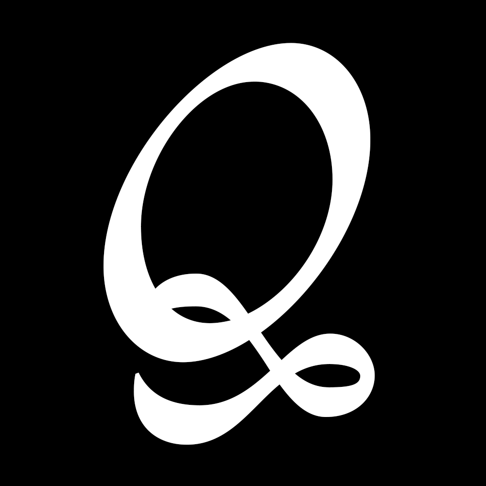
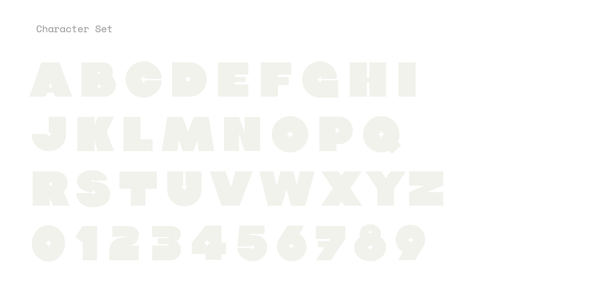
A starter pack for a lot of type designers is jokingly said to be street signs, hand-painted boards on shops and even ancient inscriptions that are not available on a digital platform. I decided to make my fourth typeface, “Pirouette”, a revival typeface based on a sign board I spotted earlier this year, but introduce elements that couldn’t be inlayed in marble due to restrictions associated with the chisel tool used to carve those letterforms. I decided to create two alternating variants of the same letterform, one distinctly different than the other, but still abiding by the same primary anatomy of the letterform. The final outcome was a modern-looking revival typeface with an extremely steep contrast in the letterforms, and a tall cap-height that isn’t comfortably readable, but definitely legible.


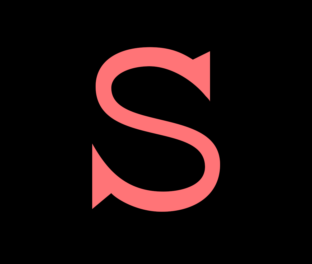
The typeface “Ego” began as an assignment in my Type Design class at MICA. It got its name from an ego clash I had at the time, pertaining to the style I wanted my typeface to have. The conventional idea challenged through this font was legibility relating directly to the stress one sees in the letterforms. For the reader to have a comfortable reading experience, the fonts were traditionally designed with thin horizontals and thick vertical strokes, but my typeface was designed the opposite way–thick horizontals and thin verticals. The contrast was low but it explored the idea of using a reverse-stress typeface for large paragraphs of text, almost making it display-like at large sizes while retaining the legibility at smaller sizes.


Part 2 coming soon! For more, follow me on INSTAGRAM :)


