
The Type-Face project
_
Beauties of forgotten typefaces
The main purpose of Mặt chữ (Type-faces) is to establish a packaging system for coffee and cacao gifts, belonging to Von Viet Project and Bratus. Inspired from the daily coffee and cacao habits in the past, we look back and re-consider the colonial cultural highlights and Indochine design factors in Vietnam’s twentieth century. At the end of the research, I decided to revive the elegance of Vietnamese typefaces in the past – the forgotten cultural heritage.


Approaches
“Honoring the interesting characteristics and essences of the antique typefaces”
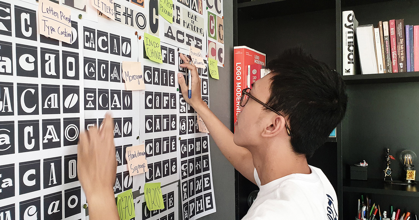
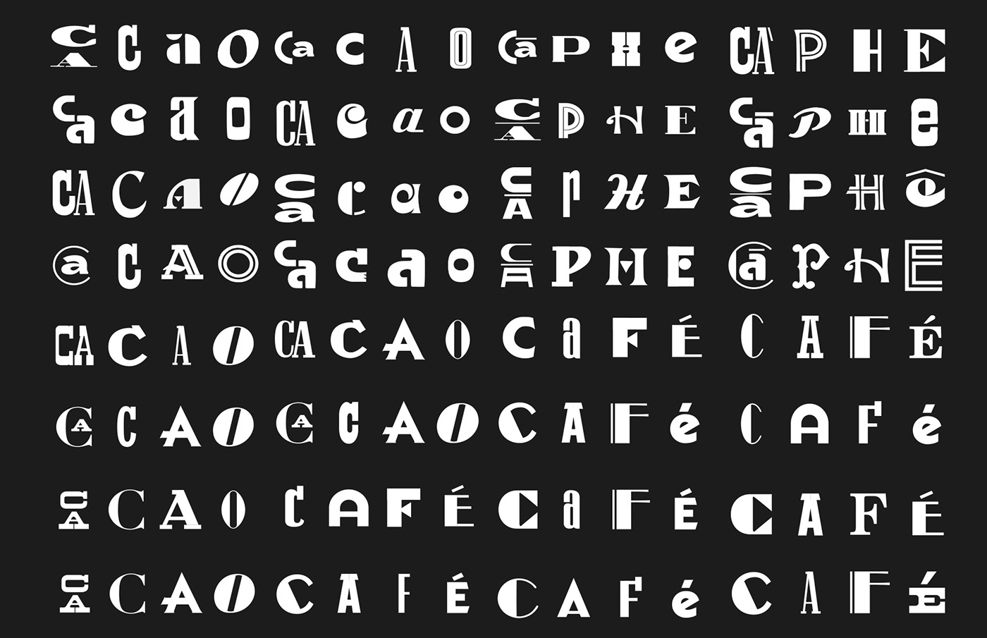
Our design process is the journey back to the past to collect and resurrect the most popular and outstanding typefaces lasting in Saigon before 1975. We were so eager to discover individual letters from the internet, documents, books, magazines, old store banners, and archived resources. This primary research prepares a diverse collection of typefaces, ready for our experiments and exploration.
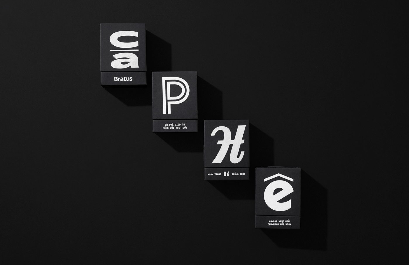
The Contents
To match the content with a visual concept, we studied how old Saigoneses feature their product on newspaper ads, then drafted up our advertising for the coffee and cacao packagings. The package content required the precise and funny compilation, that’s why we imitated the wordplay and poetic writing, as well as previous Vietnamese vocabulary. As a result, the content delivers a verbal announcement of the products with familiar, rustic, and exciting messages.
Concept Design
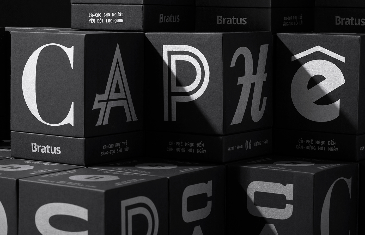
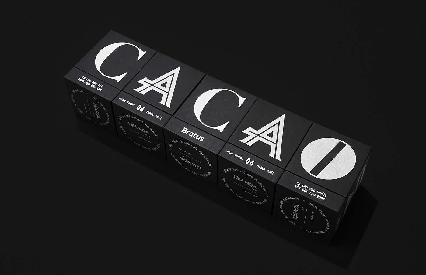
“This packaging is a gallery of typefaces”
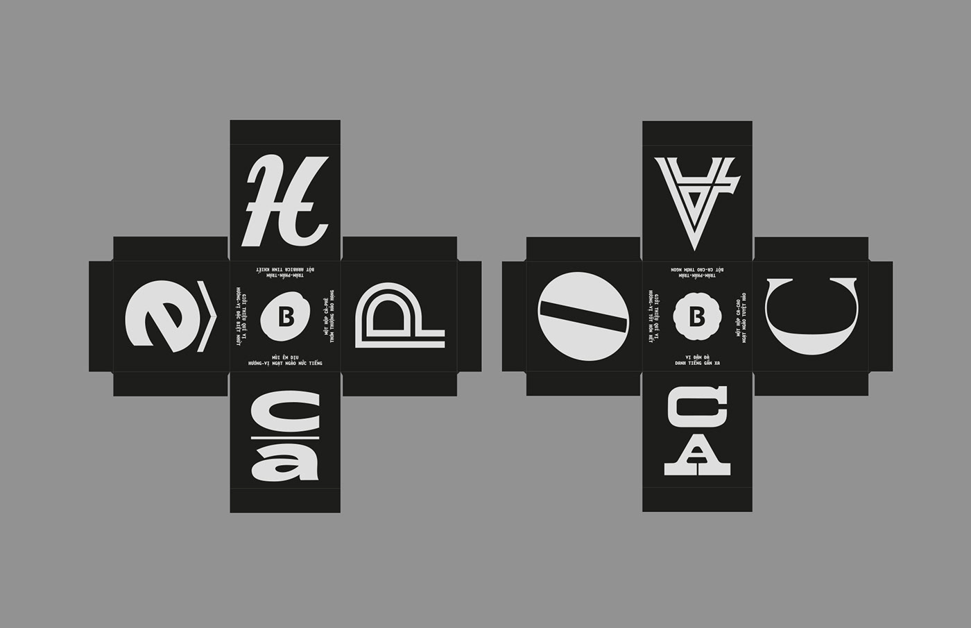
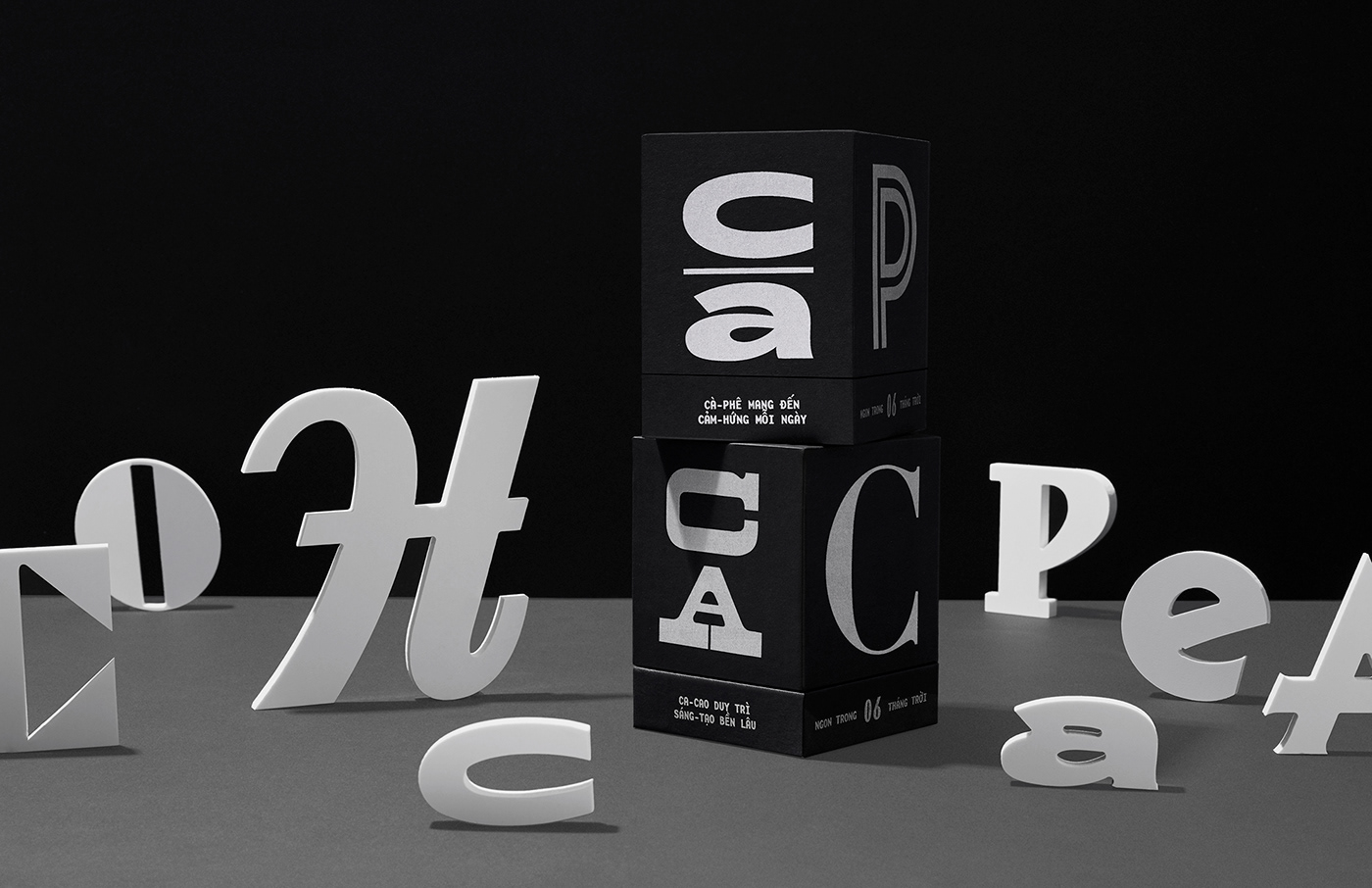
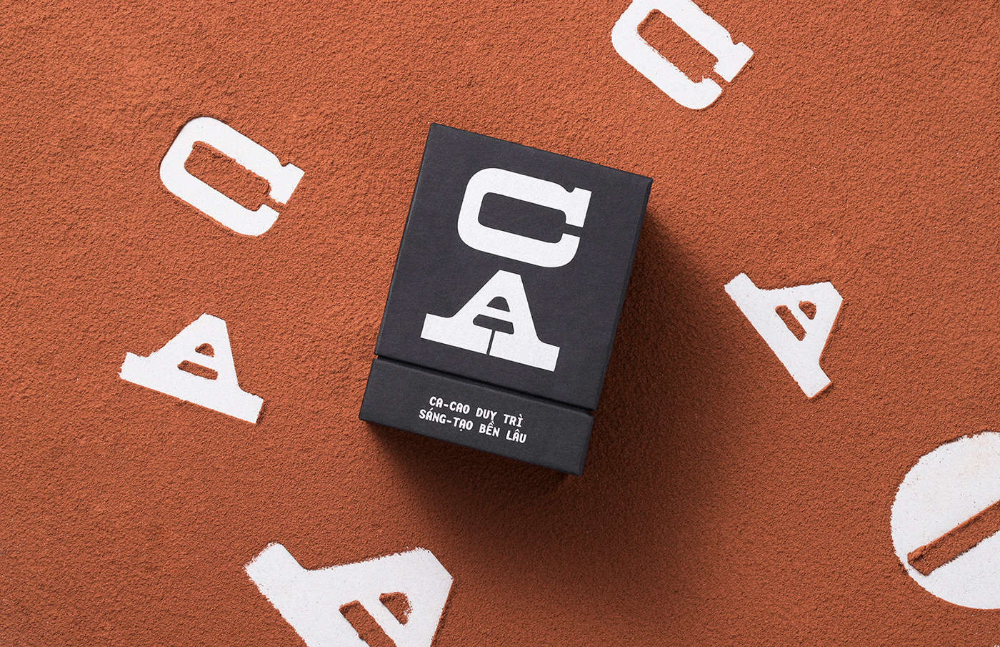
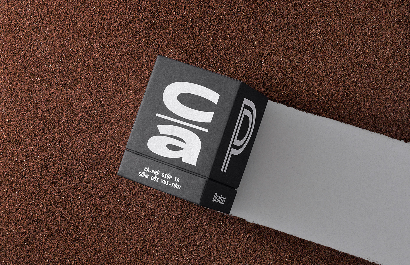
Since we had collected a big precious typeface collection and neither of them was enough to represent the whole era, we determined to recruit all typefaces by selecting random letters from each type and setting them on different faces of the box. That is also the explanation for the project names Mặt – Chữ (Type-faces). The final output becomes a multidimensional artwork spreading out the packaging surface and tells its own historic stories.
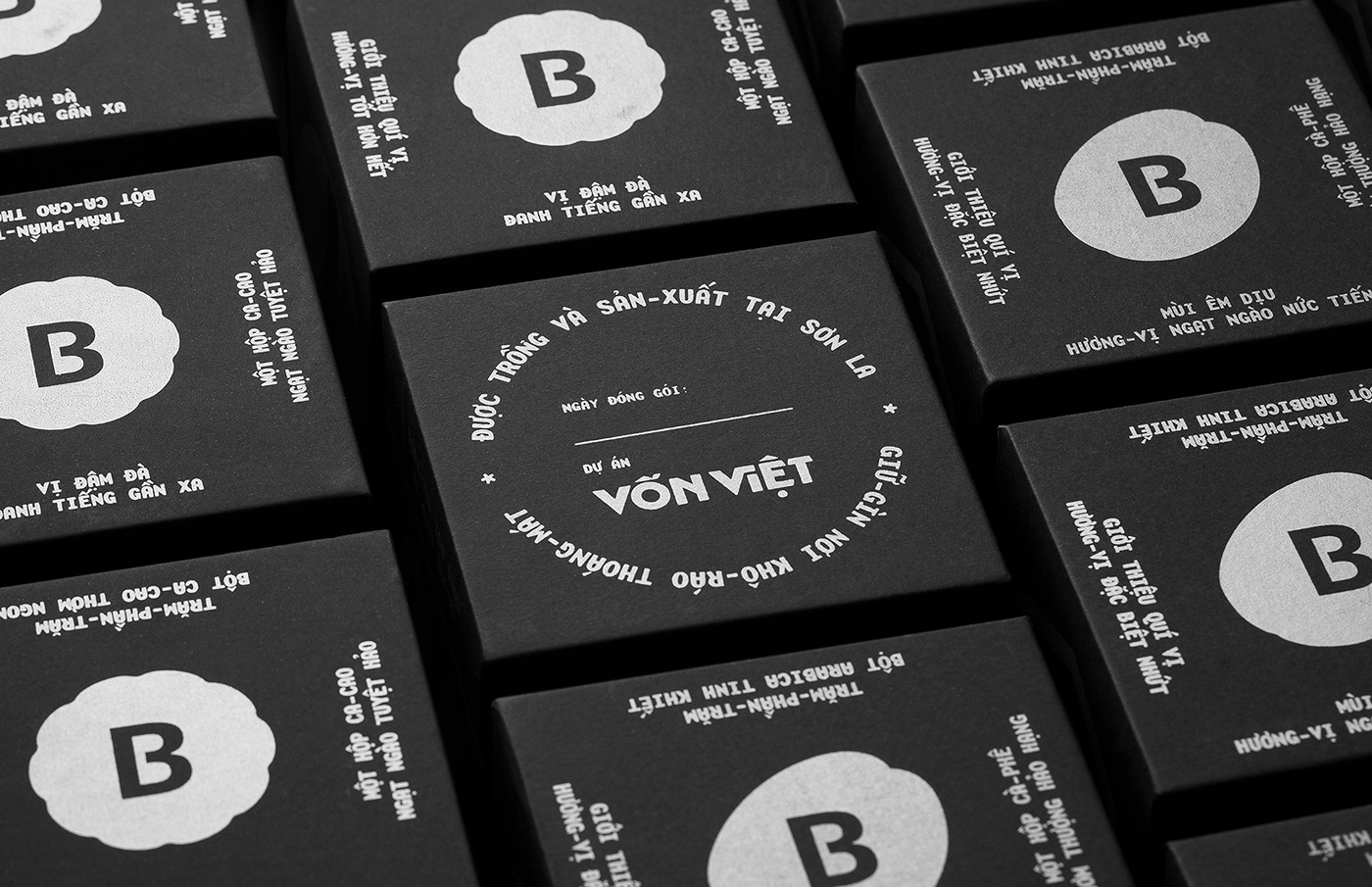
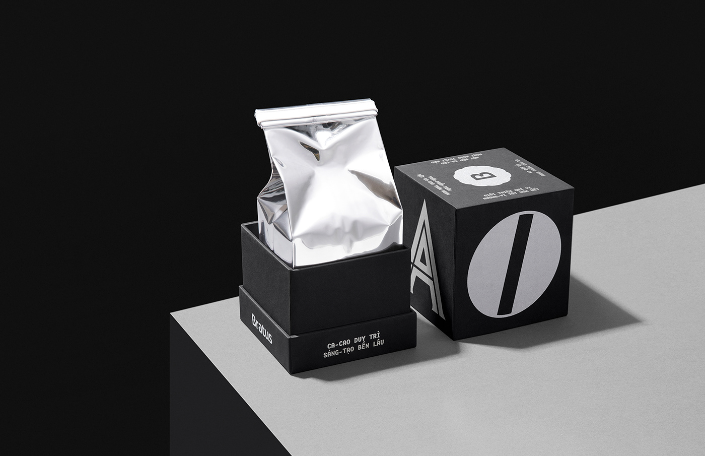
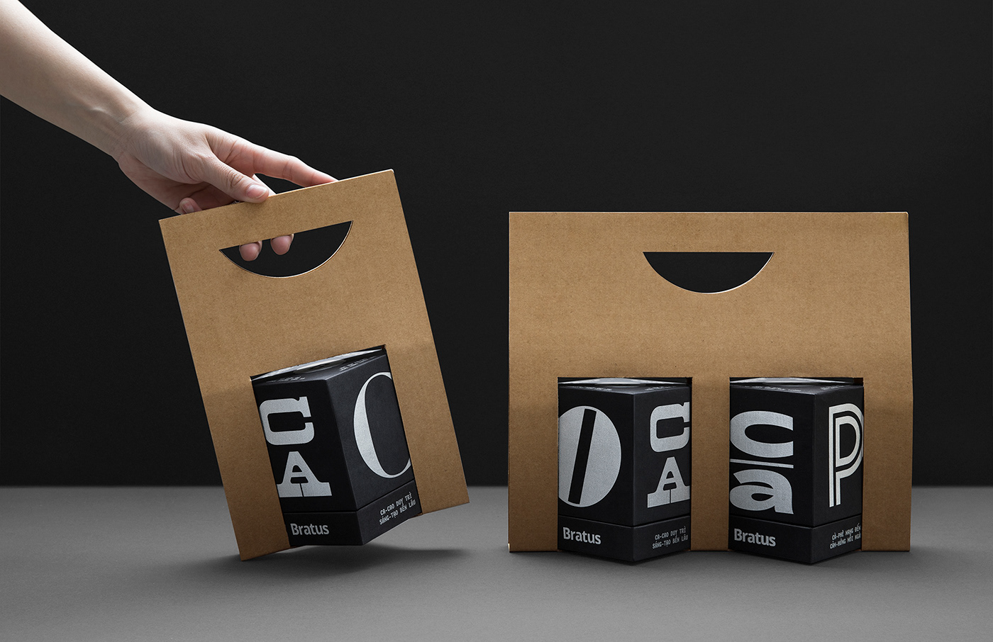
We also invest the silver-foiled silkscreen printing on the quality paper to enhance the result’s experience. To promote convenience and environmental-friendliness, we design an unglued take-away holder with cardboard material. The content of the packaging reflects the verbal language of advertising in old Saigon, with familiar, rustic, and exciting messages.
Mặt-chữ (Type-faces) project not only appreciates the eternal aesthetics and diversity of the previous decades’ typefaces, as well as reminds the constant development of Vietnam’s graphic design and the cultural potential for modern packaging.

Design Agency: Bratus Agency
Art Director: Jimmi Tuan
Graphic Designer: Si Tran, Nguyen X- Hoang, Alex Dang
Art Director: Jimmi Tuan
Graphic Designer: Si Tran, Nguyen X- Hoang, Alex Dang
Photography: 084 creative
________
Thanks for watching & your appreciation!


