
About project:
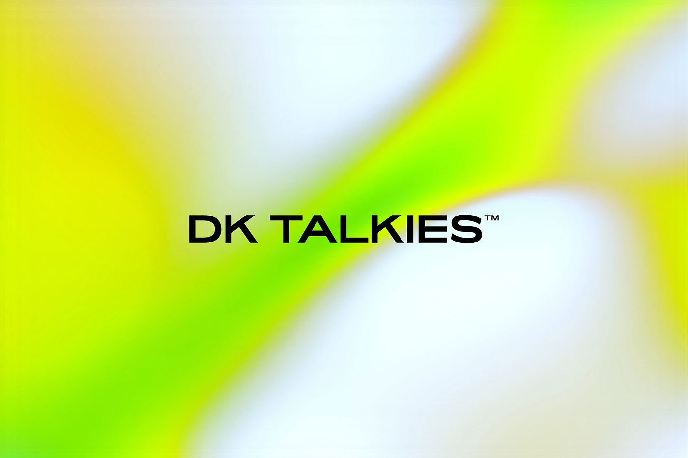
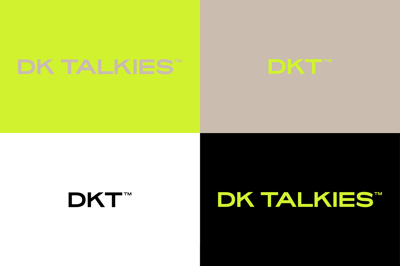
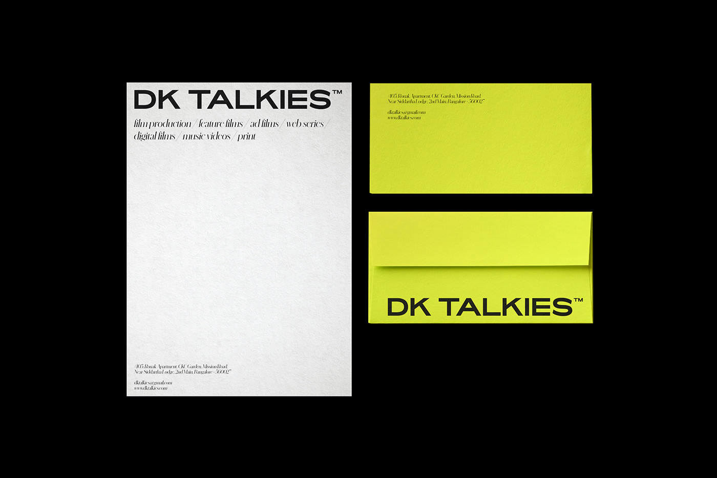
DK TALKIES™ is a film production house based in Bangalore, India. We helped them to create a new, unique identity. It needed to be practical, minimalist but also bold and stand out. The brief was very inspiring, and we were told not to play it too safe. Their identity required stretch, to work across their multiple offerings. The expanded logotype accommodates the categories:
film production / feature films / ad films / print / web series / digital films / music videos.
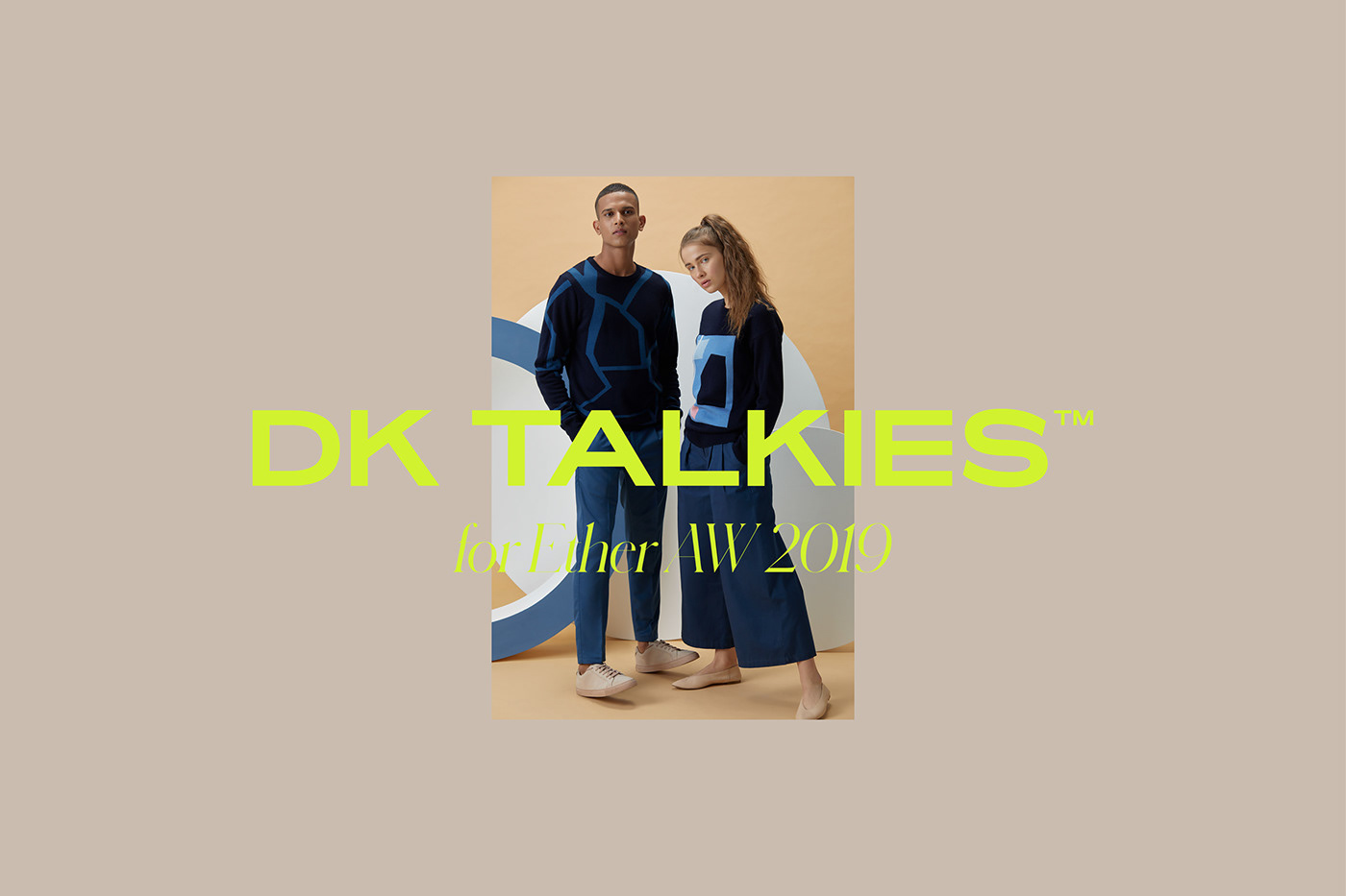
As their creative content is so strong, we wanted to make sure the DK TALKIES™ content was the hero. The other elements are used to tie everything together in a simplistic way, capture their brand personality and highlight the beautiful work.
The DK TALKIES™ identity appears across printed materials, such as stationery and business cards. As well as online formats such as social media, and eventually a new website.
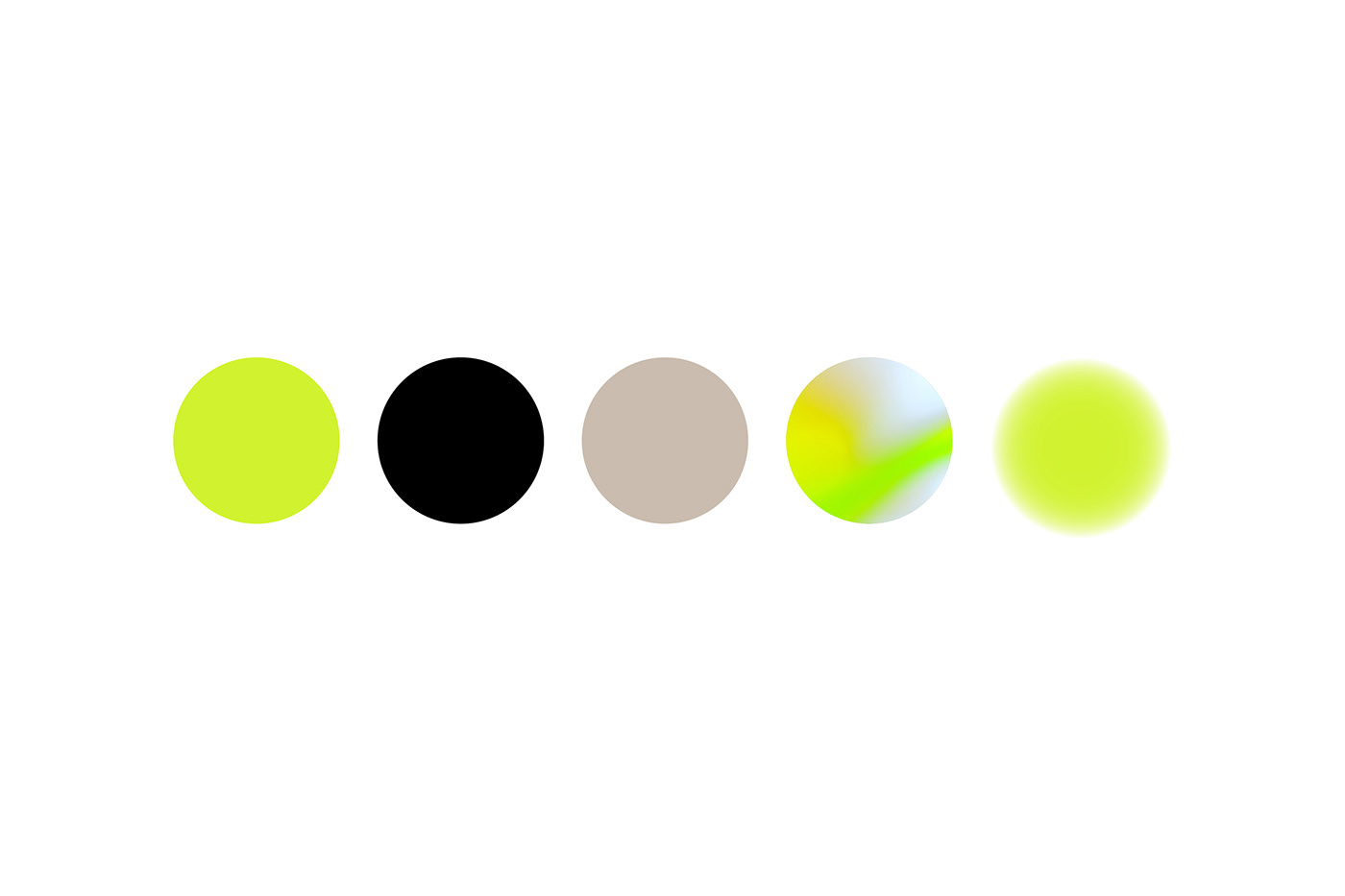
We chose three main colours: neon yellow, basic black, beige. But we wanted to add something extra so the colour palette is expanded with gradients. Brilliant neon colours are offset by more muted, softer colours. These work together and are flexible. The gradient tones are great for online mediums and give a feeling of liquidity, movement, motion.


DKTALKIES™ Trailer:
Website: