
Established in 1979, Bloomington Playwrights Project (BPP) is a professional theatre in Bloomington, IN, focused solely on new plays. Over the last 40-plus years, the theatre has developed and produced more than 500 new plays and musicals that have debuted at BPP — some of them have gone on to successful off-Broadway runs — working with hundreds of playwrights including such well-known writers/performers as Dan Castellaneta (voice of Homer Simpson), Marc Summers (Double Dare, Food Network), Jesse Eisenberg (Academy Award nominee), Jeff Daniels (Tony and Golden Globe nominee), and Suzanne Collins (Hunger Games), among others. Housed at the Ted Jones Playhouse, an 86-seat performing arts building since 2016, BPP's typical season includes five mainstage shows and three special events to consistently sold-out audiences.
We worked on a pro-bono arrangement to design the new logo for BPP, which launched in the second half of the 2019 – 20 season last Fall. (Website and logo implementation was done in-house.)
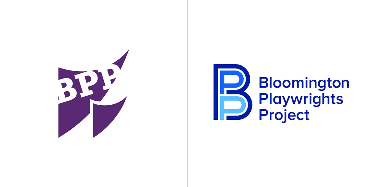
Logo, before and after.
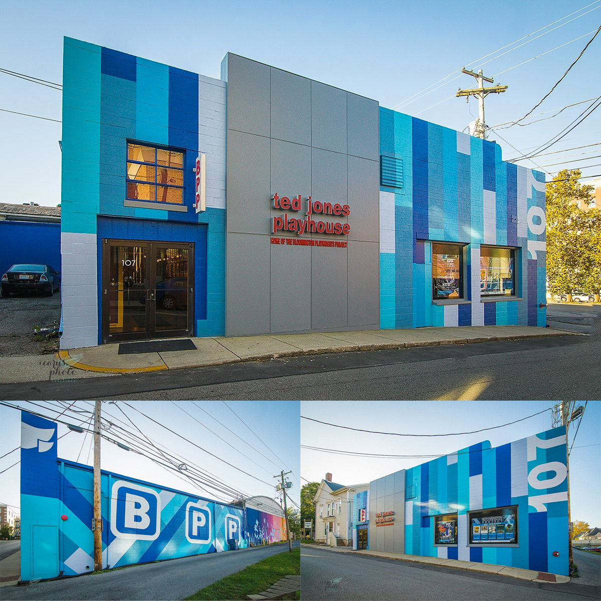
The Ted Jones Playhouse, home of BPP.
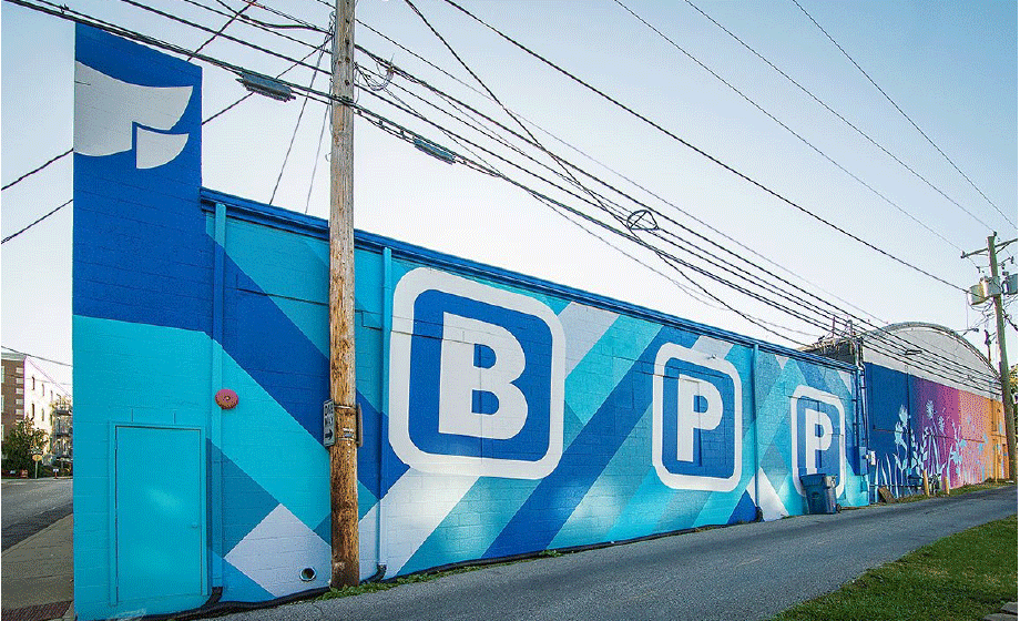
One specific request from BPP was for the logo to reflect the paint job of the building, which is undoubtedly energetic and hard to miss for passersby. The good news about it was that the colors are great — it's hard to argue against shades of blue. The bad news was the "B" "P" "P" blocky letters, which are not exactly great (and had nothing to do with the old logo) but we saw it as a good challenge because we understood that the outside of the building had become much more of a synonym with BPP than its actual logo.
So we stared at the outside of the building for a long time until we saw something…
The bold “B” was hiding two “P”s in not-so-plain sight, allowing us to draw the “B” on the outside and the “P”s inside, which was a somewhat literal, visual interpretation of the theatre's name: the Playwrights Project which is INSIDE Bloomington, so that was satisfying. More abstractly, we saw the resulting monogram as a nice analog to one of BPP’s strengths we identified in the research phase, which is “Identifying new, untold stories within traditional theater genres” — we felt that identifying those two “P” was a new story told through the “B”.

Monogram color variations.

Full logo.
We paired the monogram with Proxima Nova, a sans serif whose capital letters matched the proportions of the letters in the monogram but that also had some personality in its lowercase characters. For years, the previous BPP logo existed without a wordmark so we wanted to re-establish what the acronym stood for as clearly as possible. Stacking the extra long name in three lines neatly emphasized the initials.

Full logo color variations.
Pattern animation.
While we didn’t do any of the applications we did help them transition the posters they had already designed with the previous template into an interim solution that would accommodate the commissioned artwork. Moving forward we would ideally rethink the poster approach to better integrate the logo. In the “before” posters you can see how they integrated the old logo into applications, always on the bottom-right corner because it was supposed to be the flipping pages of a script, which very few people got and, because of the placement, the logo usually passed unperceived.
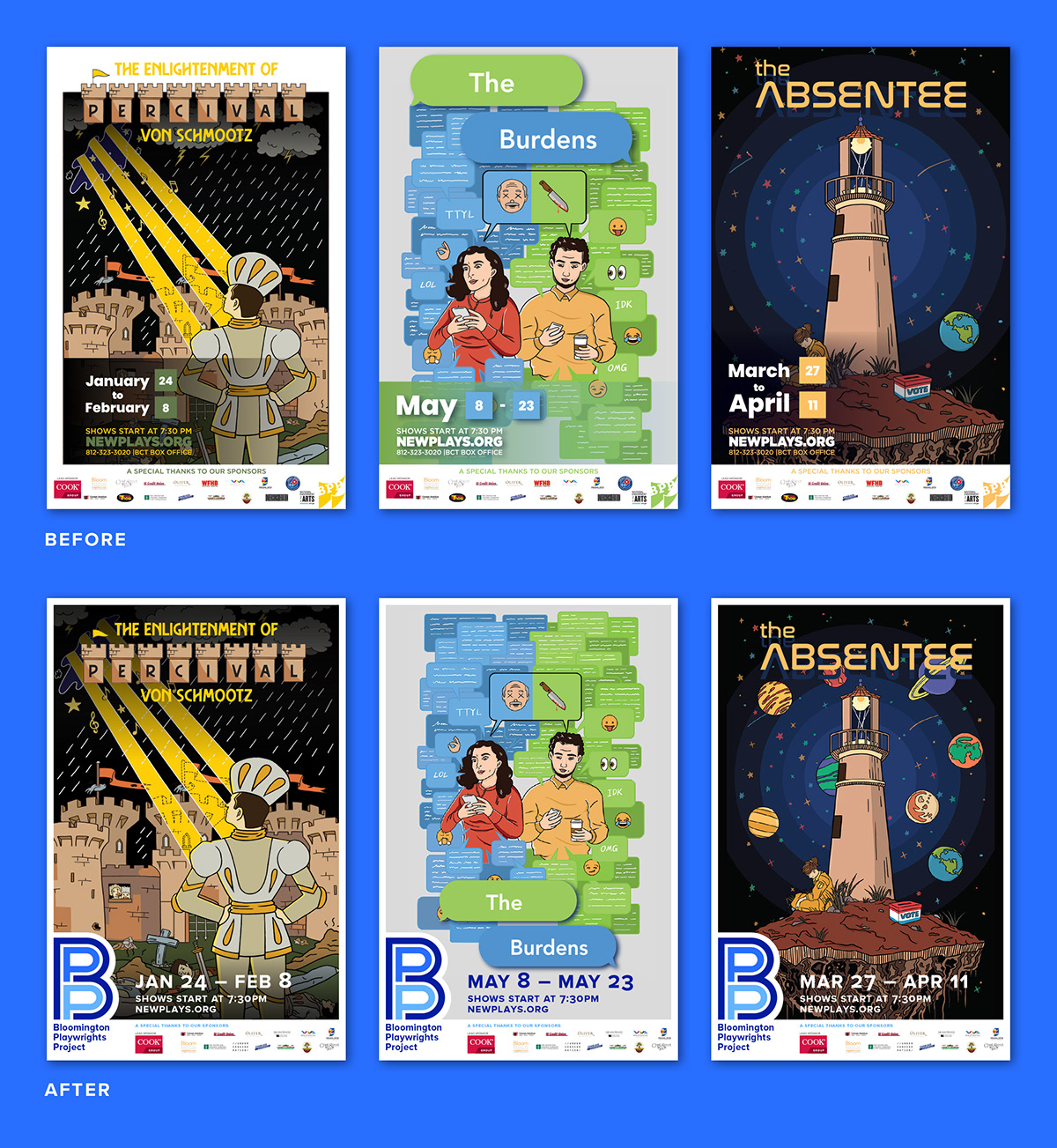
Interim posters to accommodate the existing commissioned artwork for the second half of the season.
And while we didn't do any of the implementation, we were quite pleased with this welcoming floor mat outside their theatre.


