


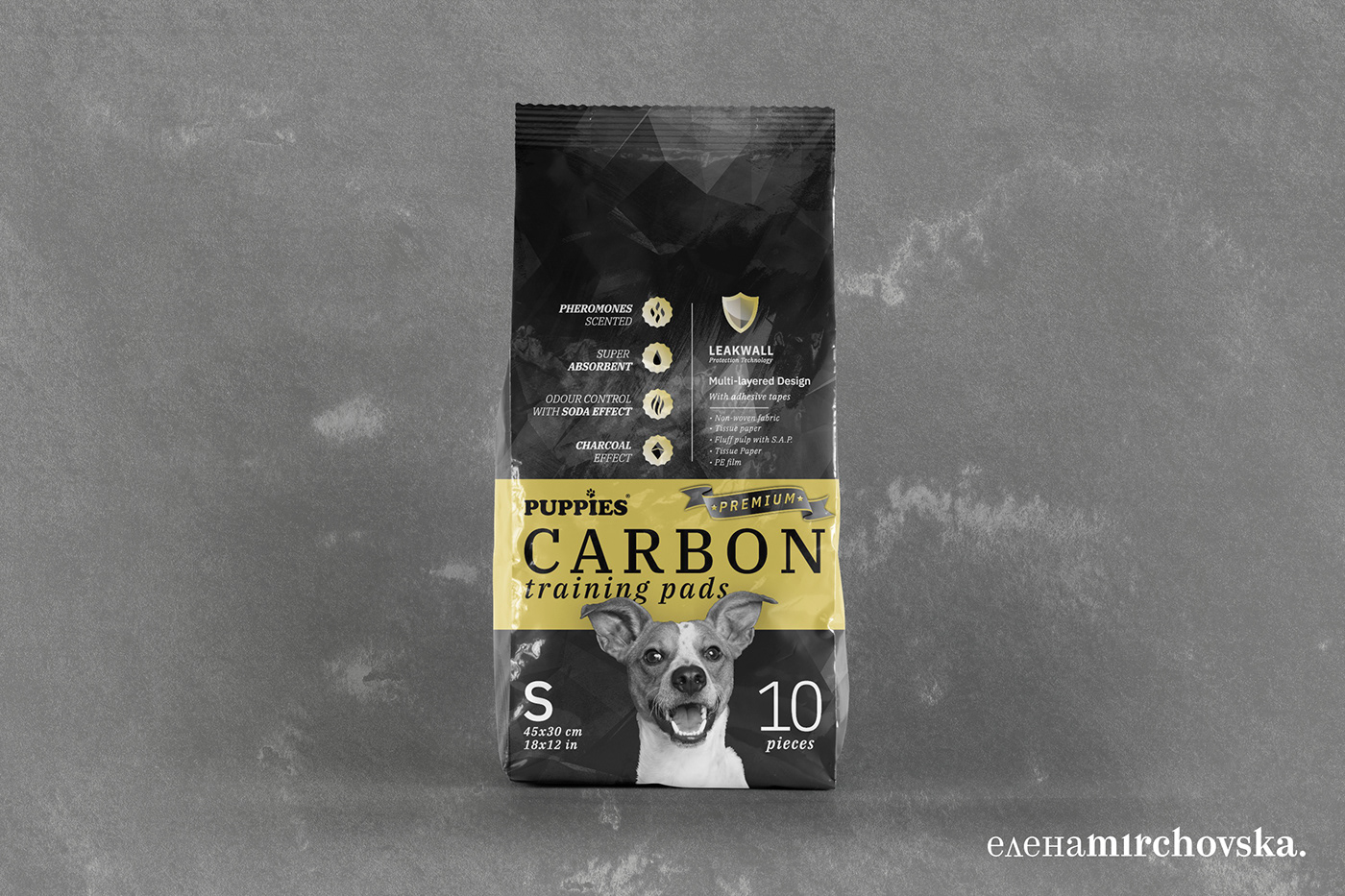
Puppies Carbon Training Pads New Packaging Design
Client is Puppies - a brand well-known in the Balkan region for their high quality products with affordable prices. This is their new training pads product which combines the power of charcoal and the rest of the pads' well-known properties. Pads are pheromones scented, have the usual sticky bottom sides, a number of layers to guarantee it won't spill, and have an additionally added active carbon, which makes them one of a kind in many markets in the region, for the time being.
Pet product packaging, active charcoal-inspired
Active carbon or active charcoal has many properties suitable for this type of product, mainly around keeping the odor to the minimum. I decided to go with a very bold, black-and-white approach. In some initial designs I had more white in the packaging, thinking that would unify the packet with the rest of the products by Puppies, however eventually we opted out with a bolder statement.
What was finally chosen was a very bold packaging with golden strip across. The gold is represented by a yellow pantone colour until the printer changed it. A bronze colour was considered too, but we opted out to the best golden shade of all. The black background texture and the overall black and gold look was what best suited the product.
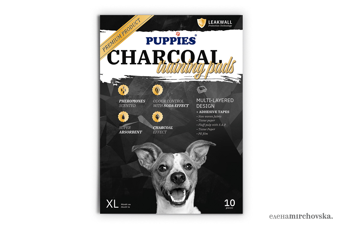
During the process the title had to be changed to a Active Carbon and eventually Carbon. Below is the design presentation for client and the final designs.
Packaging Design for Pet products


The designs’ main inspiration was the sleek combination between black and gold, which is intended to be used in the bags’ printing. Another inspiration was the Charcoal topic, which gave the opportunity for the usage of beautiful black, texturized backgrounds.
Since the original Puppies dog didn’t quite fit the design, an actual dog photo was picked instead, coincidentaly from a breed that resembles the original illustration.
Main colours besides the logo colours would be black and golden (subject to change). The colour palette helps convey a more luxurious appeal of the product.

Inspiration and references were gathered, mainly through pinterest https://www.pinterest.com/mmiu/packaging-inspo/
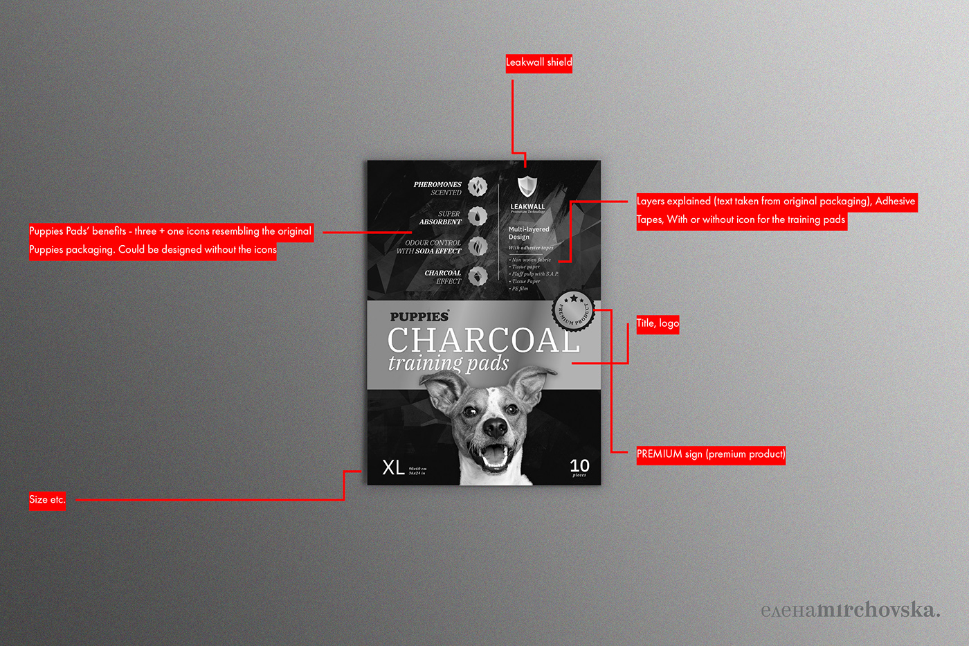
Below are the four design propositions for the project.


A much more whiter design option


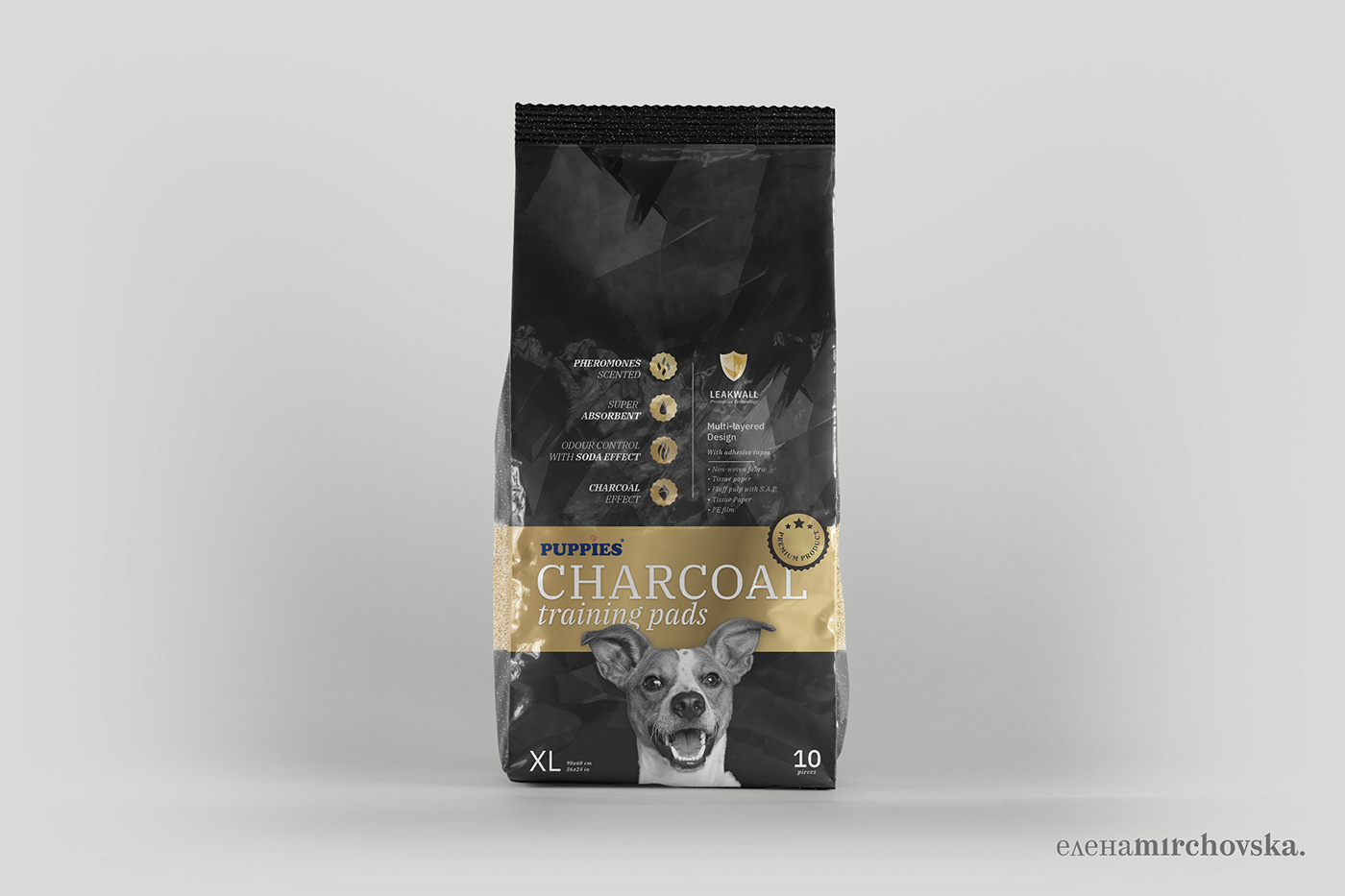
Selected design


The selected design

A bronze colour was considered instead of the gold, the printer offered pantone colours to visualize the two options. We decided to go with the gold.

Final design dieline. Note the "funny" barcode designs (a total of four different funny barcode scenes with puppies and bones were designed, one for each size).

Another packaging dieline with another witty barcode.

Packaging dieline, actual print. These are two golden colours - left is slightly brighter. The right was chosen.

Closeup of the barcode.
Preview of the golden colour and its properties.

Puppies Charcoal Pet Product Packaging, Mockup of Final Design


