Visual Identity Design for Indie Beauty Expo's Fifth Anniversary
Indie beauty Expo turned 5 in 2019, which called for an identity makeover that highlights the company's journey as leaders of the industry and the indie beauty community of innovators, retailers and solution providers that it has created along the way. The goal was to combine and capture the essence of beauty, confidence and transparency.
See below the approved concept and a few additional explorations and elements that will be used throughout the year for all trade shows from 2019-2021.

5 times a year, IBE'S trade show floor is full of activity, energy and meaningful interactions between buyers, retailers, press, trade professionals and beauty lovers. This concept aims at capturing some of those moments in which the indie community thrives, while still maintaining a minimal, modern approach that exuberates confidence.

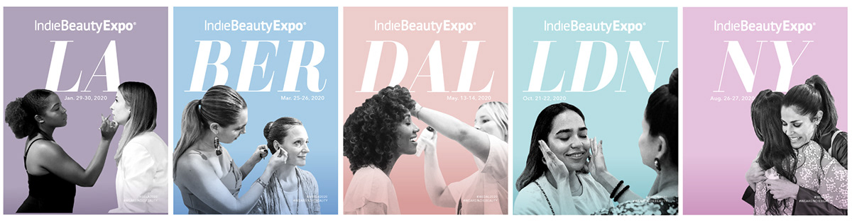
Posters for 2020 trade shows

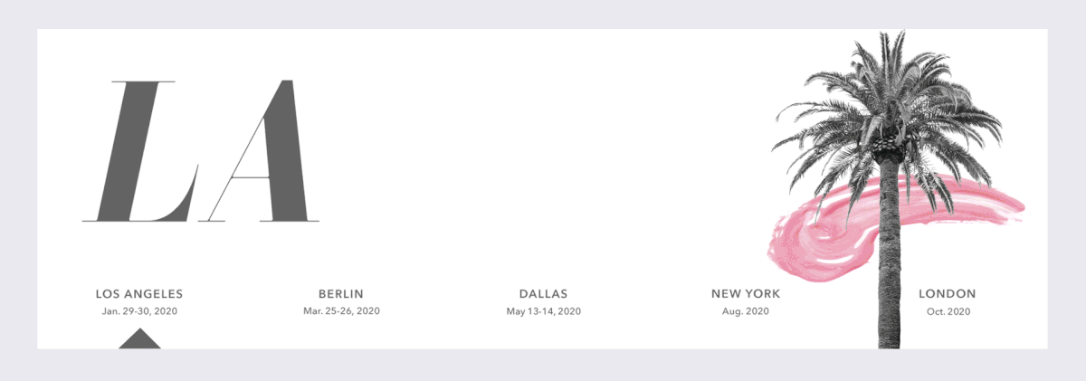
Tote design for all 5 tradeshows- Los Angeles, New York, Dallas, Berlin and London


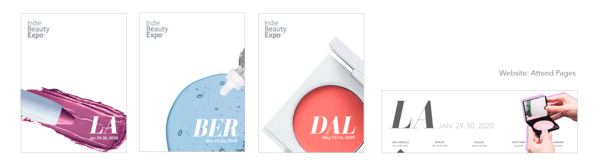
This concept explores the interplay between textures, show moments and X-rayed flowers that reflect the transparency
(in ingredients) that Indie Beauty Expo's clean beauty brands believe in. It is expressive, Intriguing and minimal- with a pop of color and a shape to anchor the visuals.


Venue Announcements

Strong, minimalistic, product-focused signage and graphics that portray IBE's role as a leader and discoverer- of new clean beauty products. The aim was to replicate the no-nonsense approach of these indie brands with tight crops and focus on demos and engagement with the product.