


A pharmacy with more than 20 years of experience that needed an update.
The project ⟶
Canalejas pharmacy is the second generation of apothecaries. After more than 20 years in the sector they wanted to take a leap and position themselves as the reference pharmacy in the center of Alicante.
Due to the expansion of their services and products, they commissioned us their new identity.
Without losing sight of the apothecary concept, we saw the need to introduce high cosmetics graphic codes for the new products and services they were going to offer.
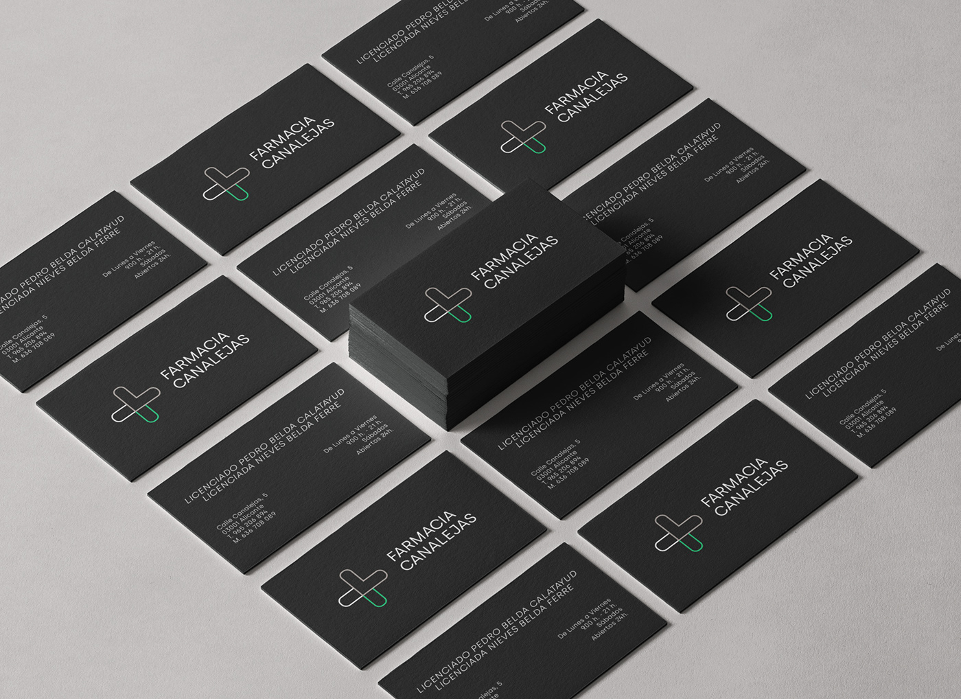
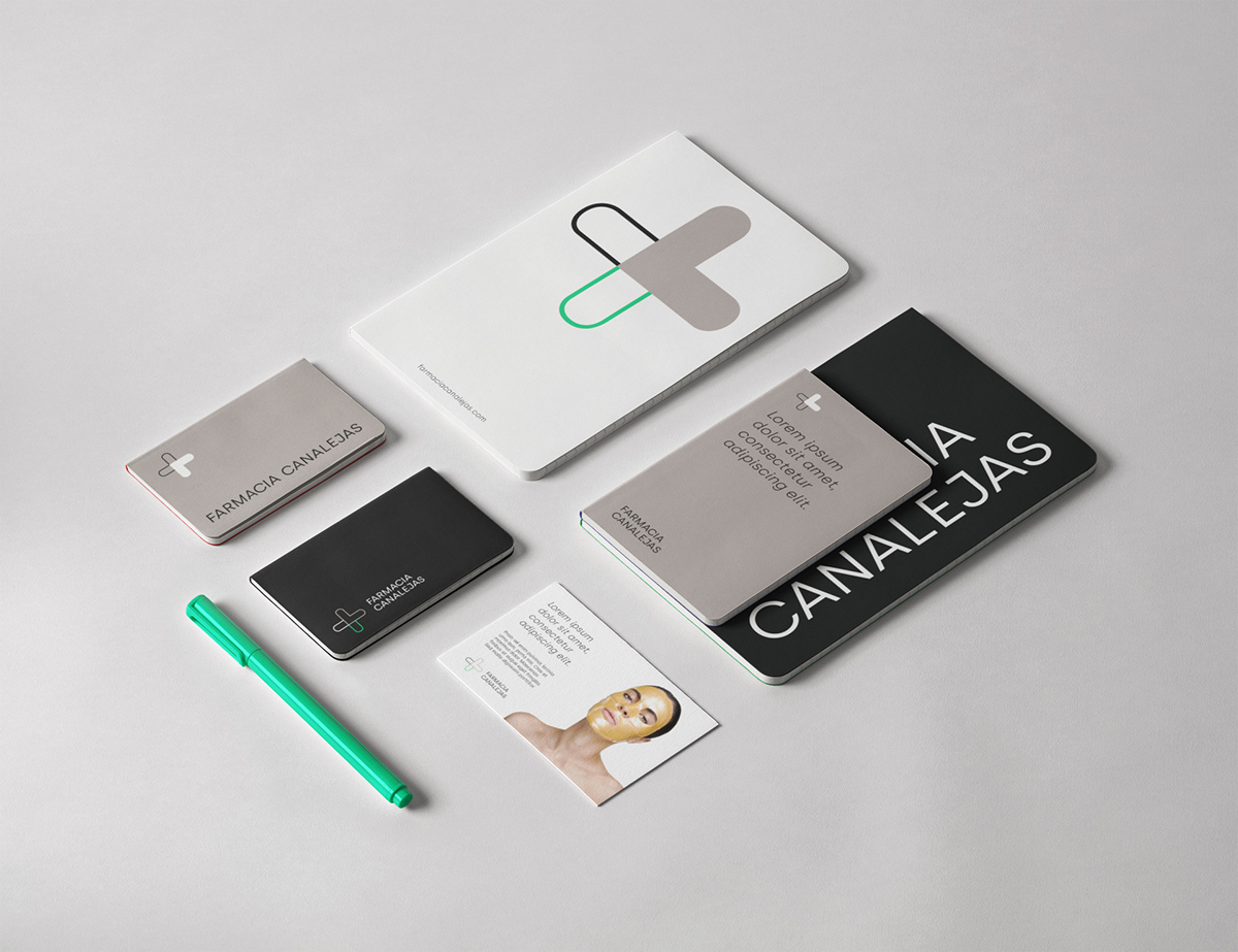
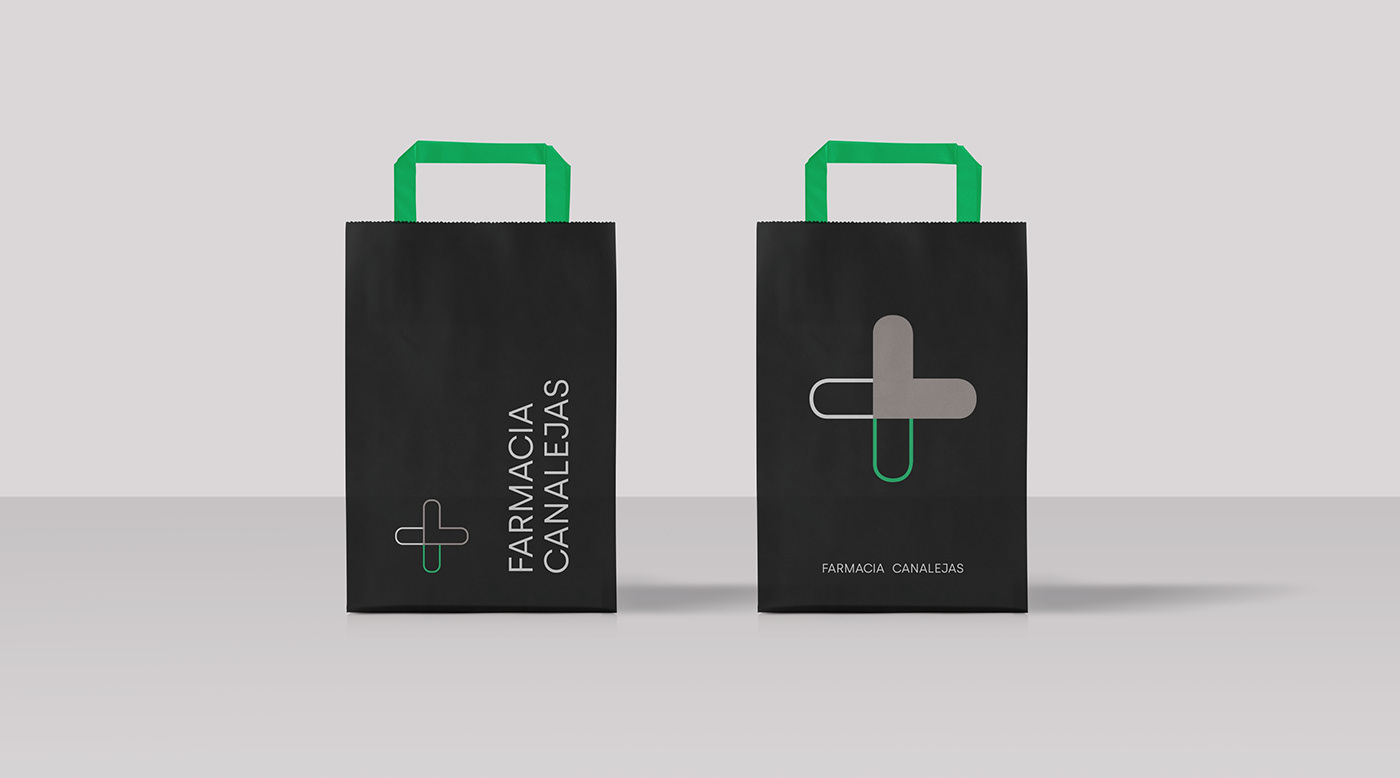
We chose the Silka typeface from the Atipo family, which offers premium "boutique" character and at the same time has a scientific touch.
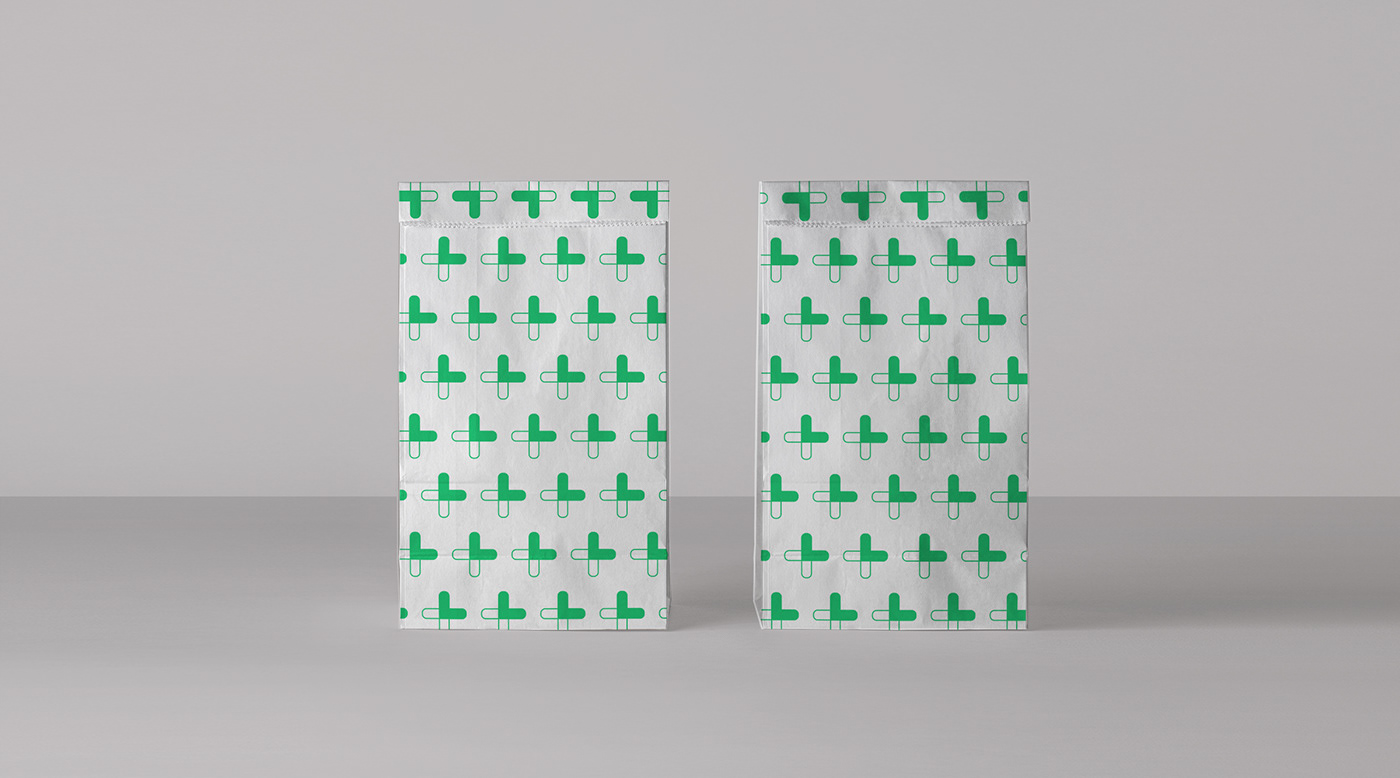
The letter J helped us create the identity symbol of any pharmacy: a cross.
A cross that, due to its morphology, speaks to us of care, of well-being.
The colors used in its interior design, such as white, slate black and taupe, provide elegance, and with acid green we give a touch of modernity.
Credits:
Year: 2020
Client: Canalejas Pharmacy
Sector: Pharmaceutical
Discipline: Brand identity
Creative Direction and design: Ana Vañó (UVE) Francés, Cristina Toledo
Project by nueve estudio


thanks! for watching


