HIDE HOTEL
Client
Somewhere in the depths of the picturesque Ukrainian part of the Carpathian mountains, someplace in a small village called Skhidnitsa, which is surrounded by dense forests and mineral springs, a small shelter is hidden. This place is called Hide Hotel.
Why Hide?
This mini-hotel is a perfect getaway from the noise of the concrete jungle and accumulated stress. This is the place that you dream of when you window-gaze at your stifling office. This is the place of sweet silence, which is swept by clean winds. This is the exact place where you can hide from everything and enjoy the quietness of nature.
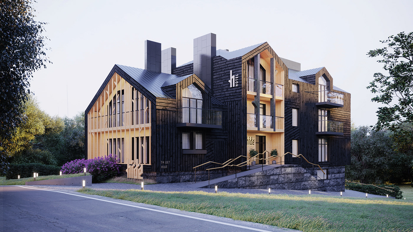
Exterior
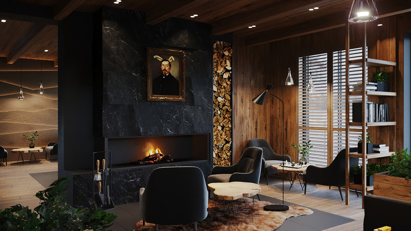
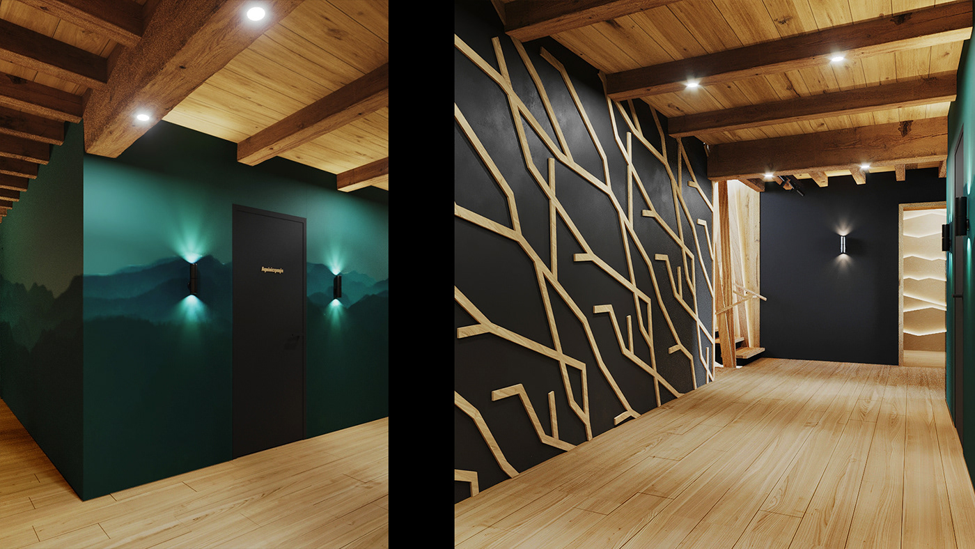
The look and the feel of the building transmit the concept and core idea of the Hide Hotel. It looks like the building is growing out from the woods around and resembles a shelter to those who are in search of peace and tranquility.
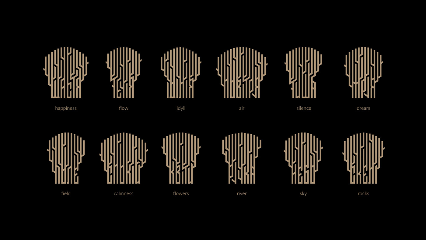
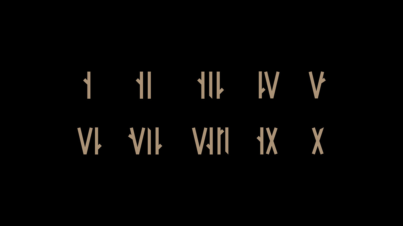
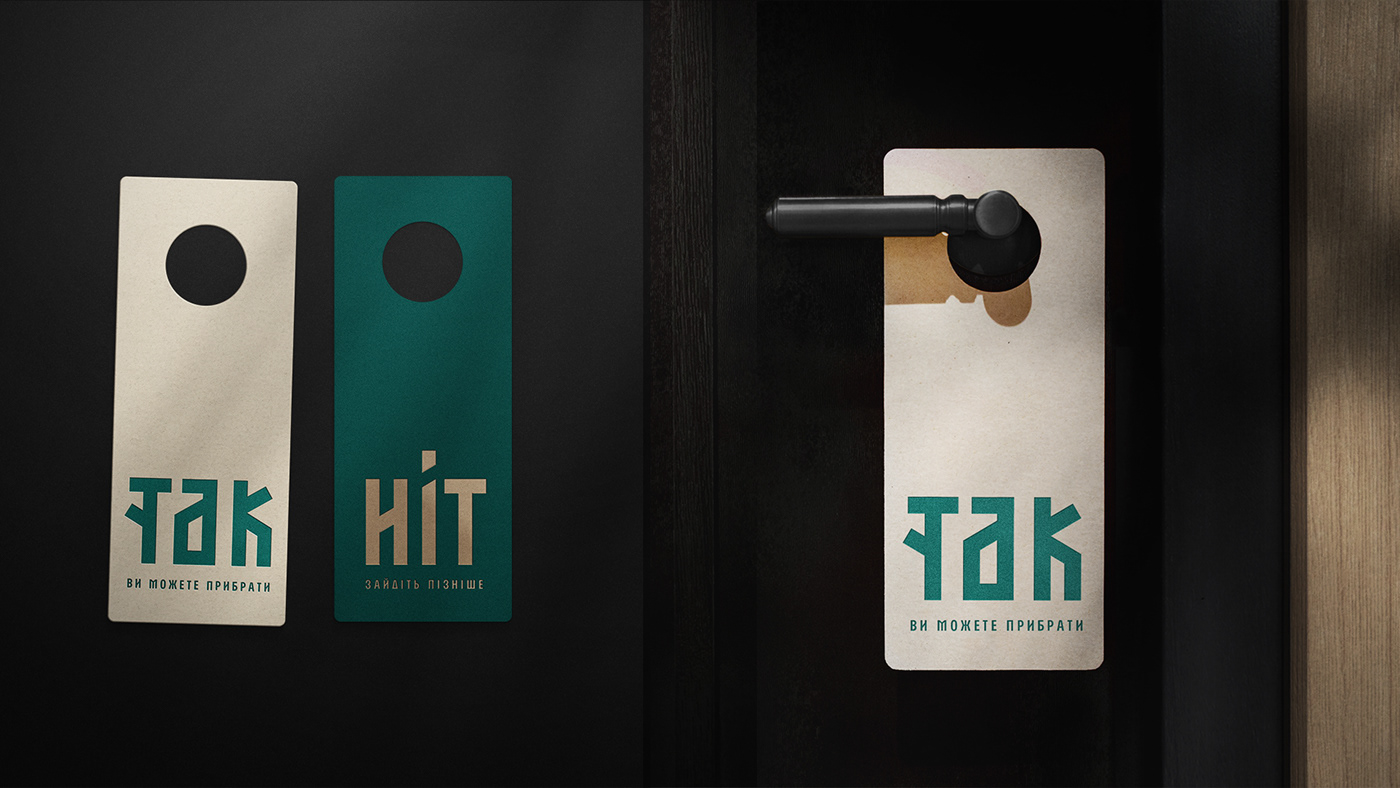
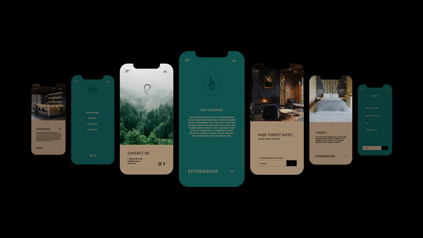
Logo & Brand Identity
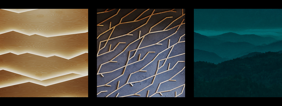
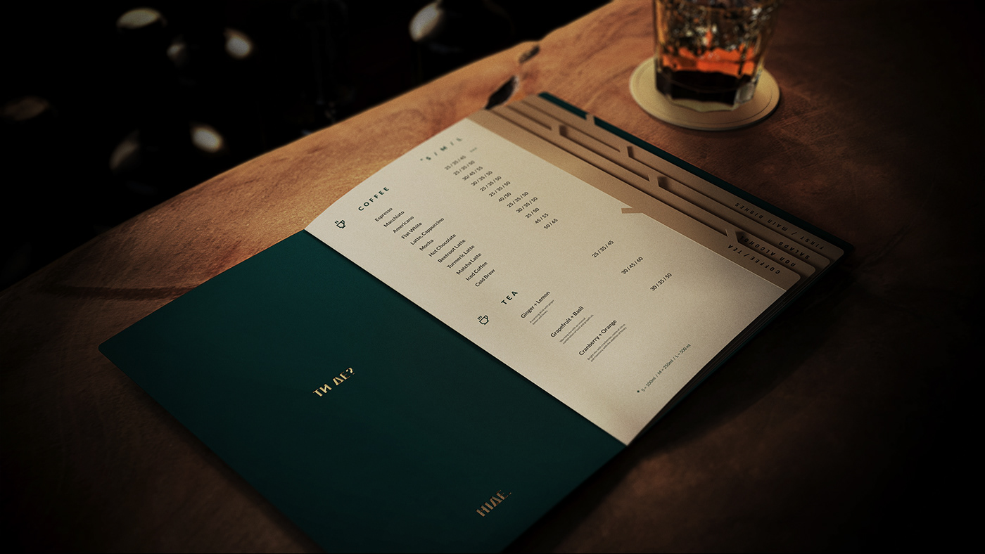
The logo and brand identity concept is inspired by the spirit of the forest itself. The patterns are based on the image of a dense thicket and towering mountains. Brand colors are taken from the palette of local nature. For instance, vibrant green symbolizes coniferous forests, beige is the color of the wood, and white and black symbolize day and night, the light and dark, yin and yang of primary colors. Brand identity engages guests in the right mood so that they can genuinely enjoy nature, silence, and peace.


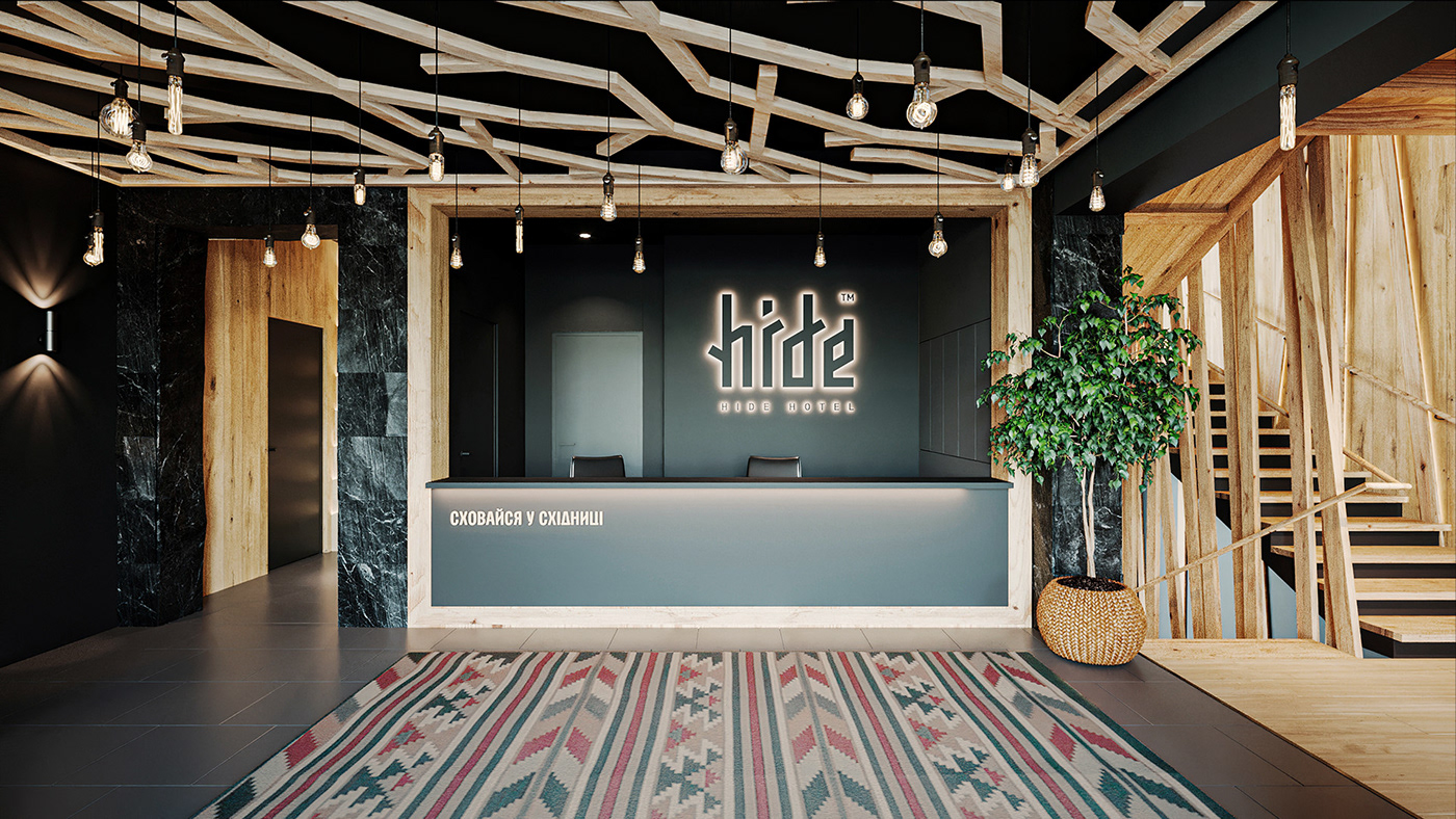
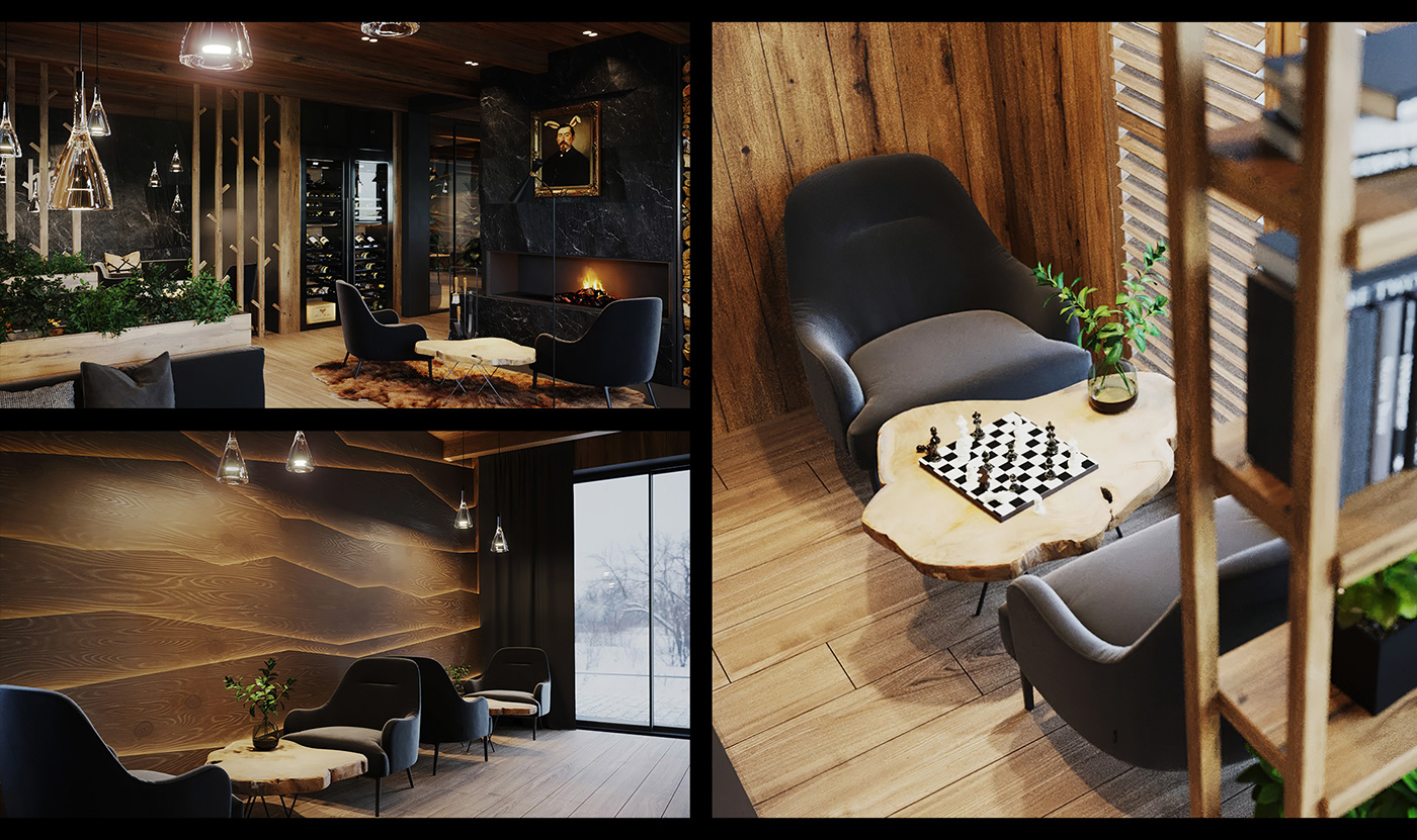
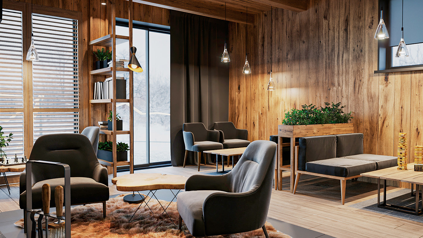
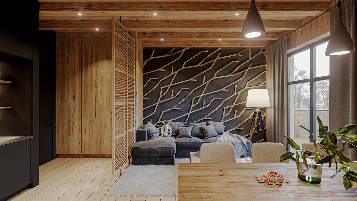
Interior and exterior design
Brandon Archibald’s special service “Hotel Identity™” gave the Hide Hotel its branded look and feel. When branding and architecture teams work aligned together, there is perfect synergy in everything that occurs. The gamut runs from naming, exterior & interior to finishing with small details such as a room key or business card. The brand identity guidelines explain how brand identity should be used and give a detailed explanation of both interior and exterior design rules and regulations. The colors and materials, furniture and fixtures, lights, and textures were carefully selected and utilized in the hotel space.

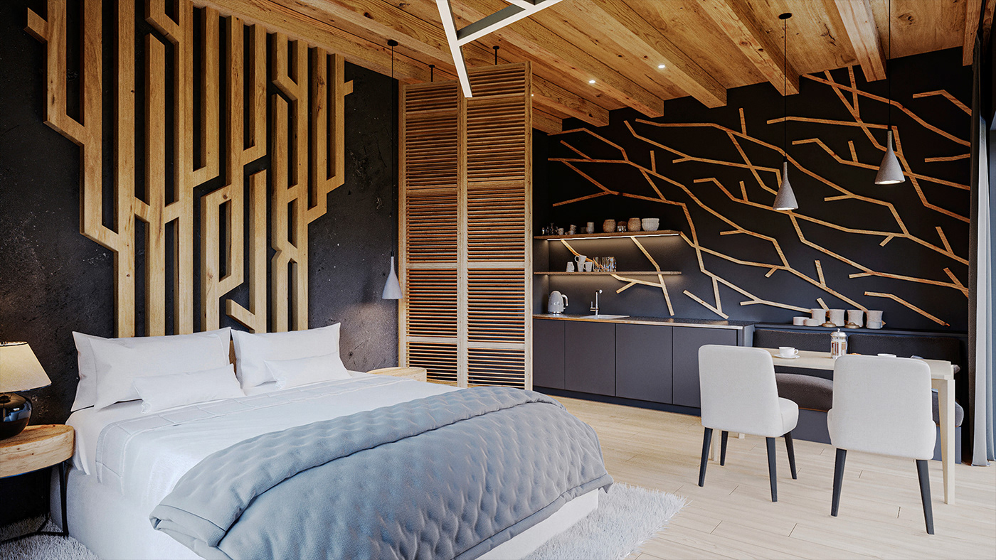
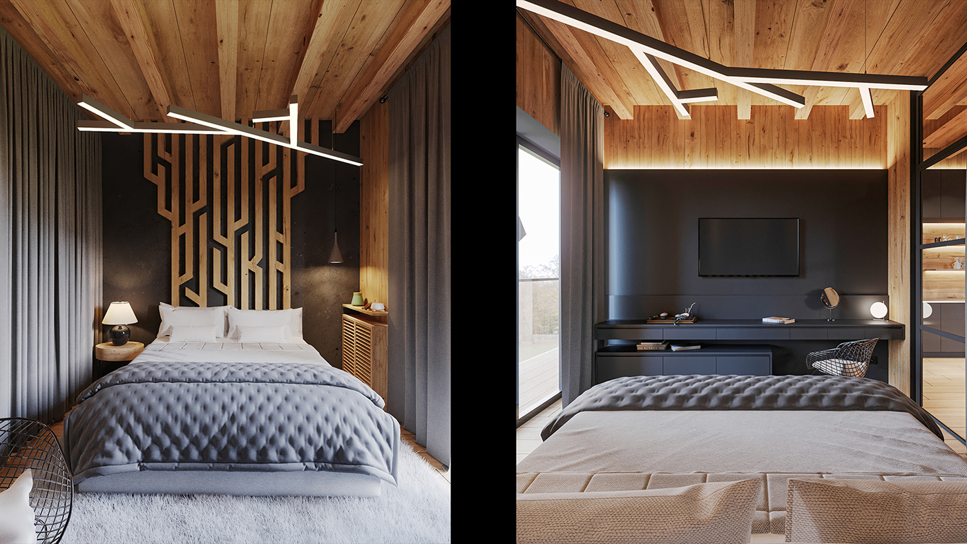
Unique hotel room names
The synergy with the branding made the inner space of the hotel very recognizable and authentic. The most significant implementation of the concept within the interior design lies in the usage of unique names of each room. These names represent a state of mind, feeling, or natural phenomenon. Here is a list of just a few of them: Happiness, Dream, Silence, Air, Field, etc. The intention was to set the guest into the right mood, and it also sounds pretty damn cool when the receptionist says while giving a room key, “you will live in Happiness” or “the Silence is waiting for you.” Our team developed the series of exclusive headboards to designate each room to represent the name in the lettering technique. This adds uniqueness and a wow-effect for the living experience of the guests.


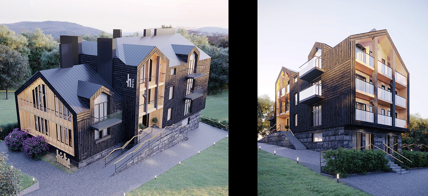
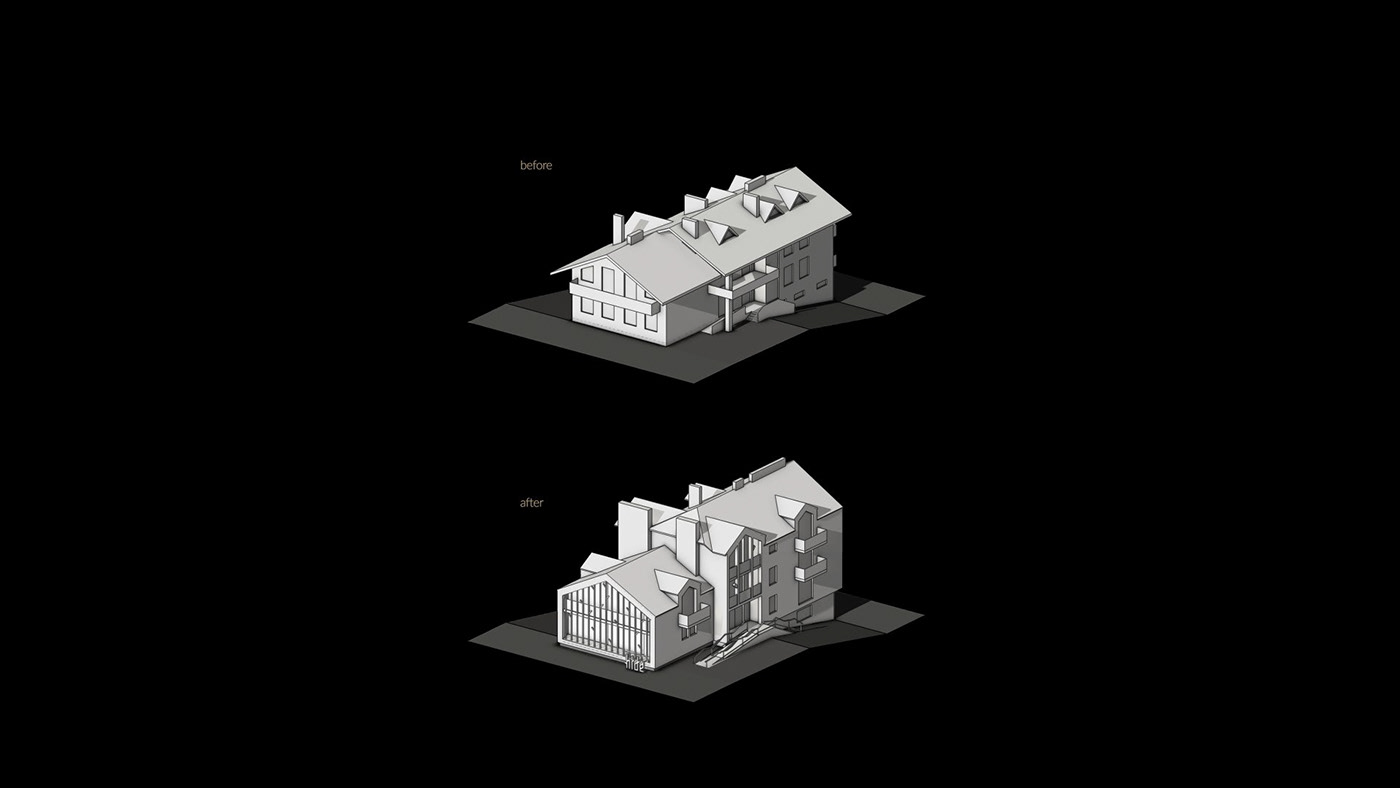
Reconstruction plan
The building for the Hide Hotel initially looked very different. On the one hand, the client initiated reconstruction and aimed to expand the space to fit more rooms. On the other hand, he wanted to maintain the look of a cozy mini-hotel without a significant enlargement of the building. The partial reconstruction changed the roof with a mansard floor and the facades, while the overall structure remained the same.
Project Team
Creative Directors – Boris Alexandrov & Anna Alexandrova
Project Manager – Daria Svidchenko
Branding
Art Director – Elena Parhisenko
Case Art Director / Lettering – Eugen Papen
Graphic Designers – Marina Nechyporuk, Server Terlekchi, Roman Sorochinskiy
Copywriter – Dimitry Panasiuk
Architects
Elena Guryeva, Yuriy Guryev, Liza Kudinova, Sergey Makuhovsky
3D Artists
Illia Tkachuk, Sergey Makuhovskiy, Plamen Zhuzhunov

Services Provided
Naming
Concept and Brand Strategy
Taglines and copywriting
Logo and brand identity
Packaging design
POS materials design
Lettering
Interior design
Exterior design
Materials Sourcing
Hotel Identity (HI™)


