The responsibility I had that helped me understand the importance of great costumer relationship so I encouraged them be part of the design and product development process what helped the company understand what really fit in the market by making them feel that they have influence on the company's and their own future.

Everything started with redesigning the logo and get the brand and visuals in line with the trends were present. The logo was simplified and keeping mind feature diversions existence its corresponded with those as well. Because more than 80% of the costumers were females between 20-50 years the colour choose was evident. I kept the symbol as a graph and mountain mixture and added a thin line what hold the meaning together. New font and arrangement helped put the logo on products and emphasised the mission with the word 'Organic'.
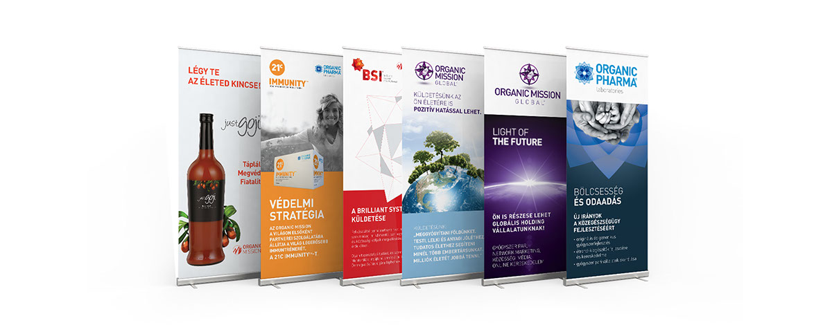
This keynote presentation what I put together helped explain the new brand and findings to the board what made them trust we heading the right way. After ironing out the foundations I redesigned assets, the learning system, the packaging of the products and all marketing materials.
Devisions
After redesigning the main brand the company introduced two new devisions one was about a laboratory produced products for the company and the vision was about going global. The three logo works fine next to each other and gives a hint these works together.
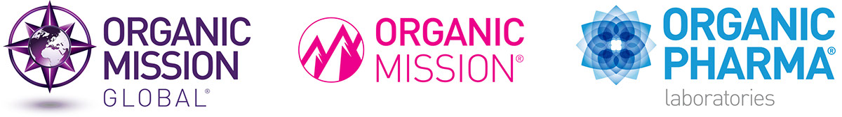
the three devision
BSI Learning System
The redesigned learning system helped new partners introduce the company for costumers, give informations about products and taught different technics reach their costumers easier and more efficient. We design an exercise book, learning cds and packaged them nicely. The system helped partners find their way and teach them being an entrepreneur. We work alongside with them to find out the right tools, method what works for them better.

Products
Next to the food supplements and vitamins the cosmetic product line was the most successful. We spent enough time to find out the best shapes, colours and tone what corresponded with the vision of the company and the costumers needs. The whole family got focus and we redesign the brand, the packages what after all perfectly fitted into the vision we have been building. Consistance, clean and sparkling as much as it had to be.

Everyoung Cosmetics
The redesign helped market the product better so we made more sales then before. The board realised the design is important and required to make better sales next to make our partners more satisfied. Costumers loved how complete were the product family and all the events, learning materials we made reach their hoped effect on the brand. The effort we put into that proved that shaping the product with costumers makes the company more success with less effort.
The success story of the cosmetics backed up us on continue supporting other product and product lines by similar materials and tools. We continued working with partners and costumers while we refined our methods. I decided to use 3d programs to create models of the products what give us freedom for creating animations or make packshots from any angle we wanted.
During the period I work for the company we hosted several events, developed new products and redesign the brand. That time gave me the opportunity to see the whole picture on product development from an idea to the actual products, packaging them physically and magically to make a successful business and make our costumers feel being part of the movement we were shaping.


