

This poster was awarded 3rd place in Arizona State University's Industry Awards in the "Print & Digital Collateral - Single Page Category".
Industry Awards are voted on by industry design leaders from design projects submitted by ASU students.
About
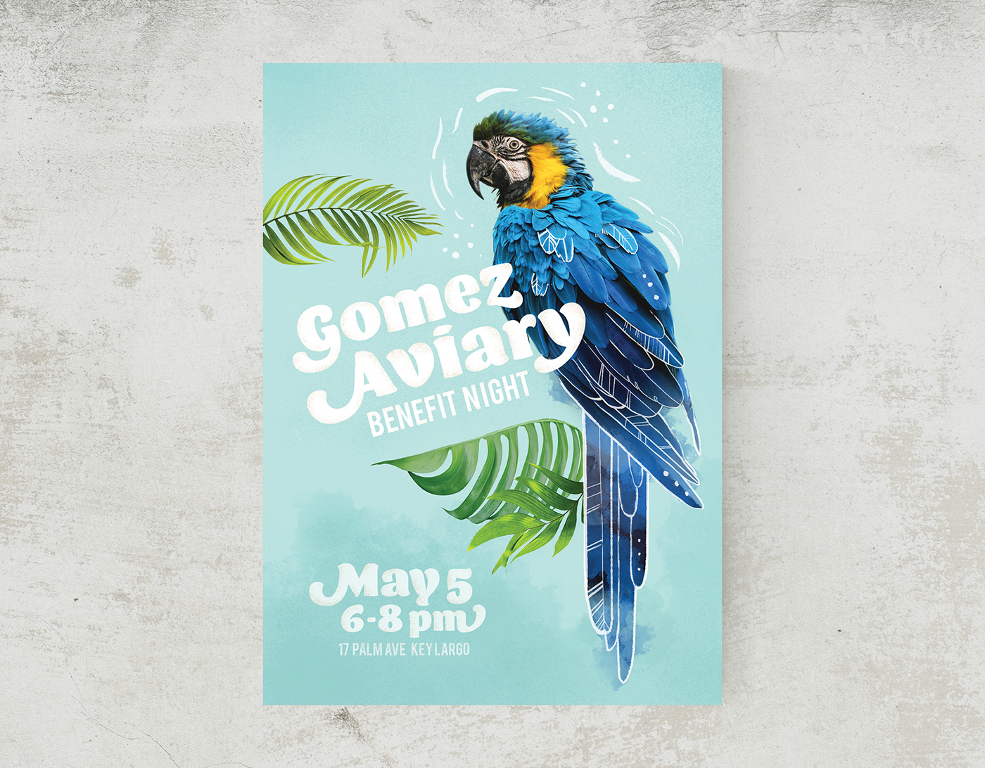
This was a poster created as an assignment for my GIT 230 class at ASU. We were asked to create a poster using Photoshop and using several techniques we learned in class.
I’ve always loved birds and have three small parrots at home that fly around the house, talk to us, whistle songs to us, and sit on our shoulders. Although parrots are extremely intelligent, funny, affectionate, and beautiful, large parrots such as the Macaw on the poster, are notoriously difficult to care for as pets. This is because they are extremely loud, destructive, needy, prone to self-mutilation, and live for decades; generally speaking, the larger the bird, the harder they are to handle. Because of their difficult natures, they are all too often kept in cramped cages in closed off rooms, neglected, or even abandoned by their owners to rescue and rehabilitation organizations.
I designed this poster as a way to support a rescue organization that helps care for these birds. I designed it for “Gomez Aviary”, a fictional aviary I named after Gomez, a young cockatiel I had that unexpectedly died from congenital issues.
UPDATE: This poster design has now been customized for and donated to "A Helping Wing", non-profit parrot rescue in New Jersey. http://ahelpingwing.org/
Objective
Client: Gomez Aviary
Audience: Wildlife advocates , local citizens, businesses who may donate, anyone looking for a fun evening out.
Intended Impact: This poster is meant to catch the attention of potential donors and participants by highlighting the beauty and personality of parrots, as well as advertising the benefit night as fun and inviting. It was meant to evoke a party on a tropical beach, rather than a stuffy fundraiser, but still clear that it’s for a good cause.
Design decisions made to achieve this impact:
I tried to find a photo of a parrot with its wings facing the viewer to better showcase the beautiful, individually apparent, larger feathers that are on the wings of a bird rather than their fronts that have smaller, fuzzier feathers. I also wanted an image where the bird’s face was in profile to give it a more graphic/ flat look to fit in with the rest of the graphic elements. I couldn’t find a bird in a copyright free photo in this exact pose, so I combined two photos from a copyright free site, pixabay.com, to achieve the look I was aiming for. (See attribution for links to photos used.)
I added in artistic touches, such as hand drawn doodles around the bird’s head and highlighting feathers using Photoshop brushes to bring out the personality and communicative nature of parrots as well as to add interest and detail and to add some of my own personal style. I also digitally hand painted in watercolor elements and grain in the background and on the type to tie in the style I used to complete the parrot, and to add more visual interest to the background. I added more of this grain around the edges of the text to help anchor the text in the design. I used the lasso tool to individually select each letter when painting in the grain, to make sure I was adding it in more precisely and not “overspraying” any on the adjacent letter in areas I didn’t want it to be.
I chose the display font I used to convey a fun and inviting mood as well as for the flourishes that echoed the shapes and flourishes of the tropical leaves.
The tropical leaves are there to add in movement to keep the eye moving around the poster, to help to anchor the parrot within the design, to add another element that gave an inviting, fun vibe, and as an acknowledgment to the environment this parrot belongs in. The background color also alludes to a tropical beach, and doesn’t compete with the bird’s bright colors, and let’s the yellow around the bird’s face contrast with all the rest of the blue so it remains as the focal point, and the curve of the beak leading the eye to the title next.
File Properties:
-Designed in Adobe Photoshop CC 2020
-300 dpi
-5x7” (as requested for the assignment)
-sRGB colorspace
Techniques Used
Technique #1 – selections and masking
I used a combination of a quick selection tool, magic wand, lasso tool, and used the brush tool within “select and mask” mode to fine tune selections.I masked out the background of the photos of the parrot and leaves. I also used clipping masks for the grain I added to the text.
Technique #2 – adjustment layers
I used a curves adjustment layer to help tie the whole poster together, and to help add more contrast. I used a brightness adjustment layer to help tie the parrot together as a whole, and to brighten the bird a bit. I used two hue/saturation adjustment layers for individual parts of the parrot to help match the colors of the feathers to each other, as some were a cooler blue, and the head was a warmer, less vibrant blue.
Technique #3 – typography
I used a display font, Barricada, in a larger font size to provide a hierarchy to what information was most important. I choose a simple, condensed sans serif font, Bebas as a compliment to provide additional information without competing at all with the main font, or taking up too much room. I used kerning to help optimize the space between letters and to avoid distracting, uneven spacing. I utilized the option to choose different glyphs in some of the letters to achieve a nicer flow within the words and to mimic the flowing shapes in the tropical leaves.
Attribution:
Links to stock photos used:


