


Coffice - is a coworking space in Mexico city
We had a pleasure to create a brand style, branding elements and supporting identity system.
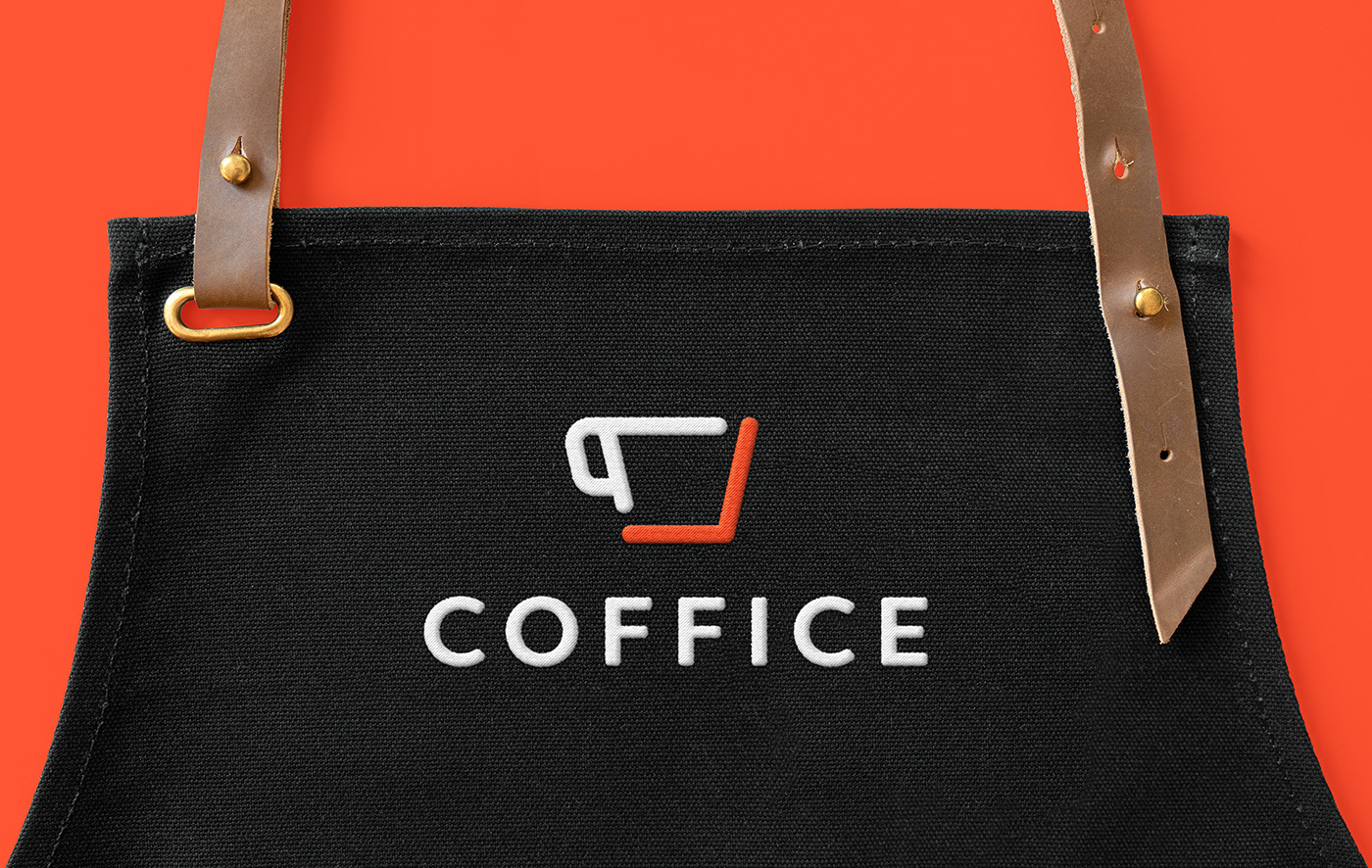
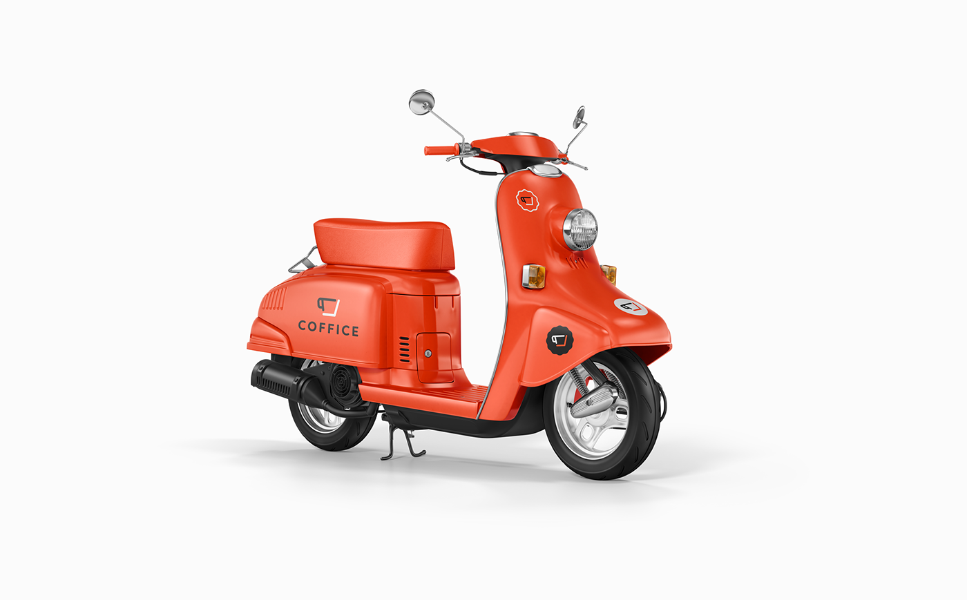
smart by design™ worked in creating the brand mark, identity system, branding elements. During the exploration stage, our goal was to find a shape that feels dynamic, symbolizes creating something new from common shapes and has a clear meaning behind. We started with more coffee symbolism, explored typography with hidden meaning, negative space designs and then moved towards a triple meaning icon symbolizing:
1. Coffee cup;
2. Laptop;
3. A chair and a table.
Through identity, we decided to communicate Coffice values —personal approach, modern, cozy, and fun. We’re delighted to see the brand and product come to life and happy to share the process and outcome.
Check more about Coffice here - https://coffice.mx
Our Role:
Brand Development
Branding Elements
Brand Identity System


Coffice
is the destination office for digital nomads and freelancers looking for a coworking space in Mexico City. Offering a place to boost productivity, amazing coffee, high-speed wifi, and low key vibes Coffice attracts a digital-minded community from all over the world.