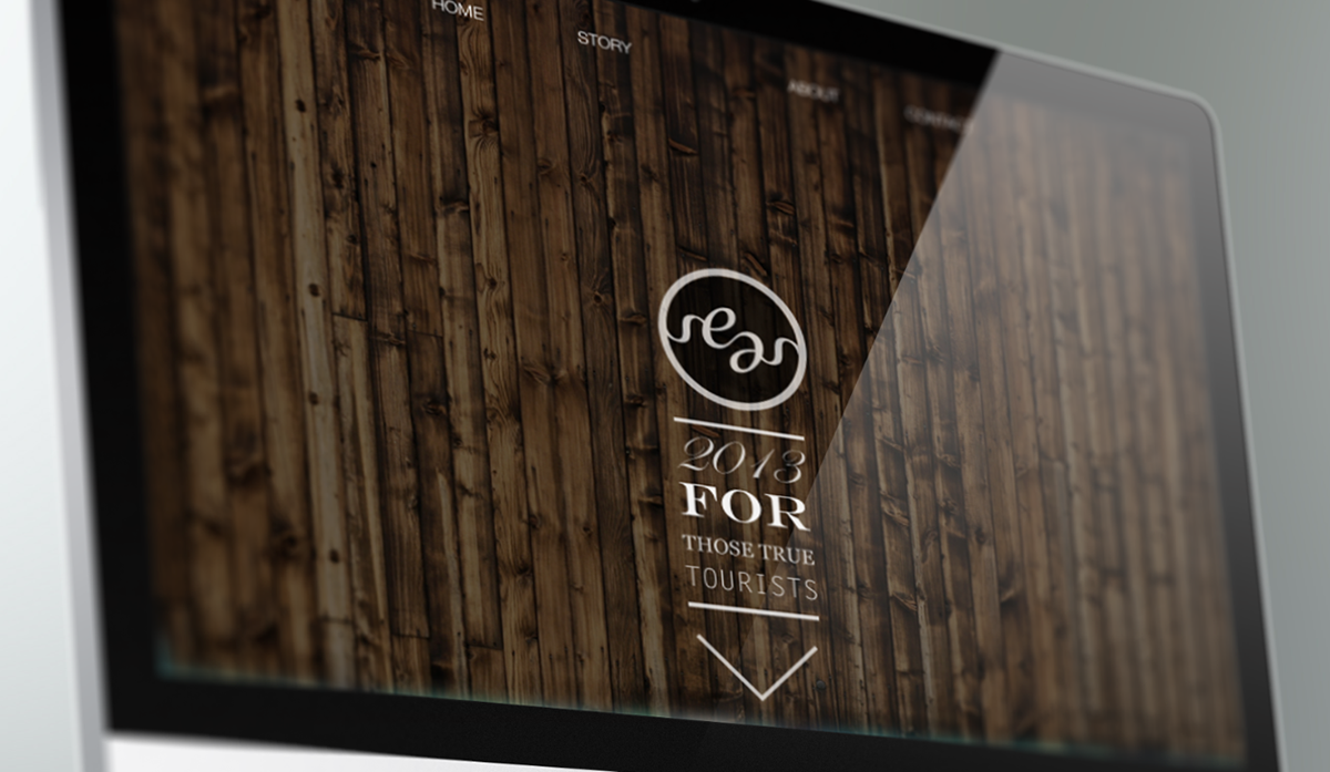
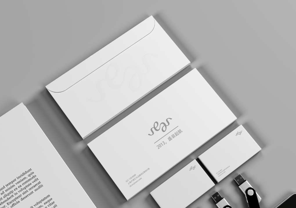
sees - 2013
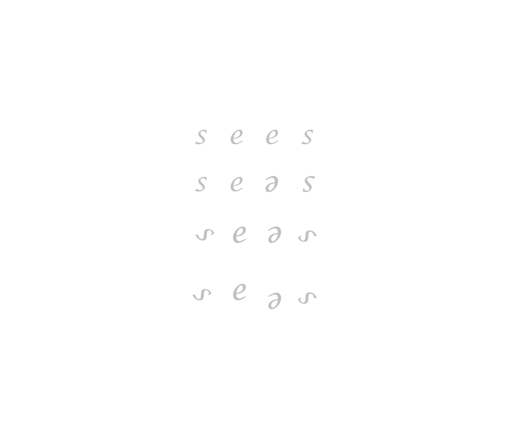
I have asked for designing a logo for my own magazine project last semester. The name of my magazine is sees, a travel magazine, which means see more (than one thing), The layout for the magazine is quite graceful and clean, so I really want to push everything into a logo which could emphasis such style. During the design process, I did realize these four letters could be ambigram and still keep good readability.
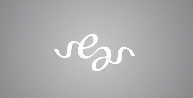
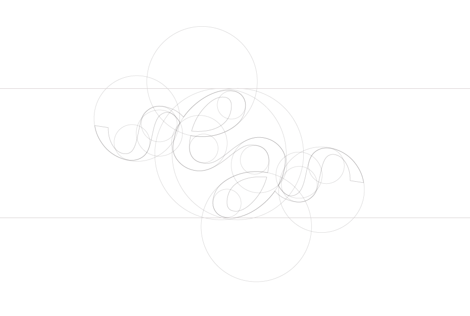

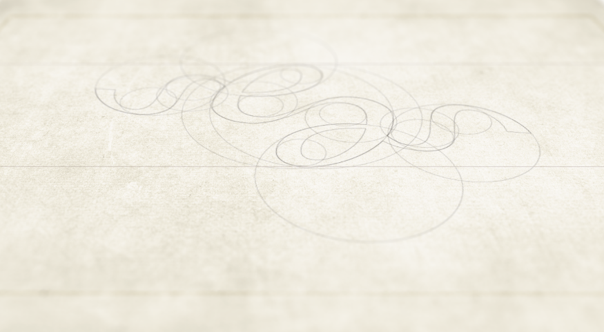

Balance, principle of Tai Ji.

Thanks for viewing, and please check my other works:
font design: http://www.behance.net/gallery/JZT-type/9426271
web design: http://www.behance.net/gallery/DING_web/9403227

