WOOBLES RESTAURANT
The challenge
The task was to develop a new fast food restaurant with the open fire and wok pan in the core of the concept. With the first location in Copenhagen and expanding a chain over Denmark, Sweden & Norway. Friendly restaurants with affordable prices and a positive atmosphere where dishes are prepared on the open fire in wok pans and are tailored to customers’ tastes in 3 easy steps.
The solution
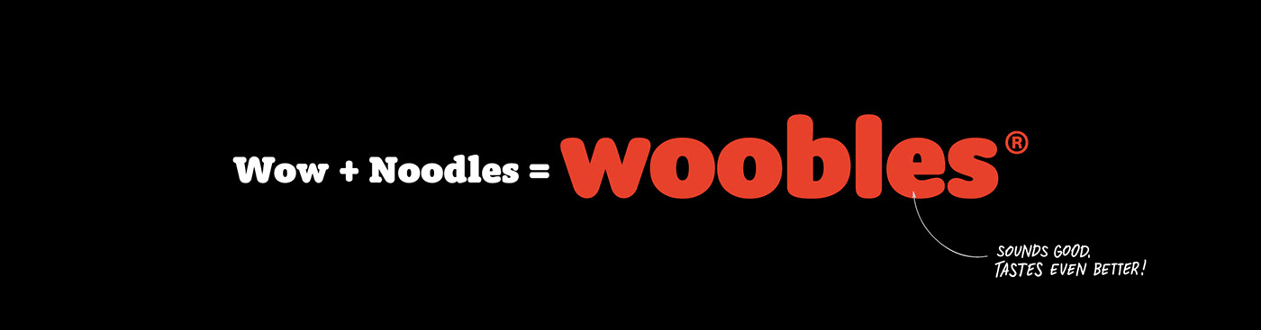
The name Woobles was inspired by the combination of Wow and Noodles. Yes, it’s that simple. The preparation of food on an open fire is a wow-process that looks like a show and has a wow taste too. You can even feel the joy just from saying: “Woooobles!”. And actually it also resembles the sound of someone greedily sucking up the last spaghetti — “Wooob!”
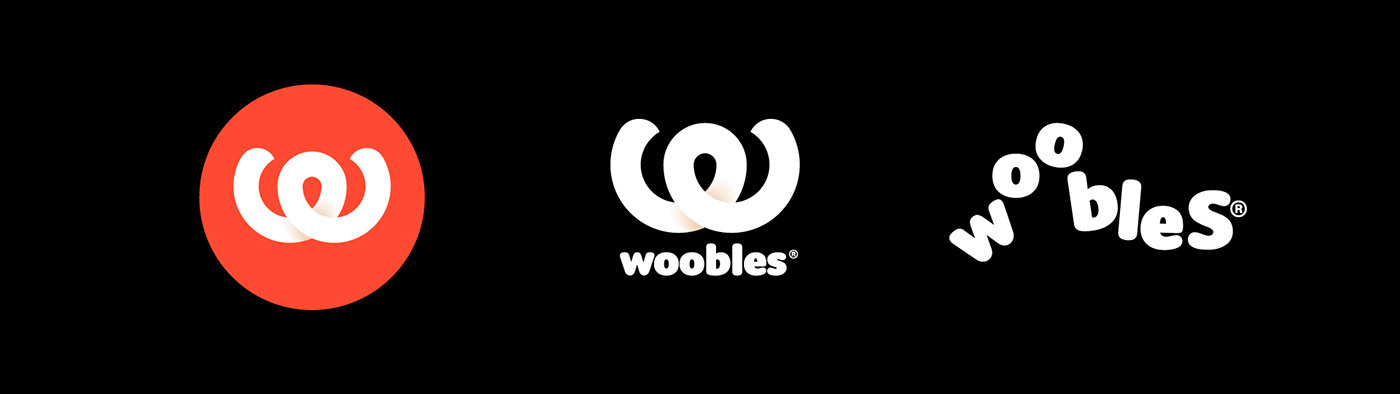
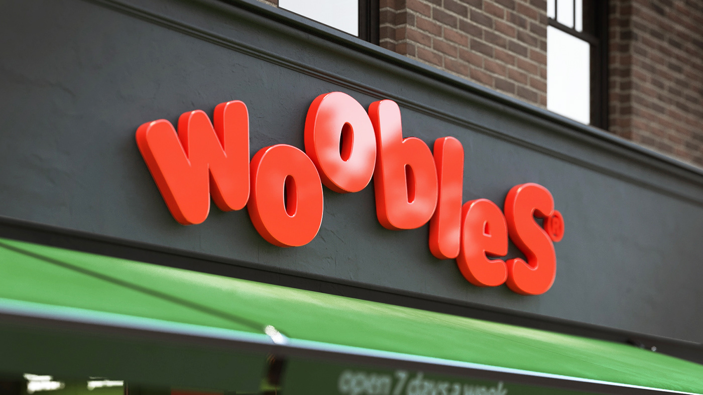
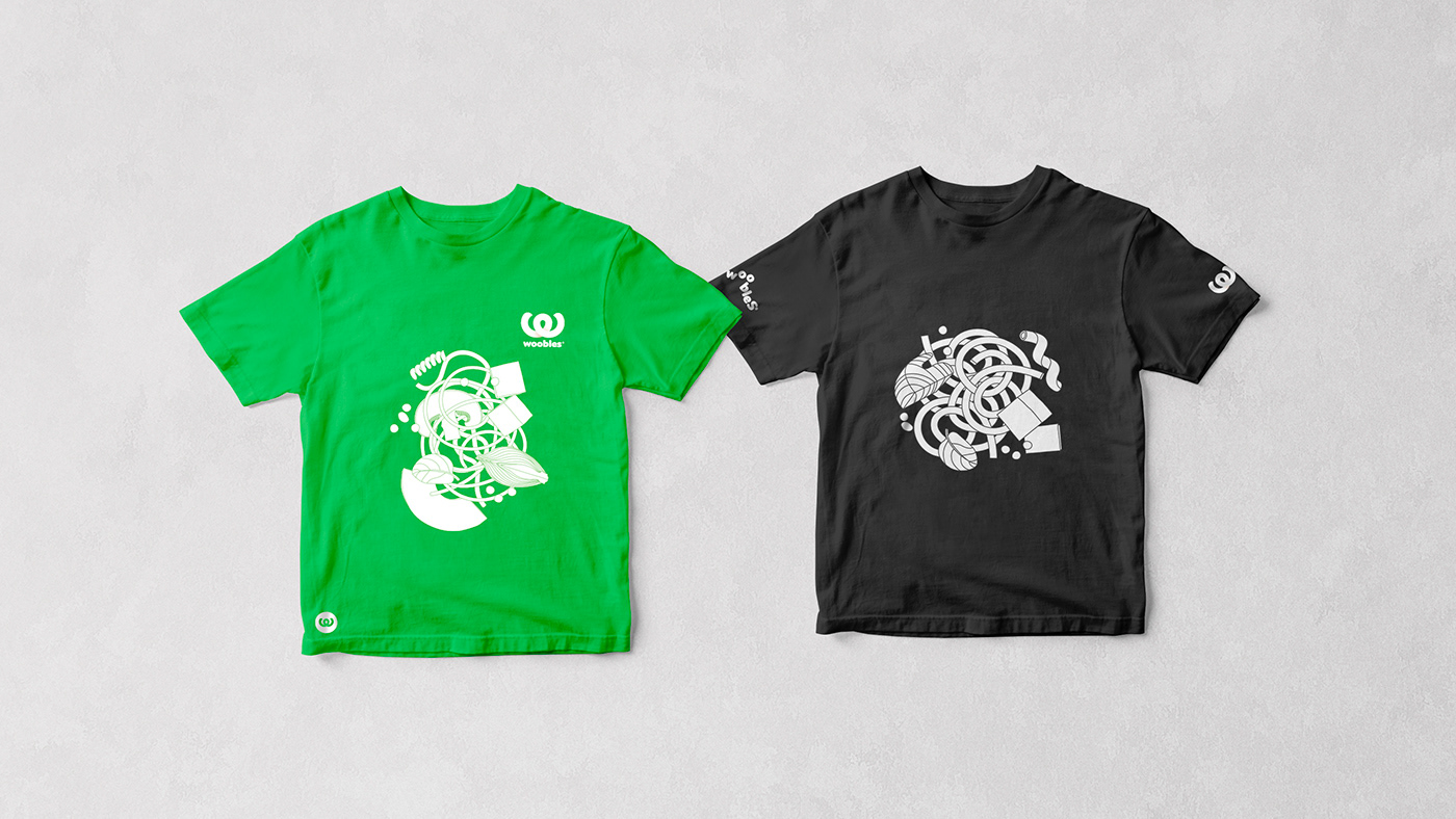
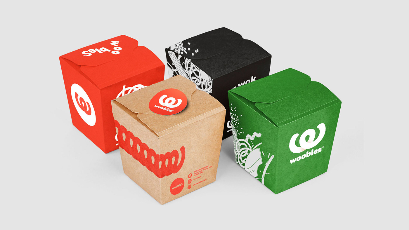
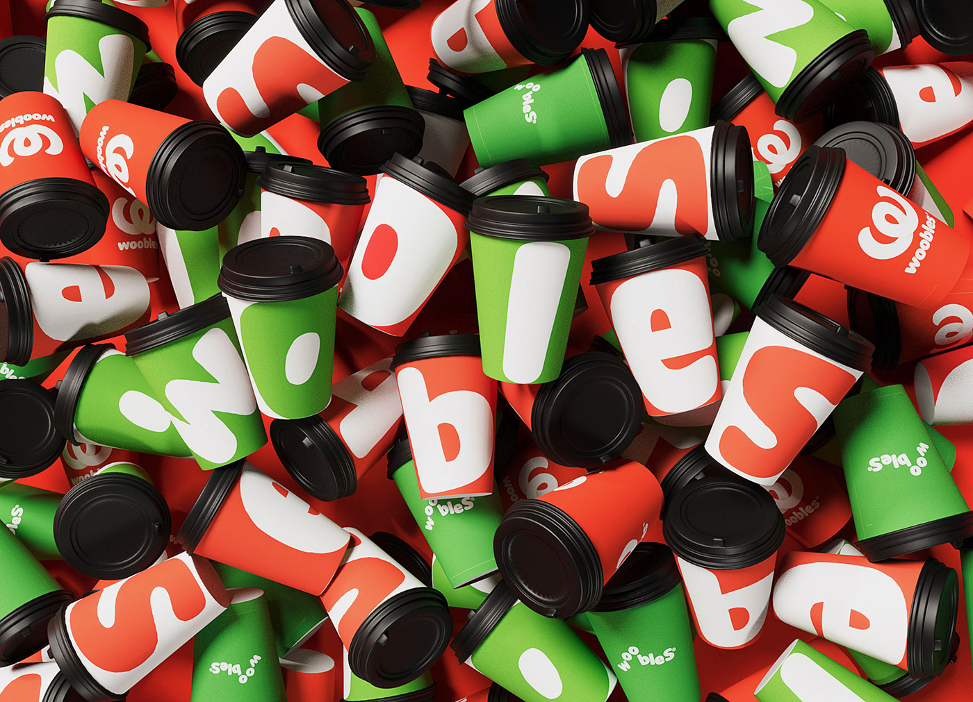
Logo & Brand Identity
The logo is a noodle-like “W” letter. It can stretch like a loooooong noodle. It can move, jump & act silly.
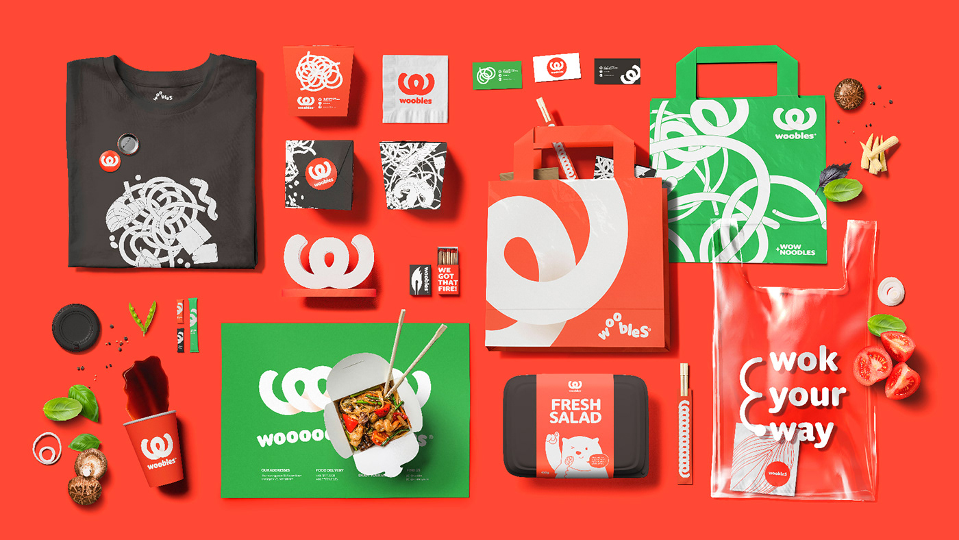
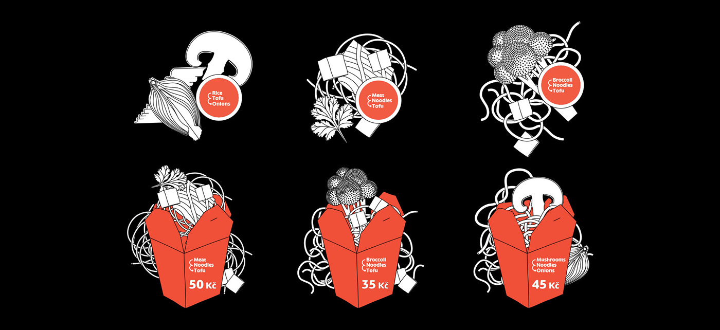
The style is enriched with the dynamic patterns made of illustrated ingredients from Woobles kitchen.

As for the colors, green reflects the eco-friendliness, and orange resembles the fire, as one of the critical components of the concept.
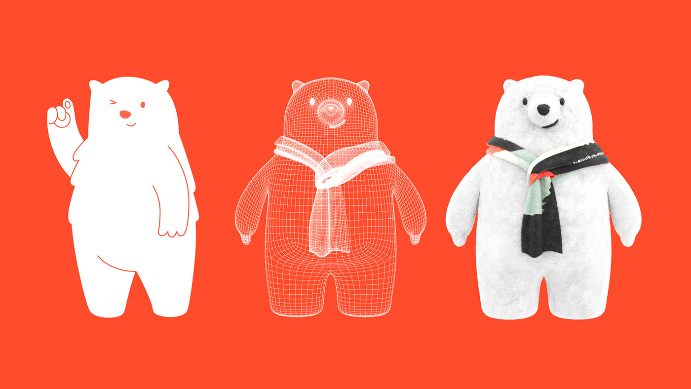
Both colors are bright and vivid, friendly, and attractive, so is Woobles. Three brand fonts could be used for various scenarios and a cute bear mascot, made in 2D and 3D.
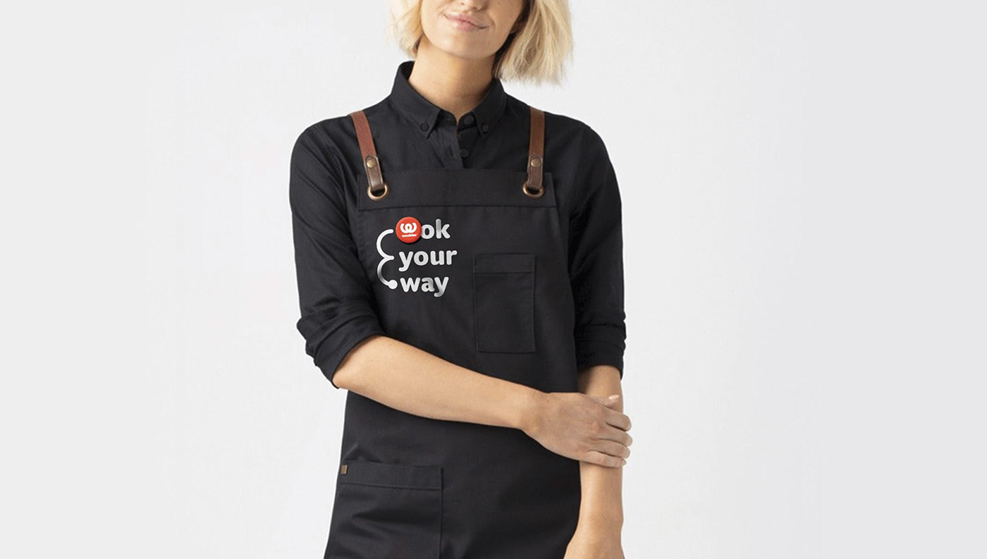
The tagline
“Wok your way” tagline perfectly explains the concept. There are two hidden senses here. One meaning is behind the actual tagline, another is behind its phonetic version. Custom made dishes in 3 simple steps make it possible to make the wok your way. Also, Woobles encourages uniqueness and authenticity. Be yourself, do what you like — walk your way.
Mascot
A Bear is Woobles brand mascot. You know...for the kids :)

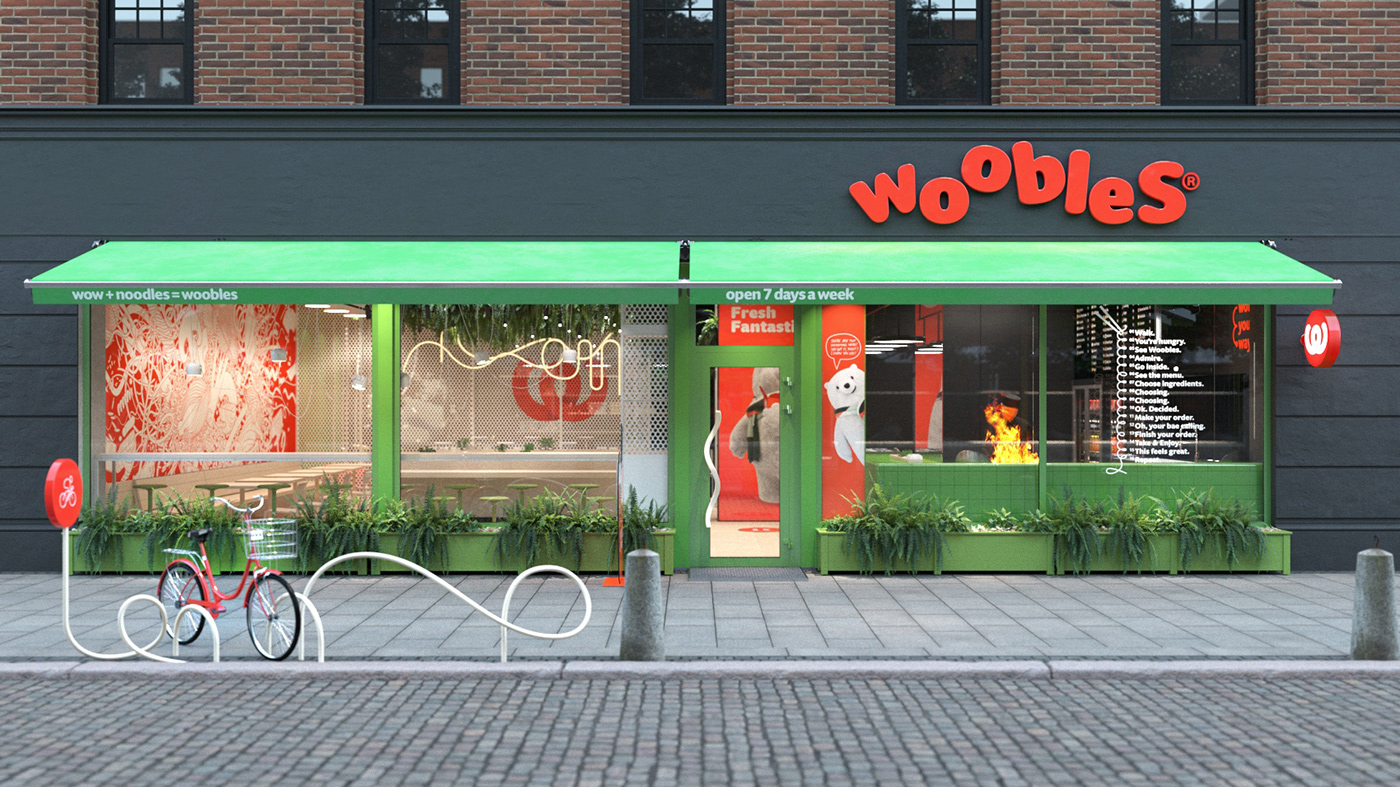
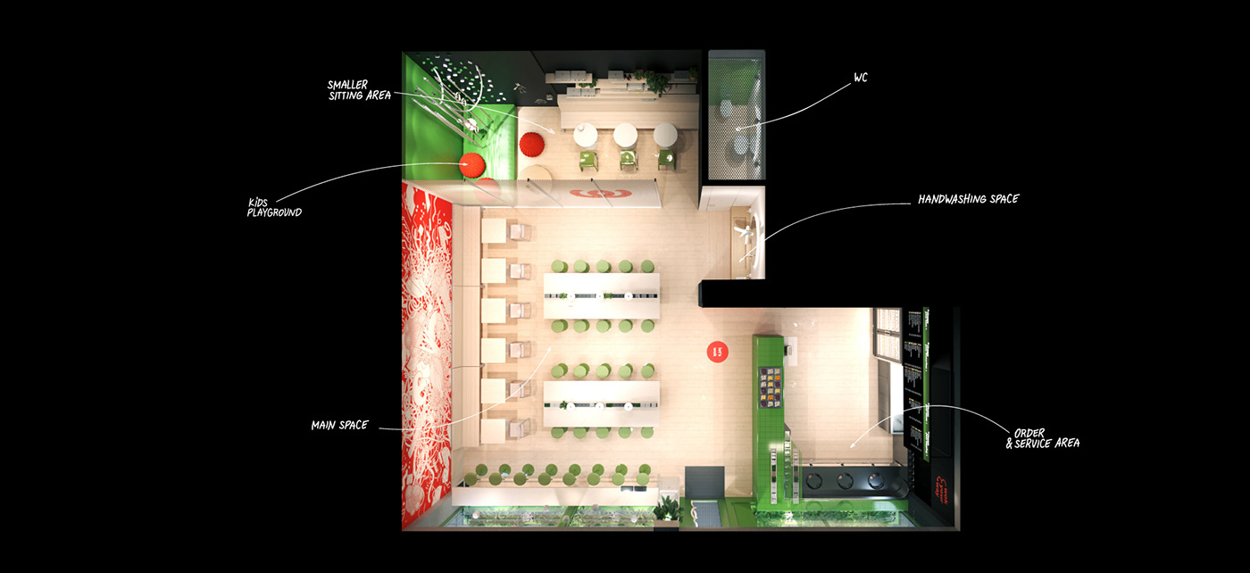
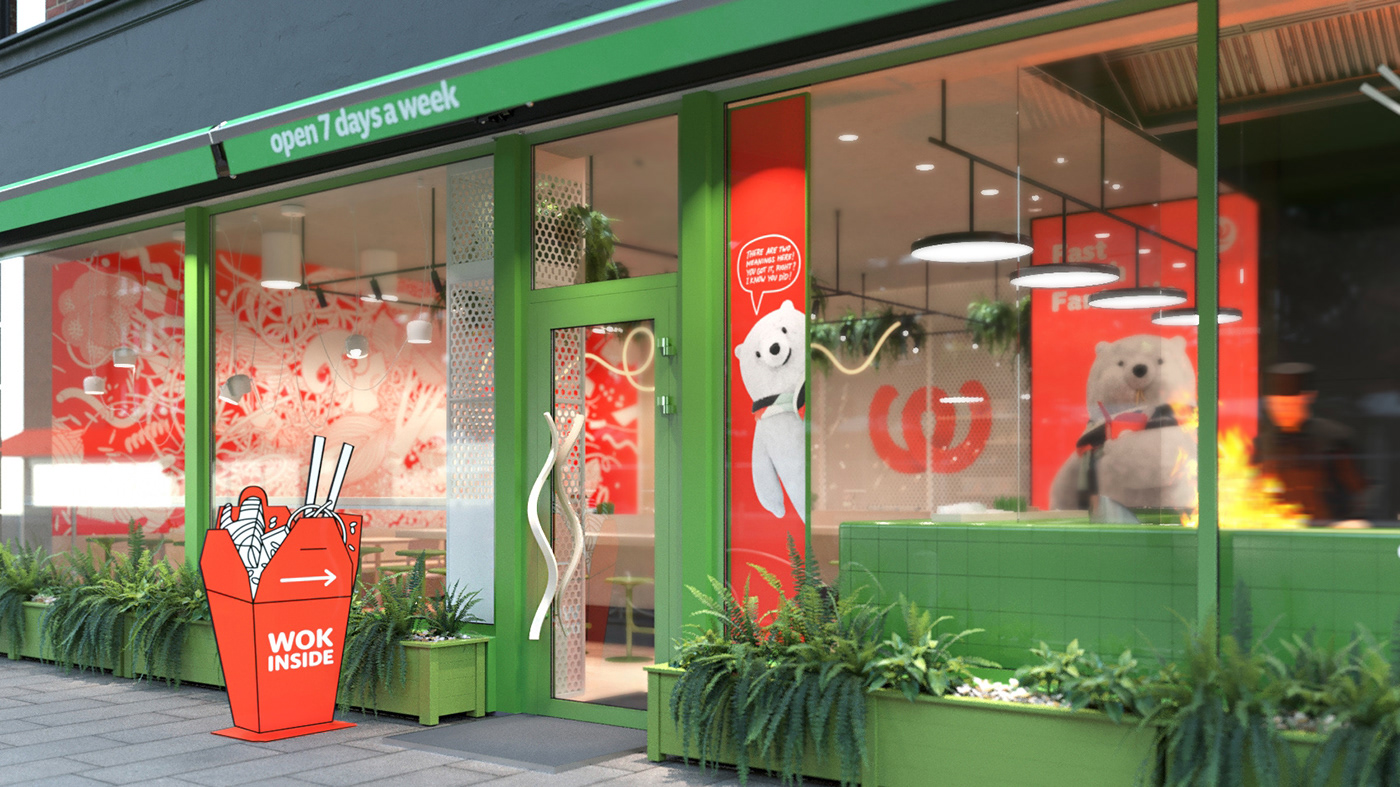
Interior and exterior design.
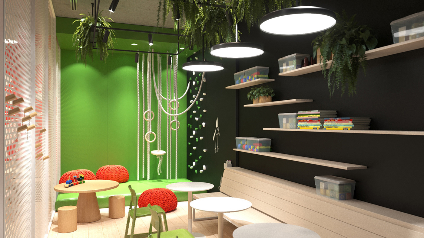
A universal and customizable design solution was developed to make it possible to quickly expand the business to a chain of franchise restaurants, applying the design to any space available for the lease. Brandon Archibald’s unique service “Restaurant Identity™” gave the Woobles operation space its branded look and feel. The brand identity guidelines not only explain how the brand identity should be used but also provides a detailed explanation of interior and exterior design rules and regulations. The colors, materials, furniture, lights, textures, and fixtures were carefully selected and applied to the first location. Now, they can be expanded to any other place within the days saving plenty of time.
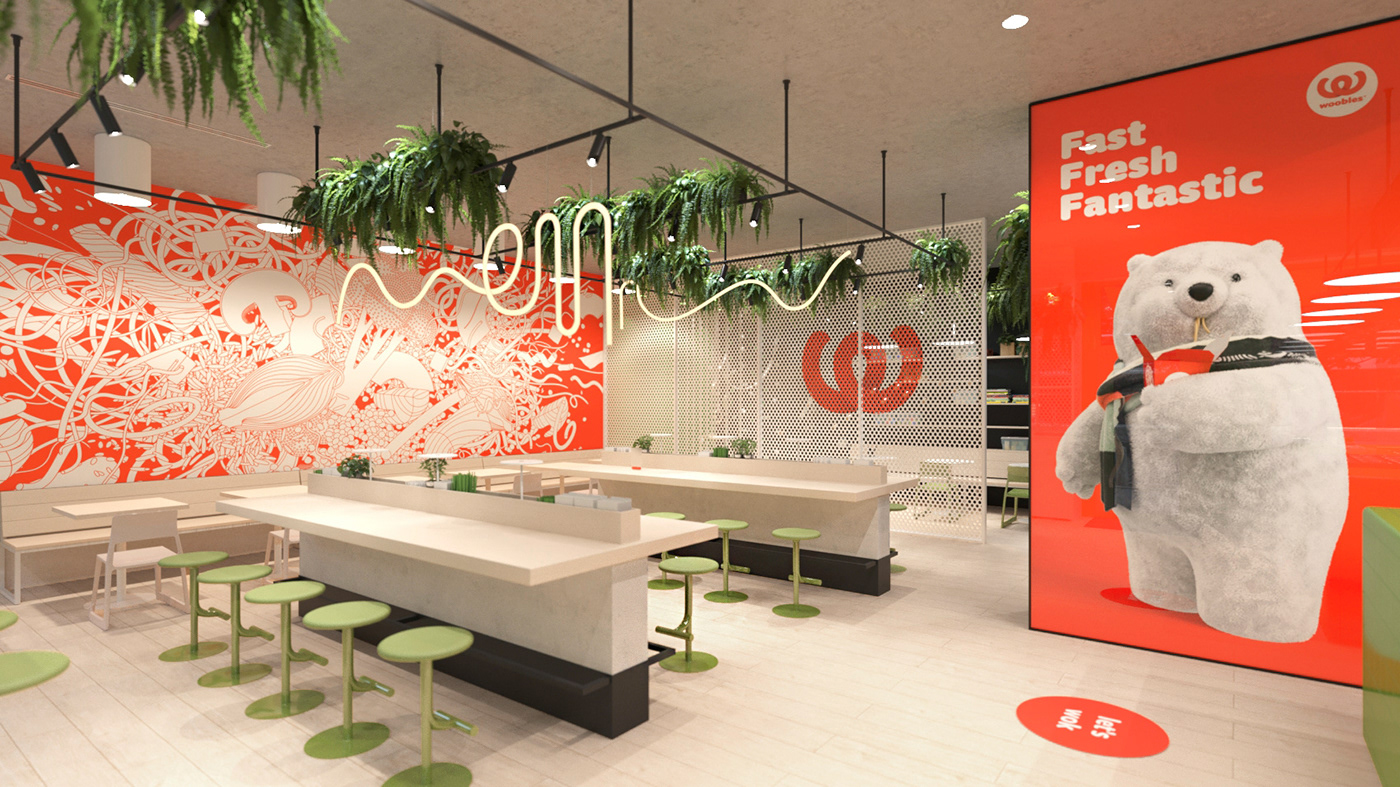


The noodle-type lists are used through the style as one of the visual gimmicks.


The set of customizable promotional window stickers, various signs, POS materials, and advertising layouts were developed to cover any franchise location’s most common needs.
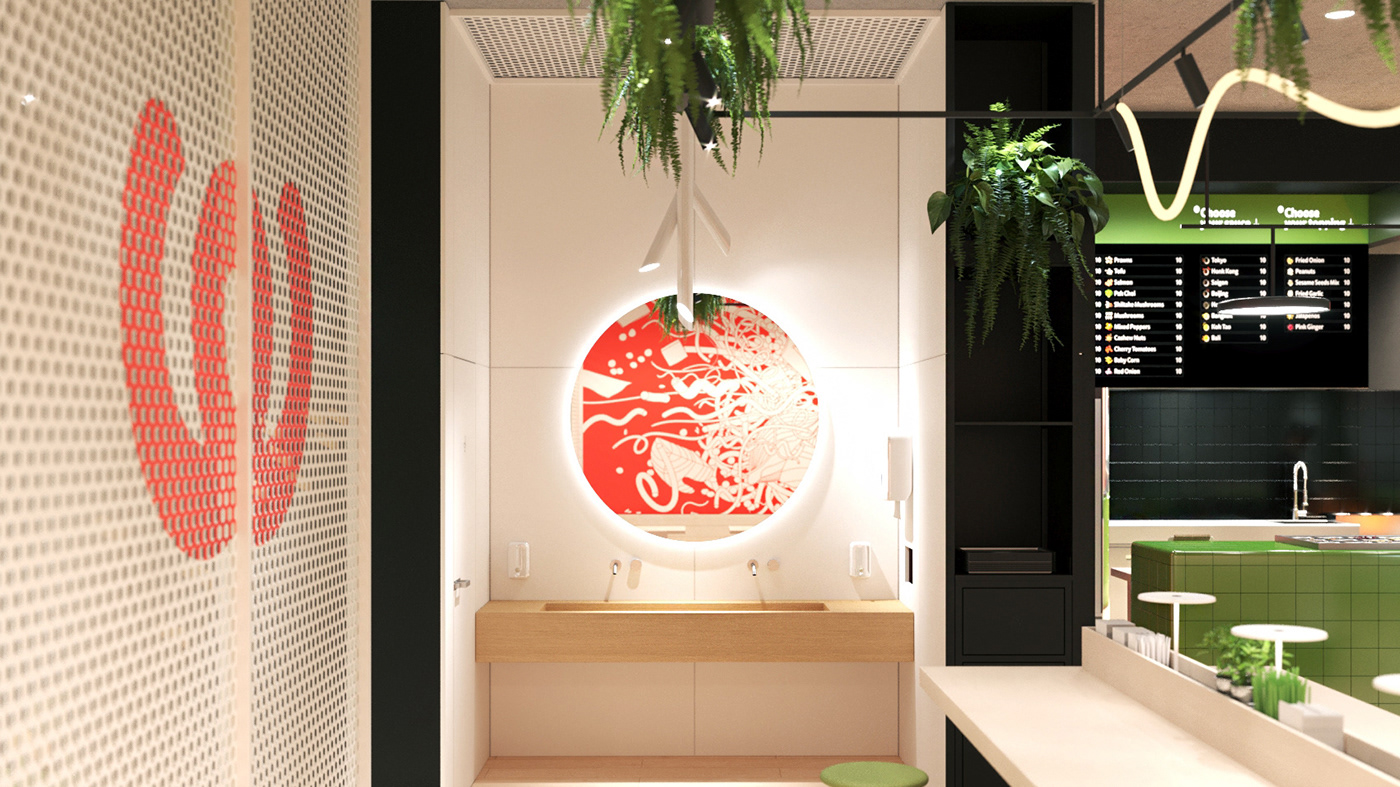
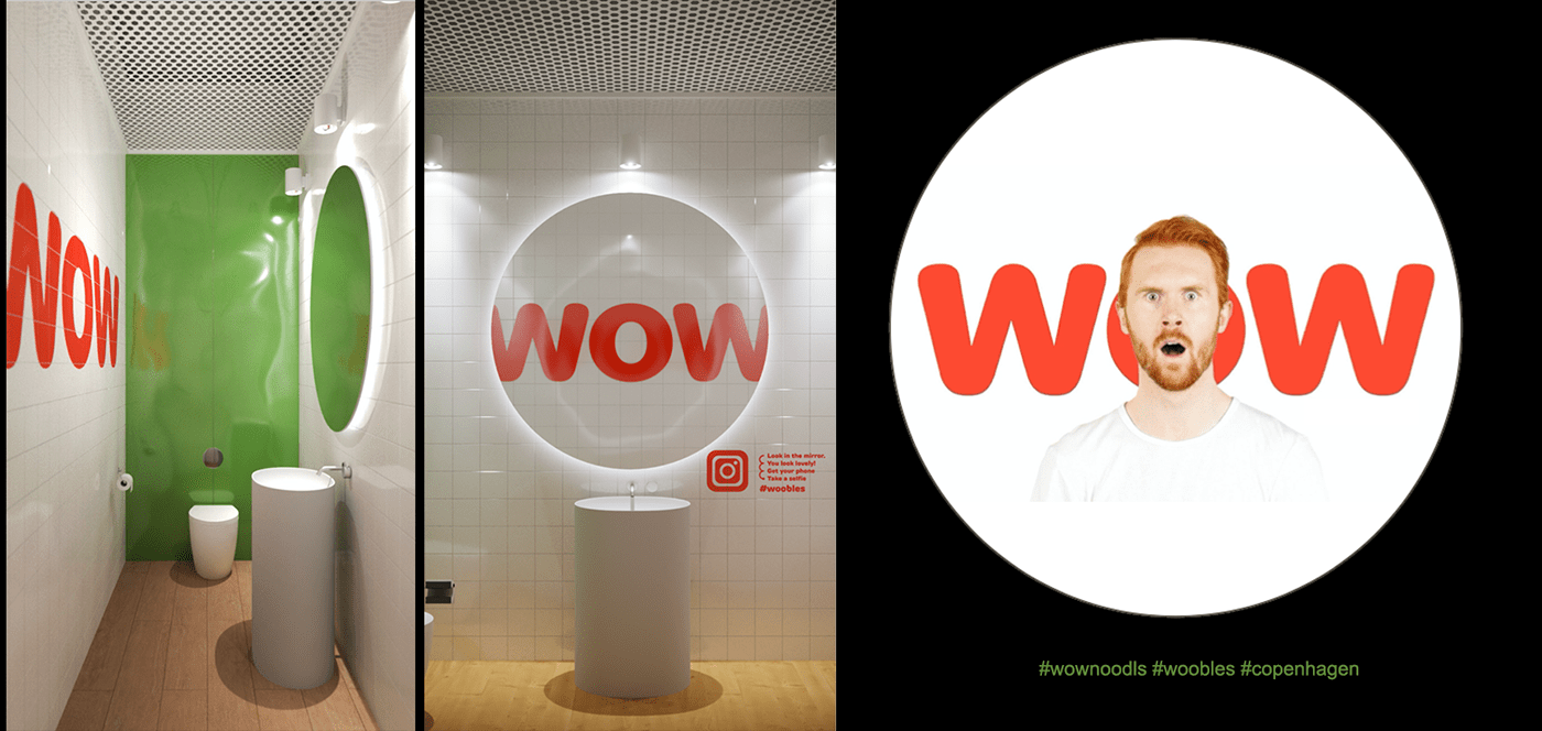
Sticker gimmick for selfie lovers
There is not much needed to encourage visitors to take wow-noodle-style selfies! Just one mirror and a big WOW sticker. Simple and catchy.
Services Provided
Concept and Brand Strategy
Naming
Taglines and copywriting
Logo and brand identity
Packaging design
POS materials design
Character design
2D and 3D animation
Interior design
Exterior design
Materials Sourcing
Restaurant Identity (RI™)
Credits:
Creative Directors – Boris Alexandrov & Anna Alexandrova
Project Manager – Daria Svidchenko
Branding
Graphic Designers – Pose Radu, Alexander Osipenko
Copywriter – Dimitry Panasiuk
Motion Design – Sergey Makuhovskiy, Server Terlekchi
Architecture / Interior Design
Interior design – Alexander Gusarev, Elena Guryeva
3D Artists – Alexander Gusarev, Abdul Garunov, Plamen Zhuzhunov, Irina Shtremel


