zona certa
Logo redesign and Identity
Zona Certa is a company operating in the buy-to-rent market aiming to improve the offer of rental. They bring solid knowledge and a broad experience in the market and have a confident long-term strategic view.
With over 20 years in the field, Zona Certa didn't want to break ties with their existing logo but needed a fresh approach. As the market grows bigger Zona Certa needed a visual identity to keep up with their solid stance.
The Redesign approach
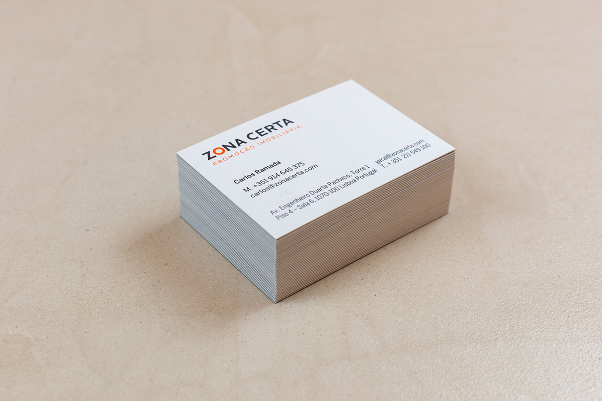
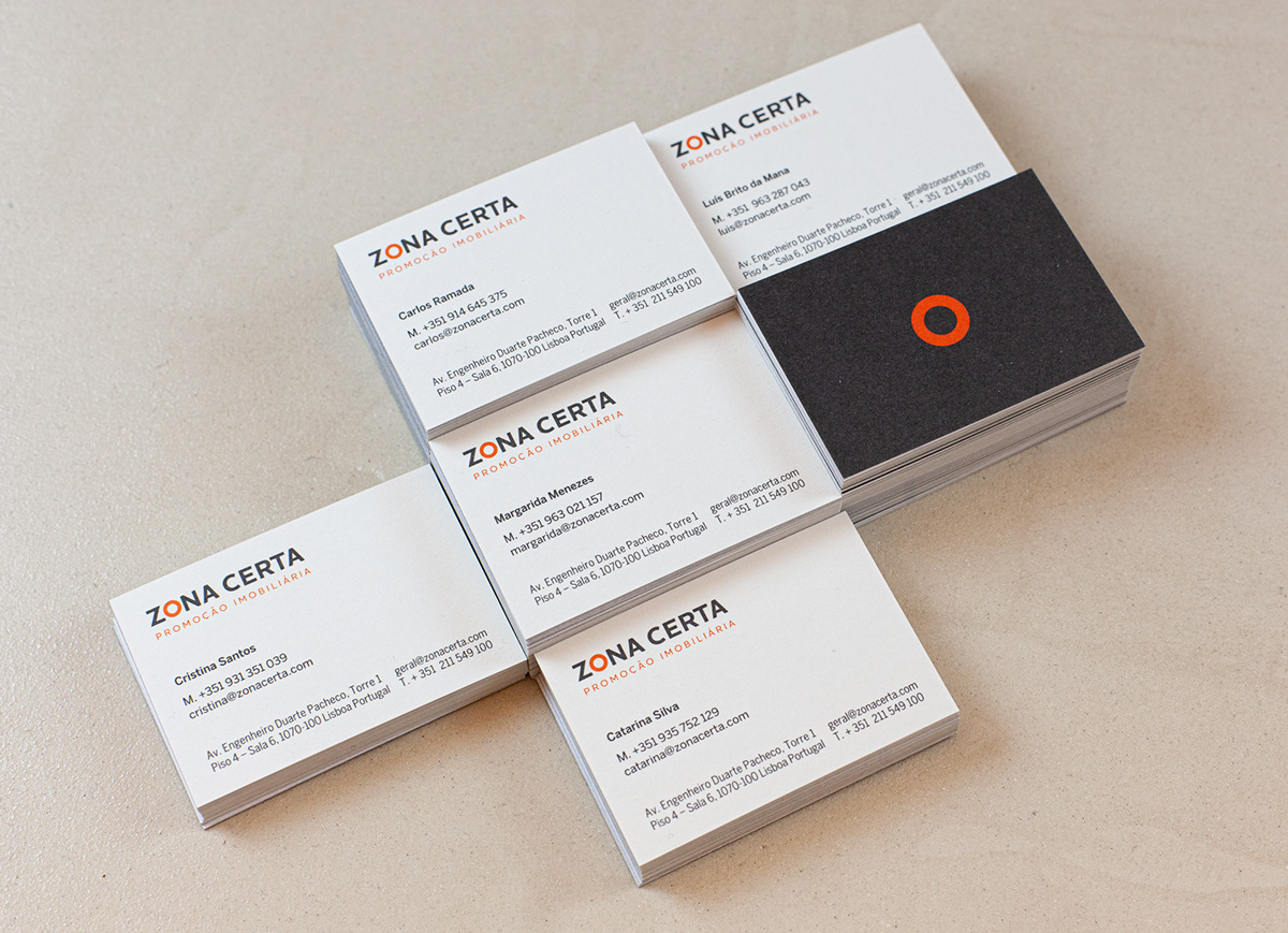
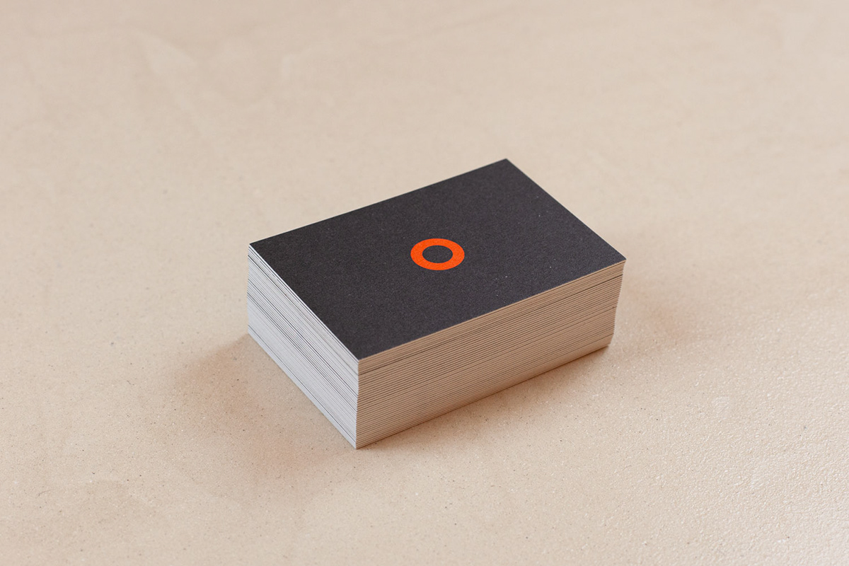
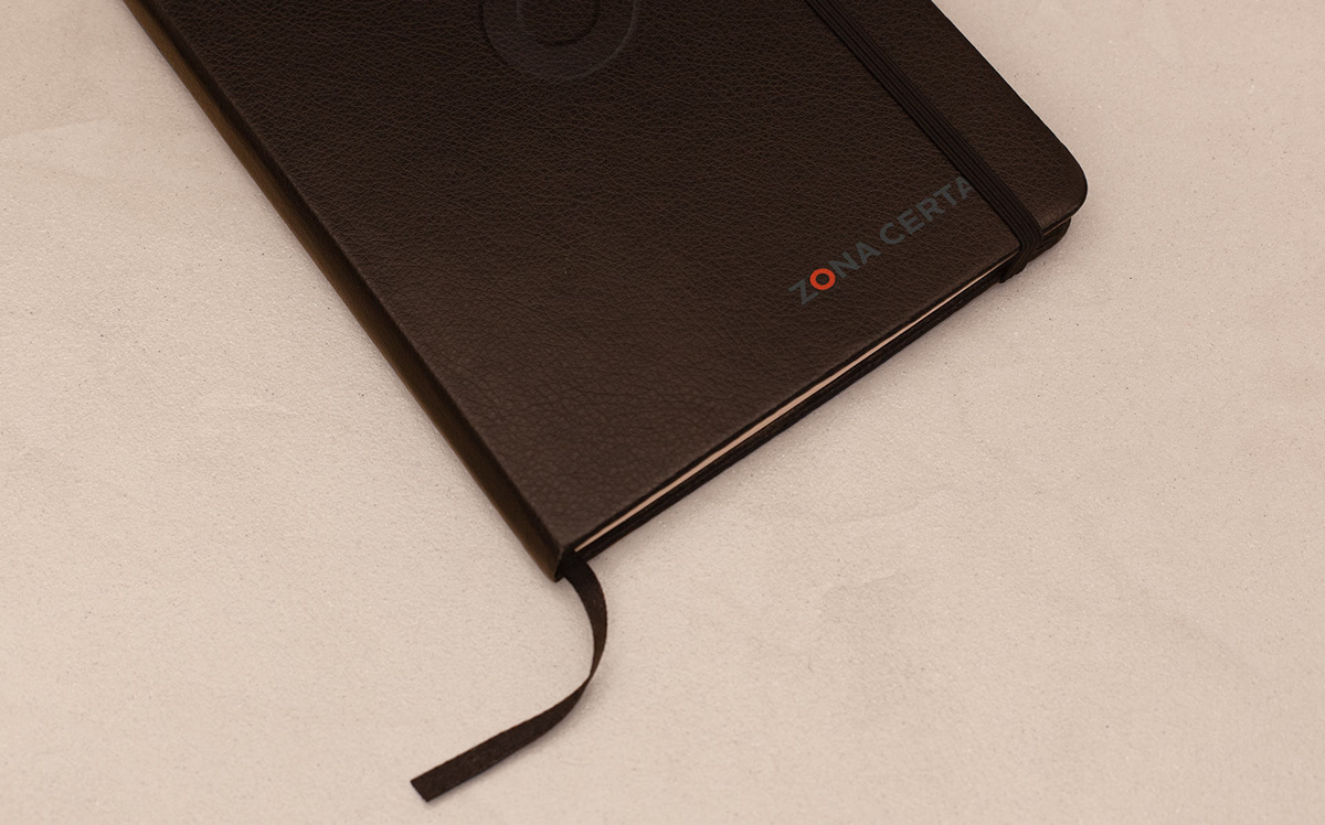
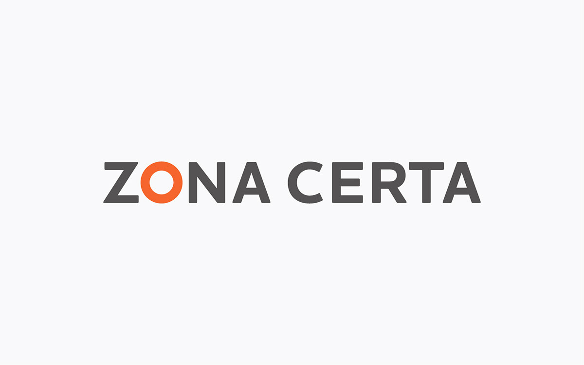
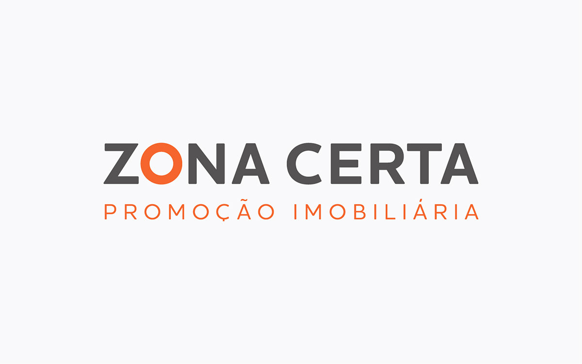
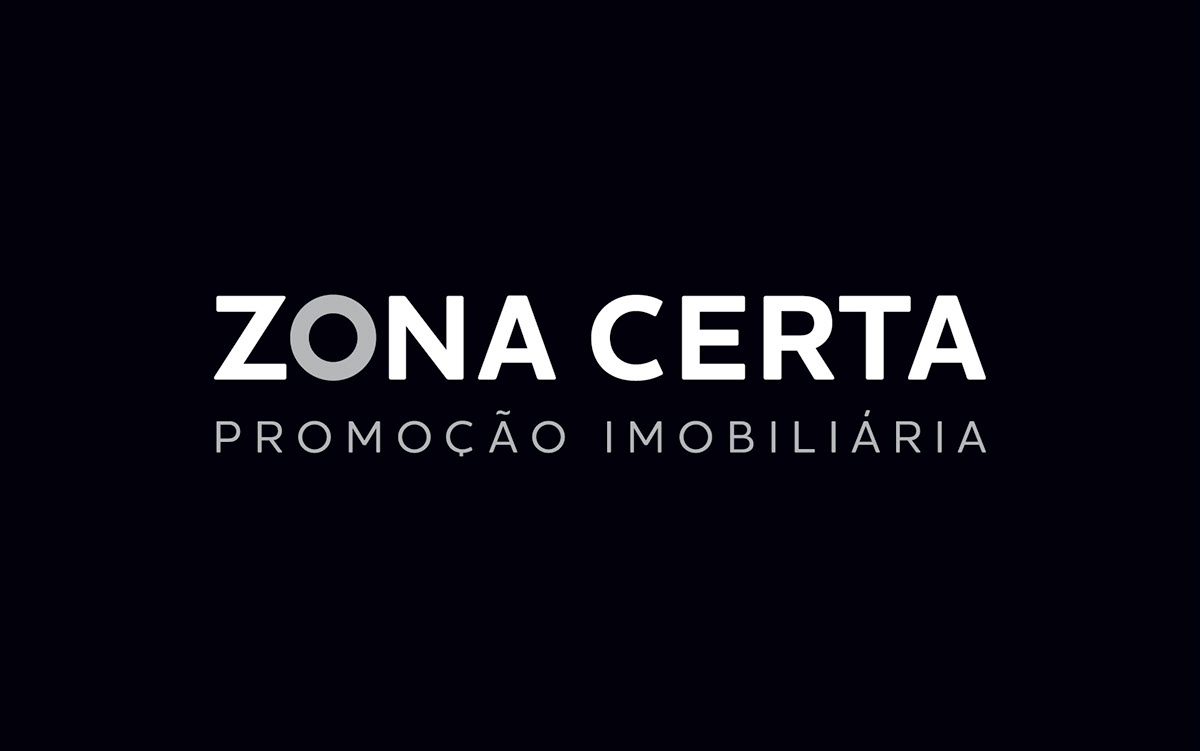
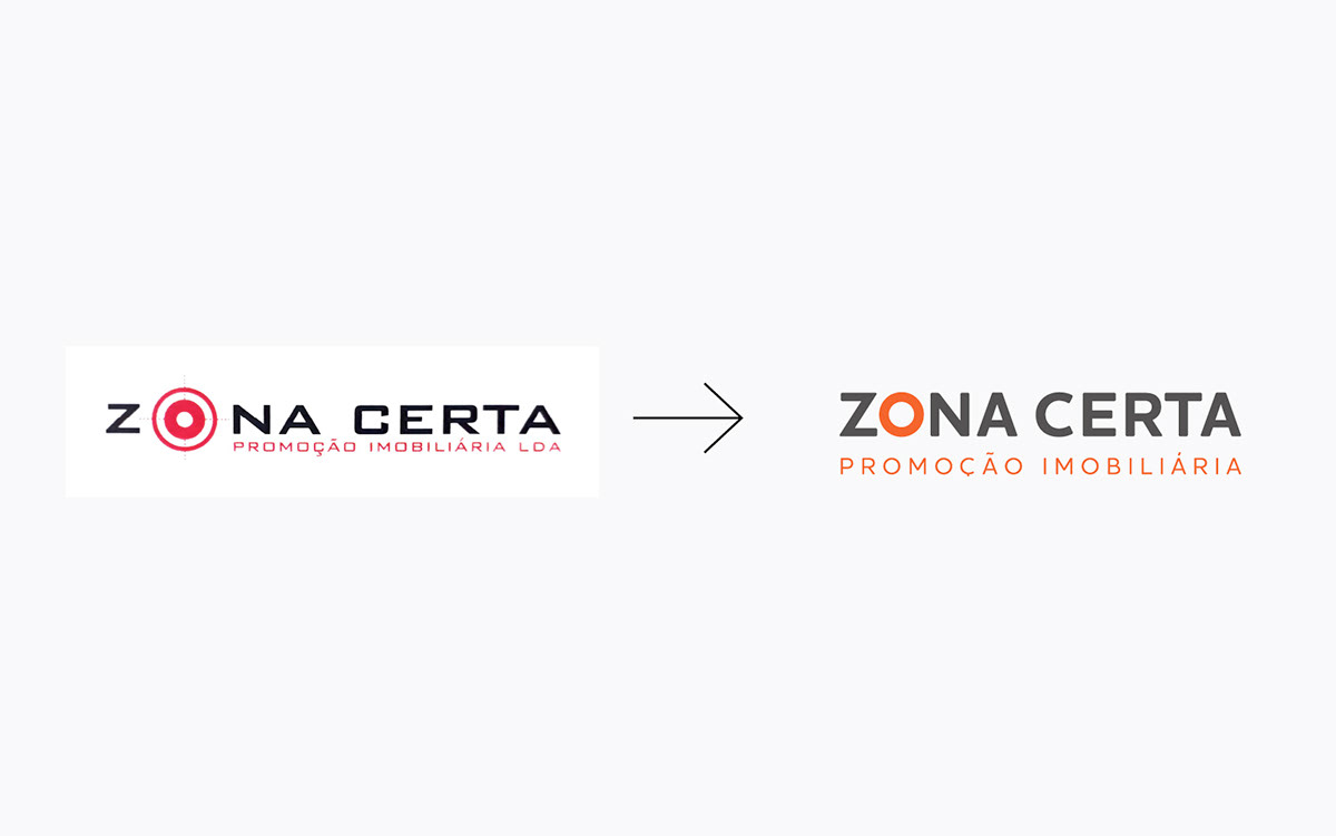
In order to make the logo overall more coherent, while the focus remained on the letter "O" (previously a crosshair target) which has the shape of a perfect circle, on the new logo mark it symbolizes a "spot" such as on a map, emphasizing the strategic location of their properties.
This shape was the starting point for the choice of typography which also aims to give the logotype a sense of openness; the bold weight of the typography gives it strength and solidity while the choice of a non-serif typeface "underlines" notions of transparency, straightforwardness. The choice of colour — a dynamic one and a sober one — aims to give the logo a more contemporary look and helps it to stands out.