Czech Medical Rescue Service (ZZS)
logo & visual style basics proposal
logo & visual style basics proposal

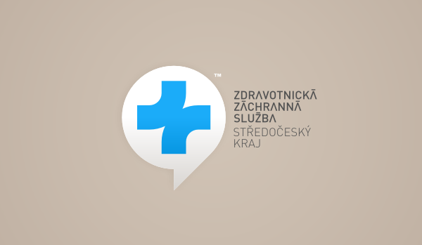
This design was created as logo proposal ordered directly by Czech Ministry of Health. Assignment was to come up wih completely new symbol for Medical Rescue Service of Czech Republic (the ambulances, basically). I'm intentionally using word "symbol" rather then "logo", because this was about something that will become generally known and understood, something extremely simple and recognizable at the same time.
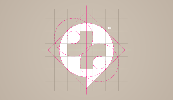
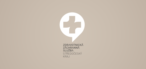
What I came up is basically a re-interpretation of the typical medical cross, this time, however, created by two lines, roads. The point where they meet symbolize the moment when patient needs rescue and meets the ambulance crew. Like two different lives and principles, usually going in completelly different directions, suddenly meets in moment of crisis. It also has connection to transportation, motion, the background symbol is about communication, phone call.
What I came up is basically a re-interpretation of the typical medical cross, this time, however, created by two lines, roads. The point where they meet symbolize the moment when patient needs rescue and meets the ambulance crew. Like two different lives and principles, usually going in completelly different directions, suddenly meets in moment of crisis. It also has connection to transportation, motion, the background symbol is about communication, phone call.


Various logo versions for the 13 districts of Czech Republic (with exception of Prague)

Pantone 299 C: the new color of Czech Ambulance cross.
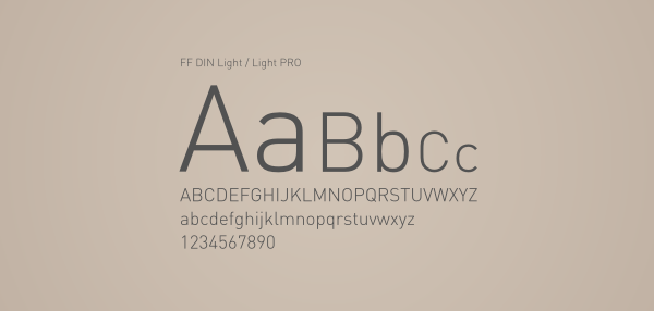
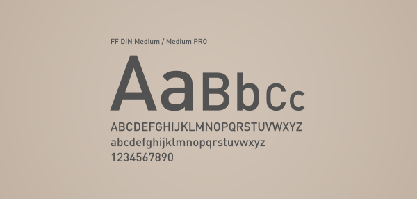
Proposed corporate typography
Alternative, vertical composition


Sign visualization


Pattern
Copyright: Jan Vranovský | FRVR™ | 2007 - 2011All rights reserved
For more, visit http://frvr.cz
For more, visit http://frvr.cz

