


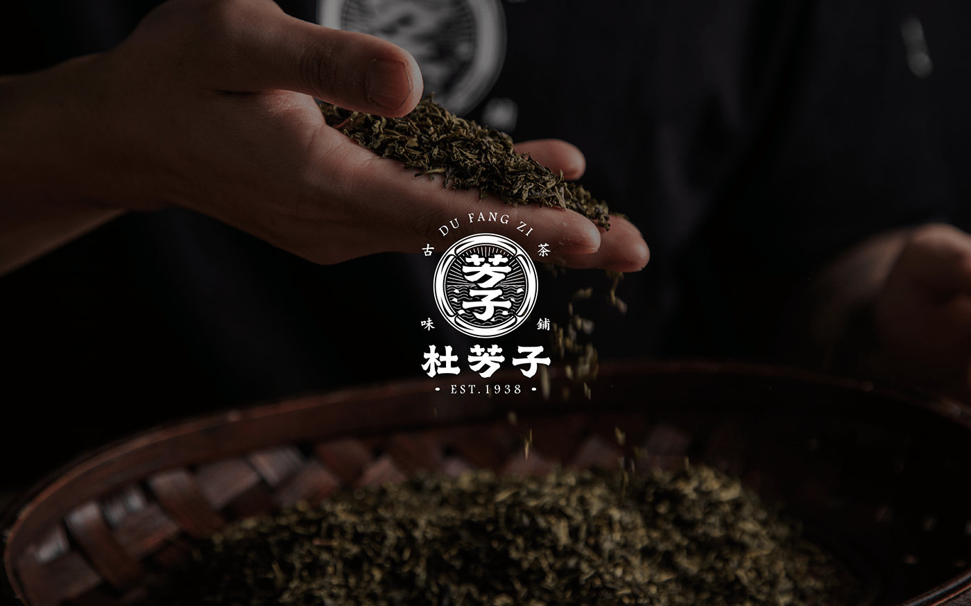
Du Fang Zi | Branding
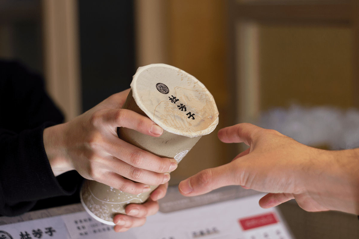
Du Fang Zi was named after the founder’s grandma in hopes of passing on her traditional tea-making process and the tastes of Taiwan.
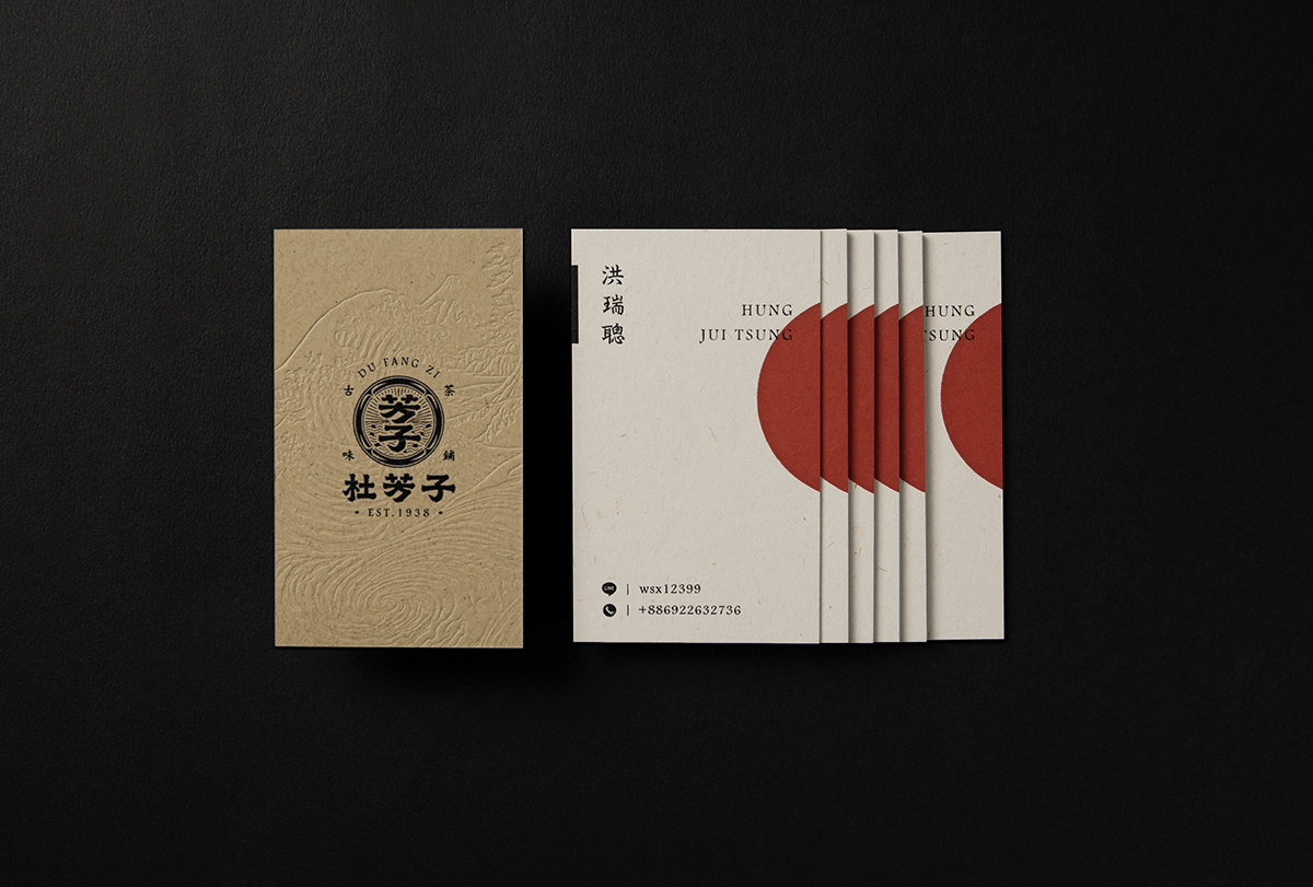
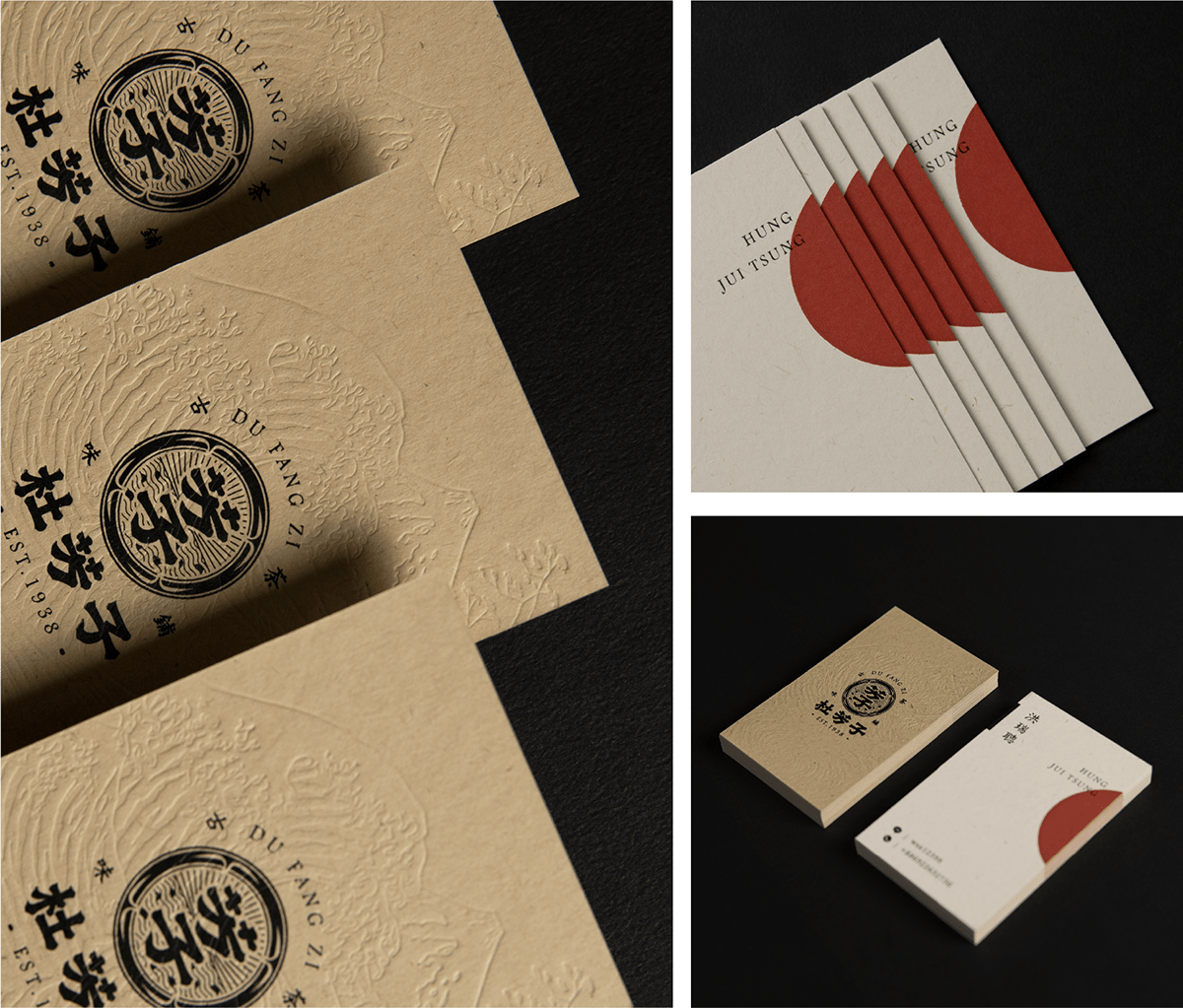
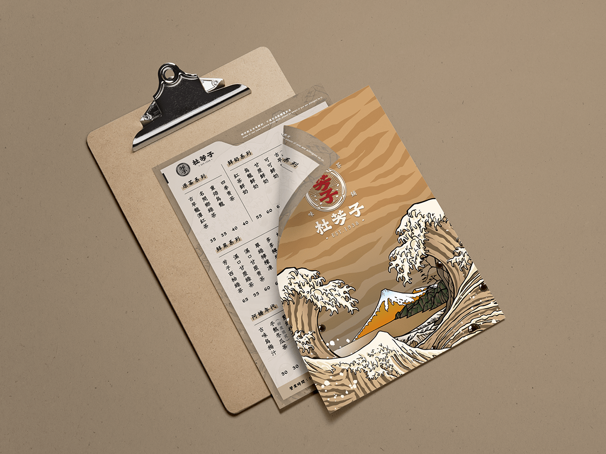
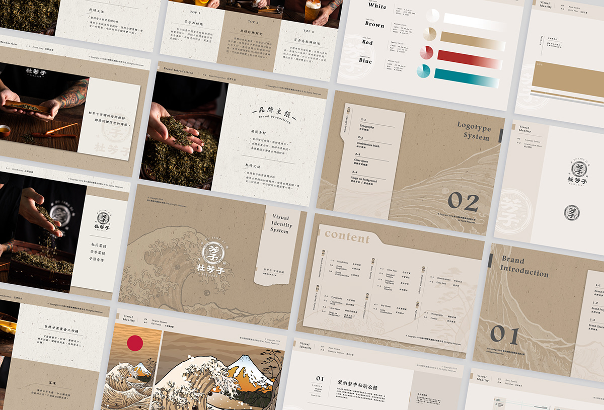
The brand identity references a traditional Taiwan and incorporates Ukiyo-e art into the key visual. Inspired by Katsushika Hokusai’s The Great Wave, the key visual includes bubble tea waves, tea jello mountains, and grass jelly cliffs. Furthermore, Grandma Du’s zodiac sign, the tiger, is merged into the wave pattern. All the elements are combined into a food-scenery painting that is a symbol of grandma Du’s expertise.


Credits
Type | Branding
Year | 2019
Year | 2019
Client | Du Fang Zi
Production | Grandvity Visual Integration Co., Ltd.
Art Director | Noodlemaker
Production | Grandvity Visual Integration Co., Ltd.
Art Director | Noodlemaker
Project Manager | Grape Chiu
Logotype Designer | Noodle Wang
Visual System Designer | Jasmine Lin
Logotype Designer | Noodle Wang
Visual System Designer | Jasmine Lin
Illustrator | Aige
Situational Photography | 東東美食攝影工作室
Business Card Photographer | Si Jia Sun / Winway
Interior Photographer | Si Jia Sun / Kaizer
Situational Photography | 東東美食攝影工作室
Business Card Photographer | Si Jia Sun / Winway
Interior Photographer | Si Jia Sun / Kaizer
Interior Design | HB Design


