Internet. Business. Chaos.
Consulting Lead Designer•2019
I was a part of team FOLO that was hired by The Morning Context to design a platform worthy of showcasing their unique approach to reporting. In other words, we had to create the canvas on which they would tell their "ambitious, timely, deeply researched and well-written stories".
Beginning with three words: 'The Morning Context', The stories were to be fit in 3 broad categories as a constraint: Internet, Business and Chaos. A design constraint laid upon us was that the visual design had to be minimal.
Base Styling
The Colour System
Since the journalism was constrained to fall under 3 topics, and minimalism was the underlying philosophy, we decided to use create the brand with the help and use of colour.
For the 3 themes of Internet, Business and Chaos, we chose 3 core colours. Alongside, we chose a deep blue to present the typed elements as well as backgrounds in the UI.

Orange, Green and Purple represented Internet, Business and Chaos
Orange, as a warm colour was used to represent the internet.
Green for Business is a no-brainer, a simple association.
Purple is complementary to Orange and we chose it for Chaos.
Brand Logo Type
Matteo
We chose Matteo as the signature brand typeface for its geometric, bold and sharp form, and that it fit perfectly in the minimalist thought.

Everything put together
The TMC identity mark
The 3 elements of TMC's reporting inspired us, in the spirit of minimalism, to combine the 3 colours chosen, with the form of the sun, to create an abstract composition, which became the TMC identity.
The reader of TMC will wake up and get their morning emailer from TMC, to read the story of that day, as the sun rises. This is what gave us the idea of using the Sun as the defining element for the TMC identity.

Identity variants for TMC, with the Sun as the key element
Primary Typography
Representing the Stories
Manorama, Ray One and Ray Three was used to visually present the title of stories for Internet, Business and Chaos. The key elements of these typefaces which we felt matched our requirement were zaniness, a sense of connectivity in the form and a bold form that imparted a unique identity to TMC.

The 3 categories of stories appear in 3 distinct yet similarly styled headlines, having the same basic construction grid

Secondary Typography
Representing the Stories
Passenger Sans, for its subtle contemporary grace and readability, was chosen as the story text font.
Some Stationery
Business Cards
We also created business cards for the team members, bringing in more play into the use of space, this time for print.

Business cards for the team members
Web Design
Minimalism & use of space
Keeping with the idea of minimalism in-view for the design of the site pages, we used a 2-column layout for the main content and complementary content.
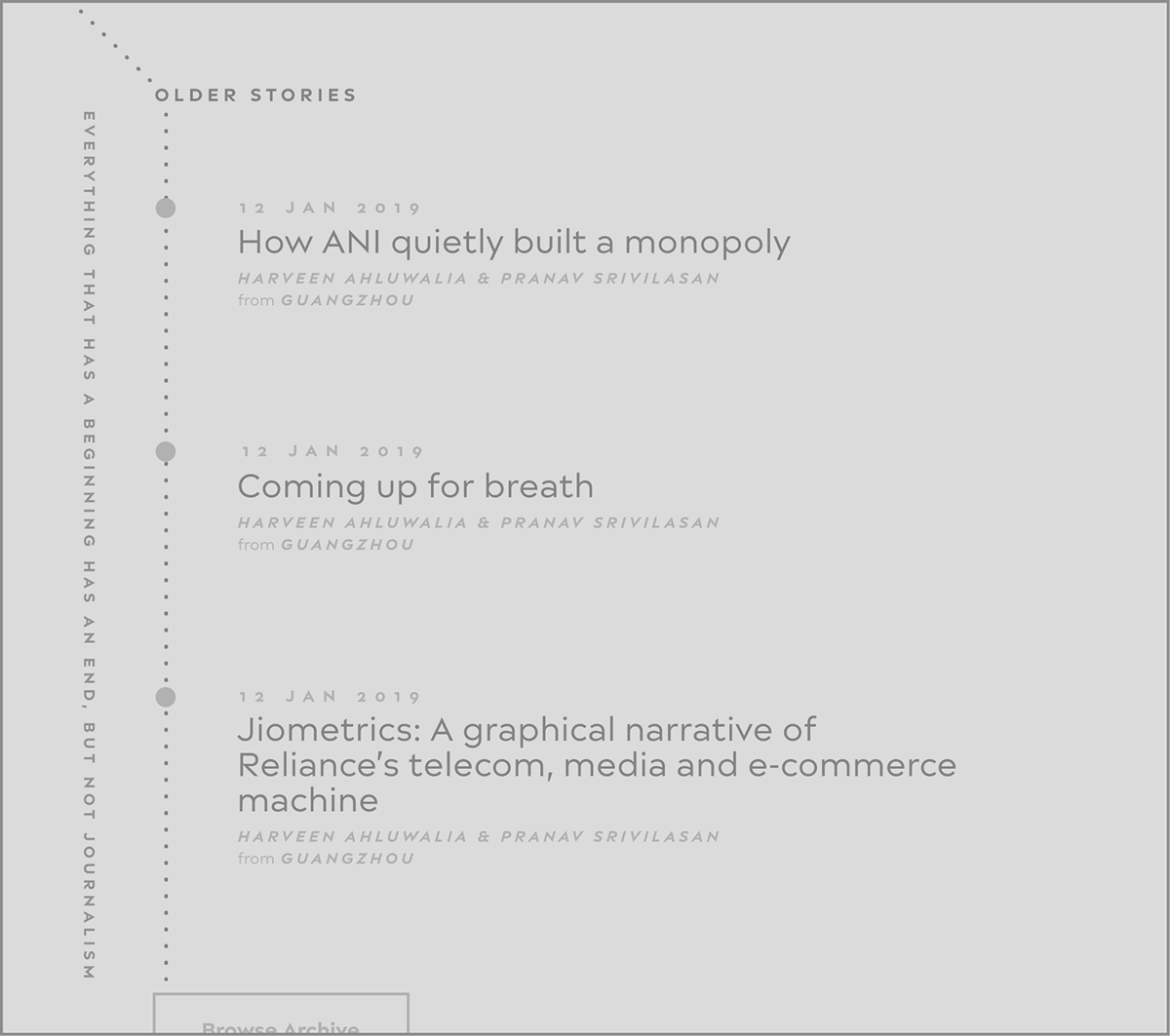
Further, we played with the space and brought in aberrant layout elements which signified 'breaking' the flow to show older stories.

Landing page for the journal
Nuancing the experience
The Elements of Writing
Elements of writing , some specific to TMC, were identified and were visually enhanced in the presentation of the content.
One of the elements was based on the fact that TMC's method of publishing was to be one story a day. Hence we chose to represent a 'timeline' with markers of stories about internet, business and chaos.

Internet, Business & Chaos on a timeline
(left) Stories in the 3 categories, published everyday would be 'marked' on the TMC timeline with the corresponding colour.
Apart from the timeline marker, the date and the location follows the theme colour too.
Bending timeline
The timeline took a turn when the reader would, while scrolling, switch from this week's stories to older stories.

Typography as the key element on mobile
Keeping with the minimalist idea, the mobile version of the site was adapted in a way as to let the typography express the brand

The story page
Dark Mode for Easier Reading
Since this is longform, and of course readers spend time reading, we created a dark mode option in the story reading screen.

The story page in dark mode
Bold & Simple Search
The Search is not just a means to type and search based on a text string, but is also a means to navigate into the main categories of the site.

The search page
Monochromatic Theme Presentation
The stories in a single theme are presented in the colour scheme designated to the theme.

A specific category page, shown above is Chaos

An Archive section which will host content from the past

A page displaying all the writers who write for TMC

A reader's dashboard to manage subscription and profile information
Do checkout the brilliant stories on The Morning Context


