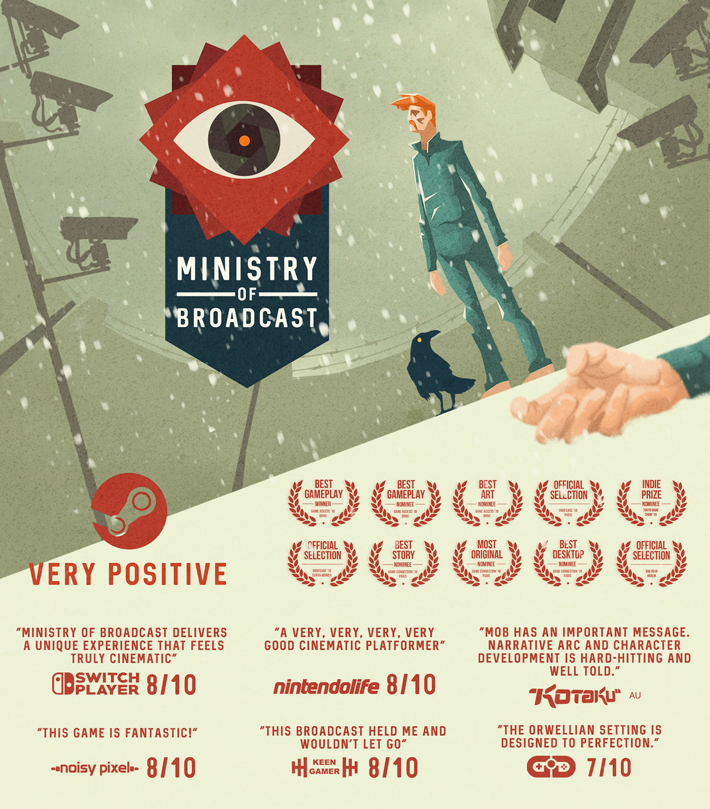
Fuchs+Dachs studio made this game in cooperation with Twin Petes studio. Together we formed a Ministry Of Broadcast studios.
Fuchs+Dachs was working on the creative and art direction, illustration, ui/ux, game design, story,
script and animations.

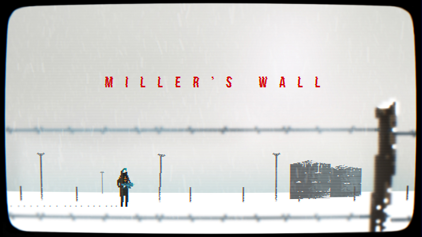
Early concepts for Ministry Of Broadcast were Arena based shooter called "Miller's Wall". We were also testing layouts with visible sides of the platforms. Along the way, as we were brainstorming, the game changed its shape and became the cinematic platformer. We have realised that we have a lot of story to tell and instead of using guns all the time, our protagonist lost its gun and shoes.
Our main goal shifted into narrative direction and we were trying to change all the aspects of the game to fit its story. Each game design decision was influenced by the story concept. Even the character movements and the gameplay.



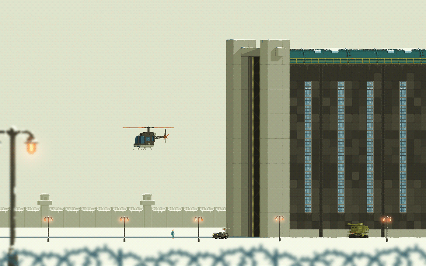
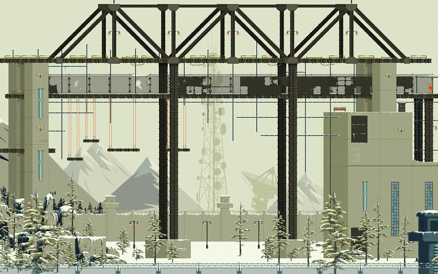
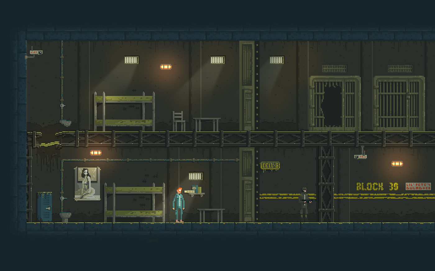
We have intentionally decided to have only 6 primary colours in the world of Ministry of Broadcast, using only their darker or lighter shades to make variations to the assets created.
This had brought a lot of complications during our progress and creations of the new assets, but it also made levels of the game highly readable and clean.
Even though we have endured a lot of pain with this limitation, we are really proud to have achieved a super-tight and clear creative direction of the whole game.
We spent a lot of time searching for the perfect colour palette to match our story and the whole Ministry of Broadcast Regime propaganda. Finally, we remembered beautiful vintage posters that used to promote holiday activities in Alps during the 1960's.
This was a perfect match for us to combine with the rest of the Art inspiration which we specifically drew from Russian & Czech Avantgarde architectural masterpieces with a pinch of Bauhaus and Brutalism.
Our goal was to create unique totalitarian regime without classic red nazi flags and symbols. We wanted to create a regime which invested some time into research, marketing and pr. They wanted to seem approachable - communist regime with capitalistic ideas.


Because the initial game idea was arena based shooter, we wanted to have a character with strong personality and a weapon. Some sort of hero archetype, but with a small twist.
The more we were thinking, the idea about cinematic platformer became dominant and a design idea to have a weak character stripped down of his own personality was something we were after. We wanted to have each contestant dressed in the same suit, something in between prisoners and athletes. That means that his head design was the only thing standing out from the other contestants. Achieving that was a challenge since the head of the character contains only 28 pixels.


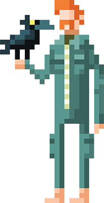
The main part of the character design was his split personality. We wanted to have part of his personality to be vocal. Everything he is trying not to show to the regime cameras, all his doubts, wishes, fears... In that moment the Crow was born and the main character was complete.


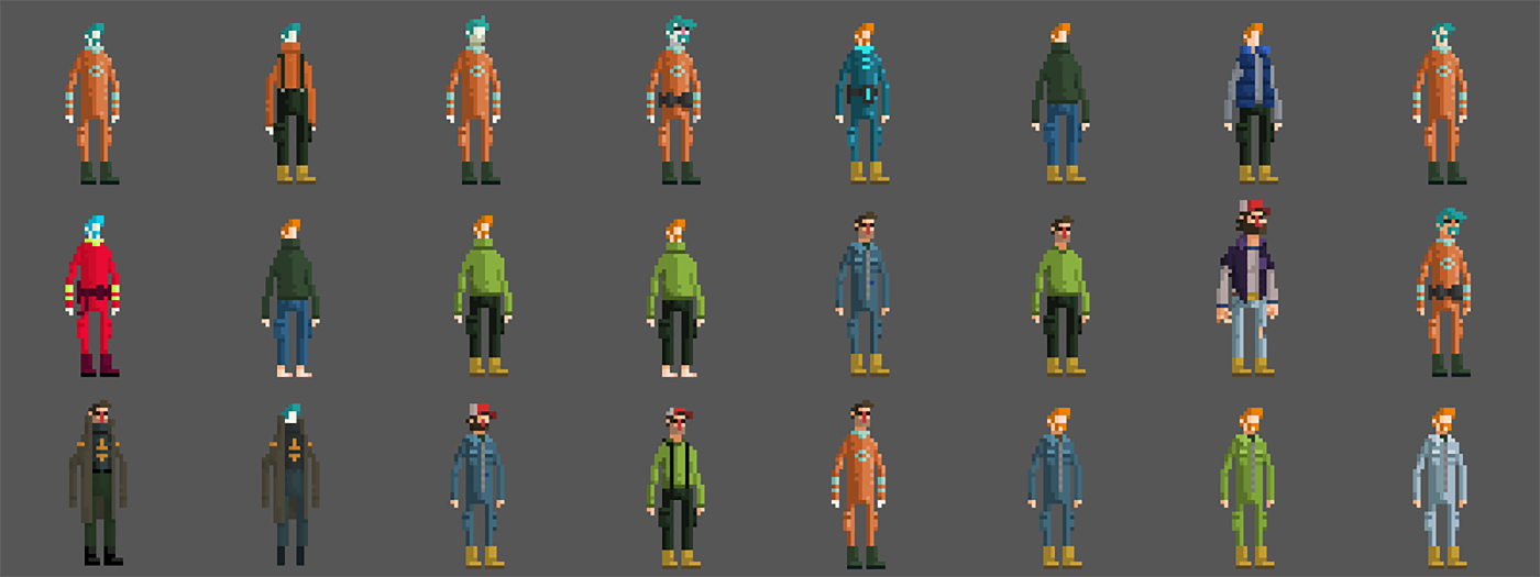
Other characters are contestants in the roles of civilians and cops. Our goal was to create archetypes of the protestors and cops to be used during arenas while the civilians are in their role. Outside the arenas all the contestants wore the same jumpsuit, but we still wanted to have all those character recognisable, even in the civilian form.
Fun fact: Only time we used a color outside of our predefined color palette is the pink mask of the "pussy riot" civilian (bottom right one) and vanilla sky at the end of the dream sequence.


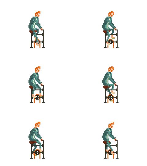
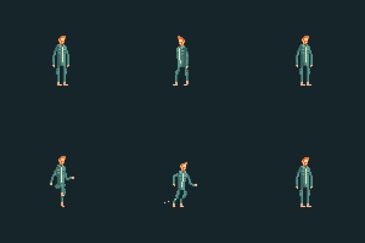
Since we had a simple character, we knew that the animation should be a key element to breathe in the personality into the very strict pixel art stylisation. Animation was the harders adventure for us since we never worked as animators and this project was our hot potato. It is possible to track progress of learning, first animations are simple with less frames, while the end animations are much more complex.
We have started with explorations - what is the smallest character we can do in the limited pixel art frame-by-frame animation and color palette. We wanted to have a clumsy regular man in the "hero" role, he slides on the ice, he is falling, he cannot hold himself long hanging from the edges and he dies a lot.
Ah yes, he dies a lot! From the start we knew that we will have many ways to die and we ended up with over 30 unique death animations.


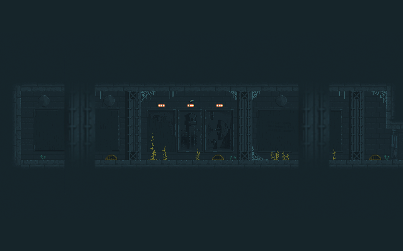
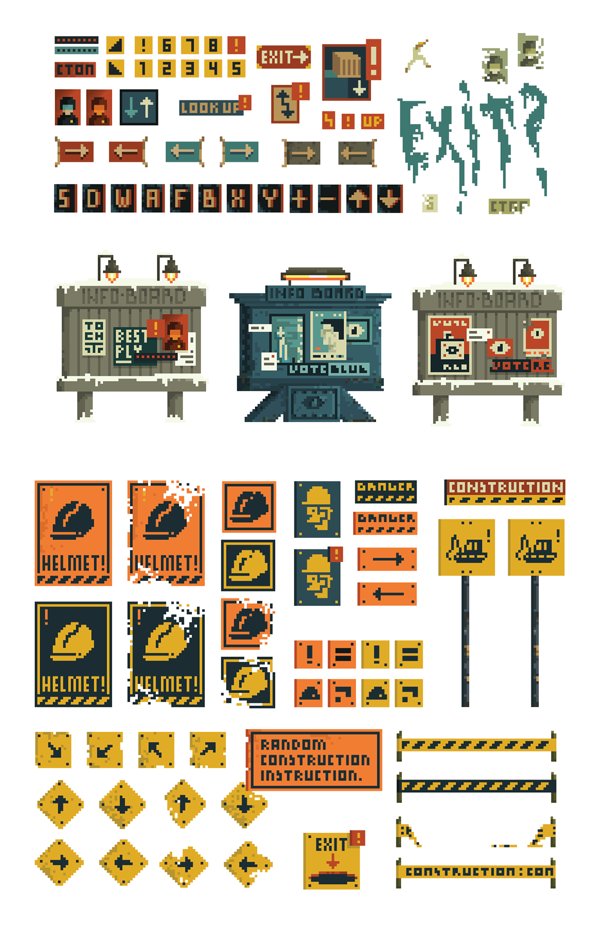
We were careful enough to pick the right colour combination in order to make space for the environment to tell the story. Fun fact here is that we have never ever (ever!) re-used an asset that you would not be able to find in such space. Every asset that we needed for a specific space we created from the scratch or pimped/dismantled an old one in order to fit the environment and a story. Another thing was that since our HUD was integrated as a part of the environment, it was a bit challenging when it comes to busier environments, and even here we would rather sit and work some more in order to achieve the best sign language readability.


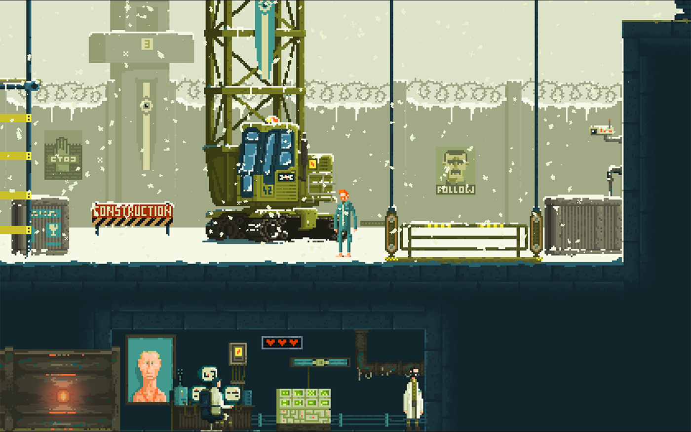
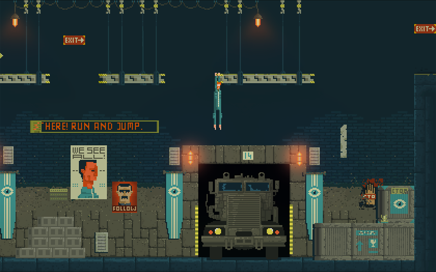
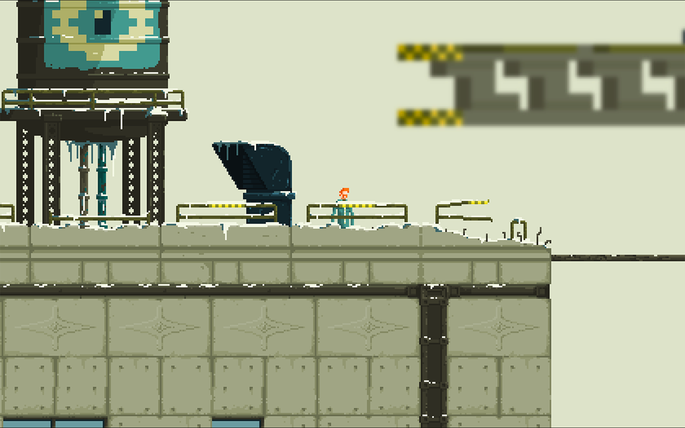


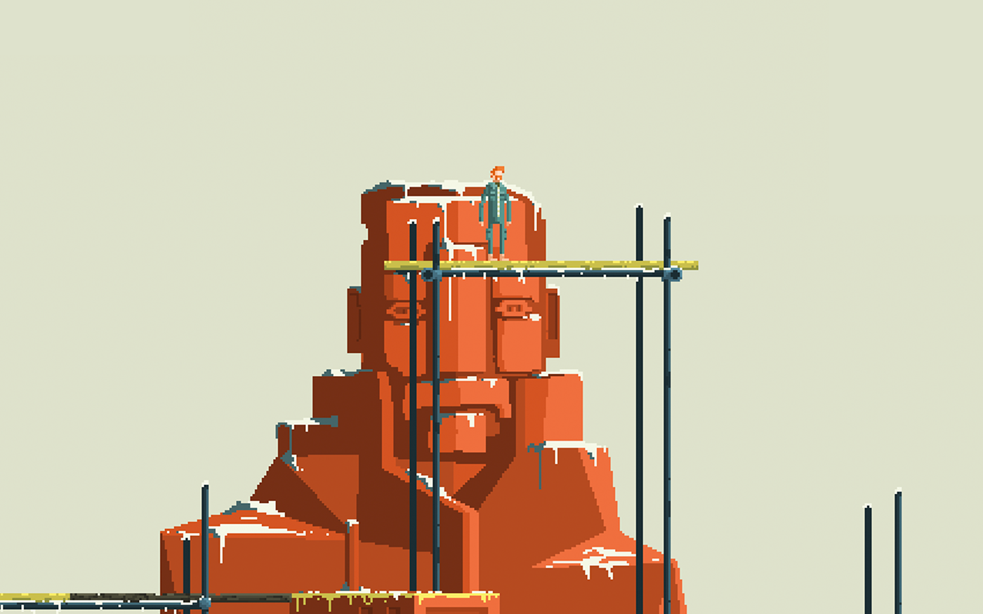

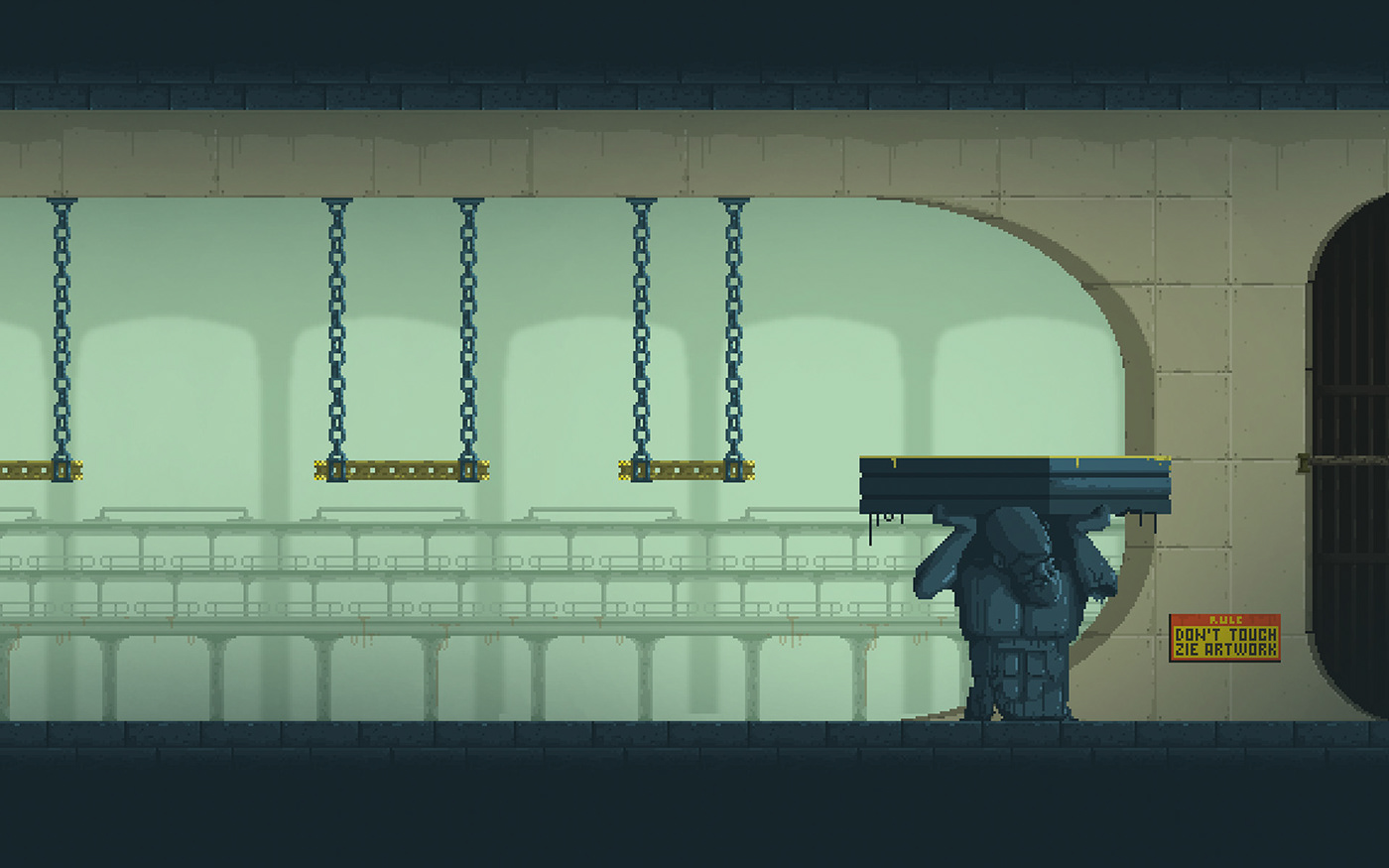
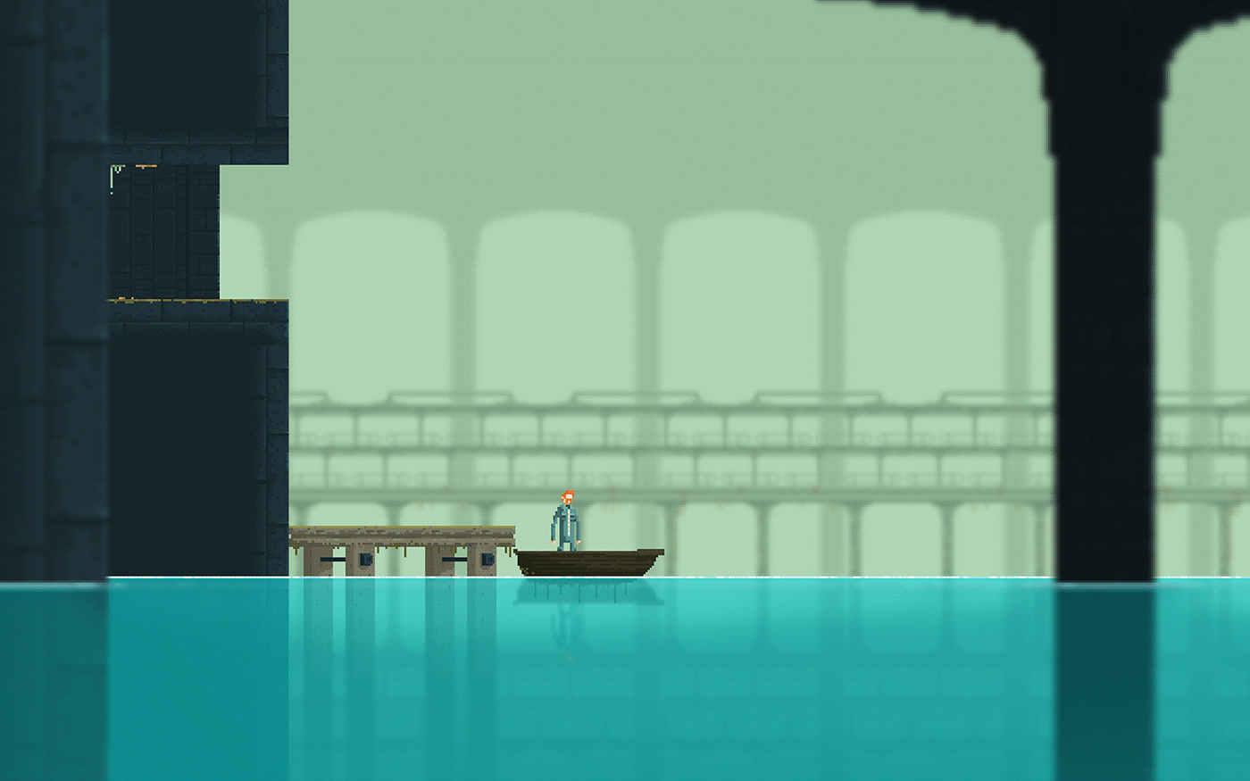
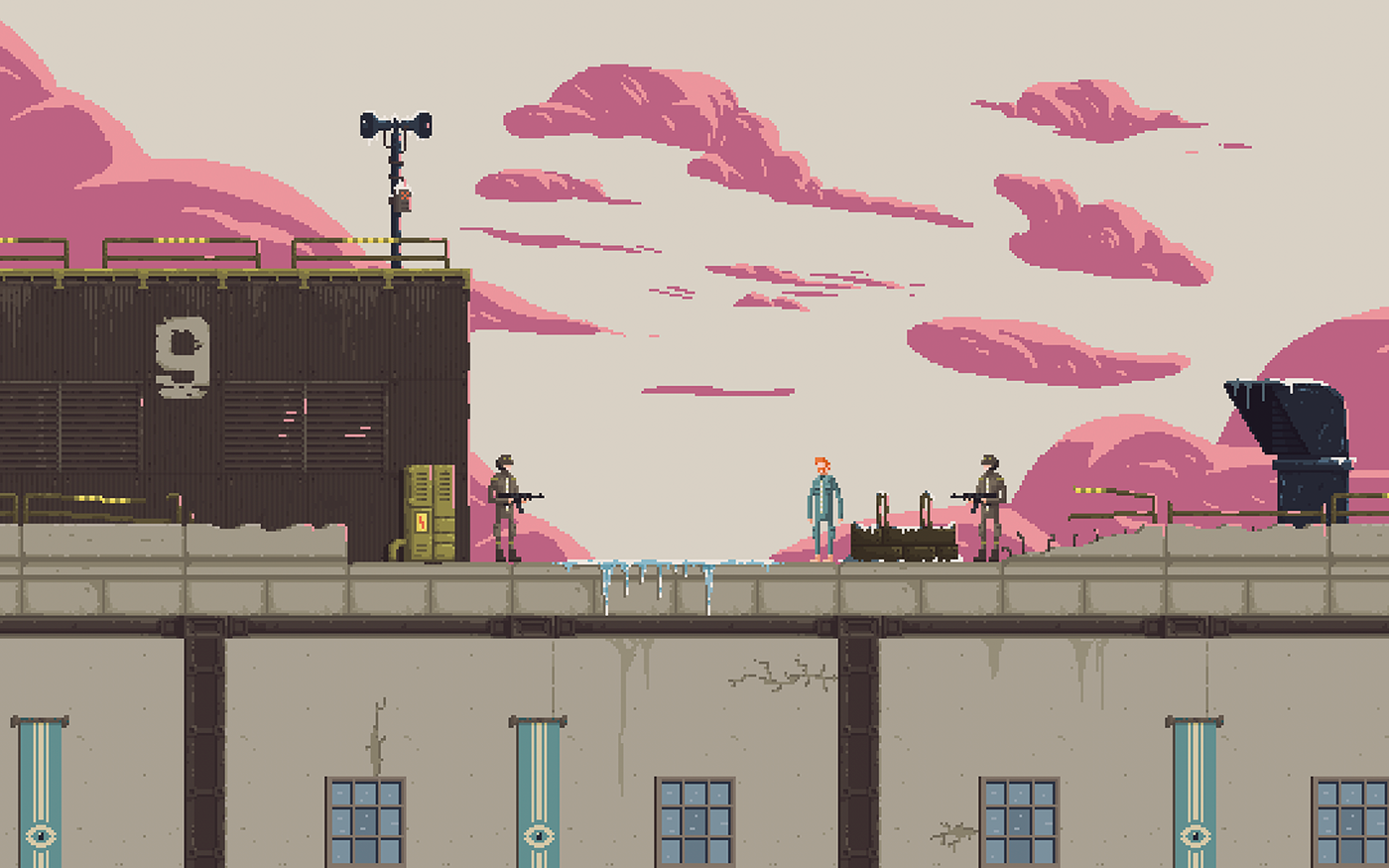
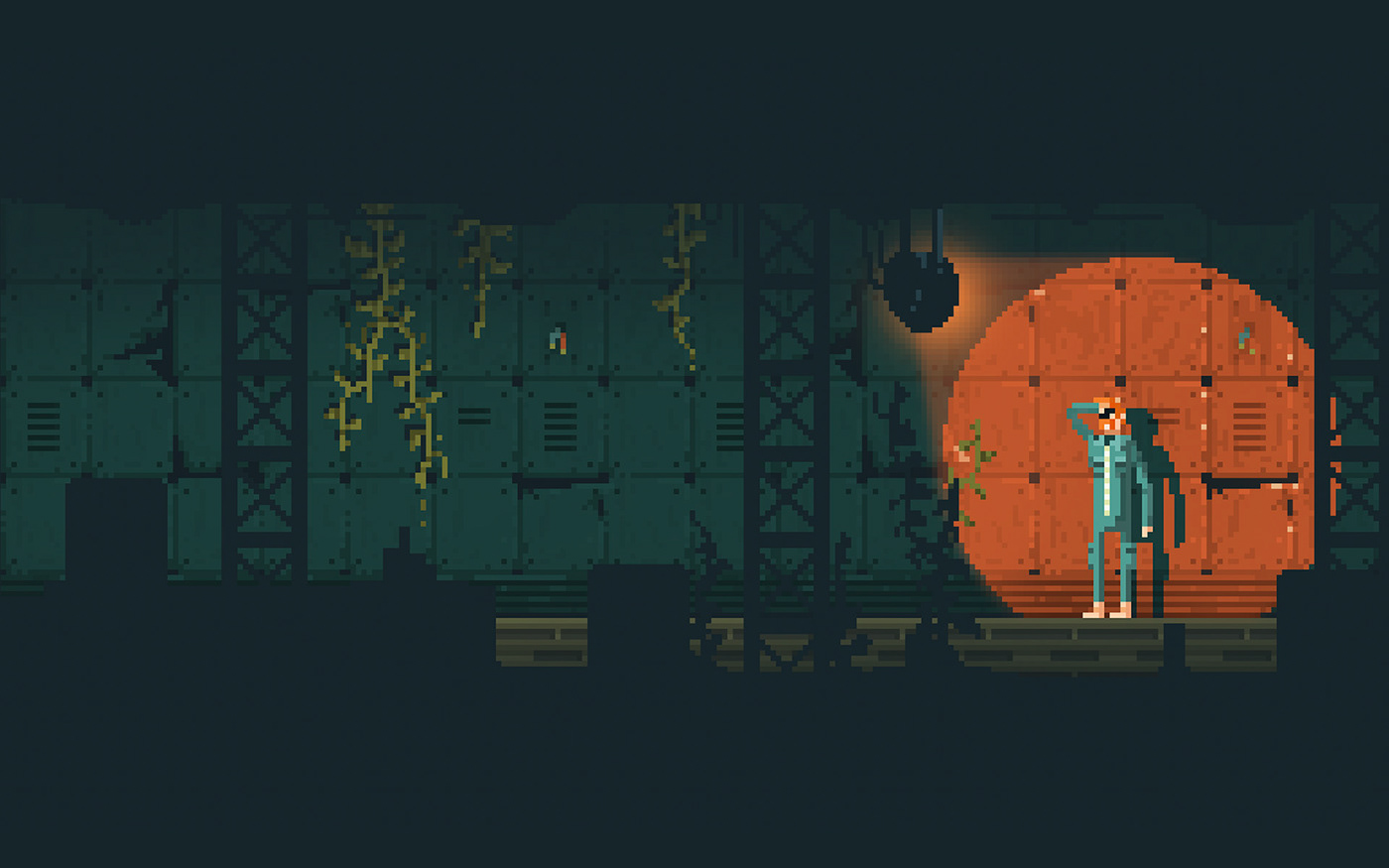
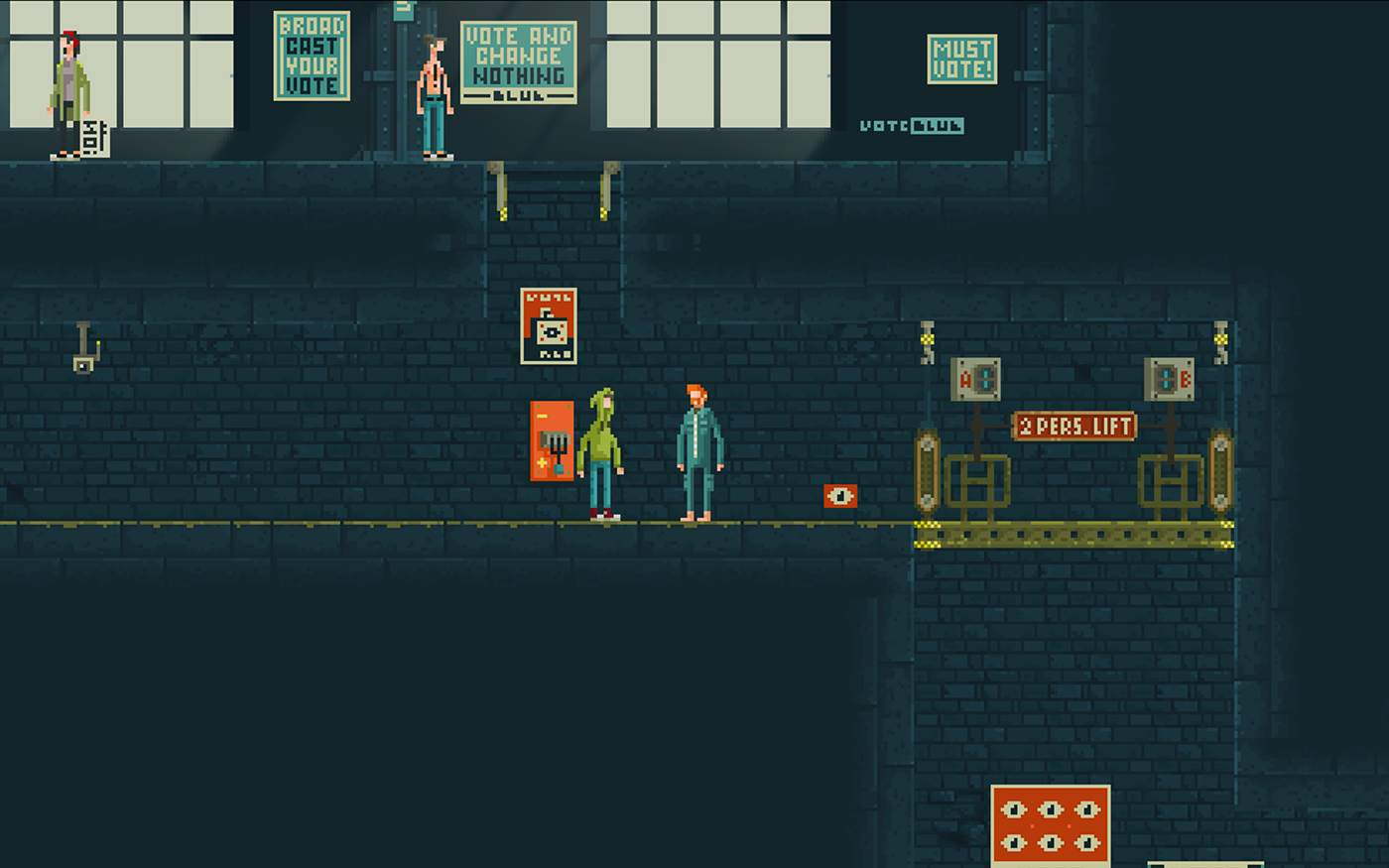
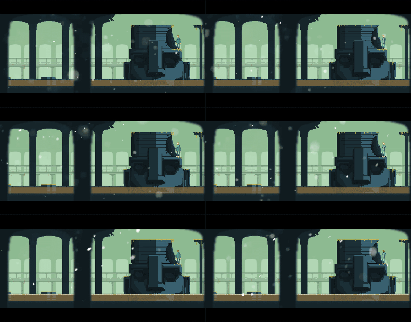


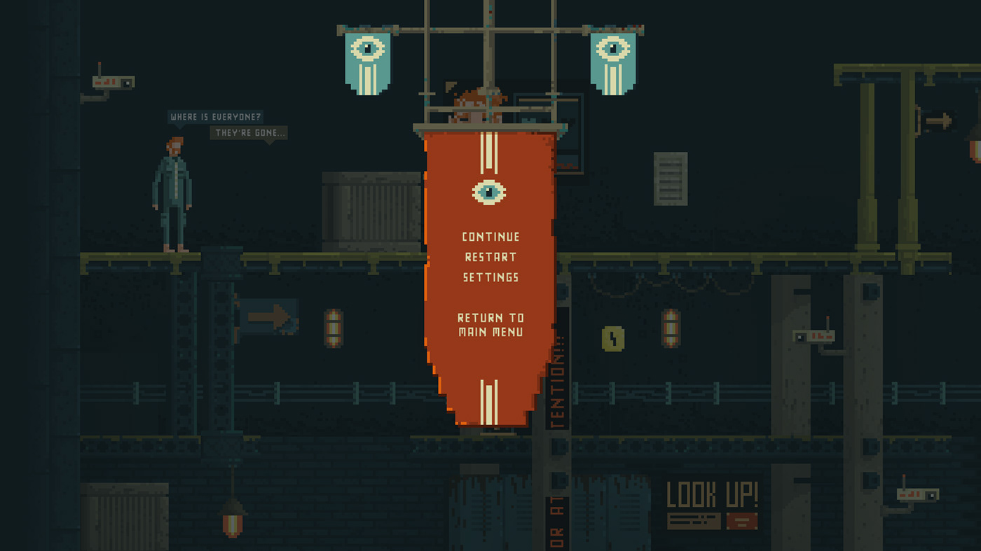
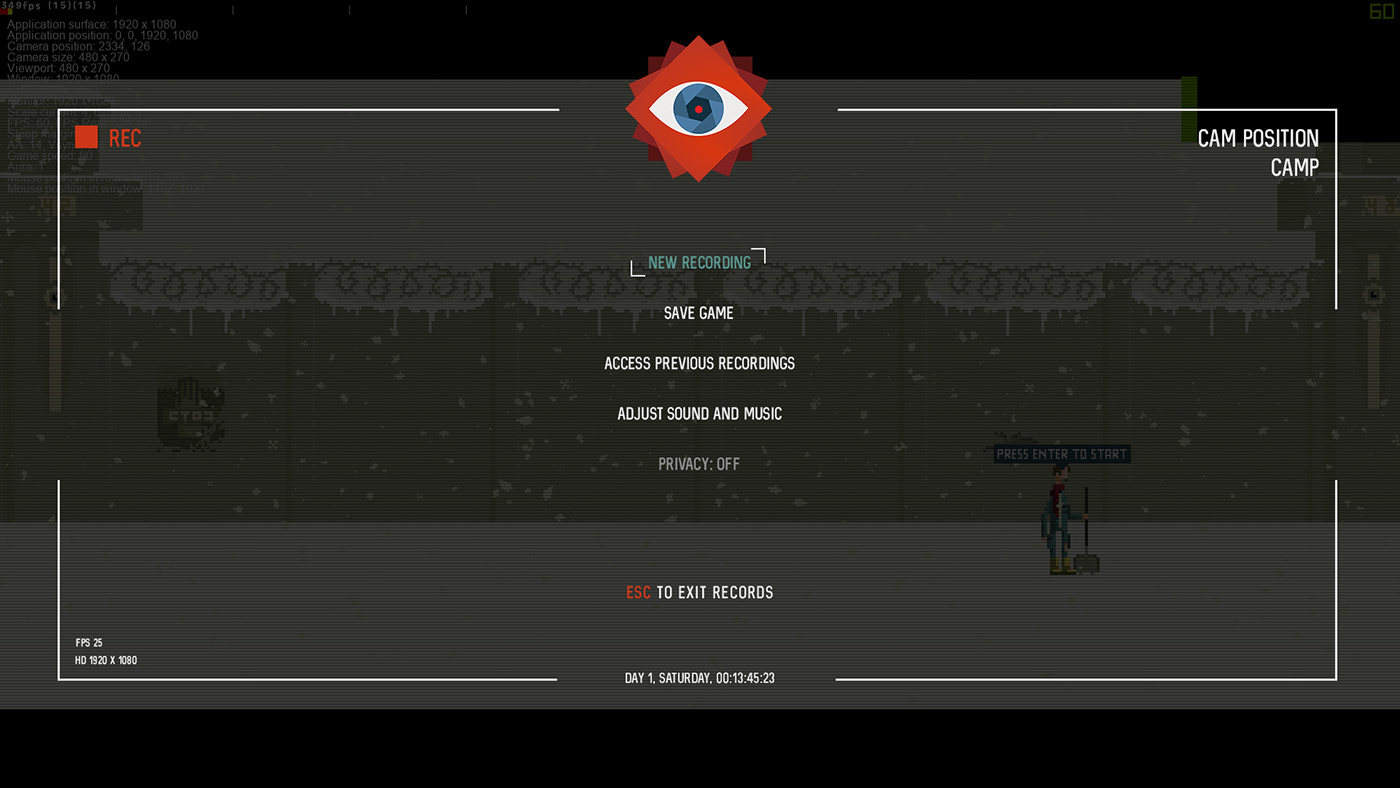
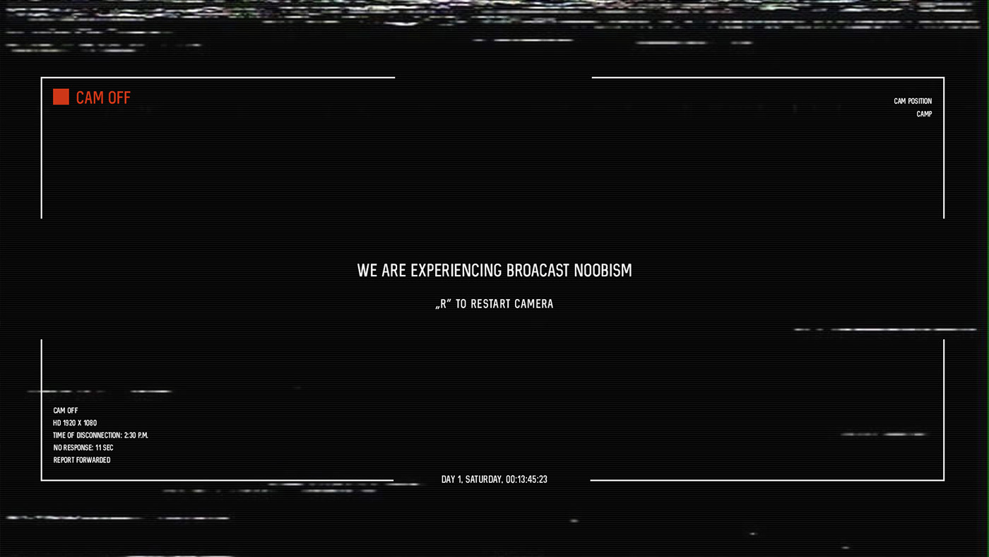
Initially we thought pixel made UI design for the Ministry of Broadcast Menu would work great. However, we knew it might make it a bit too much old school and vintage for our taste. This is why decided to go the other way and make Menu look as serious as the whole Regime and Big Brother feel that view-like from the camera is actually really making you think that as a player you are in control of the whole situation. This fit better especially with the 'pause' & 'load' sounds added. When you'd die, camera would basically show the player that it has lost connection.




When it comes to the HUD, our idea was to avoid using aggressive sticked on screen UI. Instead, we decided to let the player read the environment himself and recognise the danger through the whole environmental design. Some of the UI that would point out to information are showcased below. Some of them stick throughout the whole game, however most of them were adapted to fit into the environment and as stated before - not bother the player by standing out too much.


The idea behind the logo design and whole branding is to represent the fusion between Big Brother and Orwell's "1984" masterpiece. The animated piece was presented with aperture closing and opening whilst following the moving subject on screen. This is possible to see especially when player enters the MENU section. Below (in order stated) you will find the final logo and initial variations made to it before we reached finalisation.

Initially our title was "Ministry of Broadcast - The Wall show" - however, visiting a lot of conferences, we quick realised that everybody reads just "Wall Show" but are fond of the upper part of the logo more since it describes the game best. This is why in the final version we have stayed with our main title "Ministry of Broadcast" leaving the "wall show" to be a part of the story to tell.
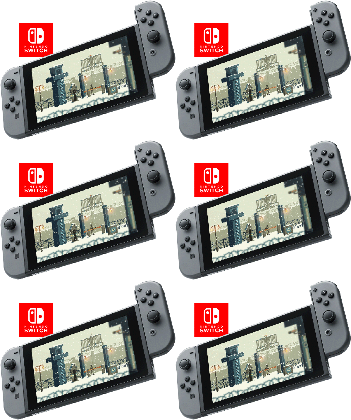
Shorter versions of logo were used later on and had to be adapted to a lot of guidelines written by Steam and Nintendo platforms. We also decided not to obsess with "school rules" and keeping the logo as it is, but rather to create variations of it adapted for posters and variations to our graphics for various merchandise to come.


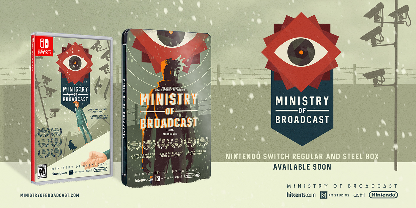
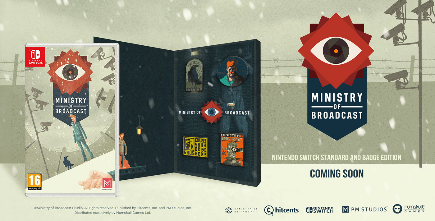
We have spent several months exploring all the possible directions in order to create cover art. We wanted to use some other, more realistic style, instead of pixel art but to still keep the art direction and pixel art feel of the game.





FOLLOW THE CROW ON TWITTER!



Many thanks to our friends and art collaborators Marko Stanojević (3D toy sculpt and additional animations), Jiri Huška (script and social content), Melike Çetinsaraç (social strategy and content) and Jana Němcová (plush).
