


Laranja Body & Bath Set
Branding / Packaging / Product Design
School Project-2019
Pratt Institute
Professor: Alisa Zamir
Solution
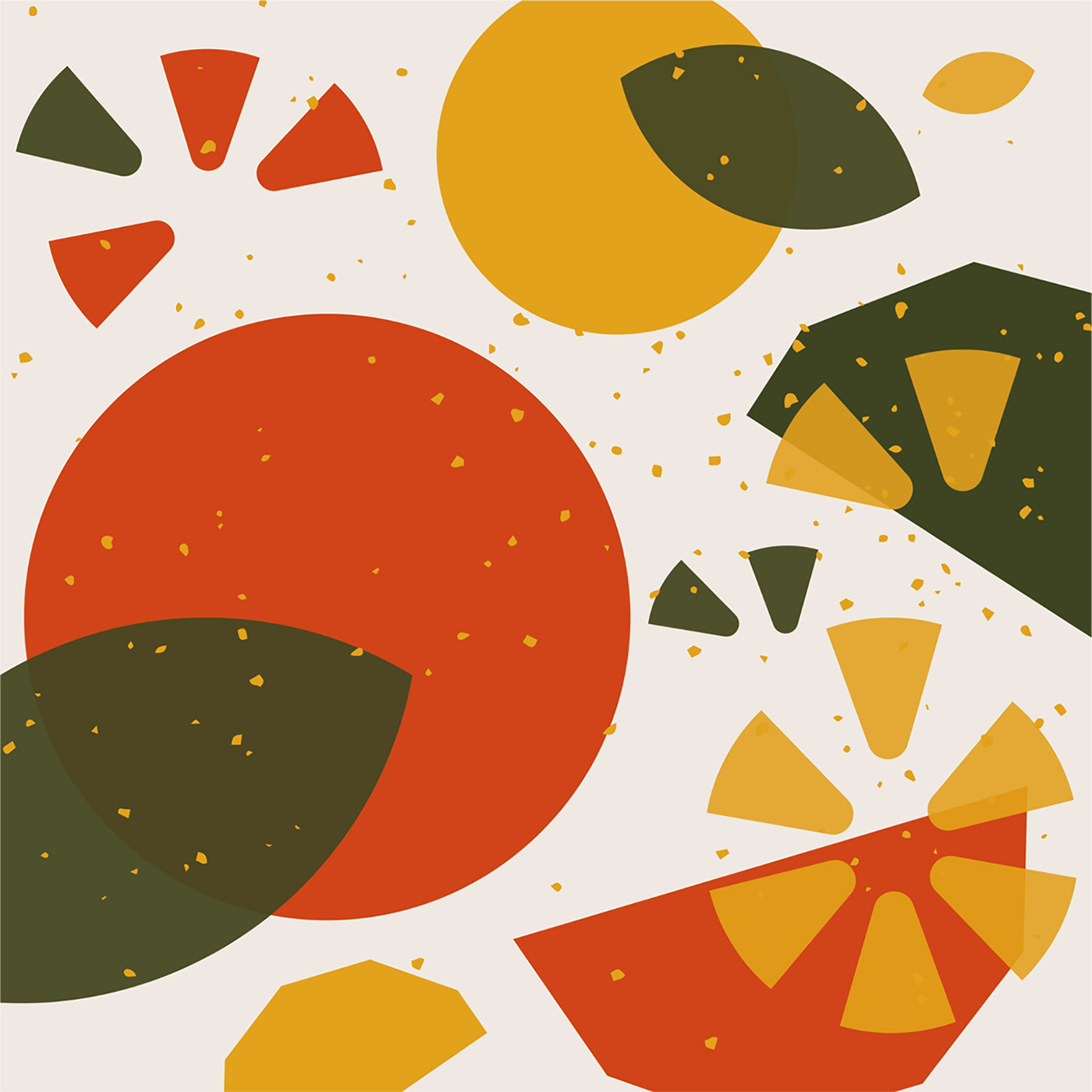
The Portuguese word “Laranja” which means orange is chosen as the brand name because the whole set of products is made of orange. To strengthen the sense of the ingredients, both the form and graphics of the package system are inspired by the fruit. For example, abstract illustrations of the plant including its fruits, leaves, flowers, seeds, and splashed juice are used as graphics on the package. Besides, the form of the bottles for shower gel, lotion, and the glass diffuser are inspired by the segments of an orange.
Angular shapes are used on the package of every product as the main design language. These shapes can increase friction, making the bottles less slippery and making the jar easier to open. The right side of the bottle is slightly thicker than the left side, suitable for the shape of human hands, according to ergonomics. Although the package of shower gel and lotion has the same form, the shower gel bottle has texture on its angular sides. This texture can remind people of the texture of orange peels and help people differentiate the two products through touch in a hazy environment full of water vapor.
To reduce the waste of resources and protect the environment, the components of the package are constructed of recycled plastic, glass, and orange peels, while the secondary package is made of recycled paper. The orange peels are hardened through a process of molding, baking, and drying, and then covered by water-based UV coating. Components made of this material are biodegradable and can give out a refreshing orange aroma.


Thanks!