CONSERVATORIO PROFESIONAL DE MÚSICA DE TENERIFE VISUAL IDENTITY / 2019 / personal
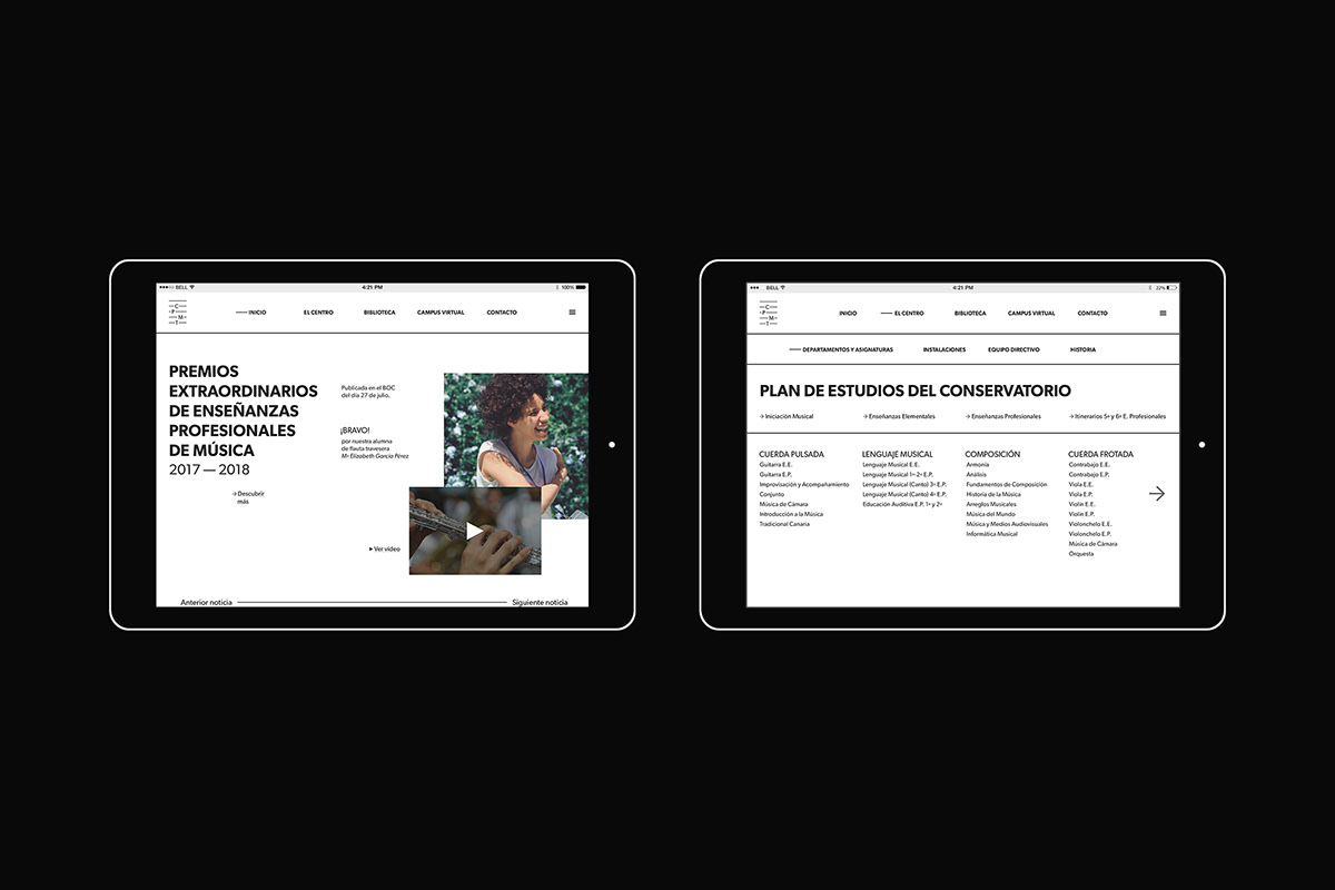
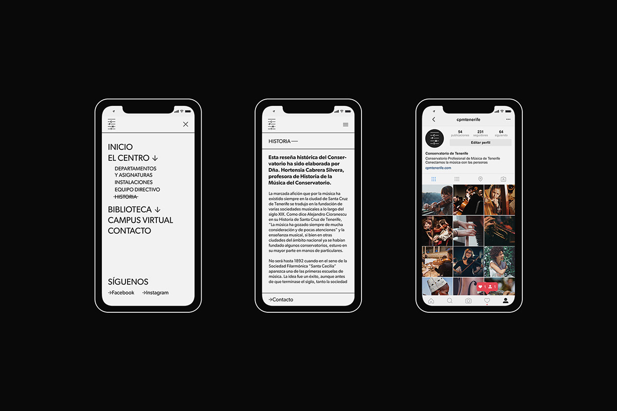
The Conservatorio Profesional de Música de Tenerife (Tenerife official music school) is the oldest music school in the Canary Islands. During its almost 100-year history, the school has focused on transmitting its passion for music to all of the students. This project is a proposal for the evolution of the brand, adapting it to the present, preparing it for the future and seeking to transmit the prestige and passion that characterizes the school.
The strategy is based on the concept of connecting music with people, placing the school as a link between these elements. With this concept, we choose the figure of the musical pentagram to visually represent the brand because: (1) it works as a base in any musical composition; (2) it becomes a grid to frame the visual universe of the brand; and (3) it provides very simple elements to transform into a visual system to represent the concept of union.
We choose Gibson font family (Rod McDonald and Canada Type), a timeless, humanist typeface, with great power in its major weights, and very versatile because of its extensive set of weights and characters.
El Conservatorio Profesional de Música de Tenerife es la escuela de enseñanza musical más antigua de Canarias. Durante sus casi 100 años de historia, el centro se ha enfocado en transmitir su pasión por la música a todos los estudiantes que han pasado por sus instalaciones. Este proyecto es una propuesta de evolución de la marca, adaptándola al presente, preparándola para el futuro y buscando transmitir el prestigio y la pasión que los caracteriza.
La estrategia a seguir se basa en el concepto de conectar la música con las personas, colocando a la escuela como nexo de unión entre estos elementos. En este sentido, se elige la figura del pentagrama para representar visualmente la marca ya que: (1) funciona como base en cualquier composición musical; (2) se convierte en una retícula en la que enmarcar todo el universo de la marca; y (3) proporciona elementos muy simples de transformar en sistema visual para representar el concepto de unión.
A nivel tipográfico se elige la fuente Gibson (Rod McDonald y Canada Type), una familia tipográfica humanista, atemporal, con gran potencia en sus pesos mayores, y versátil gracias a su amplio set de pesos y caracteres.