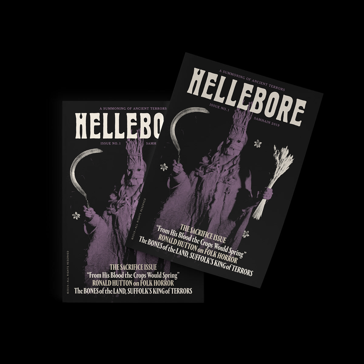
HELLEBORE is a limited-run A5 magazine with articles devoted to British folk horror and the themes that inspire it: folklore, myth, history, archaeology, psychogeography, witches, and the occult.


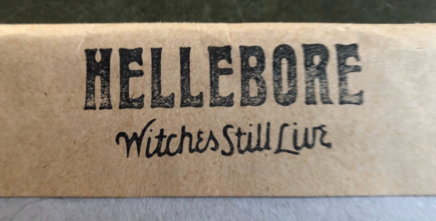
Hellebore’s masthead was adapted from an Edwardian typeface, Herold AKA “Reklameschrift Herold”. The overall letterforms were given an art-nouveau facelift by way of the 70s.
“The Hellebore logo exclusively shows its high-waisted caps. The modifications make it look as if it just emerged from a swamp. Hébert increased the flabbiness of Herold’s already wobbly contours, with more pronounced concaves. Most notably, the R became gaunt, exhibiting a smaller eye and a limpish leg.”
Read more about the editorial typefaces used in Hellebore on Fontsinuse, contributed by Florian Hardwig.


Purchase Hellebore Nº 1, “The Sacrifice Issue”:
https://helleborezine.bigcartel.com/product/hellebore1
https://helleborezine.bigcartel.com/product/hellebore1