
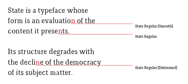
Concept
Designed for an independent newspaper in Egypt, it comes in three grades: Regular, Distressed and Smooth. These grades can be used interchangeably within the newspaper to pass comment on the content of the articles set in it. Stories which show Egypt to be progressive or democratic would be set in Smooth; whereas articles which show it to be less so would be set in Distressed. Regular fits everything in-between.


Masthead
Every article within the newspaper would be set in one of these three different grades. The grade used for the highest number of stories would then be chosen for that day's masthead, which would give the reader an immediate view of the state of democracy within the country on any given day, with a glance at the front page.

Weights
As shown above, State has ‘duplexed text weights’. This means that a word can be given emphasis within a column of text without affecting the rest of the typesetting.
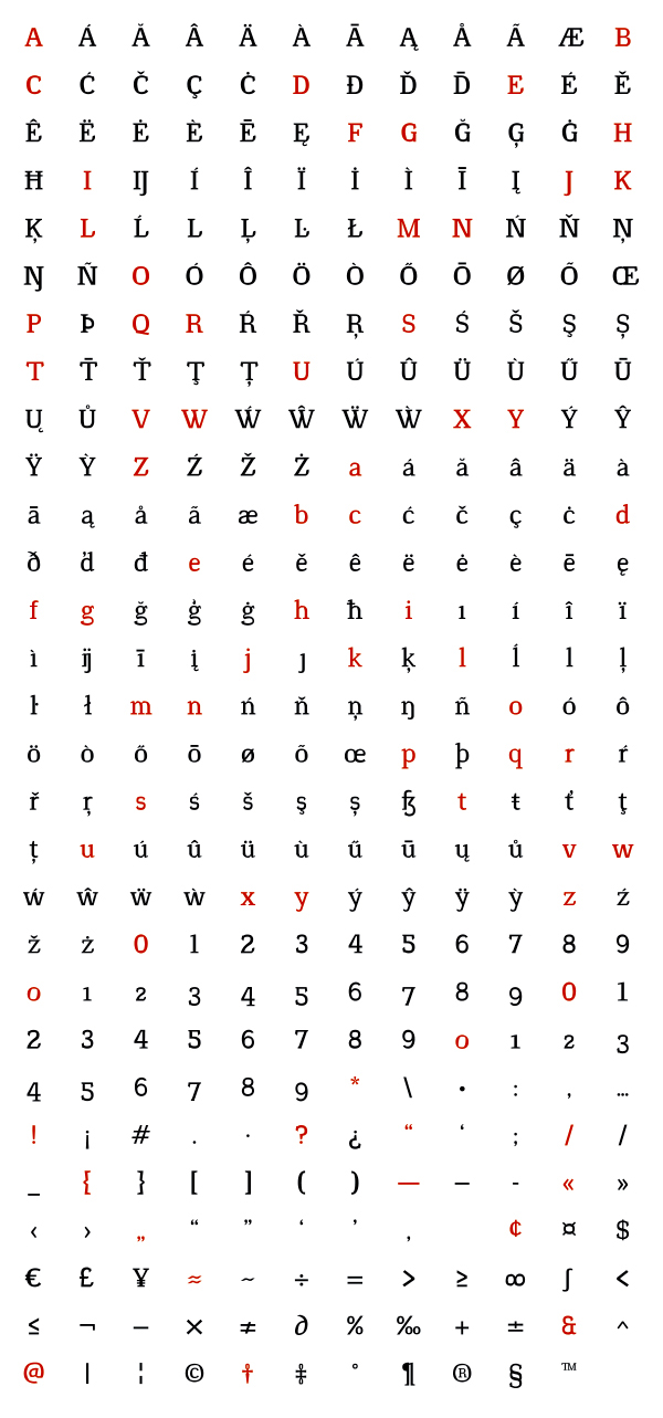
Supported Languages
Afrikaans, Albanian, Basque, Bosnian, Breton, Catalan, Corsican, Croatian, Danish, English (UK & US), Esperanto, Faroese, Galician, German, Hungarian, Icelandic, Indonesian, Irish, Italian, Latin, Leonese, Luxembourgish, Malay, Maltese, Manx, Norwegian (Bokmål & Nynorsk), Occitan, Polish, Portuguese,
Rhaeto-Romanic, Scottish Gaelic, Serbian Latin, Slovak, Slovene, Spanish, Swahili, Swedish, Turkish,
Upper Sorbian, Lower Sorbian and Walloon.
Rhaeto-Romanic, Scottish Gaelic, Serbian Latin, Slovak, Slovene, Spanish, Swahili, Swedish, Turkish,
Upper Sorbian, Lower Sorbian and Walloon.
ISO 8859–16 compliant.


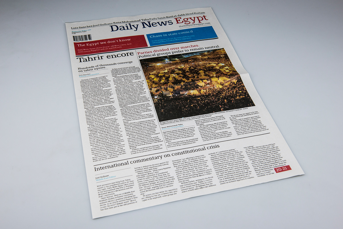
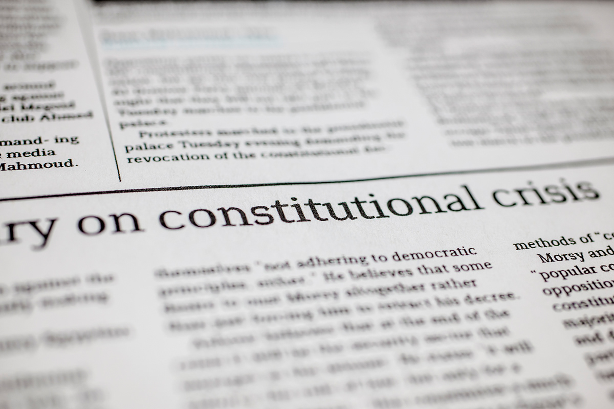
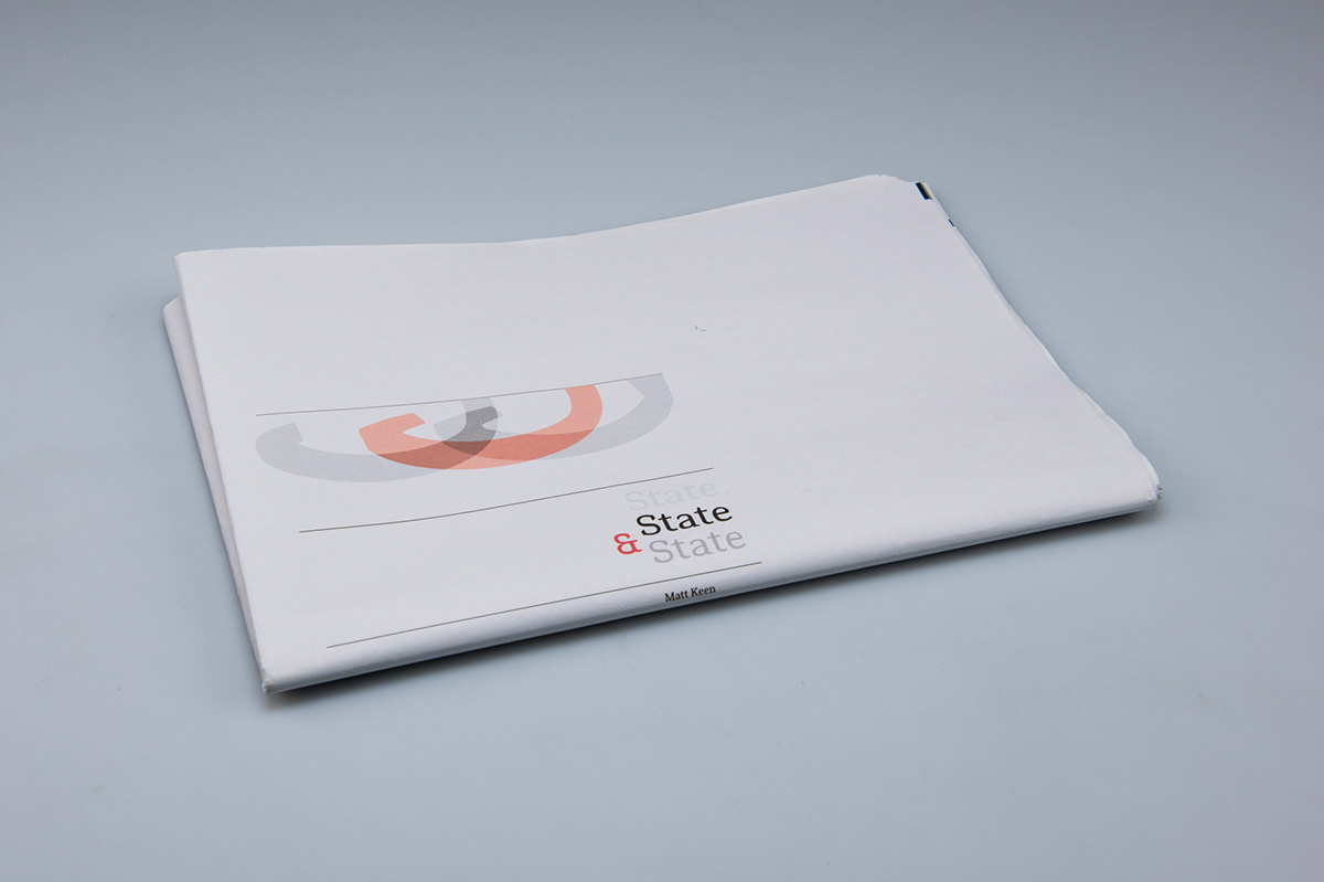
Specimen
Above are images of the specimen I created to showcase my typeface.


