


Goal Setting Workbook
2019
Guide and workbook on "how to get your life together".
5 x 8.25 inches, 72 pages, saddle stitch binding.
Written by Nick Ogura, Doctoral Occupational Therapist. Design, copywriting and copy editing, typesetting, illustrations, and branding are done by me! Available for purchase here at Totteoki Design.


The workbook draws from actual exercises used by Nick in clinical sessions. An issue we faced early on was how to bring the experience of a personalized, in-person session with a licensed professional into a paper booklet that a user would fill out alone. It was necessary for the book to be general enough for a wider audience, while still being able to break down the why and how of each step.
We discussed every possible goal-related activity and whittled down the options into a cohesive and manageable collection. Nick wrote out all the text, and we revised several times throughout the design process.
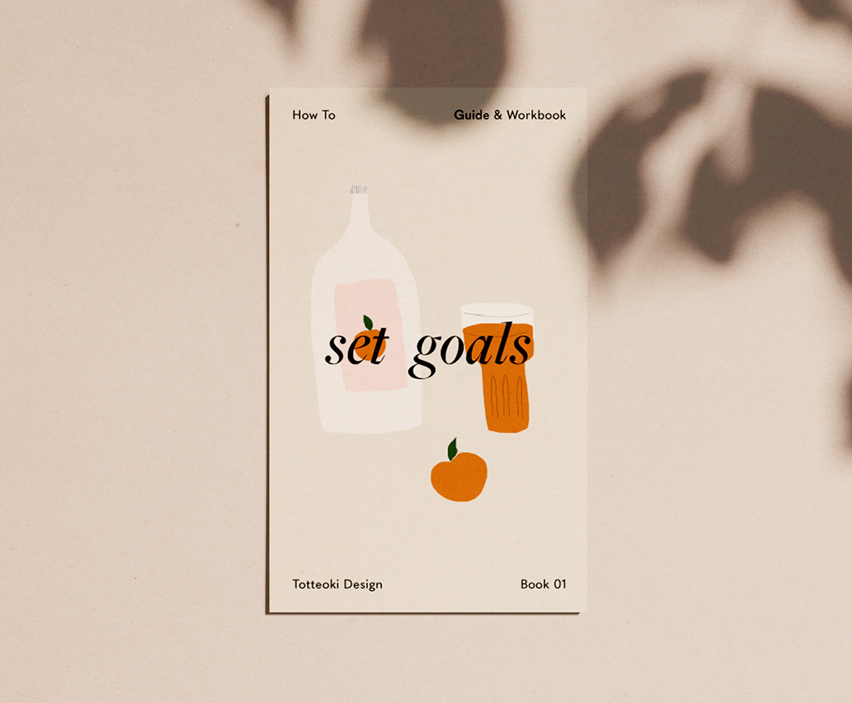
Look #01
Clean and minimal, with warmth coming through from curved lines, warm colors, and rounded grotesk-inspired typefaces.

Look #02
Geometric shapes again but in a soft-hued palette and mixing-in of textures. The first, with speckles (inspired by speckled ceramics), and the second, with a small swatch of rock-like texture on the bottom.


Look #03
Leaning more into the “warmth” aspect of the brand, I utilized a retro art style and hand-drawn lines in the illustration. The colorful illustration also takes up the entire two page spread, really immersing the reader in the sunrise scenery. The title is in Lydian, a calligraphic humanist sans-serif typeface for added warmth.

Look #04
A more playful version, with “spec” being rounded and decorated with rays. The illustration is textured and has hand-drawn elements, and carries no stroke in order to give it a more whimsical feel. The text remains minimal and cleanly divided into four blocks along the edges of the right page to anchor the design.

Look #05
Leaning more into the “minimal” aspect of the brand, I kept the illustrations and design very simple and calm, as though it were signage or a menu at a cafe in Tokyo or Seoul. Warmth and playfulness come through the childish illustrations, beige background, and rounded grotesk sans-serif typeface.


Final
In the end, I decided to keep the divider as minimal as possible, relying on the bold full-page color to help the user identify that a new section was starting. This meant removing any form of illustration, and keeping the entire design very clean and legible. Warmth still comes through from the usage of a rounded grotesk sans-serif typeface, as well as the playful "popping" of the title.


