


Островица — это крафтовая микропивоварня в маленьком российском городе. Она была основана в 2014 году, в 2015 году была разработана айдентика и дизайн этикеток для первой серии пива. Так начиналась история. С развитием пивоварни количество сортов увеличивалось, а сами сорта усложнялись и становились разнообразнее. В России произошла крафтовая революция.
Наступил момент, когда разработанная дизайн-система перестала справляться с идентификацией новых сортов, их стало сложно отличать от уже выпущенных. К тому же в 2018 году пивоварня перешла на розлив пива в банки. К тому времени было оформлено около 50 этикеток.
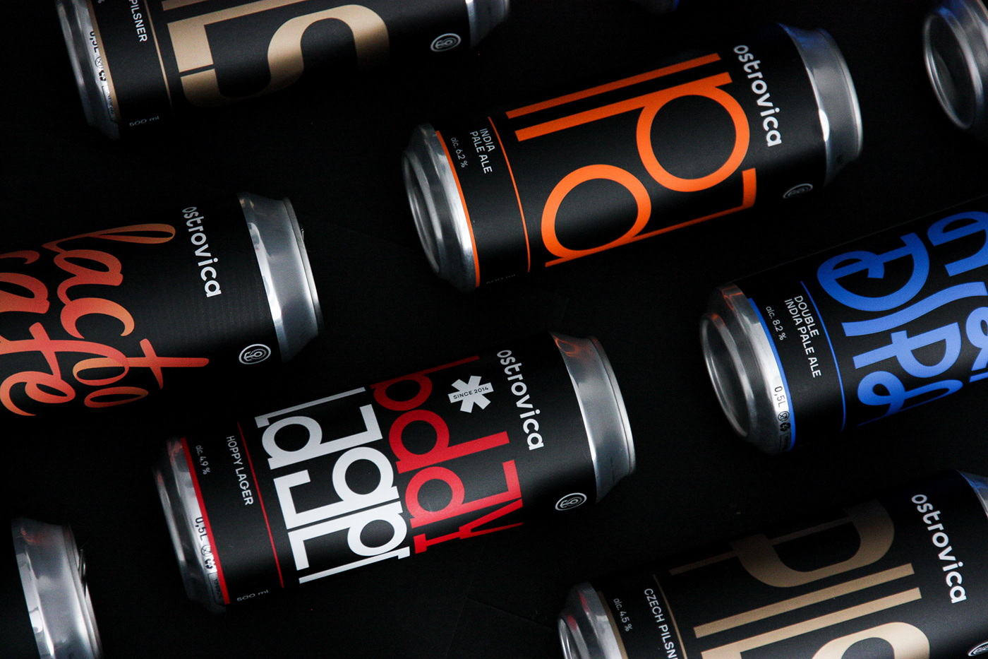
Ostrovica is a kraft microbrewery in a small Russian town. It was founded in 2014. In 2015, the identity and labels design were developed for the very first series of beer. That’ s how the story began. With the development of the brewery, the number of beer varieties increased, and the beer types themselves became more complex and diverse. In Russia, there was a craft beer revolution.
There came a moment when the developed design system could no longer manage with the identification of new varieties, and it became difficult to distinguish them from those which already produced. Moreover, in 2018, the brewery switched to bottling beer in cans. By that time, about 50 labels had been issued.

Case on the Dieline


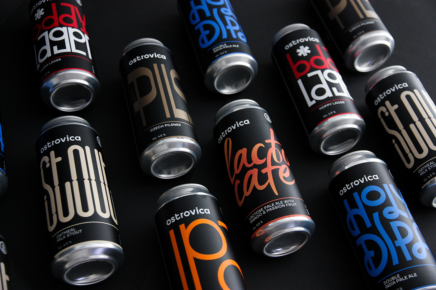
В то же время позиционирование пивоварни изменилось, и мы осознали необходимость в редизайне айдентики и упаковки. Задача стояла разделить базовую линейку из 6 сортов, которые выходили постоянно и новых релизов, коллабораций и экспериментов за счет разных этикеток.
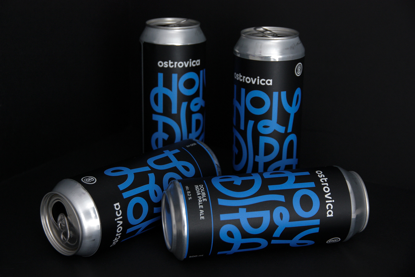
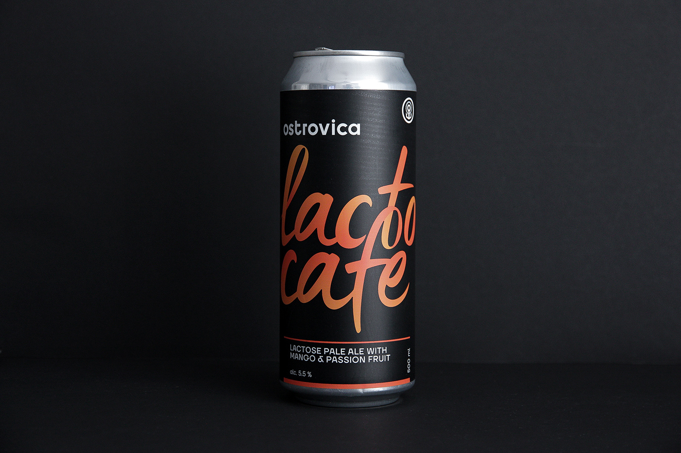
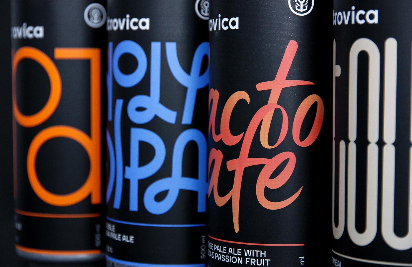
Для базовых сортов был разработан дизайн этикеток, основанный на леттеринге, отражающем характер пива. Цветовая гамма осталось преемственной, но количество цветов ограничили, что позволило печатать этикетки в 2 краски Pantone.
By that time the positioning of the brewery has changed and we realized the need to redesign the identity and packaging. The task was to divide the basic line of 6 varieties that came out constantly and new releases, collaborations and experiments due to different labels.
For the basic varieties was developed a label design based on lettering reflecting the character of the beer. The color scheme remained consistent, but the number of colors was limited, which allowed printing labels in 2 Pantone colors.


Case on the Dieline
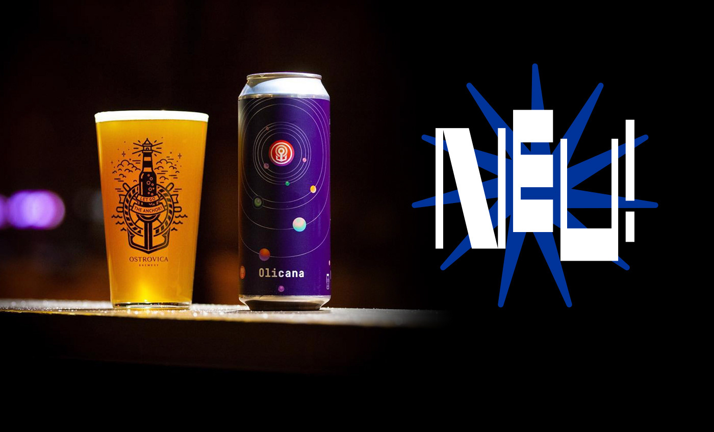
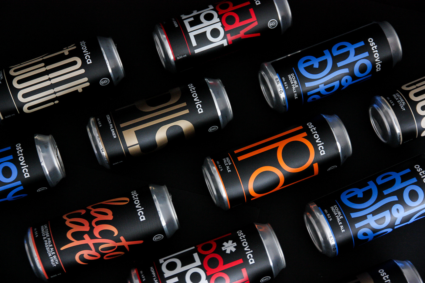
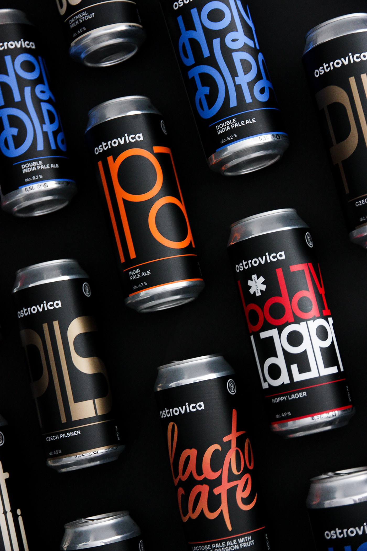
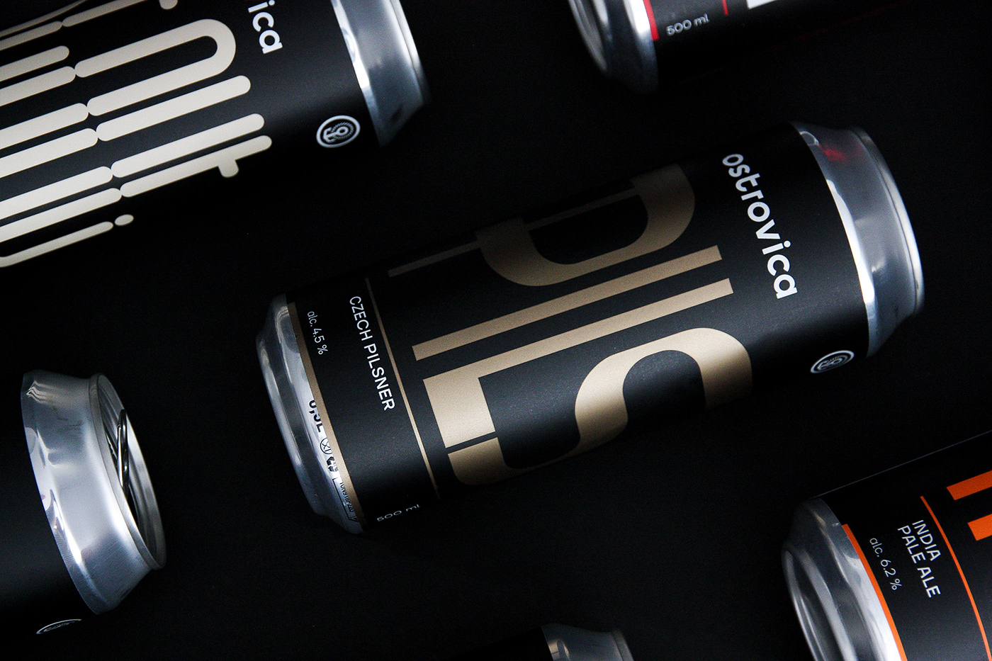
Для новых релизов была разработана другая схема верстки этикеток, отличающаяся расположением логотипа вертикально сбоку. Такая компоновка позволила использовать всю площадь этикетки, заполняя ее паттернами, типографикой или иллюстрациями, не меняя положение знака и логотипа. Таким образом внимание акцентируется на концепции сорта, а не на пивоварне. В настоящее время эксперименты продолжаются, результаты вы можете наблюдать в Инстаграм пивоварни.
For new releases a different label layout scheme was developed, with the logo positioned vertically on the side. This kind of layout allowed to use the entire area of the label, filling it with patterns, typography, or illustrations without changing the position of the sign and logo. Due to this, attention is thus focused on the concept of the variety, and not on the brewery. Currently, experiments are ongoing, the results you can see in the Instagram brewery.


Thank you for watching!


