

UX Case Study: Enterprise Productivity Application Analytics Tool
Overview
DealIQ is an enterprise productivity tool developed by CBRE. It helps commercial real estate brokers create leads and manage deals faster and more efficiently.
The stakeholders of the project wanted to track usage and adoption. They had identified key metrics, and the data scientist on the team configured the analytics to display performance.


Problem Statement
After launching DealIQ, there was a need to report usage and adoption to the stakeholders. It was determined that a website with live data visualizations representing various performance metrics would be the best solution. It had to be accessed through an SSO.
Users and Audience
The intended audience for this website was the developers and the stakeholders who had funded it. The analytics would be visible to a small group of approximately 300.
Roles and Responsibilities
My role was UX/UI Designer. I collaborated with two full-stack developers, and a data scientist.
Scope and Constraints
The minimum requirement for this was that it run on a desktop/laptop with the Chrome browser. It was never intended to be responsive and adapt to mobile devices.

Process and my work
I started by selecting colors. The colors had to both harmonize and provide sufficient contrast. The graphs needed to support up to six data points, and each color had to harmonize and contrast with each of the others independently.
In addition, the Time Per User graph had to show lines for Mean and Median values. The median line was typically over lighter colors, and the mean line was typically over darker colors. So the lines were black and white, respectively.
Earlier in the project I also mapped out the user workflow to determine what UI assets would be required.
I also created low fidelity wireframes with annotations to communicate design decisions to the PM and developers.
A slider control was designed for users to filter analytics values manually. This presented challenges to the developers. We were successful in negotiating the technical challenges while preserving the visual integrity of the control.
A loading animation was created for the rare occasions when there was a data lag and the user had to understand that a graph was coming.
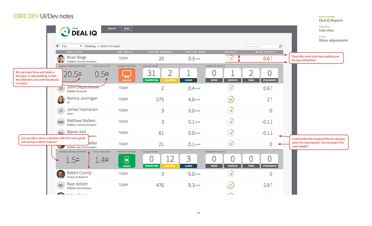
The website went through several updates, and a second page was added which displayed further data about specific users.
This project had a quick turnaround because of the small group of contributors and stakeholders.


Outcomes and Lessons
This project did not require typical user experience discovery or research activities, but it did provide a useful tool for stakeholders to check on the success metrics of the project.
When I joined CBRE Dev, I joined a team which had already gone through version one of a software product, and most of the styling and UI had been built with a design system. This project was independent from the DealIQ design system, so I was able to prove my skills with a brand new UI. Because of the lower stakes, I was afforded more latitude for creative exploration.


