


DESCENSION is a dark parallel to the ascension of Jesus Christ. There’s a world created to represent the perceived descent we’re going through. I was inspired to do this album after I realized I was frequently "aux cord lord" at any given house party, function, flex. An increase in partying meant that in tandem with winning the crowd's favor with poignant song selections, I also was falling victim to the criticism of on lookers from the "outside." The version of my self that these people perceived was being placed in a lower setting, so to speak. They think I'm falling from grace, they aren't privy to my embrace. I don't care if they think I'm descending - it's going down at this gathering. None of my peers are bothered either; we all live in DESCENSION.

The main album art, used for major streaming services. They see me and see something else. I feel like the orange in my eyes clearly evokes evil, possessed imagery, but the specific look I'm giving here is almost tragic, almost as if my eyes are filled with a sadness induced by the criticism.

The SoundCloud album art. They see a fallen DAX; one corrupted by the world around. There's some pixel sorting on my face. It drags my face down along with my morals; hopefully you can notice the descent into madness.

The alternate album art. They perceive me and subsequently place me in that spiraling fantasy. Here I am as a resident. I wasn't in love with the idea of having the album's name displayed, but this was my favorite attempt at that. The descent is at its peak, with my enraged face overwhelming the canvas.
Here's the announcement trailer I released in anticipation for the album.


The tracklist for the album, divided into into two halves by the logo for the UN funded artificial intelligence "Changing And Idle Data Algorithm."
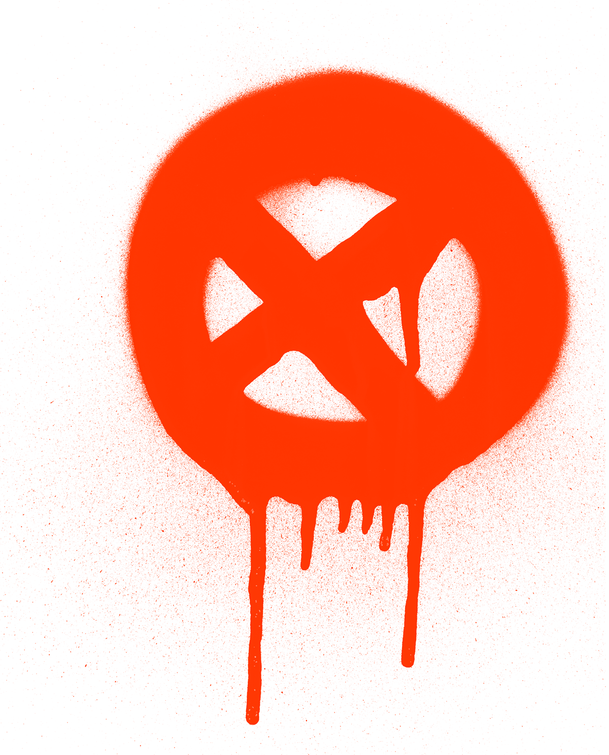
Spray paint textures contrast the solid, stark shapes that go into the album's branding. Nothing within the art naturally "glows" past the specks of paint that may surround a given element.

The main color palette for the album. It's very highlighter-esque, reminiscent of the construction safety vests. The pitch black background is usually something I avoided (in the spirit of giving my works more texture and detail), but for this project, it served to communicate the exaggerated point of view the audience might have of me... and all this.

Here's the general use banner. A version of this graphic is used on the DJ DAX SoundCloud page. There's actually a sly introduction to my muse for this project, @fairyalexx (pictured to the left, with one of her Instagram stories). Me having a muse seems to happen almost every album, so having Alex be the one for this album was pretty special. I imagined this album wrapped up in beautiful, drug induced visuals, and you'll see in a bit with the single cover arts how well she fits into that.
Now for the single cover art.
I almost hesitated doing that again for this album cycle, but I found the style so fun, that I had to try it out on more images. Here are all 8, with two of them shown in greater detail.


As you might have seen, the first song and the last song the tracklist share something in naming convention. There are two drugs that I meddled with, and those experiences bookend the album. Again, Alex serves the aesthetic of sharing that sort of experience with someone ideal. As you'll see in these next, last two images of her, she carries the same air of intoxication and sadness in her eyes, but unlike myself (lol), she's pretty visually appealing.


One of my favorite aspects of this album: the custom Team Future logo.

thanks for listening


