


Prime-IQ Branding / Products
2019-2020 | client (Cell-IQ)
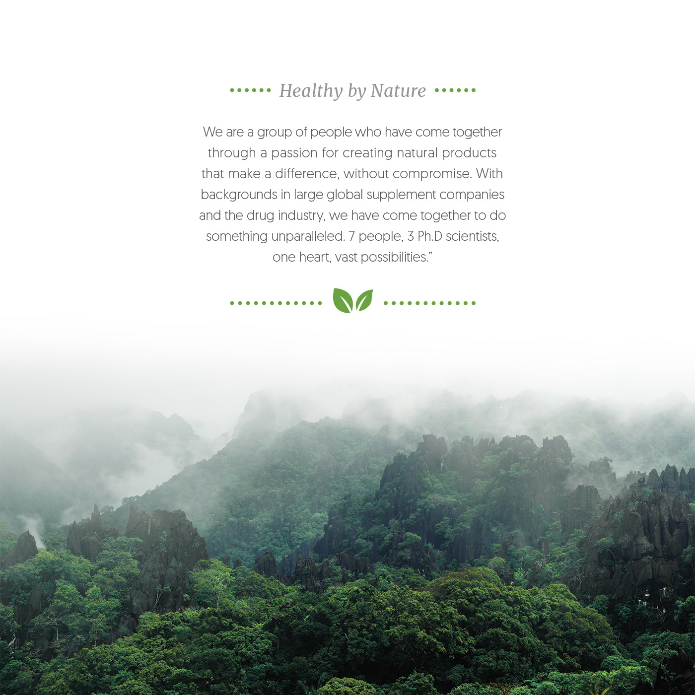
About: Prime-IQ (aka, known as Cell IQ) is a group of people who have come together through a passion for creating natural products that make a difference, without compromise. With backgrounds in large global supplement companies and the drug industry, they have come together to do something unparalleled. 7 people, 3 Ph.D scientists, one heart, vast possibilities.
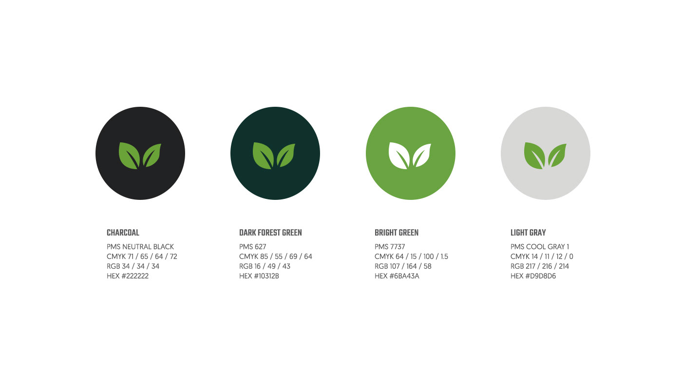
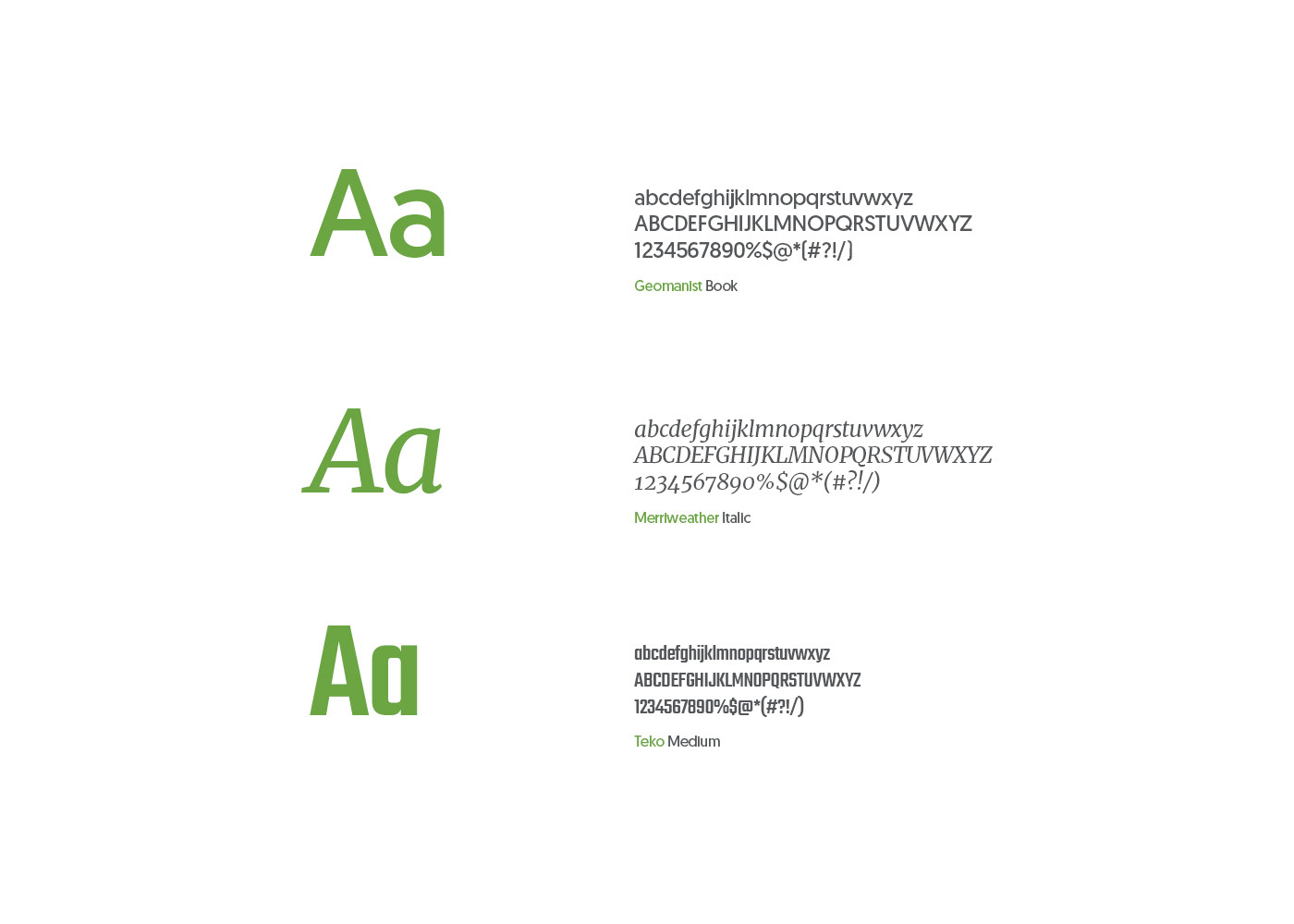
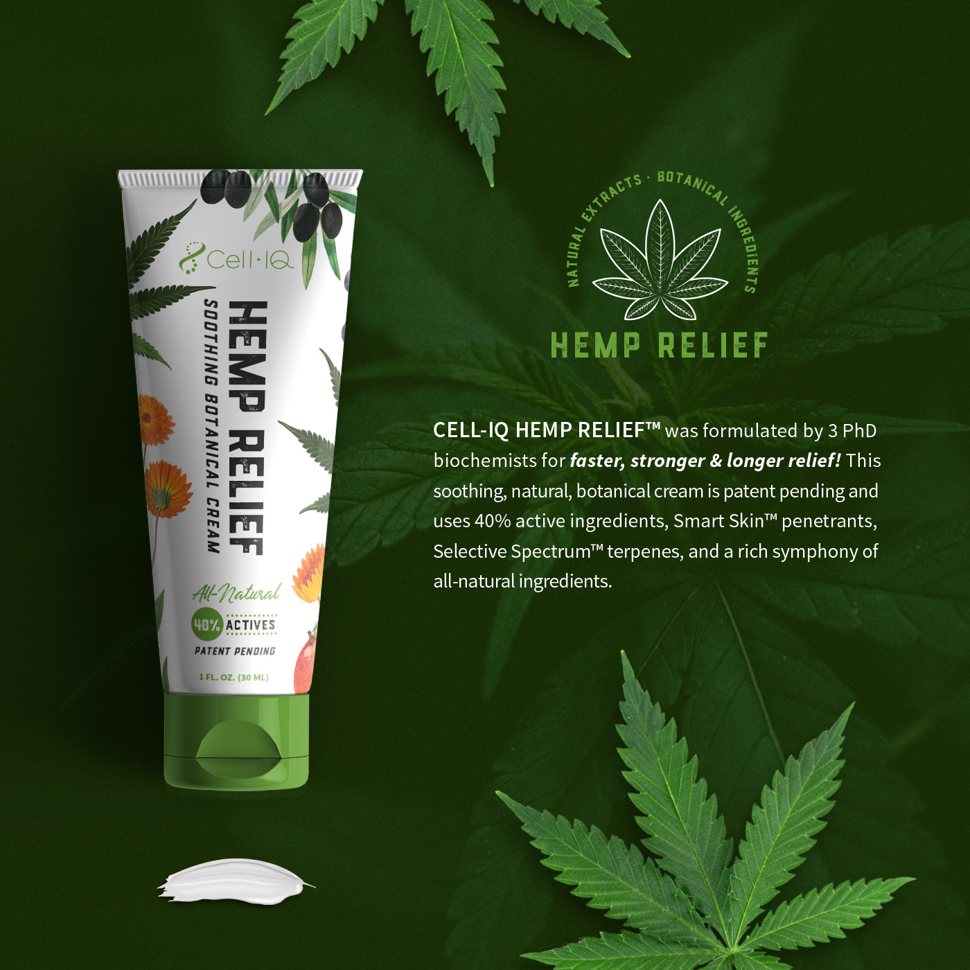
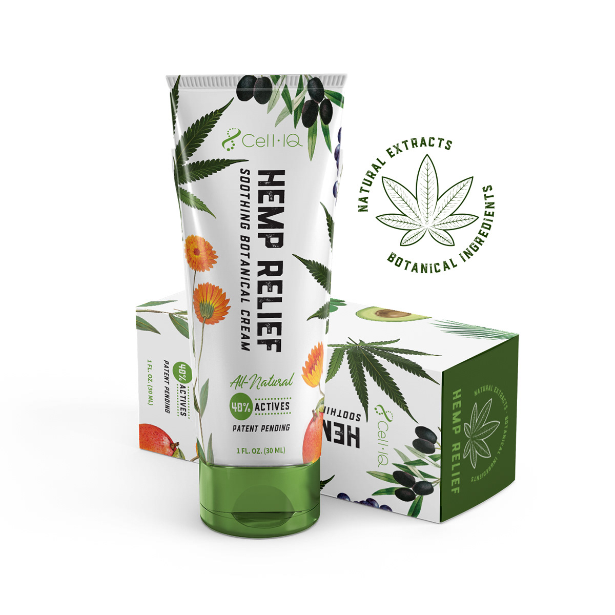
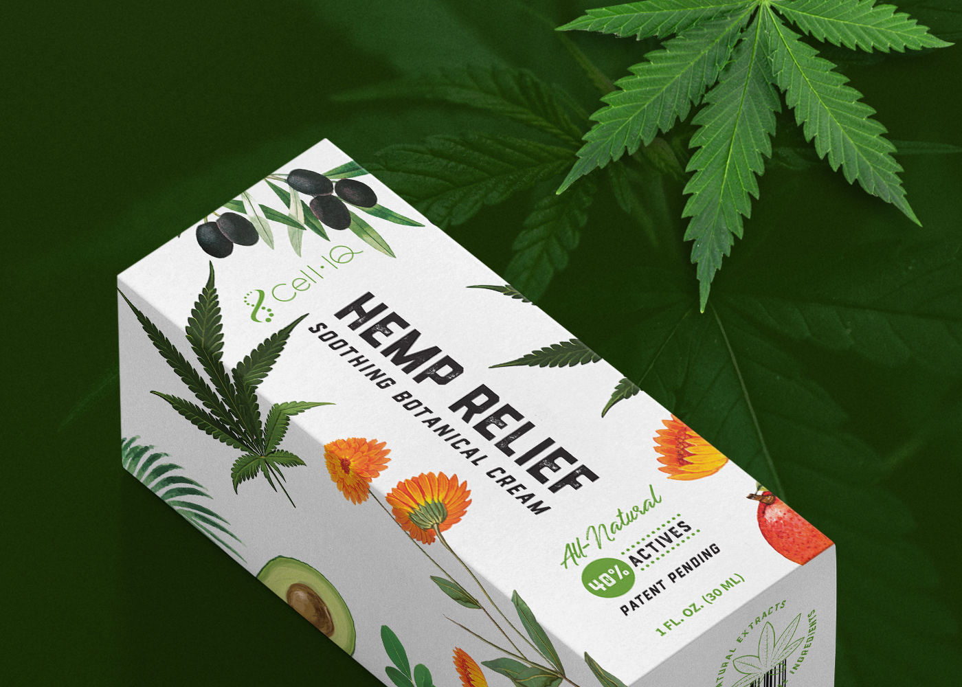
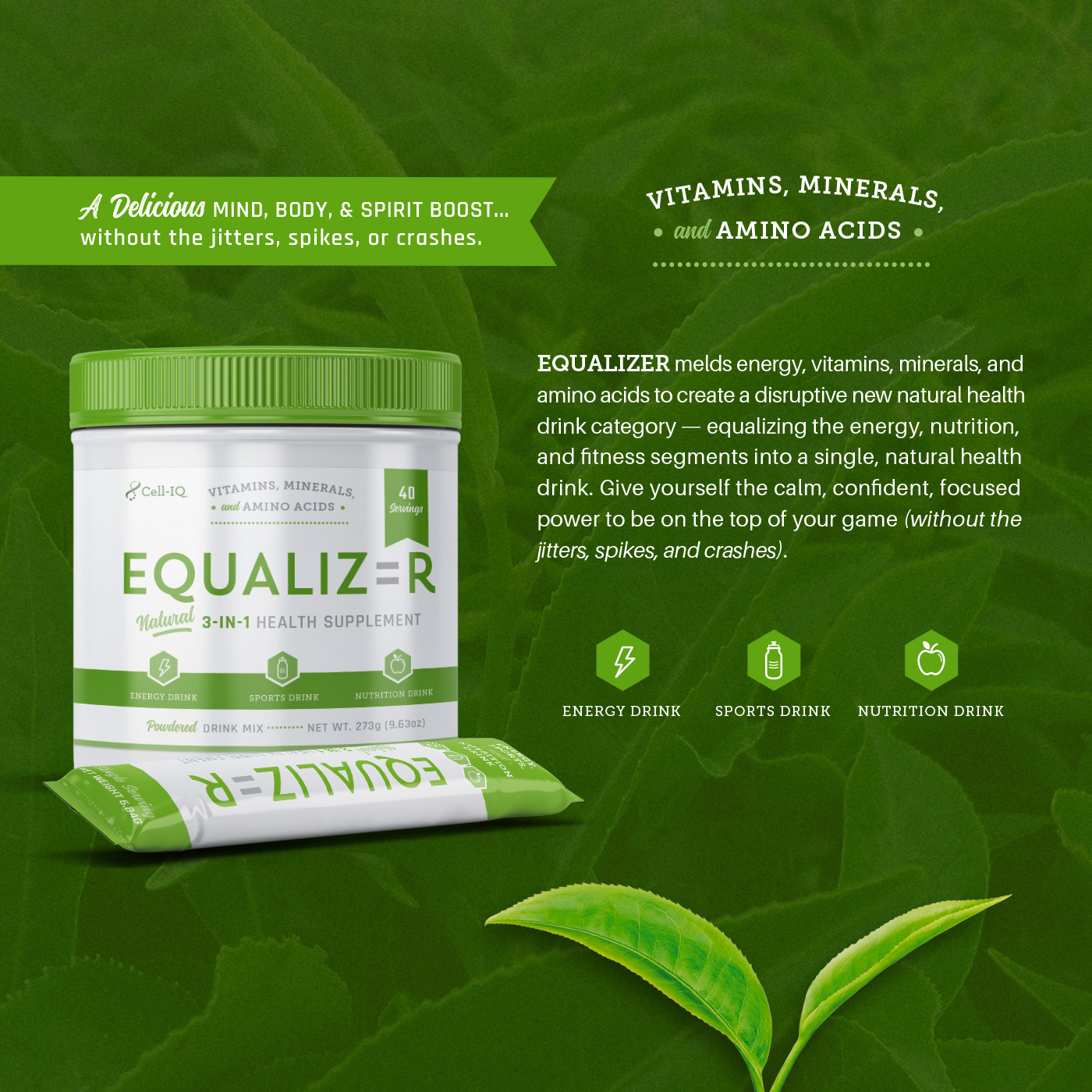
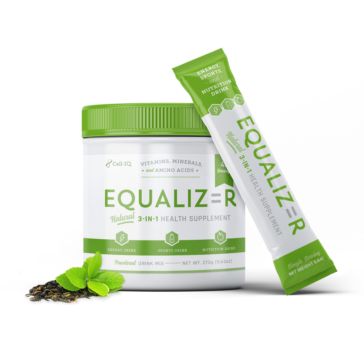
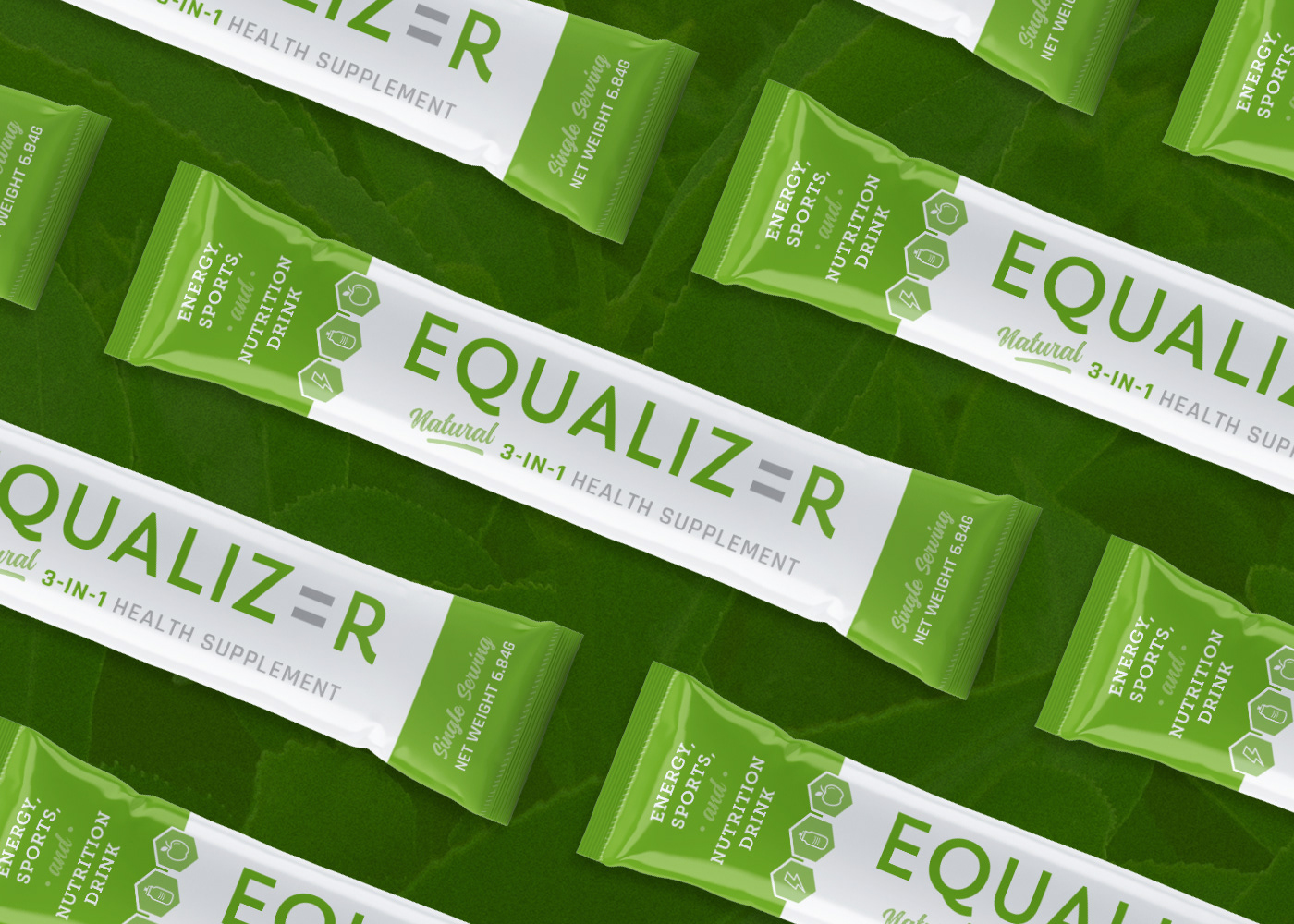
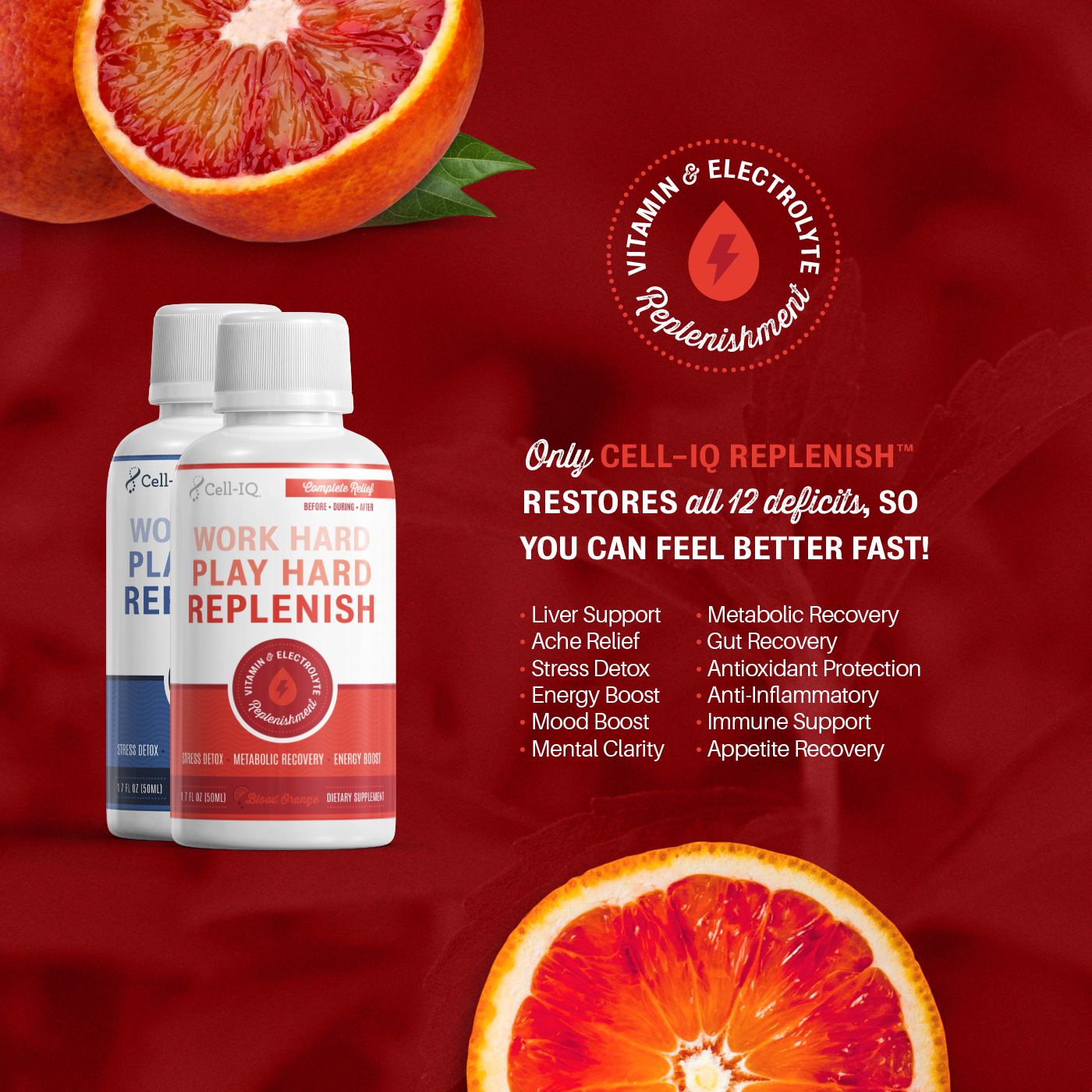
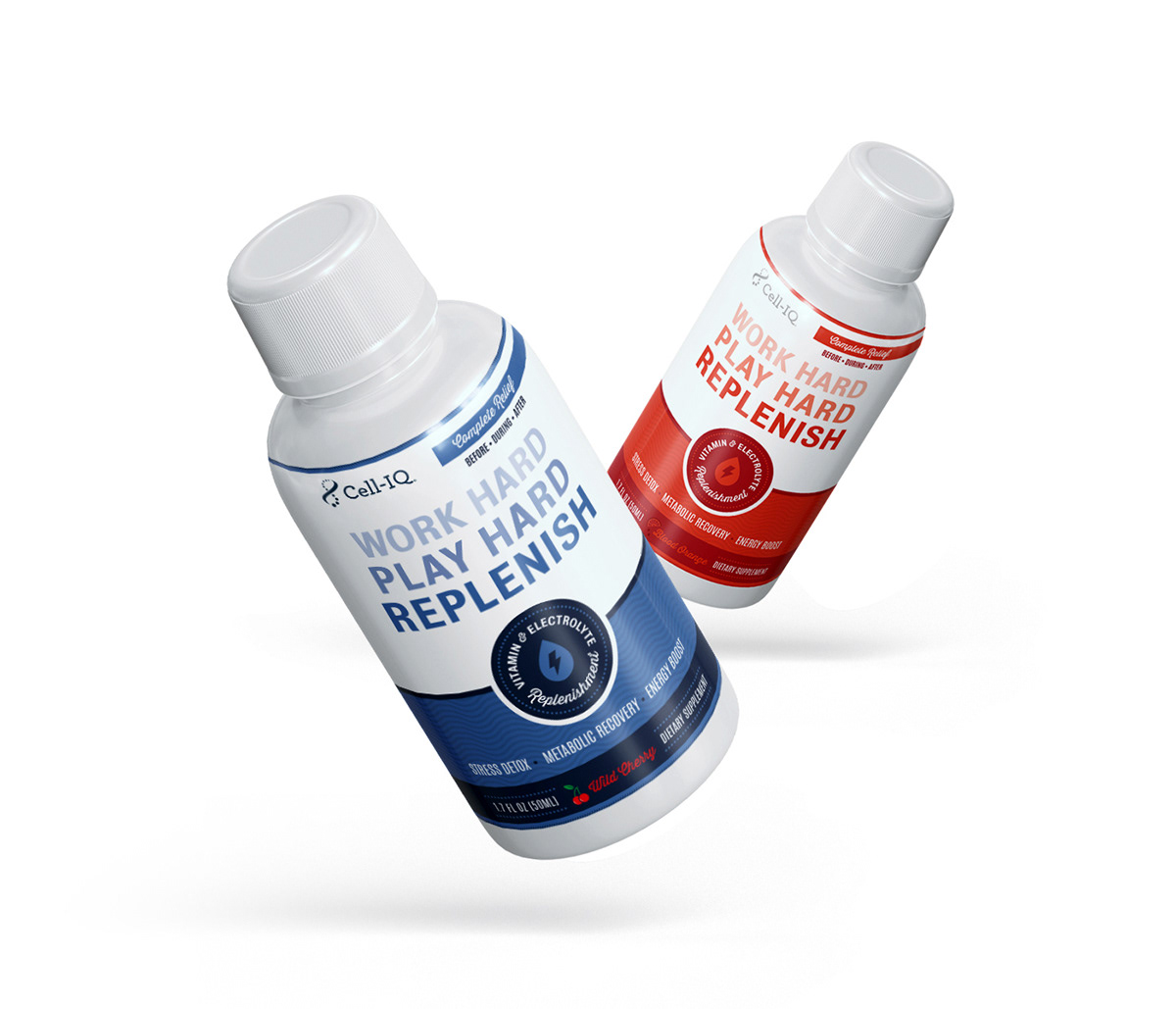
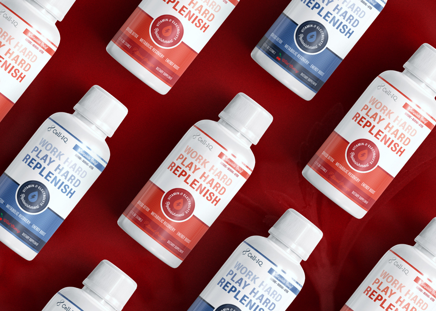
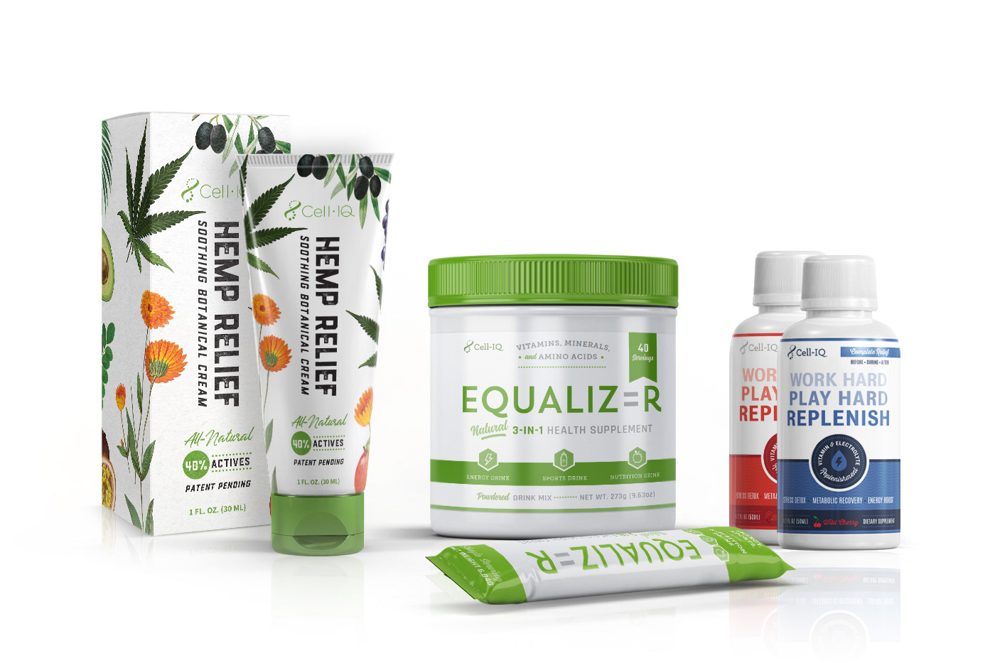
Summary: Back in early 2019, I was asked if I would be interested in updating branding/new name through a company called Cell-IQ™. Key elements that they were looking for in their total brand concept was having a certain look that had a good potential of appealing to the primary woman buyer, while also being able to be done in a way that wouldn't alienate men. During the research phase, I presented 3 moodboards of styles (minimalism, botanicals, or bright and colorful). They chose the botanical theme because it didn't leave out the possibility of incorporating some of the minimalism or colorful elements in the future. During the logo design process, they were also wanting a simple and clean look that kept a balance between being slightly more feminine, but not off-putting to men. The key component was making sure it communicate "Nature + Science = Thrive" by using a graphical element in a natural/botanical way (aka, leaf). For now, the Prime-IQ logo name is not being used until sometime in the future). Besides designing from scratch their logo (custom letters), in the 2 years I have done work for them, I have had the joy of designing the styleguide keeping in mind their core demographics and design style they were wanting for their brand, packaging such as the 3 above: Hemp Relief (concept: heavily "botanical" to reflect all the ingredients in the product), Equalizer (concept: a calm energy product that would communicate energy without communicating jittery-ness), and Replenish (concept: to create a soothing and healing design message on the product's ability of replenishing the body's deficits & restoring its functions) as well as their sale sheets and amazon slides, graphics, & billboard layouts. My approach as a portfolio piece was to layout areas that highlighted certain items that would show off the brand's strong-suit such as the branding of the logo & color options, and the styling of their products.
fonts used: Styleguide (Geomanist, Merriweather, Teko) / Hemp Relief (Drone Ranger, Underland, Source Sans Pro) / Equalizer (Heebo, Museo Slab, Rajdhani, Montana Rough, Source Sans Pro) / Replenish (Bureau Grot, Antonio, Thirsty Rough, Aileron).
credits: Designed under Lettermuse Studio (Owner of Katrina Sutton) / Direction by Ben Pollock (COO) and Team (William Hennen, David Warren, Meredith Pond, and Scott Anderson).
credits: Designed under Lettermuse Studio (Owner of Katrina Sutton) / Direction by Ben Pollock (COO) and Team (William Hennen, David Warren, Meredith Pond, and Scott Anderson).