Design Leads: Bryant Hodson, Ferenc Petho, Curtis Barlow
Design: Kevin Dewey, Denis Modugno, Andrew Hair, Bethany Bateman, Casey Robinson, Christine Chiang, Dave Nay, David Matayoshi, Eliza Jensen, Alison Smith, Joe Martel, Josie Morris, Mark Gowans, Mati Collings, Matt Spencer, Michelle Barber, Robb Perry, Ryan Plumb, Ryon Bazzle, Sierra Sahleen, Jake Kenning
Dev Leads: Matthew Larson, Zach Williams, Kyle West, Derrick Craven
Dev Architect: Gabe Dayley
Managers: Jeff Hawkins, Brian Edwards
ZION is FamilySearch's proprietary Design System, spanning all of the organization's customer-facing web apps and web-based digital products.
Although the catalyst for this monumental design+dev effort was a stack update to ReactJS, it was ultimately fueled by our team's desire to have our ecosystem of digital products better meet the needs of beginners through improved consistency and integration.
“It is proper integration that transforms the complicated into complex and understandable.”

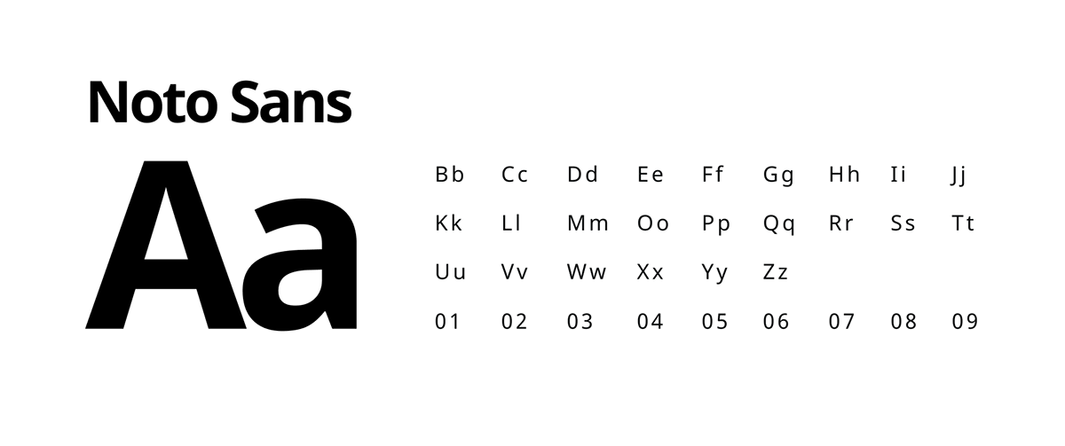
An International Typeface
FamilySearch.org is increasingly visited by users across the world and is translated into a variety of languages. Noto Sans is an ideal choice as the primary typeface for Zion UI because of its vast language support—supporting 582 languages in 237 regions all with "a harmonious look and feel".
Type Block
To improve hierarchy and consistency of type styles across FamilySearch, we developed a set of components that we call Type Block. Type Block is a set of default type pairings with baked-in spacing and hierarchy.

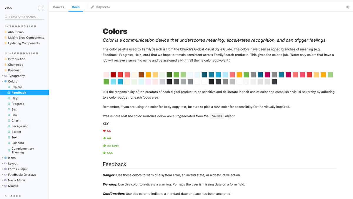
Color
Color is a communication device that underscores meaning, accelerates recognition, and can trigger feelings. In Zion, colors were assigned branches of meaning to be used consistently throughout FamilySearch.

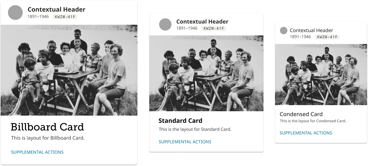
Standard vs. Billboard
Component design should be informed by the component's context. To allow for the same component to be used in several different contexts, we built-in some pre-configured style variations.
"Standard" styles are optimized for 'doing work' within an app with compact spacing and smaller type. "Billboard" styles are tuned for content consumption with more comfortable spacing, larger type, and being more image-forward. This allows for both marketing pages and core applications to share the same components with a similar look-and-feel but be appropriately configured for their context.
Understanding Overlays
To better promote cross-product UI consistency, we provided a set of overlays with specific purposes instead of a set of general purpose modals and menus. This also helped to cut-back on the ubiquity of 'favorite designer patterns' that can actually be quite interruptive to the user such as dialogs and alert banners.
Organizational Breakthroughs
A design system is at the service of the product teams that use it. This is not FamilySearch’s first attempt to have a common style guide and shared set of components. With a design system of this scale and scope, design tends to be the most straight-forward part; often the biggest challenges are in its application and adoption. Our Zion team worked hard to address process challenges early-on. These were some of our solutions:
• To ensure that the design system stays alive and maintained, we established a dedicated team to be stewards of the system. This is a full-fledged engineering team including PM, QA, UX, and Dev because a design system is a complex, full-fledged product.
• To get buy-in, to train, to get a range of perspectives, and to increase velocity of the team, we gave component assignments to designers and devs outside of the design system team.
• To keep the wider organization in-the-loop about new stuff that is introduced into the design system, we set up a bi-weekly 'share and tell' meeting with devs, designers, and product managers.
• To establish a clear path to approval for making changes to the design system, we put one person in charge of final approval for the design of new components and one dev in charge of the final approval of its coded implementation.
• To keep product quality high and ensure proper use of the design system components, we conduct design reviews—pre-dev and pre-launch.
Process

Our design process began with a site-wide audit of styles. We screenshot everything, outlined individual components, and tried to identify how each component might fit into Google's Material Design vocabulary.

Design assignments were issued to the entire UX team. They worked together in small groups.

Our design team used Figma to collaborate on drafting up specs for component design.

Design leads established a template in Figma to give the UX team a framework—a suggested process and documentation layout.

Determining typeface styles, sizing, and spacing on different devices.
Design docs, developer docs, and component previews/demos were brought together on Storybook as a 'single source of truth'.


