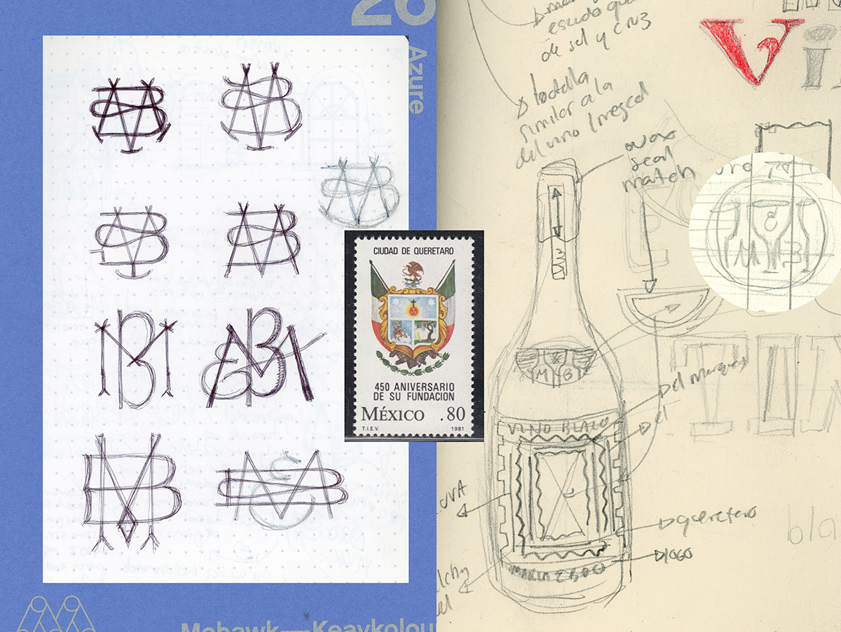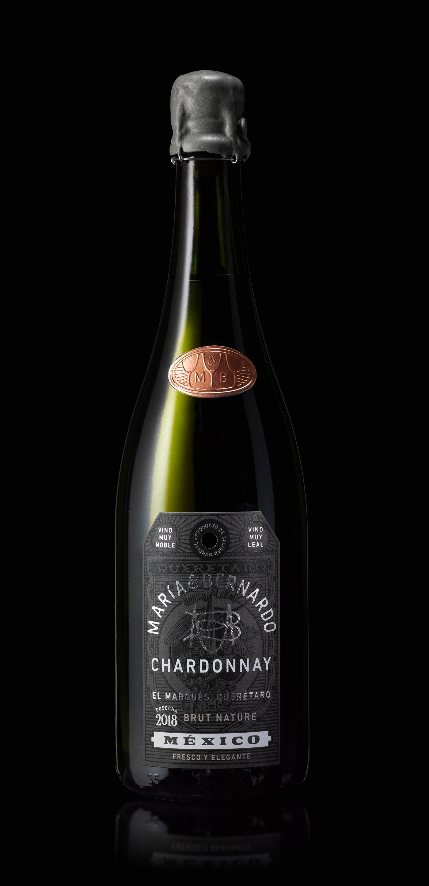

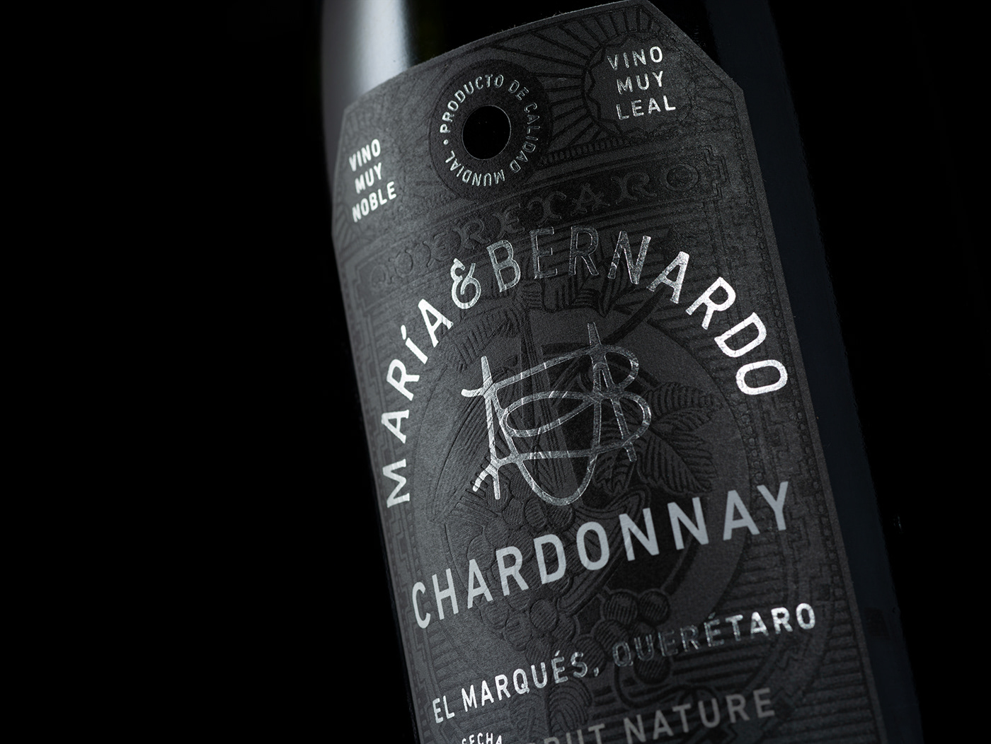
M A R Í A & B E R N A R D O is a family owned vineyard at the heart of México; Querétaro. This state is the only in the country with a truly unique wine history, a fact that can be appreciated in its heraldic shield with the use of vines. This, is the main source of inspiration for this label.
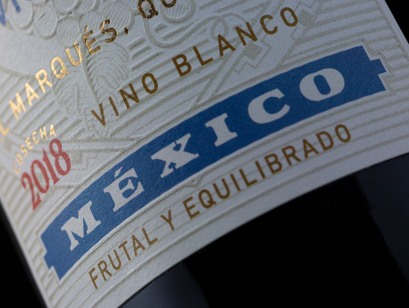
The label works as an analogy; what we harvested in the past, is what we celebrate in the present. The background is a deconstructed and modernized version of Querétaro’s heraldic shield, in which I also took some of the historic words of the state to describe the wine itself. i.e “Muy Noble, Muy Leal” which translates to the English as “Very Noble, Very Loyal”.
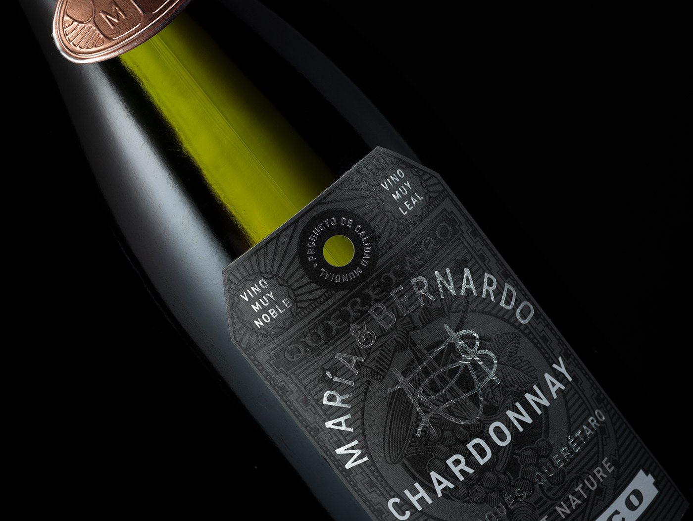
The shape of the label is a reminiscence of paper tags founded in wine shops as a gesture of simplicity to such intricate design, turning the ordinary into extraordinary.

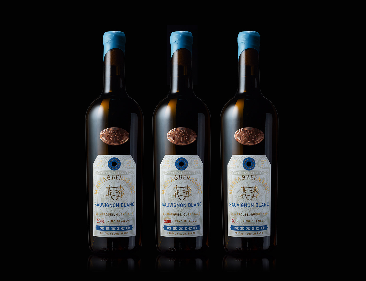
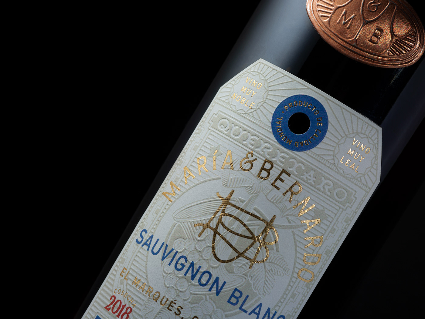
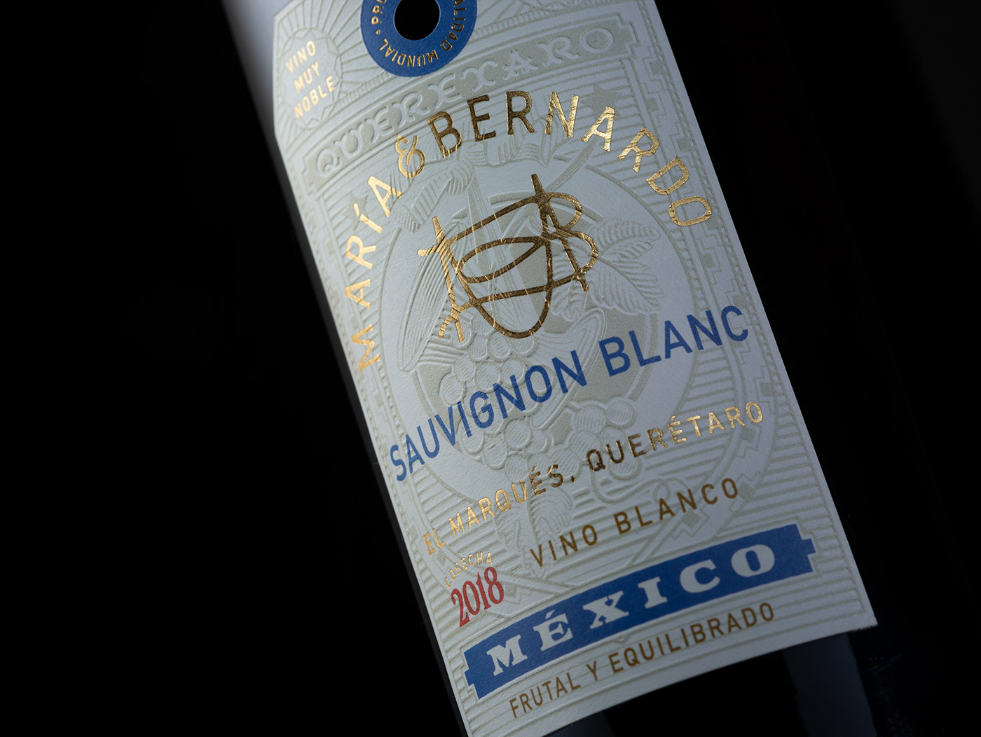

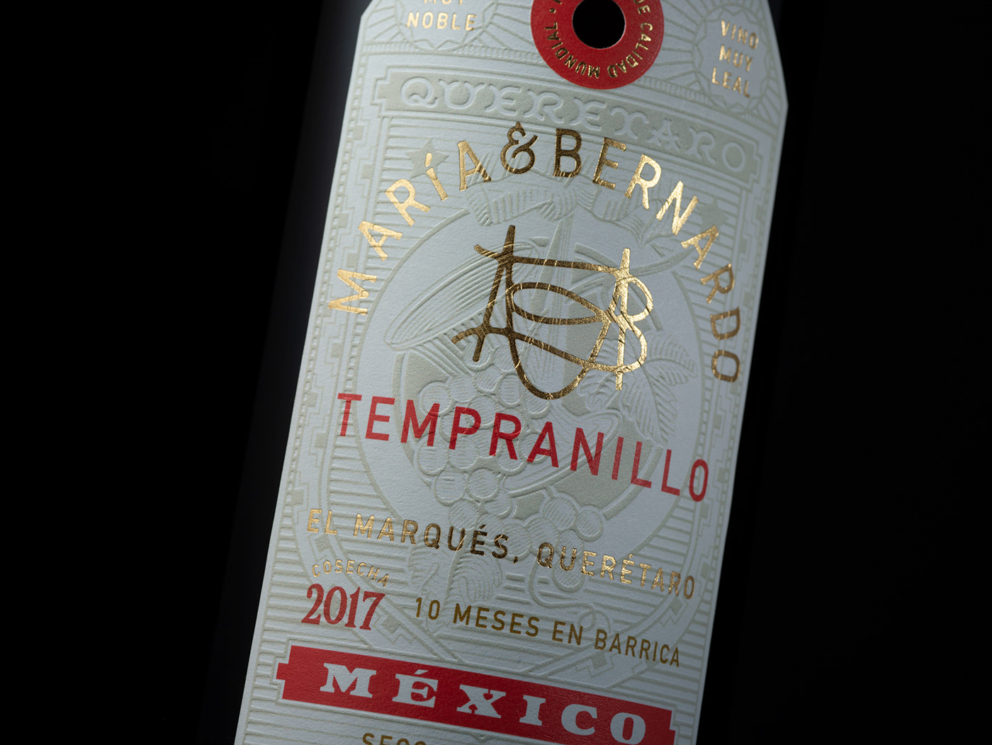
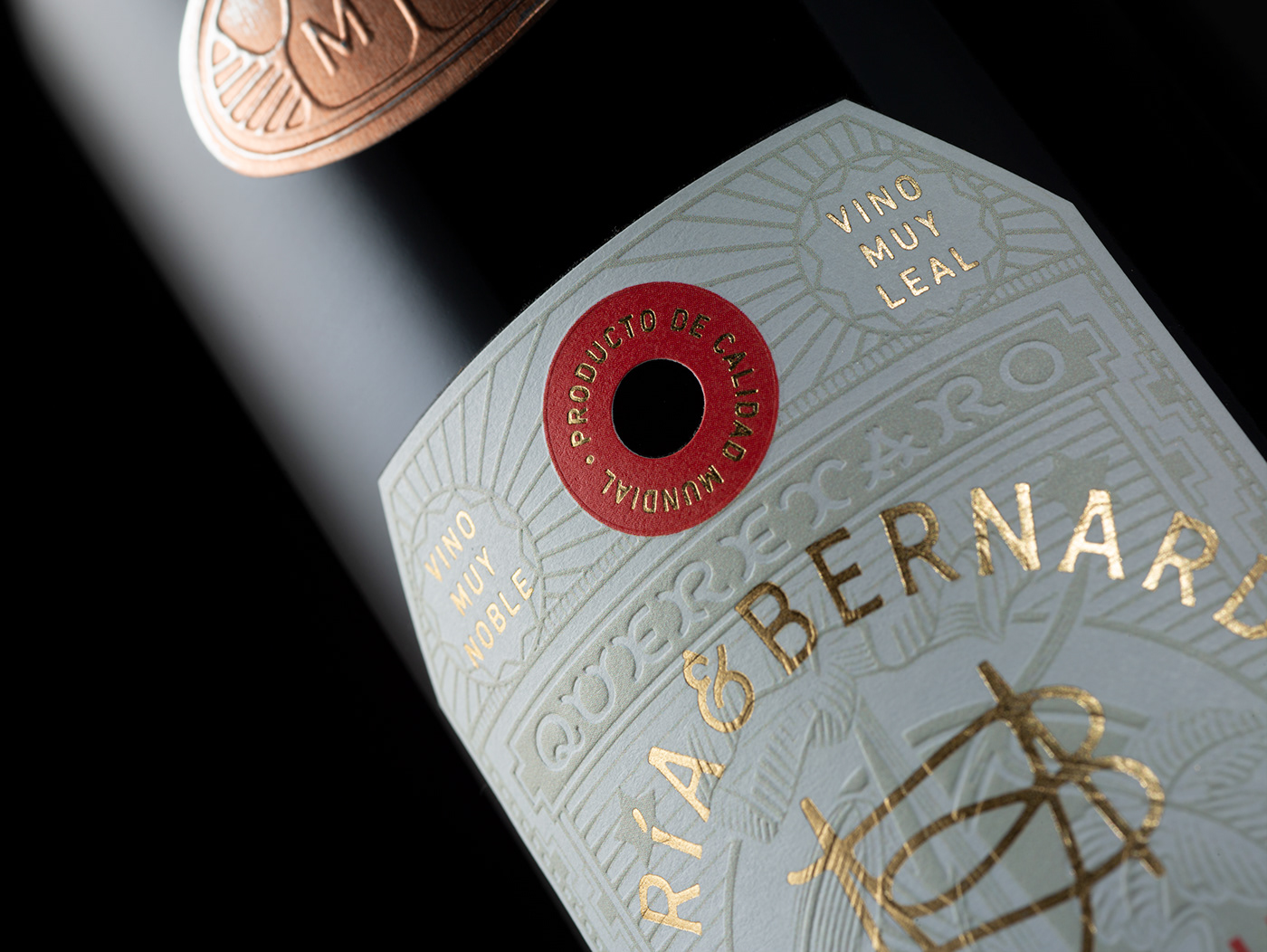

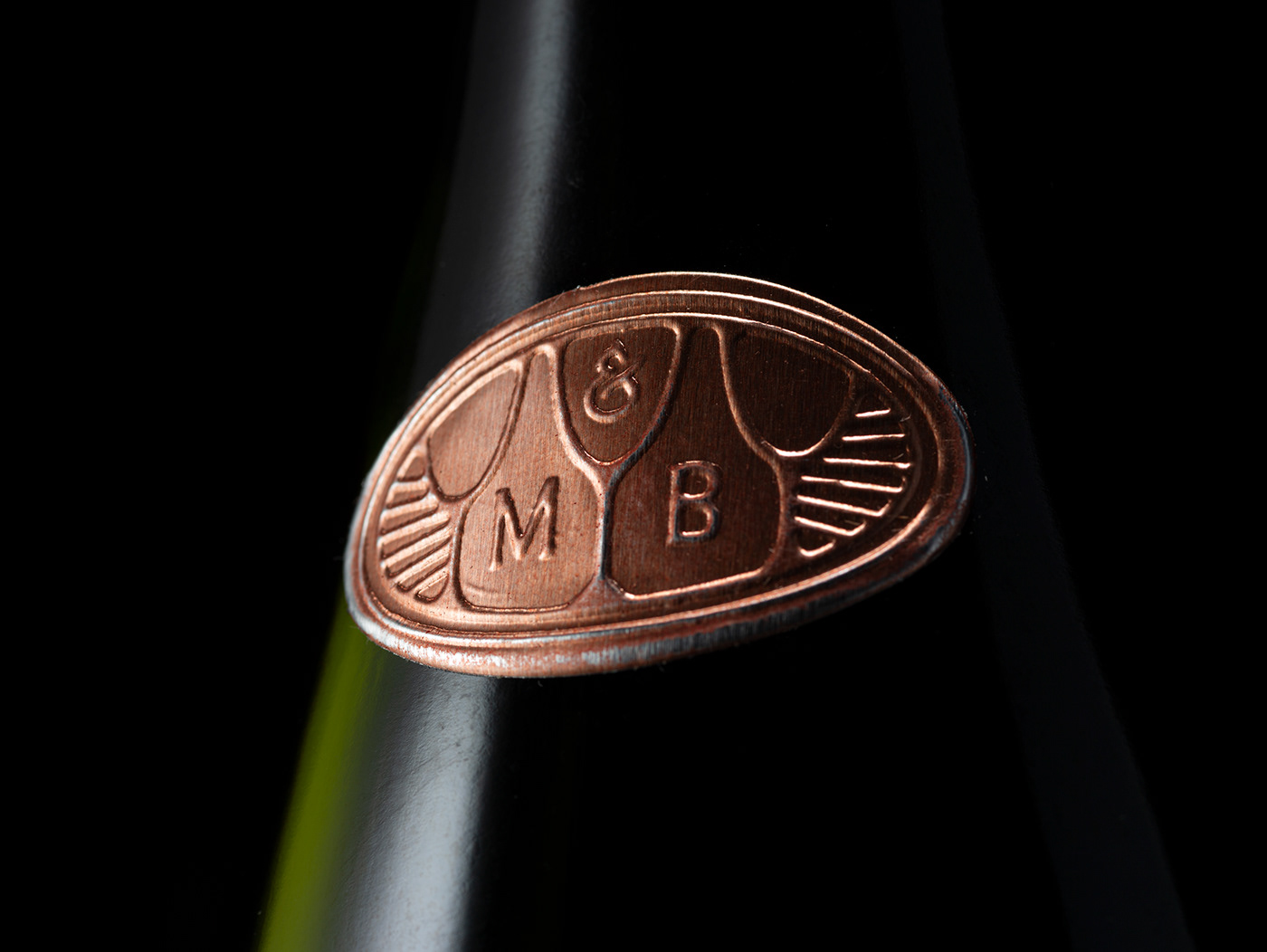
T H E C O P P E R S H I E L D at the center of the bottle is a line-work representation of 3 glasses. On the negative space they form two bottles of wine that work as holding devices for the initials, leaving the ampersand at the center as a third party who enjoys the wine; the consumer.