


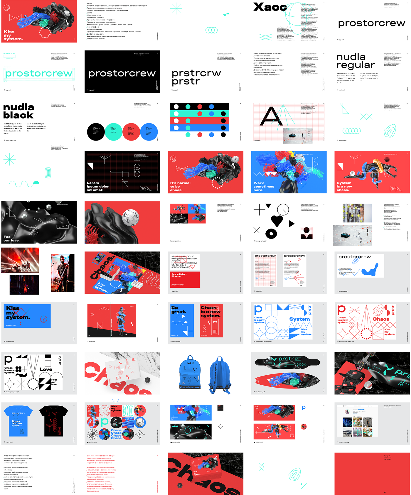
Prostorcrew сhaos identity.
Prostorcrew is a player in Moscow’s event market. Their clients include Porsche, BMW, Mini, Red Bull, Rado, Philips, and Hyundai. In 2019, the agency made a breakthrough: first, with Porsche Sportscar Together Day and then Redbull Soundclash. With great events came great media coverage from well-known Russian media: Forbes, the Village, RBC, and Rusbase.
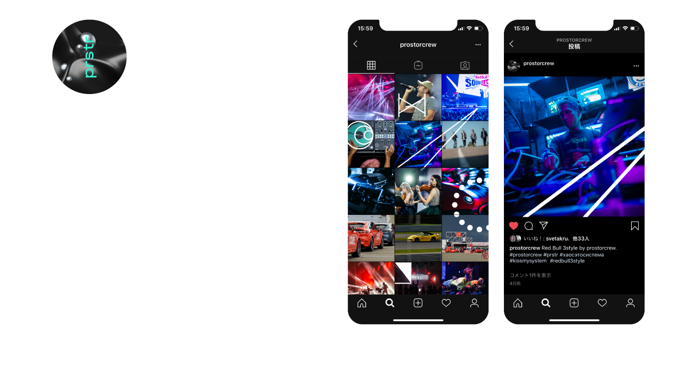
A special attitude to visual communication is what distinguishes prostocrew from other agencies on the market. It’s not lovely pictures or business identity — it’s more like an album cover, a revolution symbol or a subculture sign. We released the first iteration of a formless identity three years ago, and with the current redesign, we replenish the lexicon and make metaphors out of those new meanings.
The idea is the following. More often than not, new creative agencies are hungry. They perform bloodletting on the industry, make it go wow, they talk back and break the patterns. And then, as 5 years go by, they homogenize and become formalists. Prostocrew is business and art, work and action-packed movement, budget tables and watching the sunsets on the site. We don’t oppose one to the other. We manifest chaos as a system and the system as chaos, as an approach to business and life organization. We allow luck, mistakes, emotions and total control to happen, we allow productivity and meaninglessness, we are ready to participate in your tender with our opinion and attitude :)
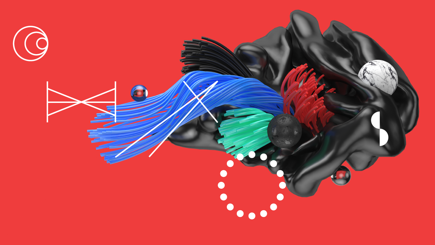
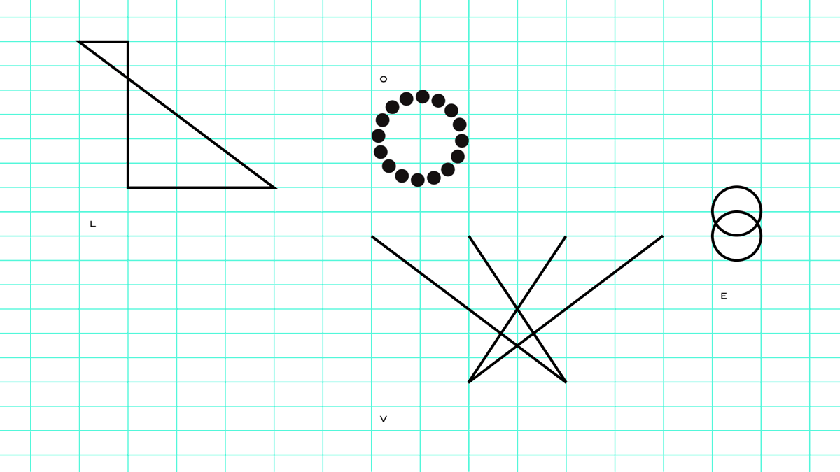
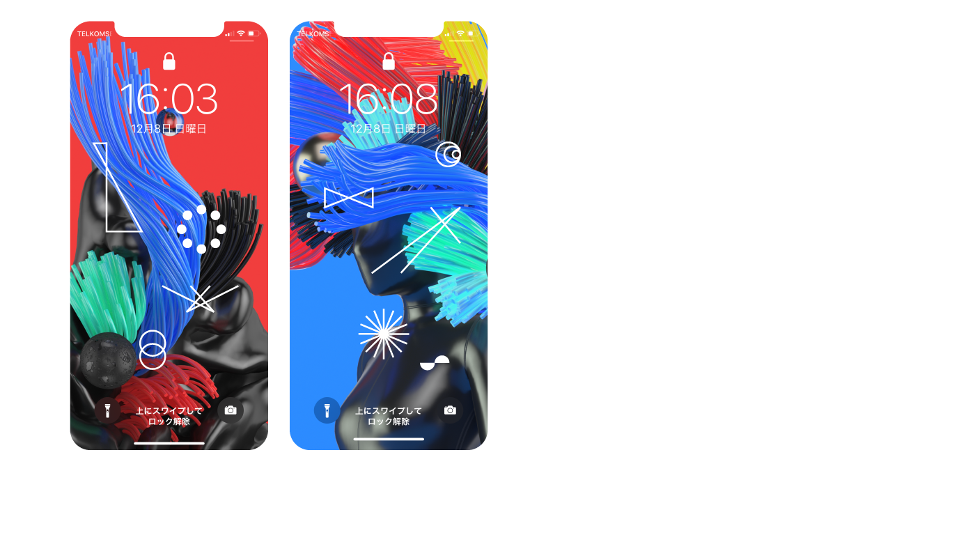
The ‘chaos-system’ metaphor is reflected in our graphical tools:
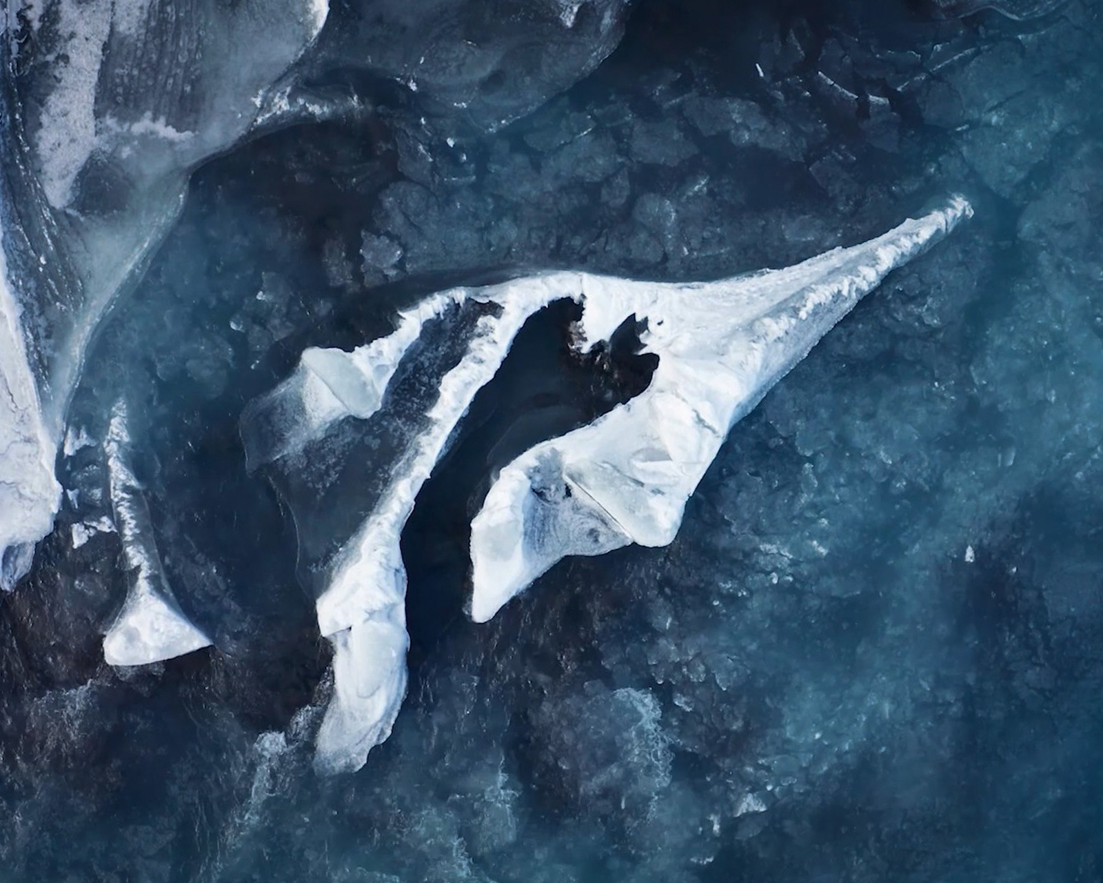
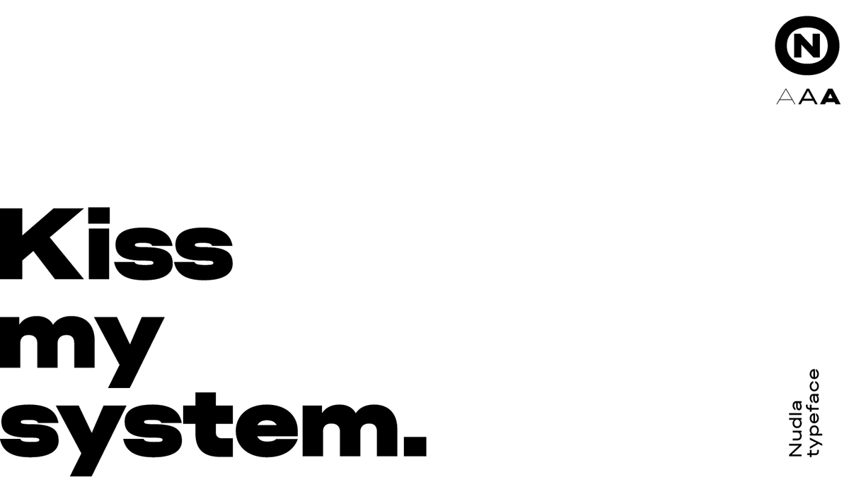
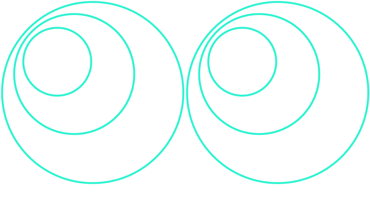
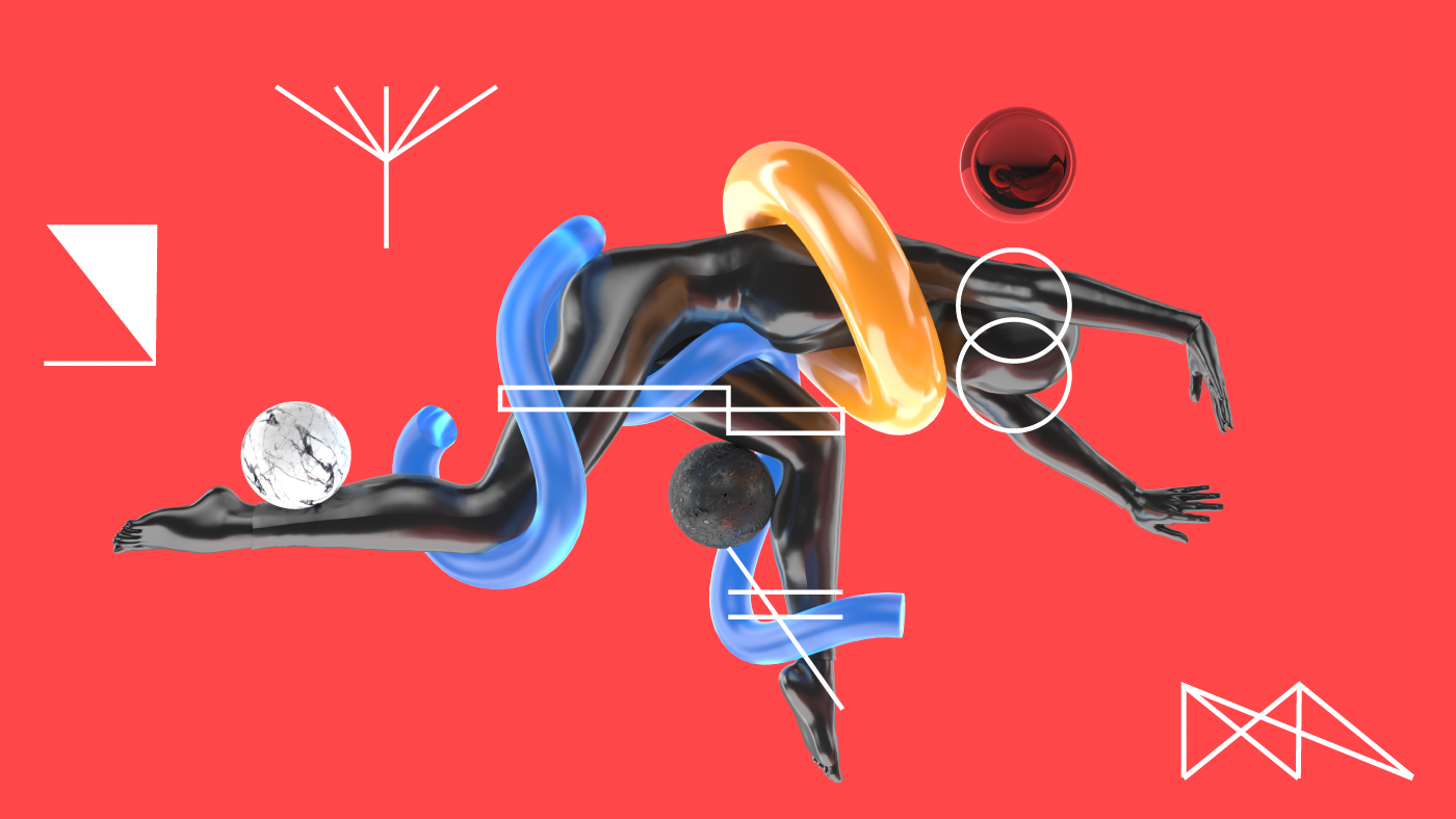
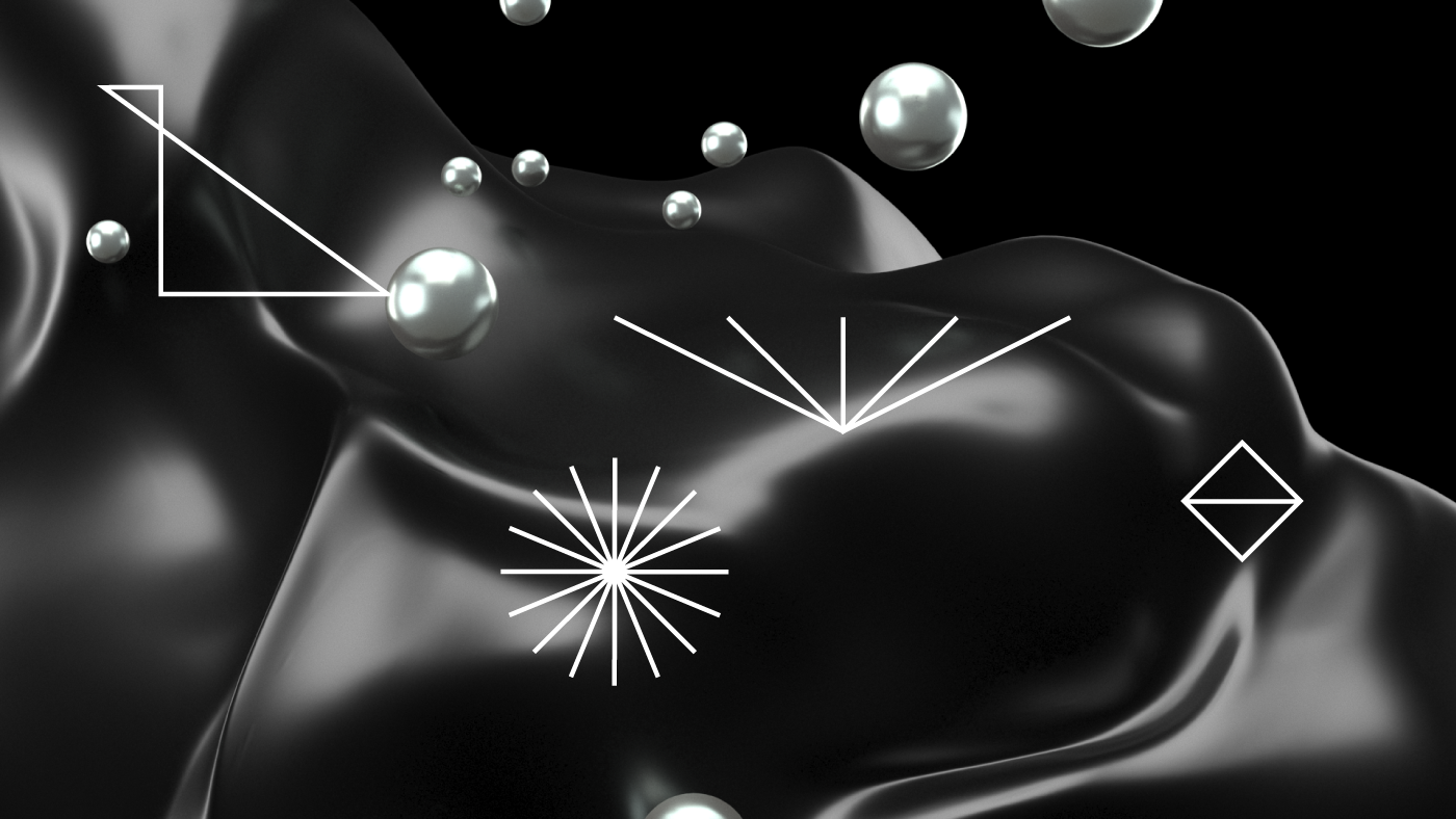
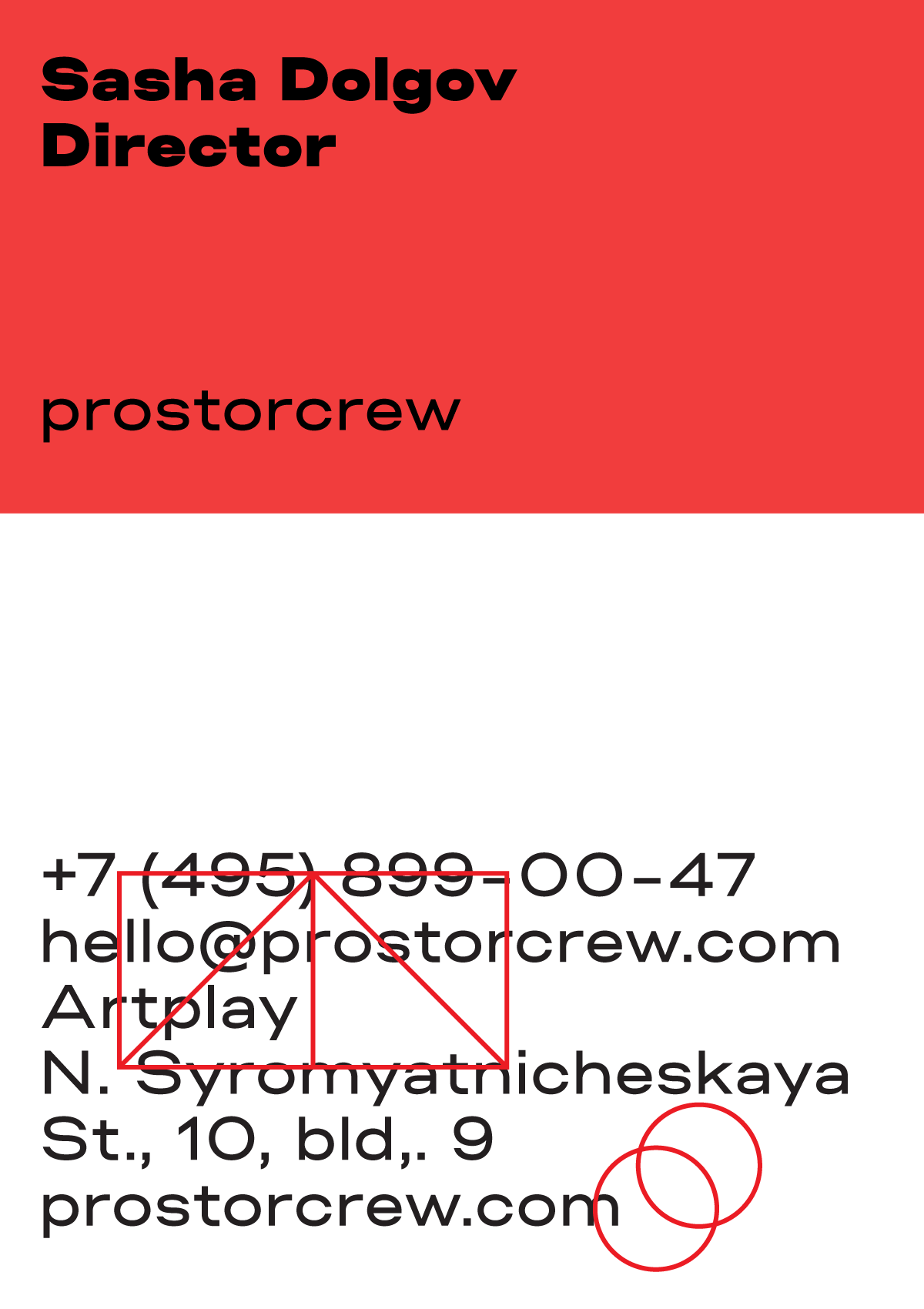
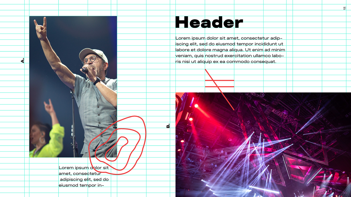
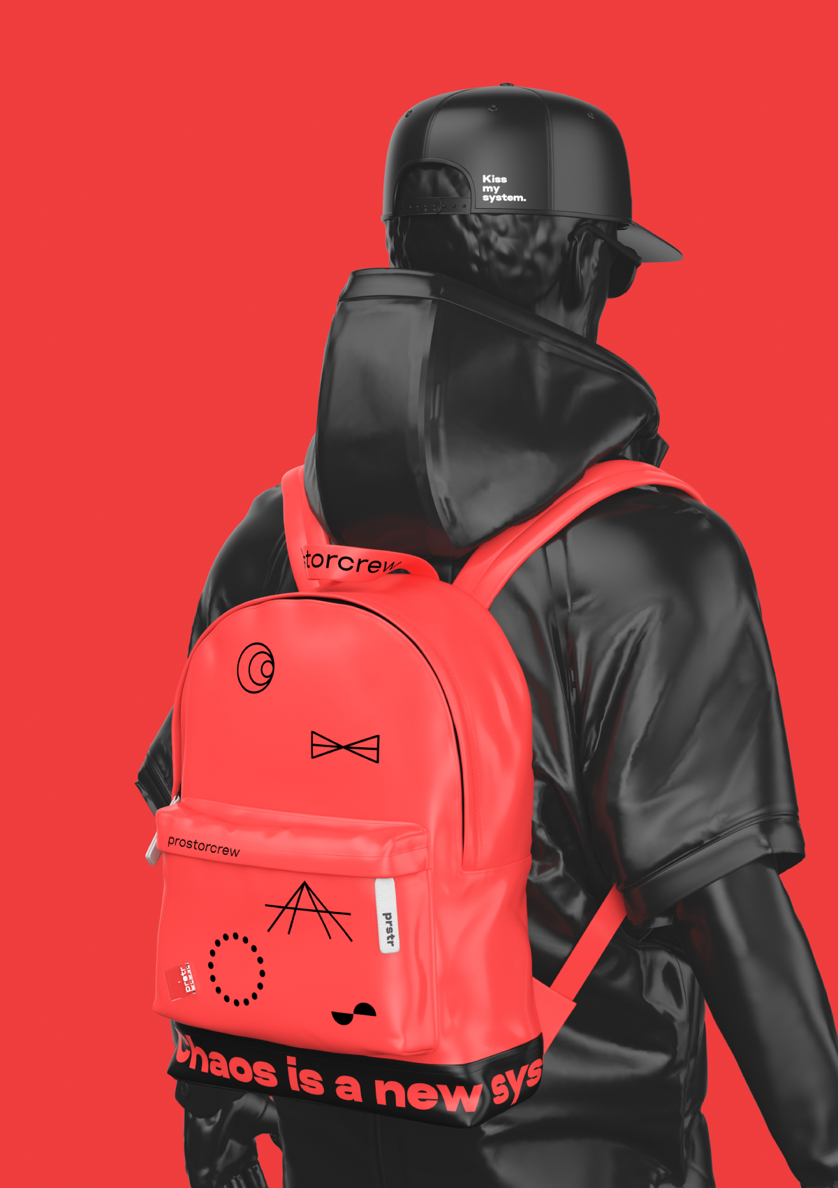
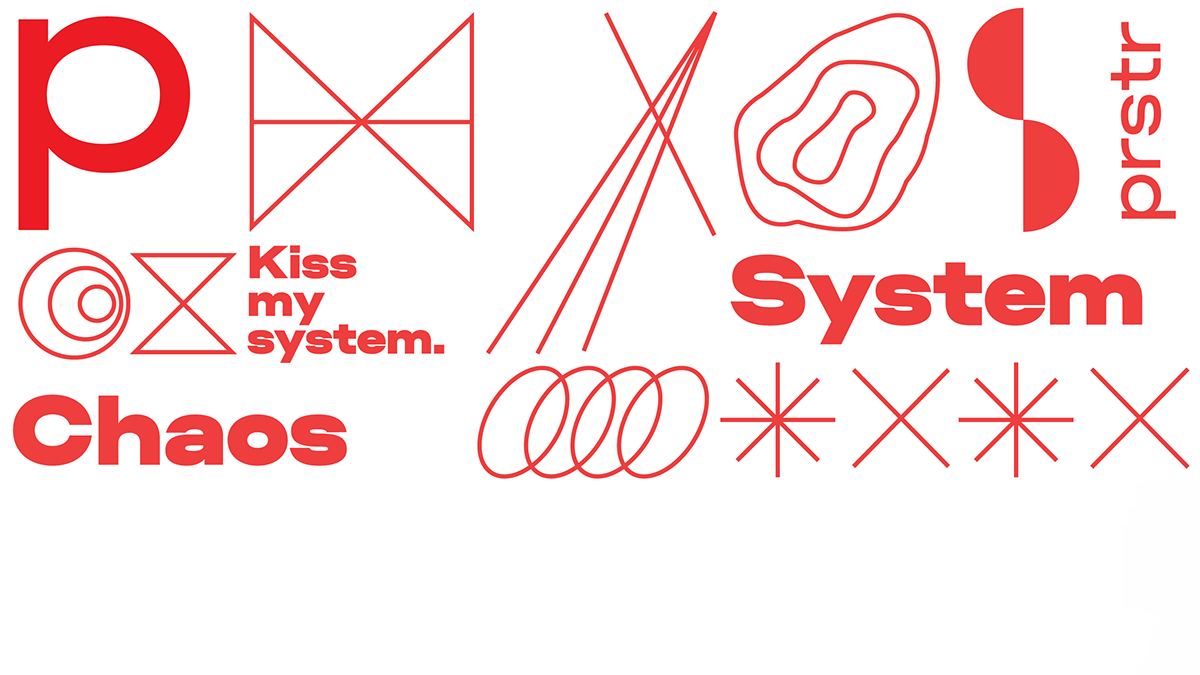
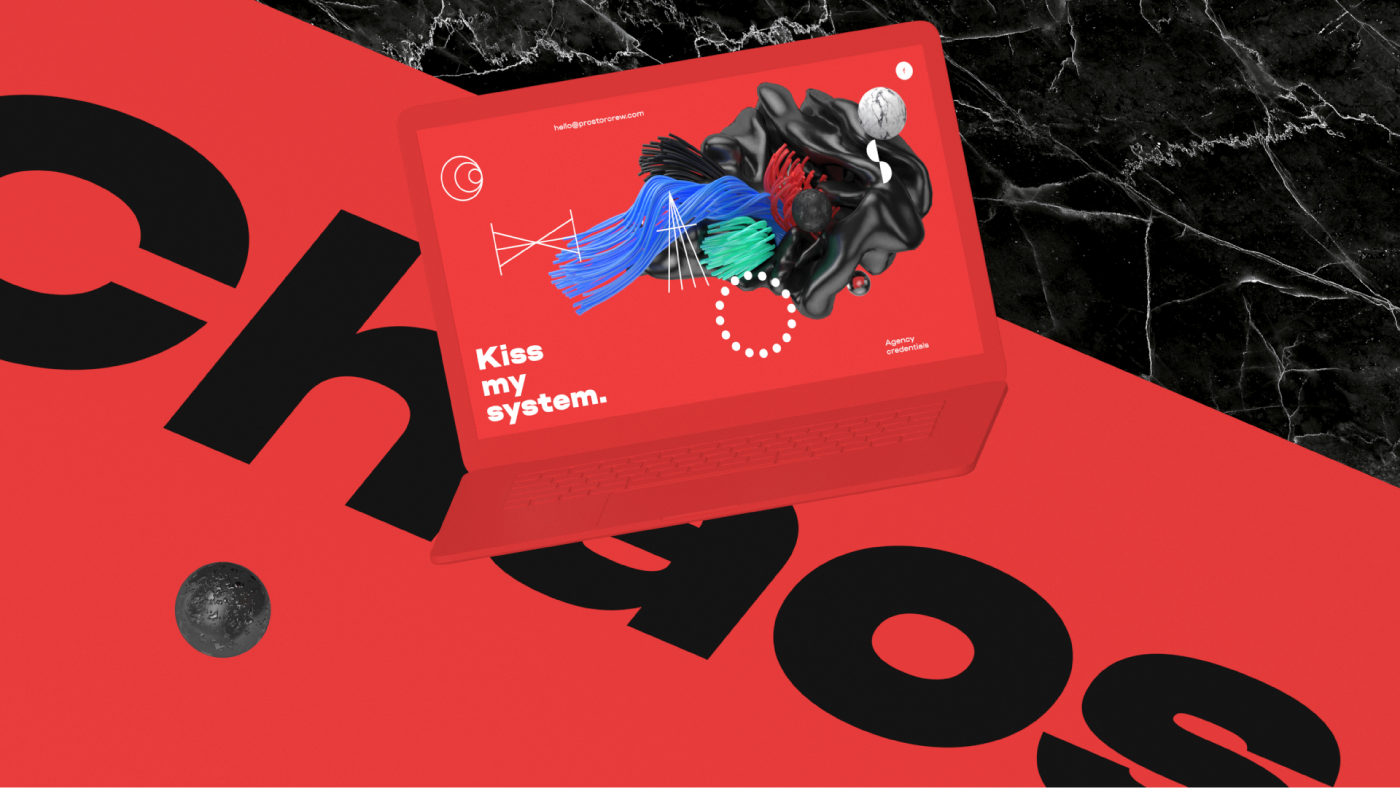
Modular design: random, chaotic visuals are, in fact, built using a strict grid. This is a visualization of how confusion and chaos can live within the guidelines of modularity and system laws. This is a key graphic metaphor that can be traced in all our media. Animated shapes: they bring dynamics to the design and make the layout perception more difficult, as well as support and highlight the chaos effect. Typography: our own Nudla typeface, as a strict grotesque in modern style, gets the system by the balls and stops it from falling apart. Creative 3D illustrations and animations: they complement the visual imagery and expand the variability of media usage. Color model: gives an affirmative and sometimes aggressive note to communication.


Erohnovich Roma, art-direction, design
Elena Kowalski (Glenjan), type design
Ilya Klimov, 3d, motion graphics, visuals
Typeface used: Nudla Typeface
Music: Nctrnm — Number, Mosaic, 2019


