

CannaLinks - Designed in Ukraine, Yaka Design Bureau
Brand Identity, Brand Language
CannaLinks are advisers and promoters of recreational cannabis worldwide.
In a few words, this is how they position themself on the market, which is an important aspect since it helps to understand the needs of the client: "Our team exclusively serves Cannabis operators, contributing an array of advisory expertise and an unwavering commitment to furthering the industry and the best practices via CannaLinks."
Solution
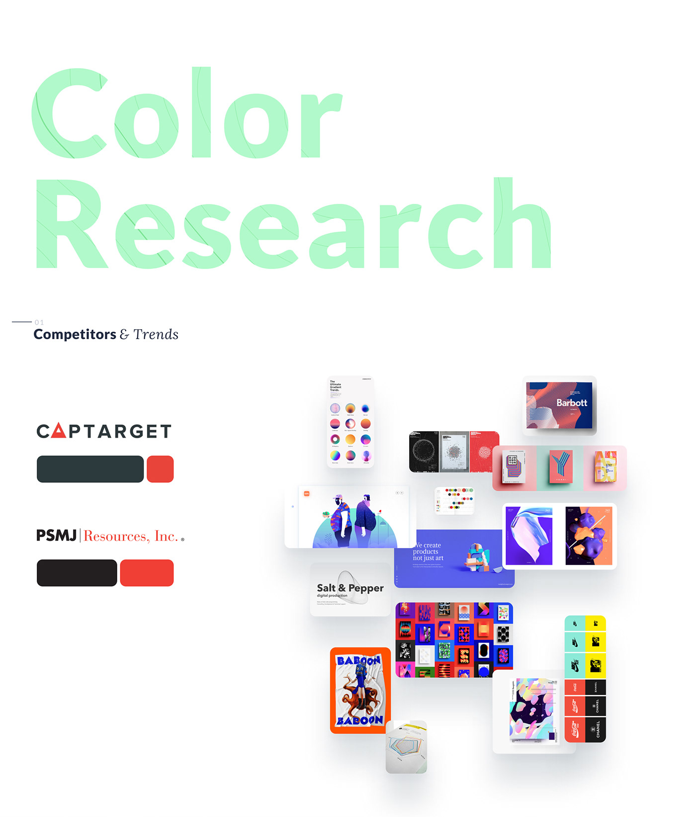
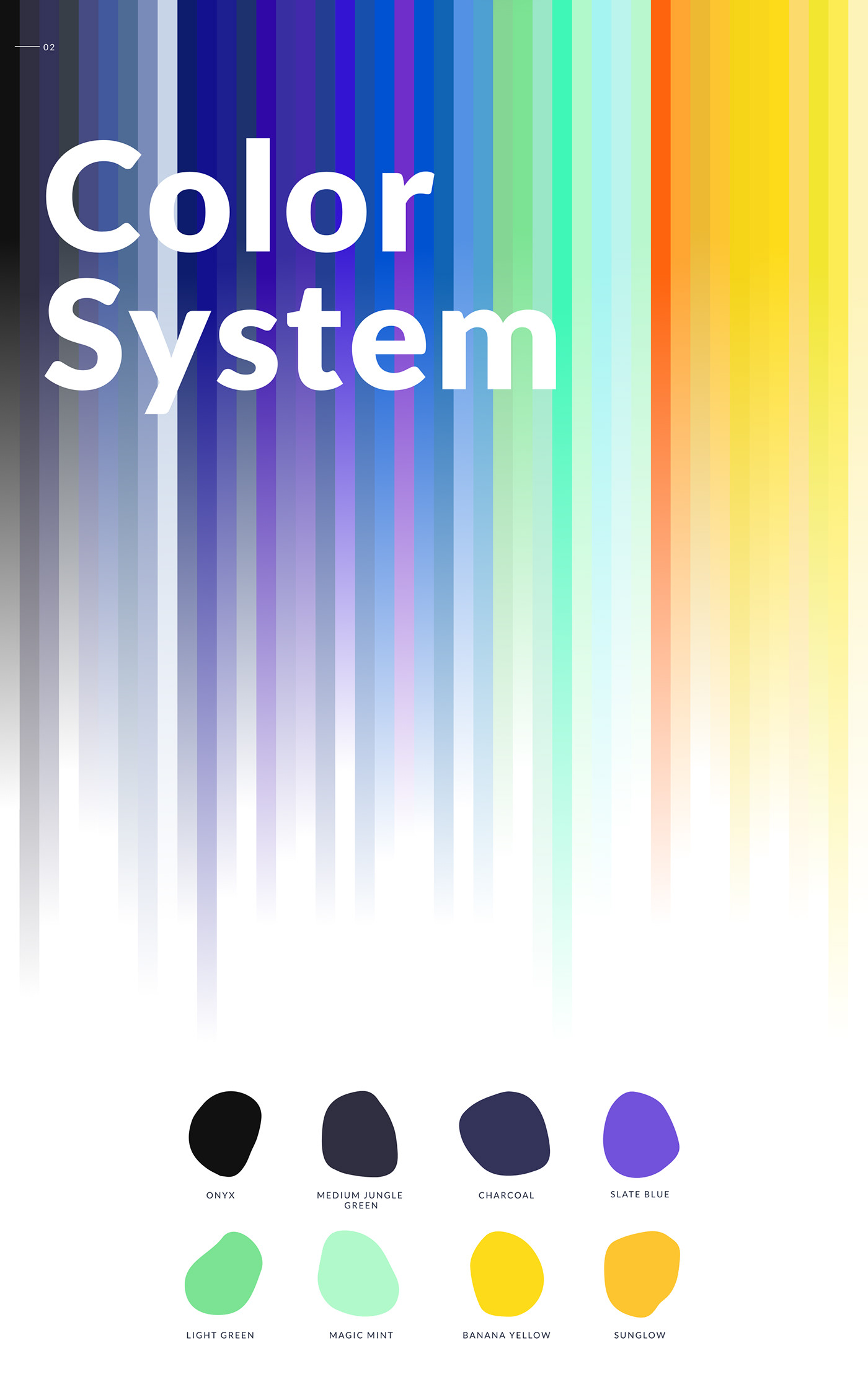
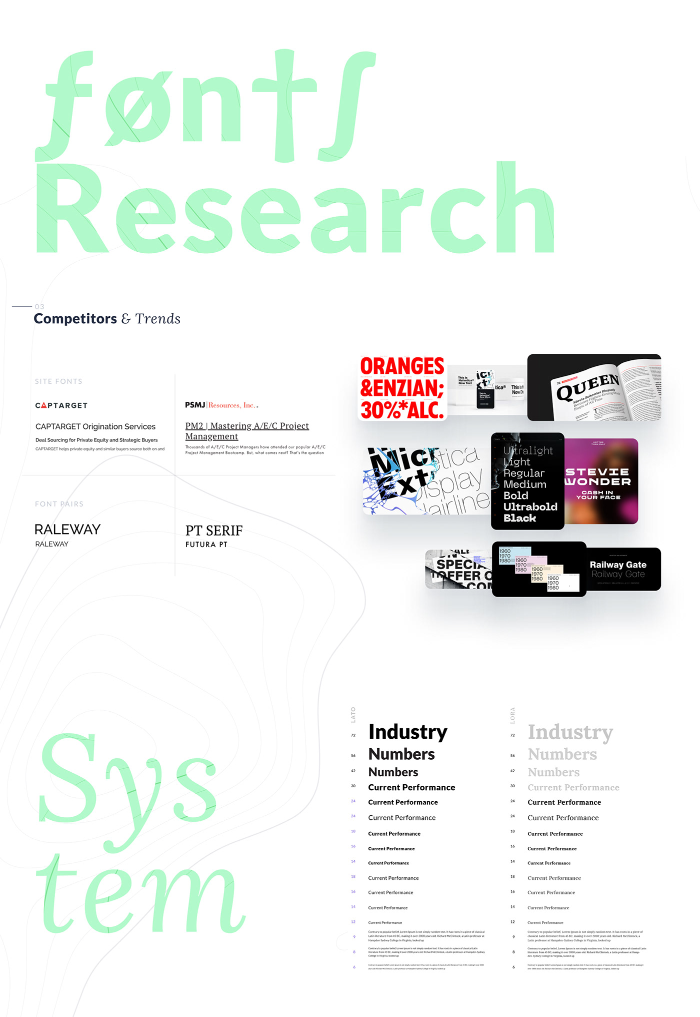
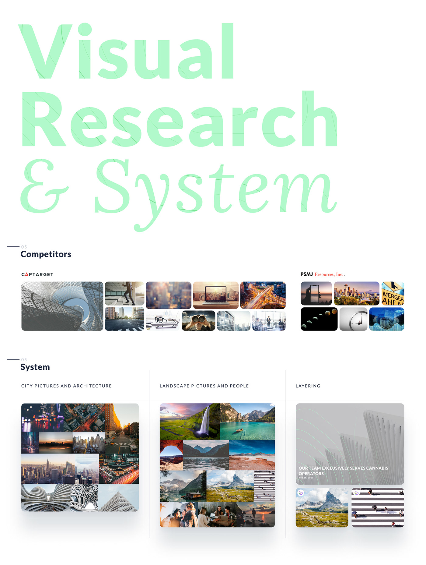
We conducted a study that would give business owners confidence in the process of choosing a path of visual communications. Where concerning the language of the brand, we have focused on the wide geography of the company's customers, as well as their desire to enter the market in other countries.
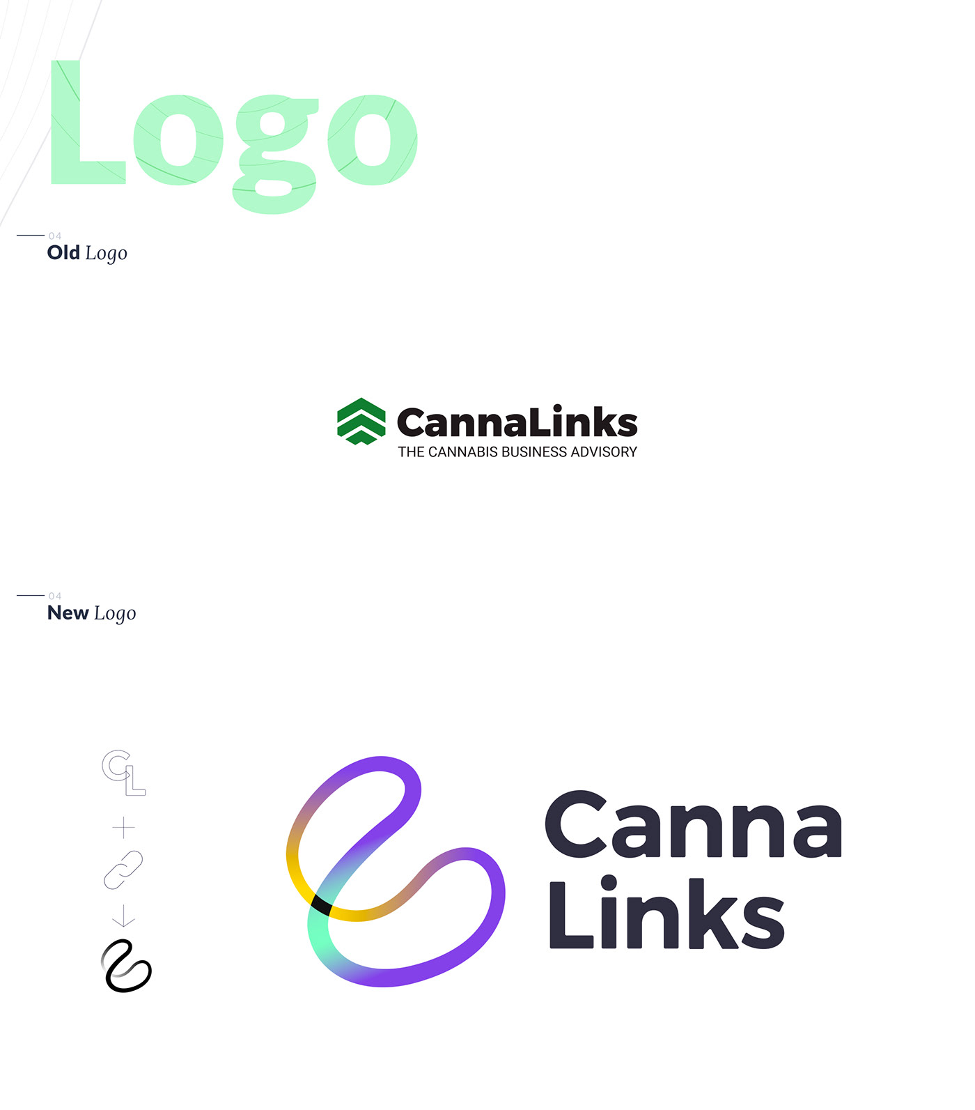
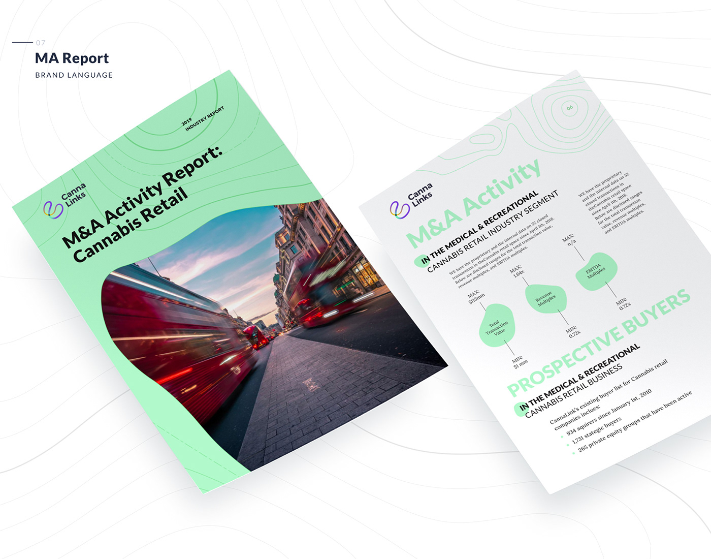
This is a new presentation style of our case, where we set a goal to show not just an image but a short evolution of the brand.


Tags: UI, UX, Product design, clean, service, homepage, icons, branding, brandbook, colors, research, service platform, webdesign, web site design, advisor, teamwork, freelancer, company, logo, business card, customer, presentation, fonts, social media kit, brand language, badges, mockups, brochure, report, pattern, competitors, system, color trends, font trends, visual system
STAFF:
ANI GRIGORYAN - GRAPHIC DESIGN
MYKOLA TKACHENKO - GRAPHIC DESIGN
IGOR NECHITAYLENKO - GRAPHIC DESIGN
OLEKSANDR GEFFEN (YAKA SPECTRUM) - ART DIRECTION & GRAPHIC DESIGN