


Sol’ is an architectural and interior design studio.
The logo gives you a reference to clear and precise forms, that are creating at the beginning of the design process.

Sol’ is an architectural and interior design studio.
While scrolling the logo under 90 ° you can read each letter of the brand name, including the apostrophe.
(First concept)
While scrolling the logo under 90 ° you can read each letter of the brand name, including the apostrophe.
(First concept)
Argo Development is a large construction company.
The logo gives you a reference to columns and structures, that are placing at the earliest stages of construction.

Possible is an SMM agency.
Two squares symbolize two owners, and the shaded part is a common cause.
The shaded part can move diagonally: top, center or bottom (as it is now).
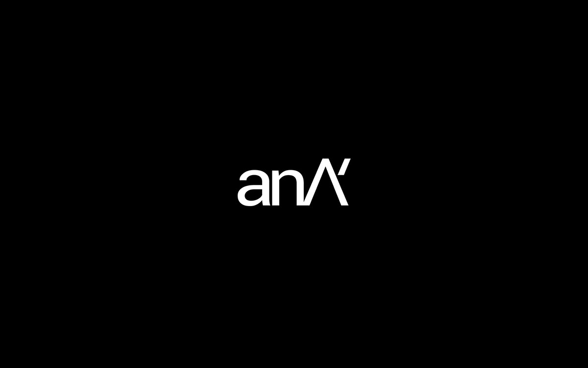
anA is a manufacturer of lighting systems for residential and commercial premises.
The last letter takes emphasis and acts simultaneously as an emphasis and graphic stylization of lighting with a lamp.
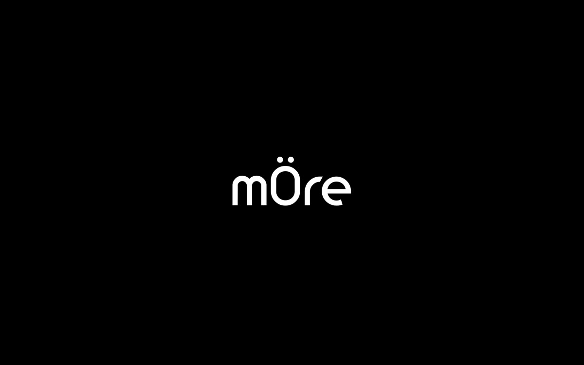
mÖre is a PR communication agency.
The letter "Ö" gives a reference to the name drawing a parallel to the work.
And also more connections as well as opportunities for your business.

Flove is a premium segment flower shop.
Refined connections between letters show the fragility of designer bouquets.

Ba4u is an interior design studio.
The logo symbolizes two levels. The horizontal strip acts as an overlap between floors.
Thanks for Watching.
Don`t forget to Appreciate this.
Don`t forget to Appreciate this.
|
|
|
|


