

New York Giants Landing Page Concept
Going to school in Rhode Island, watching my favorite football team (the New York Giants) was proving to become a challenge as I was no longer watching local New Jersey broadcasts. To make matters even more difficult, the team itself wasn’t exactly clear on where or how I could watch the game when I went to their website. The New York Giants’ website is a collage of news stories, photos, and ads screaming to buy tickets and jerseys. Unless you search for it, broadcast info was nowhere to be found. Every button labeled “Watch” brought you to the NFL’s streaming service instead of the information I was desperately looking for ten minutes before the game started. The clock was ticking.
A design problem was clearly present to me, and I thought it would be a fun passion project to redesign the homepage of the website to coincide more with what fans actually use the website for as well as make it more user-friendly. Yes, many people go the website to buy tickets, gear and read up on the latest news, but I was convinced that it is not the purpose the majority of people are there for. I feel many users are like me and are just trying to find out how to watch the game from the comfort of home and perhaps read an article here and there to stay updated.
So, I conducted a survey asking the reason fans go to their team’s website/app and how difficult it is to find the information. The results proved my hypothesis correct with nearly 80% of the participants saying that the main reason they visit the website is to find out when to watch the game and what channel to tune their TV onto. The same results also found that 60% of the users struggled to easily find the information, just like I did. Next, I decided to design my own solution.


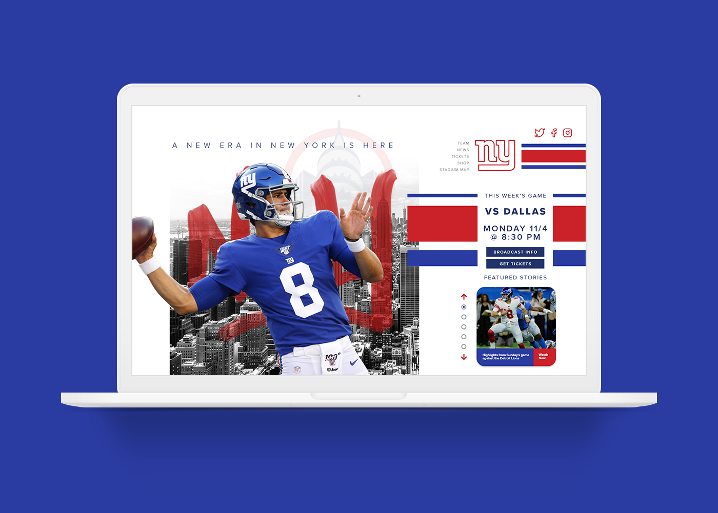
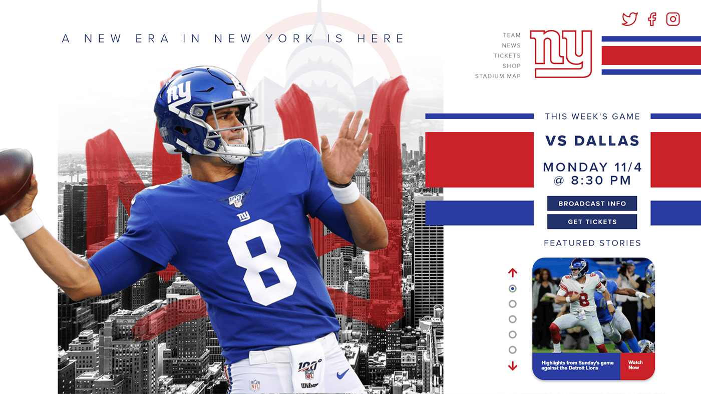
I felt the current website throws way too much information at the user, so I really wanted to dial it down. That is why the landing page I designed utilizes a hero image to the left. I chose to design a graphic involving Daniel Jones, the new quarterback of the future, in order to instill inspiration and hope for the fans whenever they come to visit the website. The original menu bar has a total of 17 different options, and I felt that many of those could be combined and simplified. I conducted a card sorting survey and was able to reduce the menu to 5 options, while still keeping the same functionality and content that the previous menu has. You can also see that in the right-side column it immediately highlights the next game to be played, broadcast info, and tickets for that game. This is the information users are trying to find when they go to this website, so I wanted to make sure it was the featured content of the landing page. The featured stories gallery is a more organized way to display what users should read. Instead of showing 4 different stories to pick from at once, I think it is better to slowly feed information to the reader in chronological order. That way, it is easier to know which is the latest information that they need to keep updated on while not feeling overwhelmed.
You will notice that a vital design element I wanted to implement was the Northwestern stripes pattern. I chose to do this because this has been part of the team’s identity on all their uniforms since 1954. It is easy to slap the team logo across the website, but I wanted to make the team identity present in various and creative ways. Thank you for reading, I hope you enjoyed my project!
Thank you for watching!


