


From the initial sketches, there were two strong concept ideas.


And concept number 2.


This concept was the chosen concept, but the typography needed some work to bring it all together, as it still looked like two separate parts rather than one combined logotype.


Wyzowl stylesheets for different areas of the brand.


Wyzowl is a video marketing agency that were looking to refresh their brand to bring them up to date in the market and give their channels a new look.
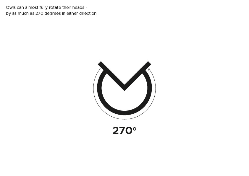
I created a simple, minimal owl symbol which was based around the fact that an owl can turn its head 270 degrees. I then created a bespoke logotype using angles of 22.5 degrees to keep it consistent.
Although the primary colour of the brand remained the same, I created a new colour palette based on this that was more vibrant, and fresh.
I chose the typeface ‘Inter’ as I thought it paired well with the logo and it felt like a better fit when used big and bold than what it used to be (Montserrat).


