Building THE italian Graphic Design blog
Grafigata.com — Brand Identity, UX/UI Design, Brand & Content strategy, Business development
I created Grafigata.com in september 2014 in order to share high-quality and detailed graphic design guides and resources and enable other designers to achieve success and improve their skills.
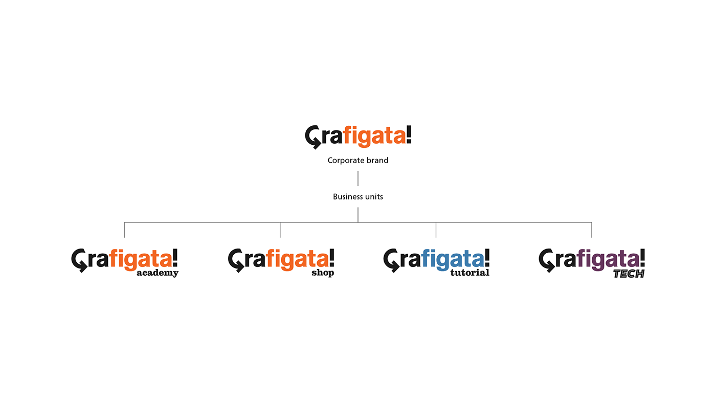
Over the years, around Grafigata, a community of more than 35,000 designers has emerged and Grafigata has become the most popular, appreciated and read blog regarding Graphic Design in Italy.
Grafigata, with the Grafigata Academy, has also become a learning platform for designers who want to improve their professional skills through online advanced courses.
This is the presentation of the identity principles behind all of this.
"Sprigiona creatività!"
"Unleash your creativity"
1. Brand Identity
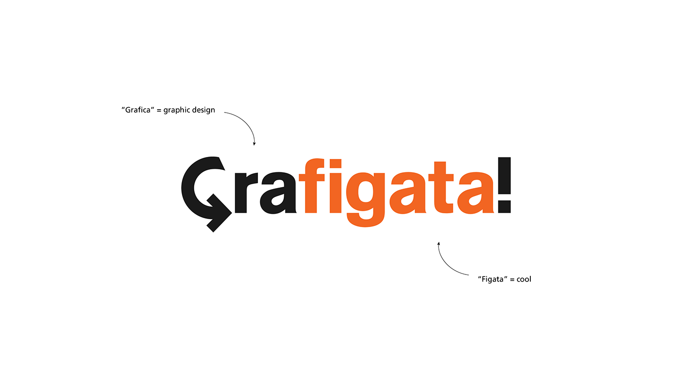
The name "Grafigata" is a union of the two italian words "grafica" (graphic) and "figata" (cool).
And that already says it all, doesn't it?
And that already says it all, doesn't it?
The logo is meant to represent one basic concept: the creative revolution. The "G" openly becomes an arrow in the direction of the exclamation point representing enthusiasm for change and personal growth.
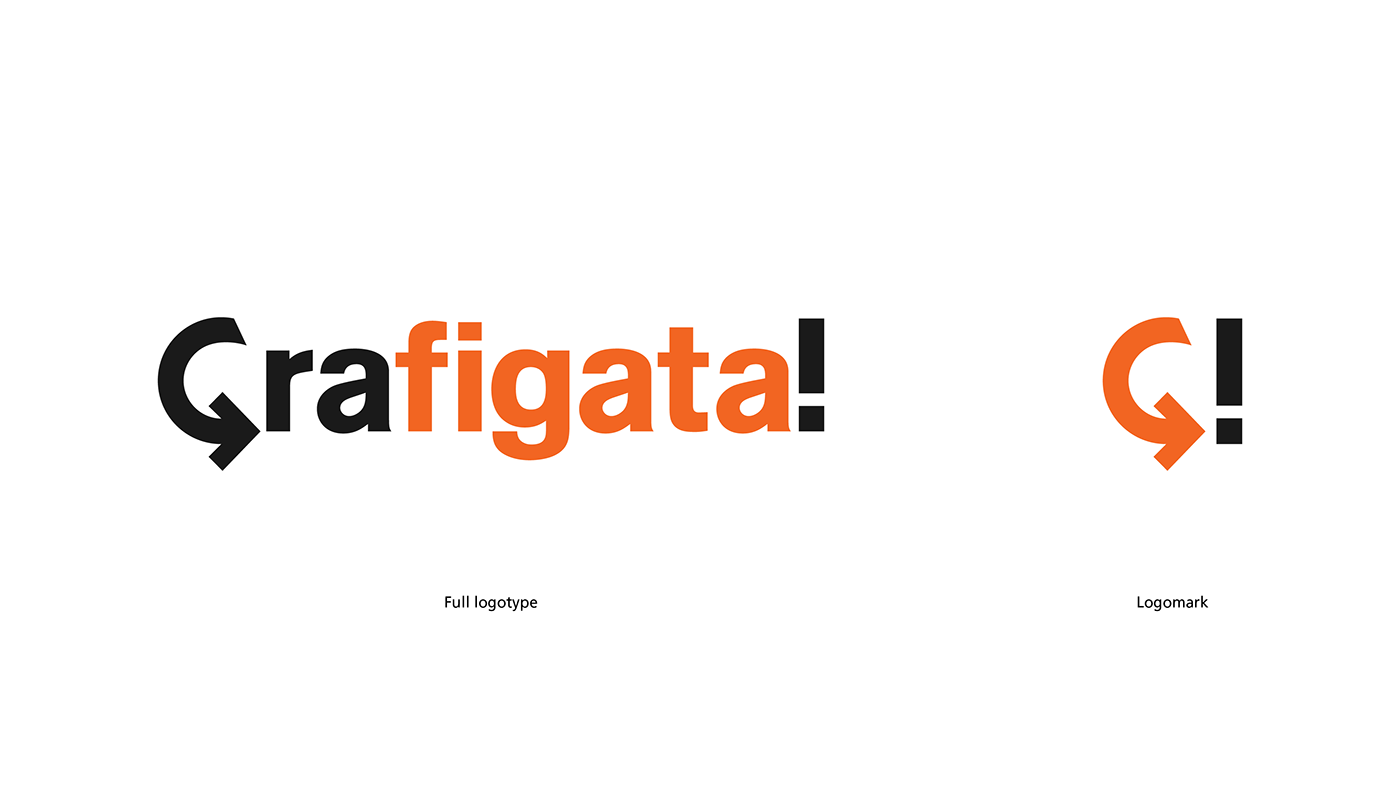


2. Brand Hierarchy
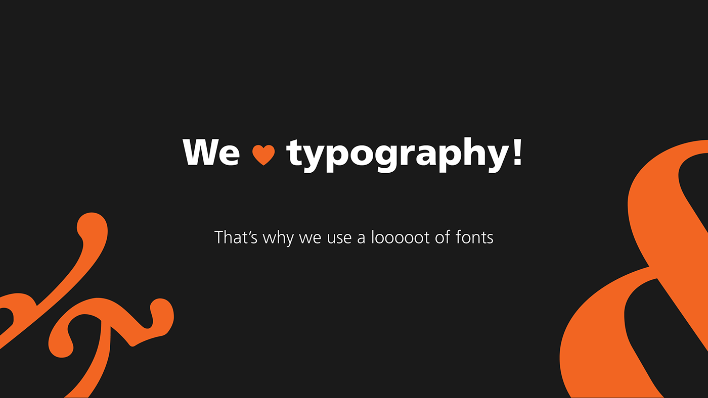
3. Typography
A blog about graphic design can't help but have a great focus and attention on the typography it uses.
On the blog itself and within all of its communication.
On the blog itself and within all of its communication.
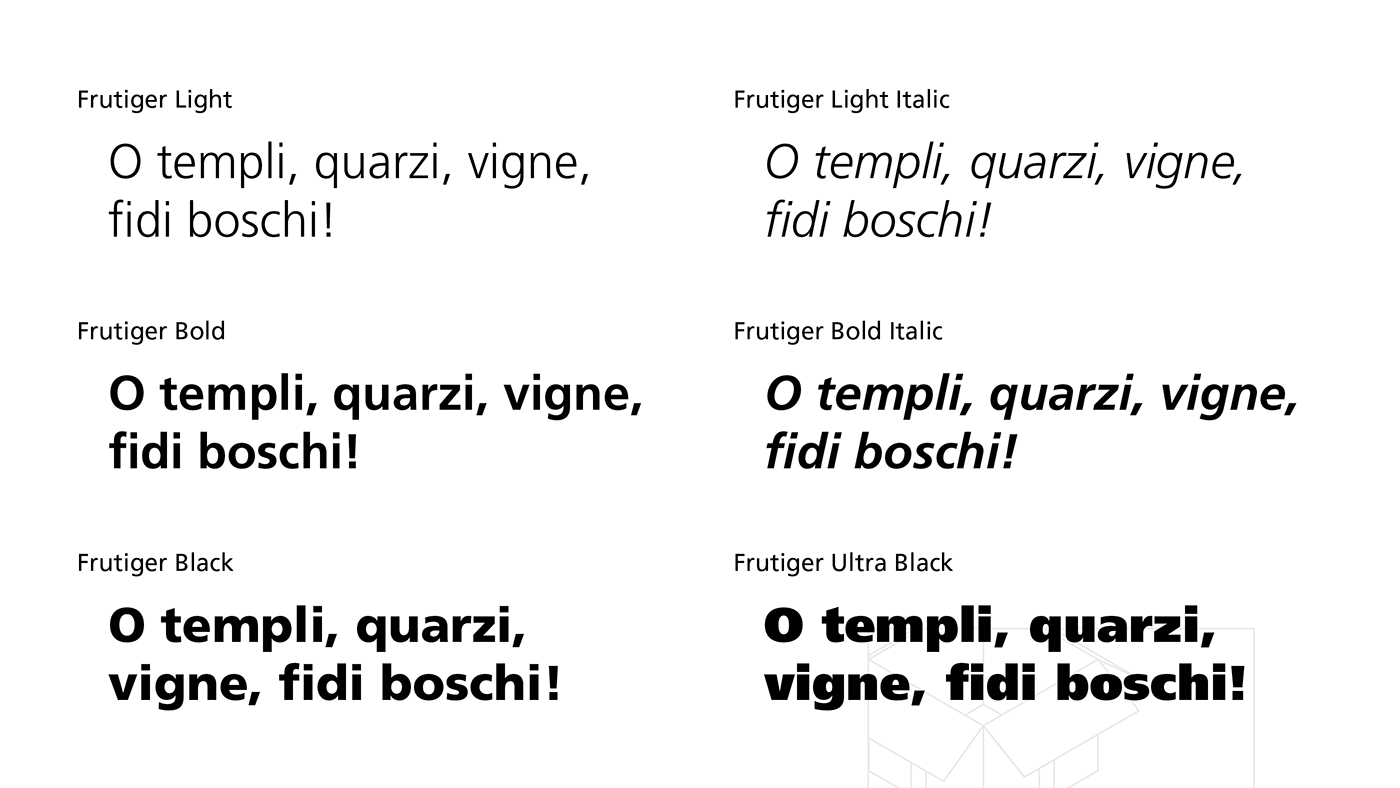
The main typeface of Grafigata's communication is Frutiger, a font I've had a real crush on for years. It is a humanist sans-serif designed in 1975 by Adrien Frutiger.
We use Frutiger on practically everything: graphics, social media, communication, merchandise.

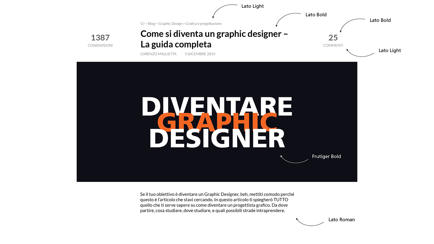
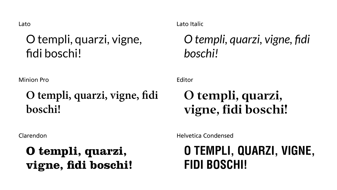
Utilizziamo il Lato, un Google Fonts, per il sito web. Un carattere sans-serif umanista, neutrale ma dinamico.Il Lato ha anche il pregio di essere "simile" al Frutiger, in alcune sue forme, e anche di avere un italic veramente eclettico.
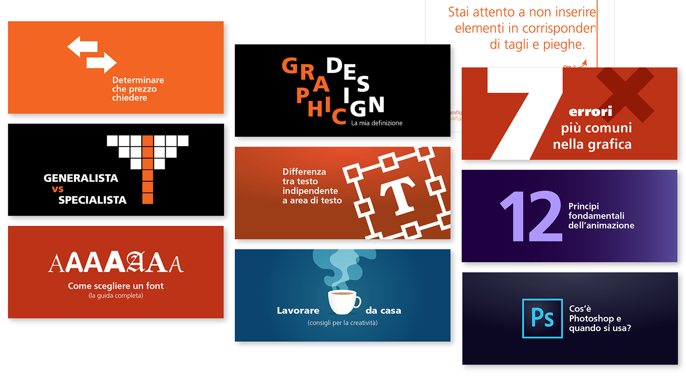
Utilizziamo, poi, molti altri caratteri tipografici diversi per caratterizzare alcune aree tematiche e linee comunicative e, in generale, avere maggiore flessibilità d'azione.
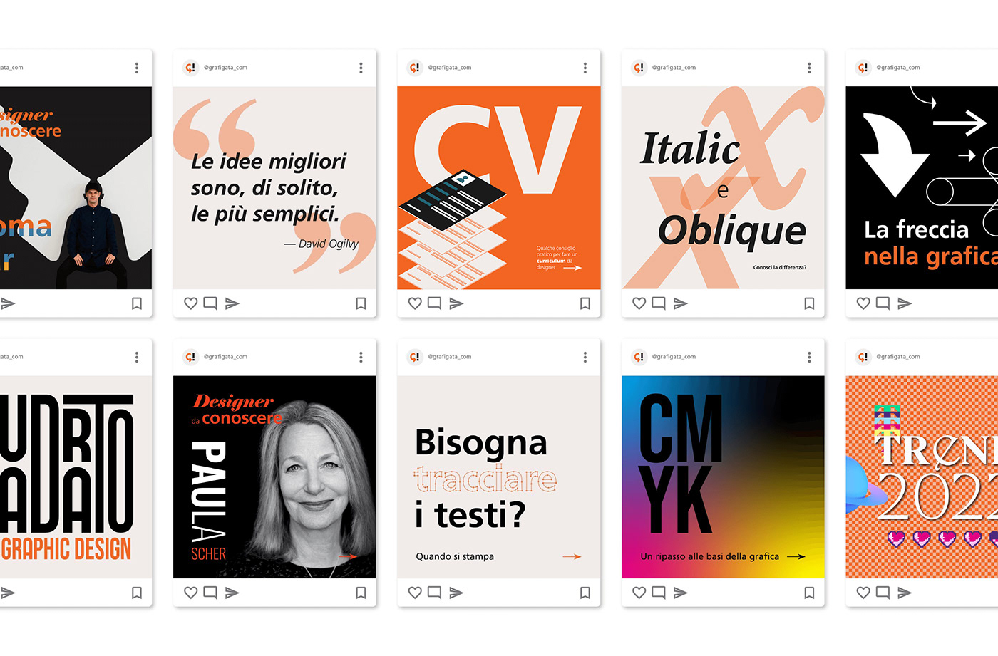
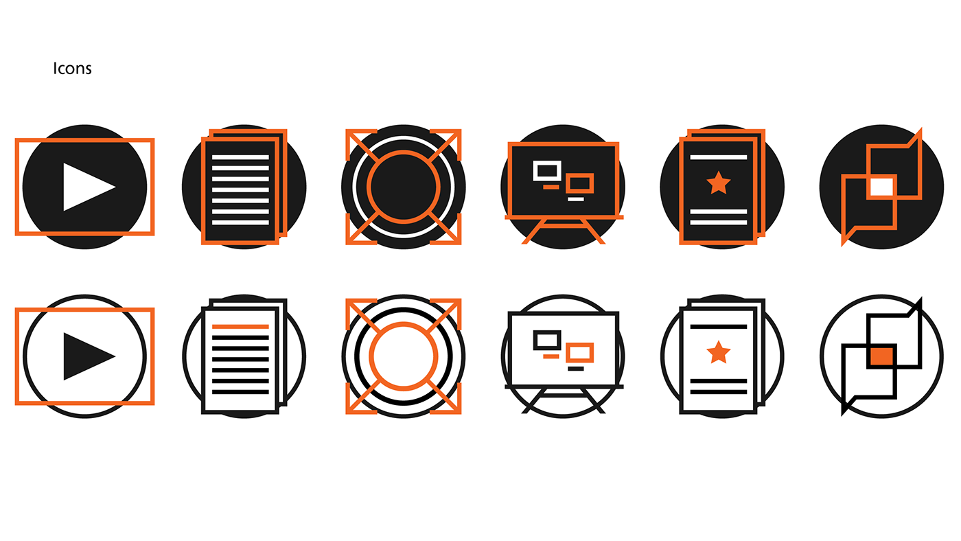
4. Icons and graphics


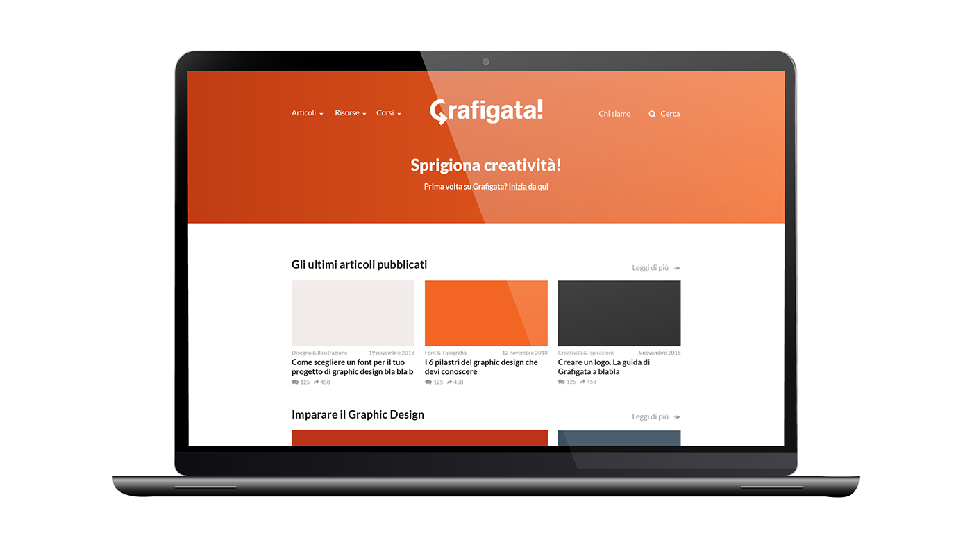
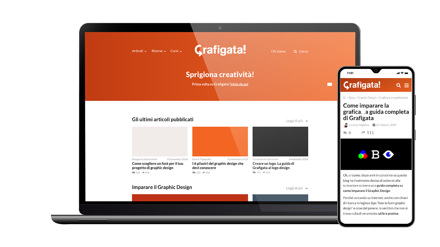
5. Layout and UI
The layout of the website is very clean and simple, with the key objective of facilitating navigation within the blog and ensuring optimal reading of the posts.