
Deal IQ Mobile App Commissions Feature

Overview
DealIQ is an enterprise productivity tool developed by CBRE. It helps commercial real estate brokers create leads and manage deals faster and more efficiently. After the initial web app was launched, a native iOS app was developed.

The UX Solve
Research found that the CBRE commercial real estate brokers who were using the Deal IQ web app were frequently going directly to the commissions feature to check on what their commission would be for a deal they were working on, and especially for closed deals.
This was a popular feature when it launched, and it was requested to be added to the iOS app.
The challenge was to adapt a UI, originally optimized for a wider desktop format, to the mobile screen, while also maintaining familiar interactions and layouts.
Users and Audience
Commercial real estate brokers for CBRE are the biggest earners, often bringing in seven-figure commissions. While they are supported by administrative teams and managing directors, our research found that the brokers would be using the iOS app more than any of the other members of a broker team. The others did a majority of their work on the web app in a desktop environment.
Roles and Responsibilities
Research for this feature was completed through a support team aggregating feature requests from users. Also, analytics of user behavior from the web app revealed a preference to visit the commissions dashboard on the web app.
My role was to determine the limitations the feature had on any mobile web browser. I needed to sketch out the feature as optimized for touch, swipe, and allow simple access to the most important information. My deliverable was highly-refined clickable prototypes, with redlines or specification information, for the software developers on the team.
Scope and Constraints
This feature was developed over three Agile sprints, with a small Scrum team focused primarily on the commissions feature for Deal IQ.
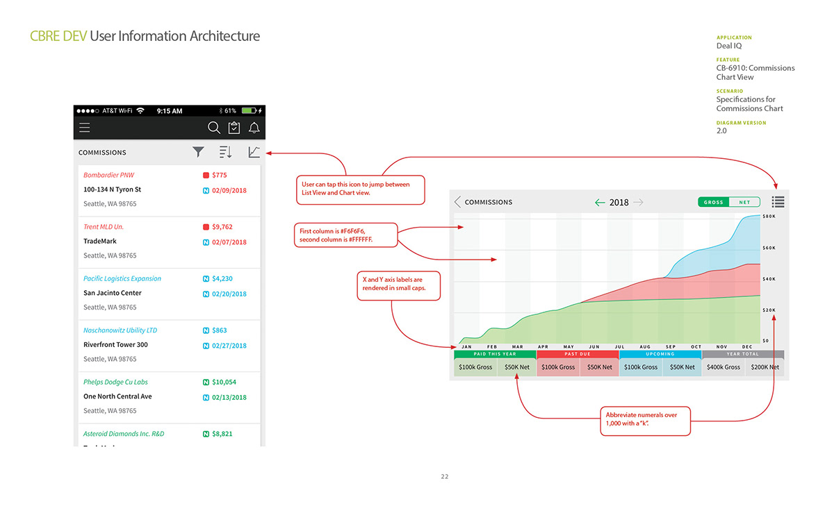
The feature included a line chart to display commission data over the lifetime of a deal. The desktop web app used the generous space afforded by the larger screen to label a large amount of data points.
The challenge was to replace certain text-labeled data points with icons and colors. These colors and icons had to be semantically the same as their text counterparts in the desktop web app.
Since the commissions line graph only functioned horizontally, the user would be required to rotate their device to landscape format.
Process and my work
I started by mapping out the steps in lo-fidelity screens and linking interactions with blue lines.
These sketches were reviewed with the product owner of the feature, and feedback was discussed. This iteration cycle continued until we were ready to go into clickable prototypes.
The style guide for the product, both the web app and the mobile app, were already in place; it was a simple matter of creating net-new design patterns which were optimized for the mobile screen from the existing patterns.
The mobile app developer who worked on this feature shared a test version which our team could test and verify.
After it went through our standard QA process, we launched an update to the iOS app and notified our user base.
The following week we observed a spike in mobile usage for that feature.
Outcomes and Lessons
The feature remains the most popular part of the DealIQ mobile app. When users were interviewed for future research, several indicated that this feature was the only reason they used the app, and that they loved how quickly they could check their commission numbers.
Our team was encouraged by this outcome, and looked to use it to get more resources for adding features to the DealIQ mobile app.
There were some existing assumptions about mobile usage which were proved incorrect when this feature was tested. The most important lesson was that a horizontal tab interface, if it was required by feature constraints, could be swiped to see more. However, a user would need to be able to know that there were more tabs available with a swipe left or right, so the UI had to be designed so that one of the tabs was partially cut off by the edge of the screen.


