


HSC
Identity // Packaging
THE CLIENT
The mission of HSC patented, smart products is to raise awareness of the need for a healthy lifestyle.
THE OBJECTIVE
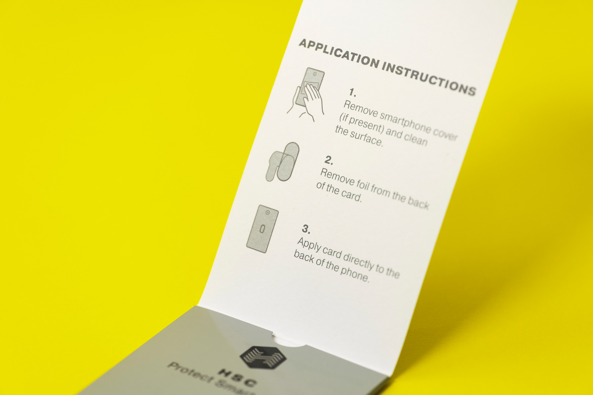
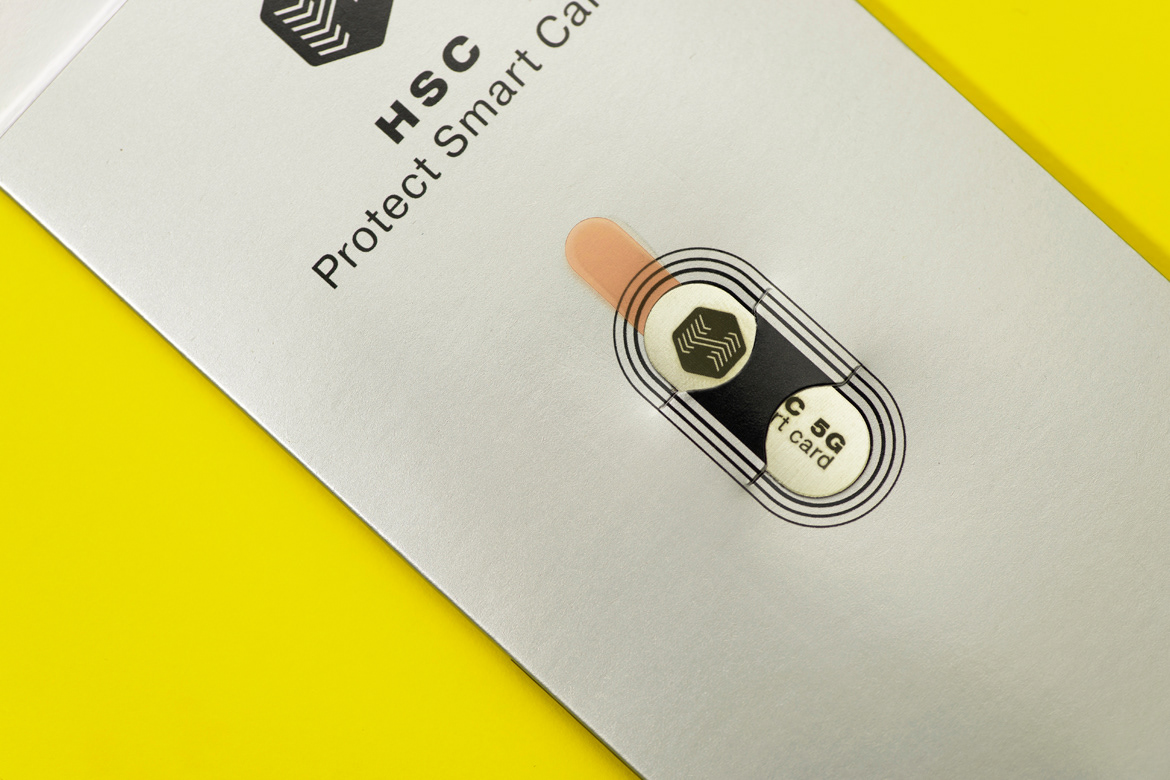
Visual identity and Packaging design of a product which uses advanced and exclusive know-how and technology to protect people and the environment from a wide spectrum of pollution (electromagnetic, biological, chemical...).
The mission of HSC patented, smart products is to raise awareness of the need for a healthy lifestyle.
THE OBJECTIVE
Visual identity and Packaging design of a product which uses advanced and exclusive know-how and technology to protect people and the environment from a wide spectrum of pollution (electromagnetic, biological, chemical...).
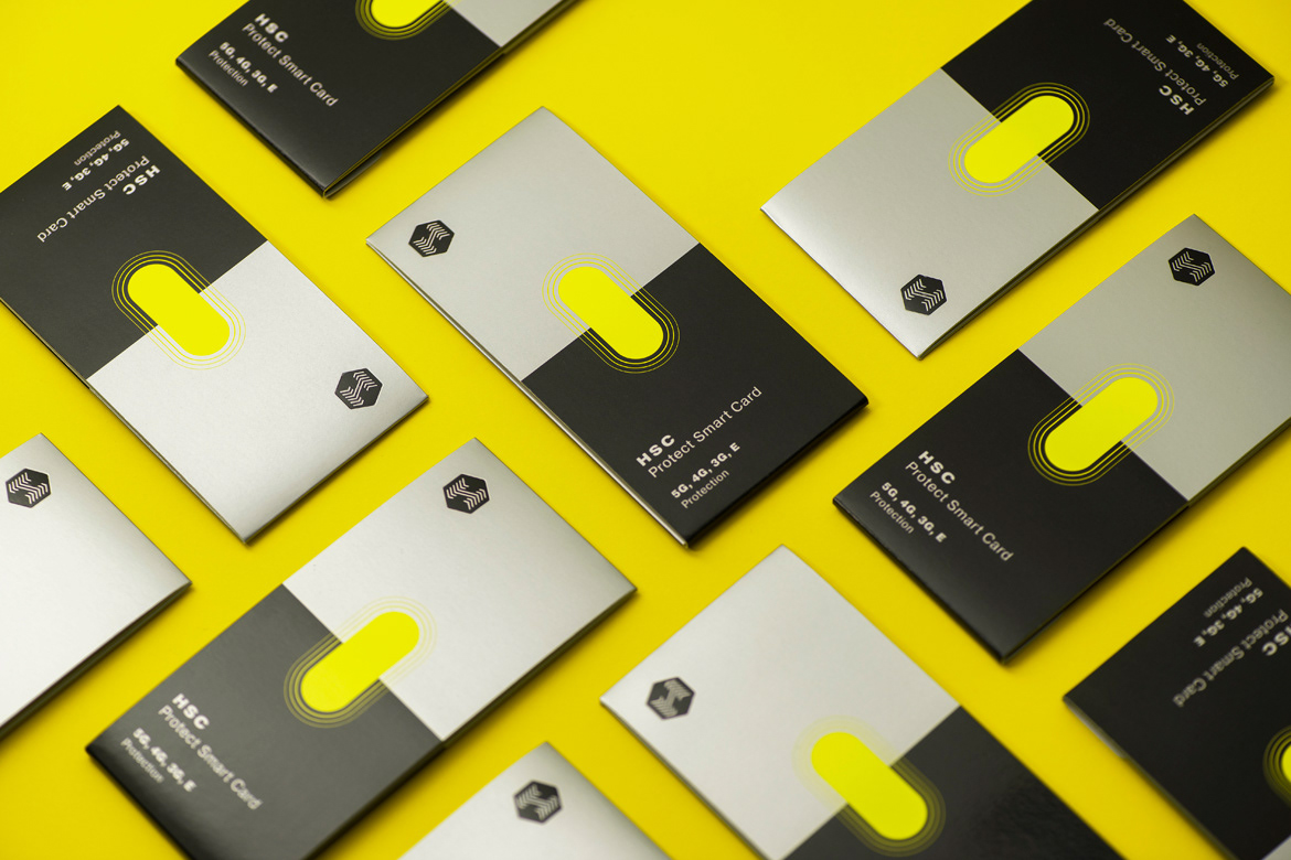
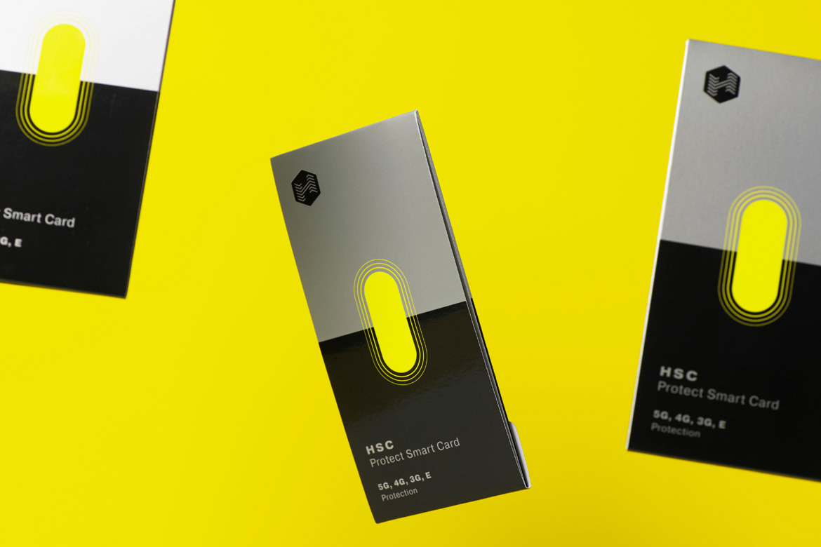
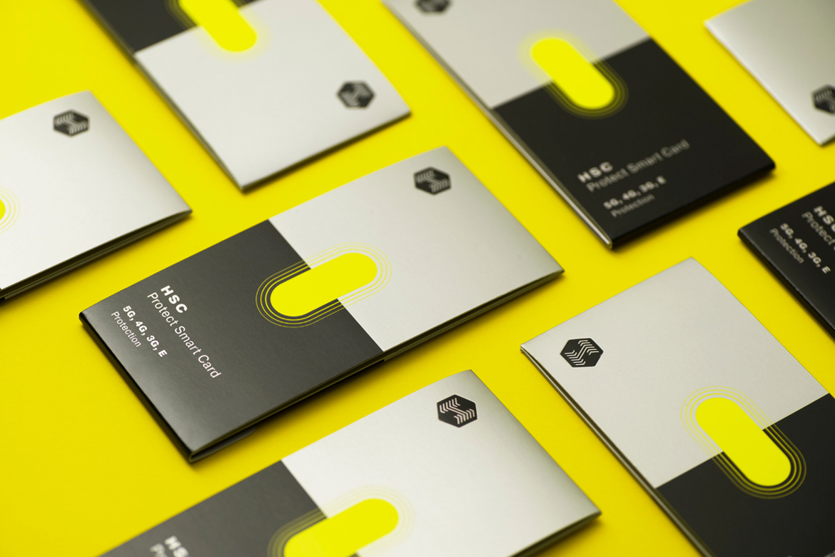
THE SOLUTION
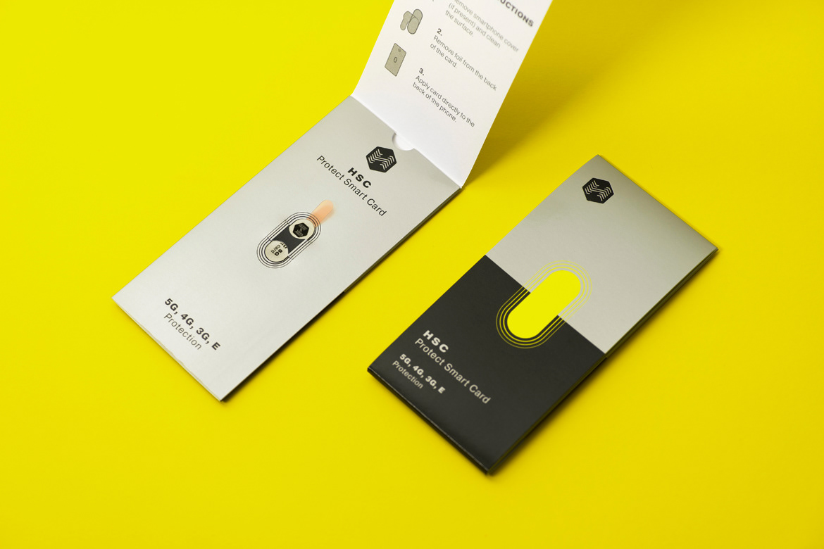
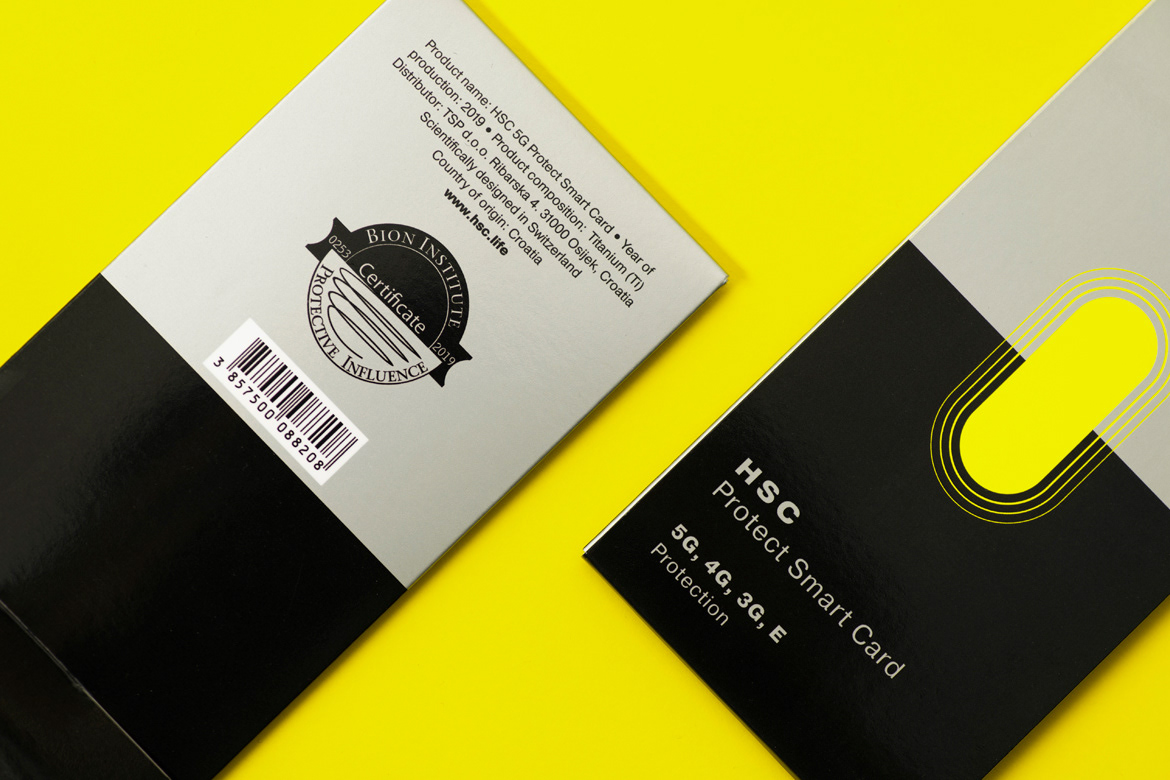
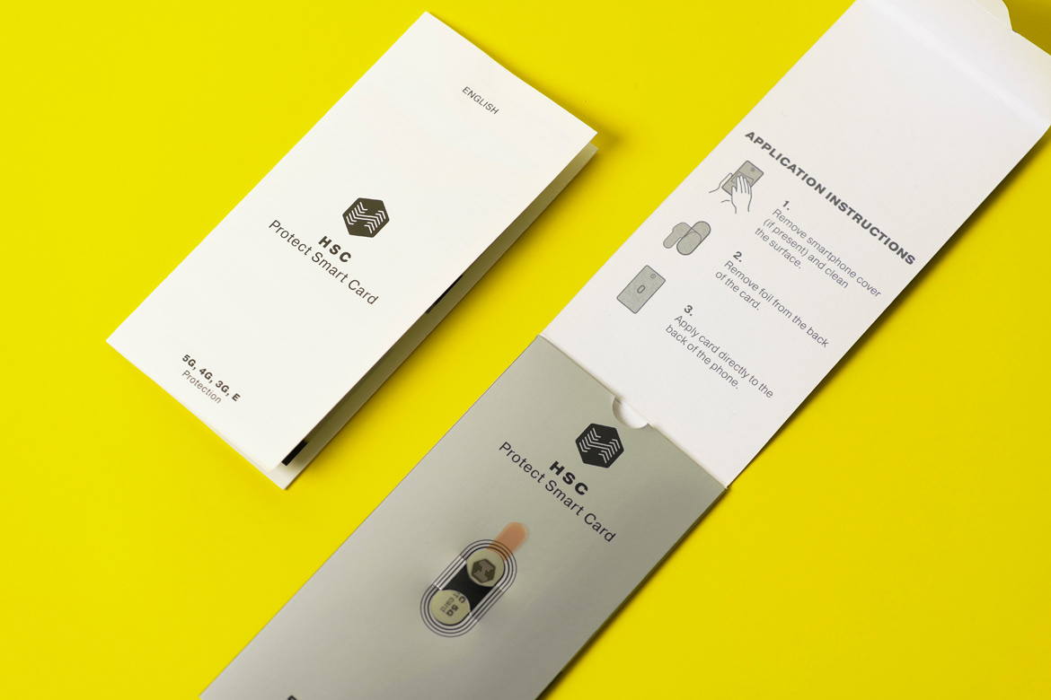
The packaging design shows the silhouette of the product and its beneficial effect. Vibrations, buffers (layers), symbolise the main function of the product which is - protection. With the intention to represent a filter, the packaging is divided in half with two colours.
The packaging design shows the silhouette of the product and its beneficial effect. Vibrations, buffers (layers), symbolise the main function of the product which is - protection. With the intention to represent a filter, the packaging is divided in half with two colours.
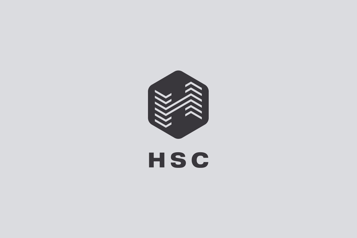
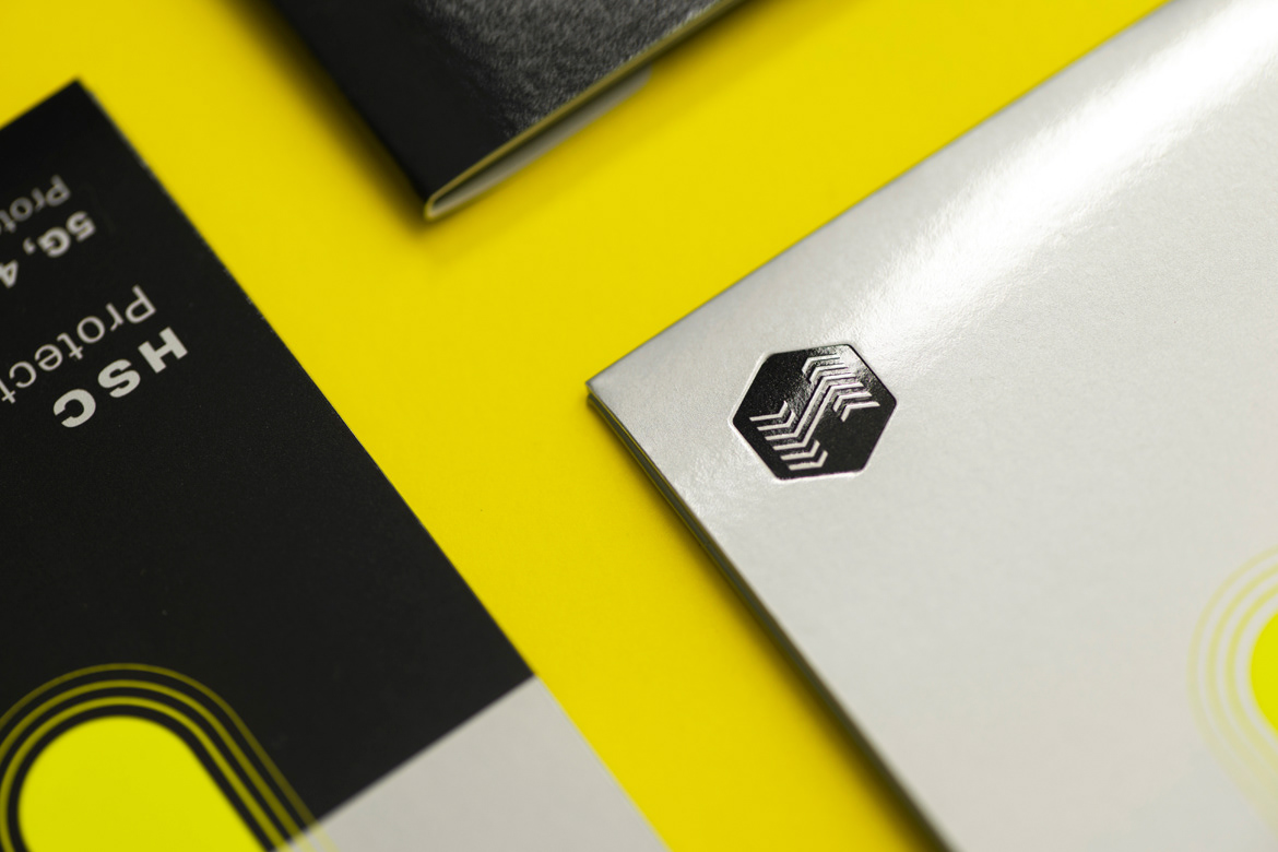
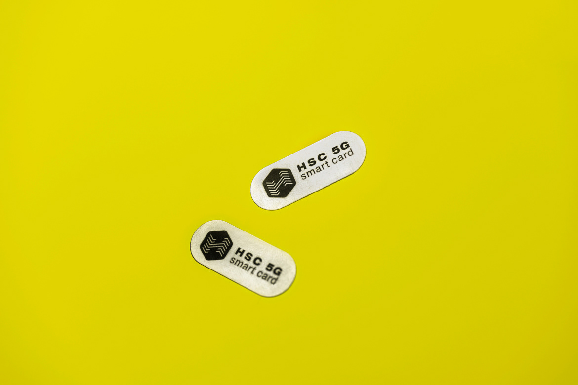
The HSC logo in its coherent form shows the purpose of the brand with a hexagon used as a shield and the symbol H stands for the process of transforming something negative into positive.
______
Credits
Agency // Studio 33
Client // TSP d.o.o.
Art Direction and Design // Leo Vinkovic
Illustration // Mario Majkic
Photo // Marija Gasparovic
Do not use any photo without author's written permission.
© Studio 33


