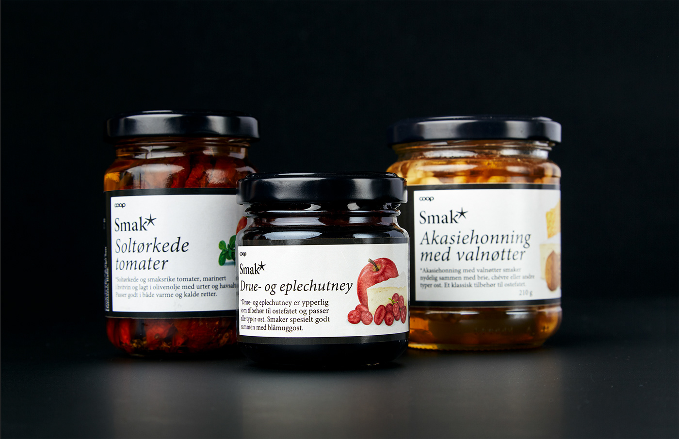
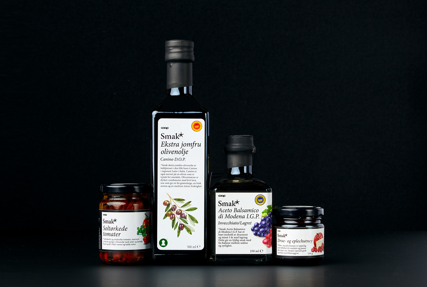
By redesign, Coop’s premium series Smak* ("Smak" meaning "Taste" in norwegian) stands out by referencing the craft and history behind the products. A nod to timeless quality, put into system.
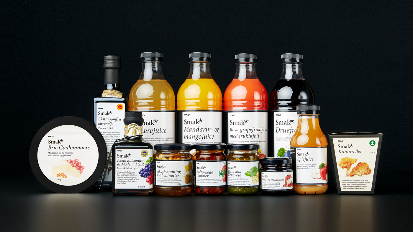
Smak* is a series by Coop consisting of products of the highest quality. Each product is carefully produced following strict criteria on the commodity’s origin, its quality and the end result.
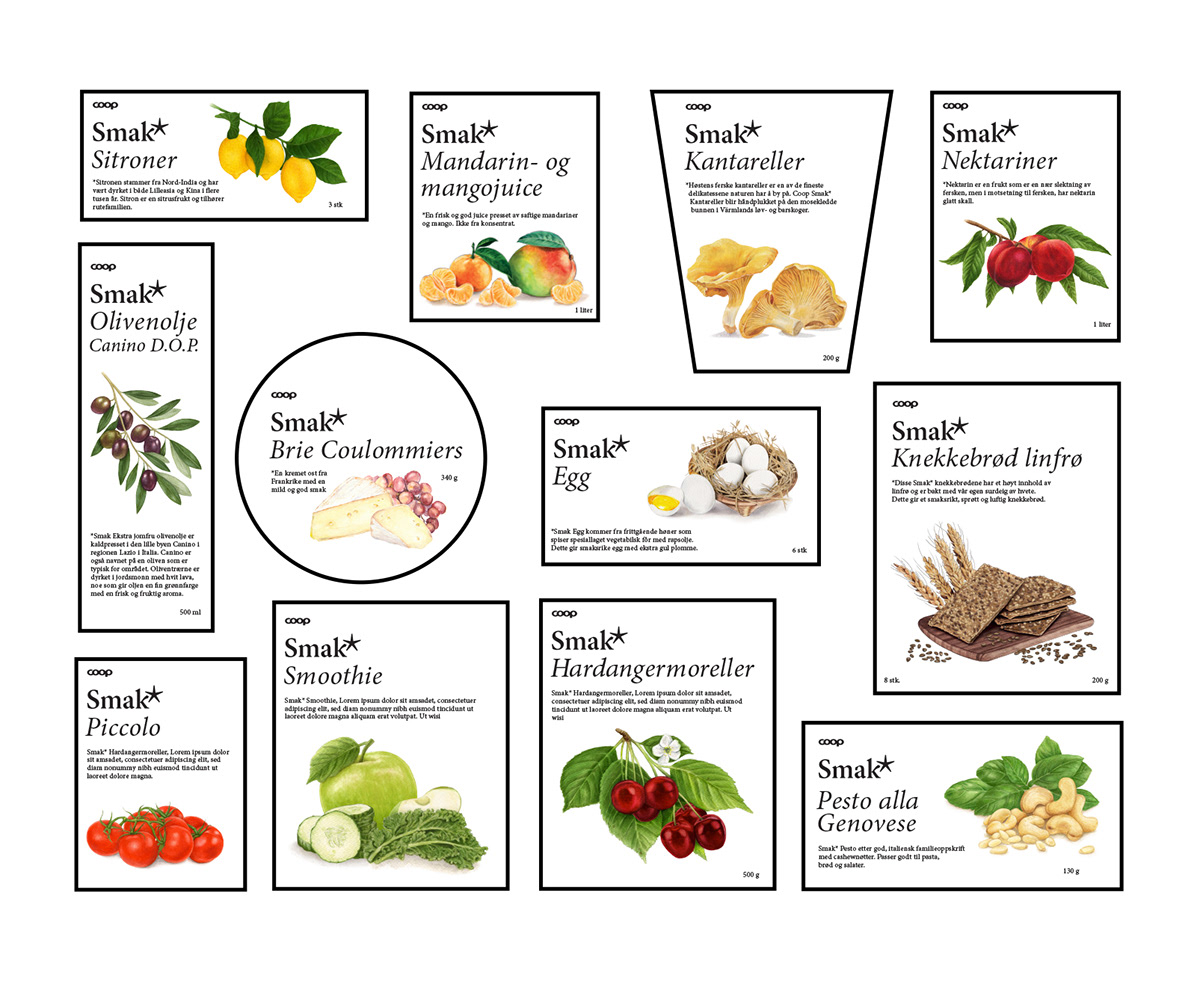
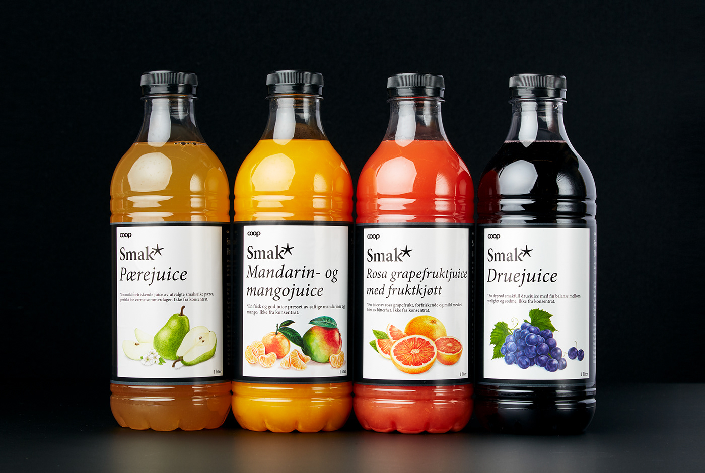
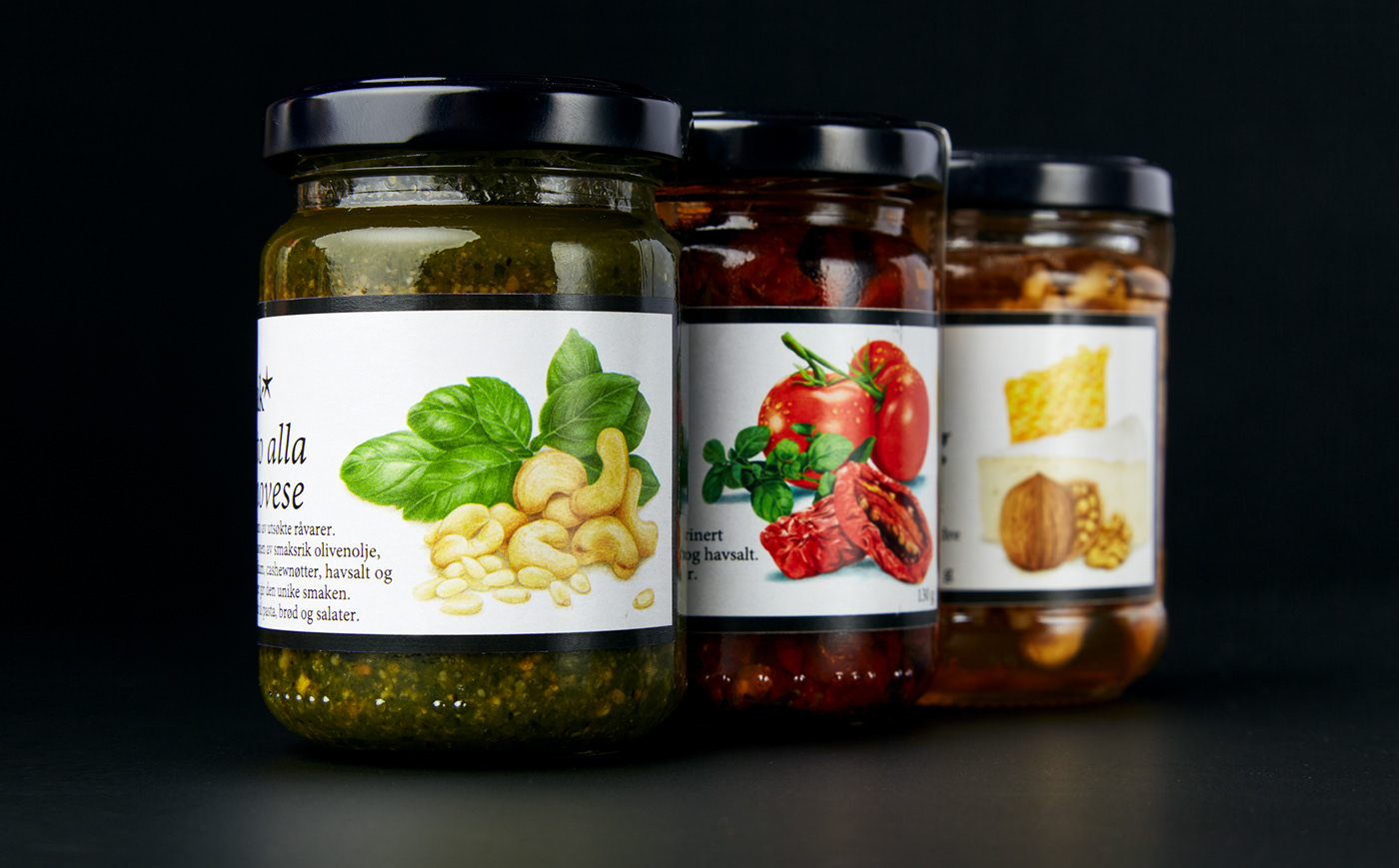
In collaboartion with Coop, Anti have redesigned Smak* and developed a packaging system for the series which counts 80 products in total.
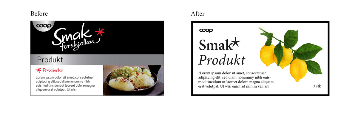
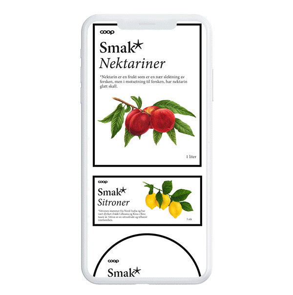
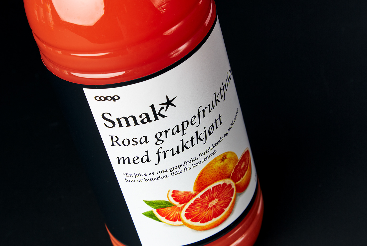
The original design has been stripped for unnecessary elements, and the name has been simplified from «Smak* Forskjellen» to «Smak*». The star (*) has been kept as signifier of the series’ position as Coop’s star products, while it at the same time gives a visual reference to the series’ origin.
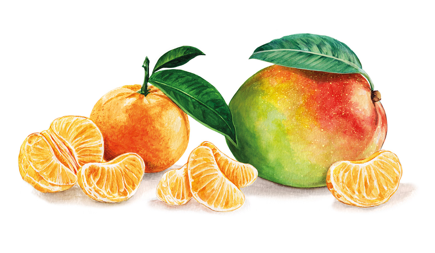
Supported by a strict framework and a simple typeface-layout, Smak* is now characterized by rough and classic illustrations in a low-opacity color palette, which gives associations to craft, history and quality.
In conclusion, Smak*’s redesign allows for the series to communicate storytelling in a simple, recognizable and adaptable way.
Illustrations:
Martine Lindstrøm & Esra Røise