


MERLAK —
WINERY IDENTITY
WINERY IDENTITY
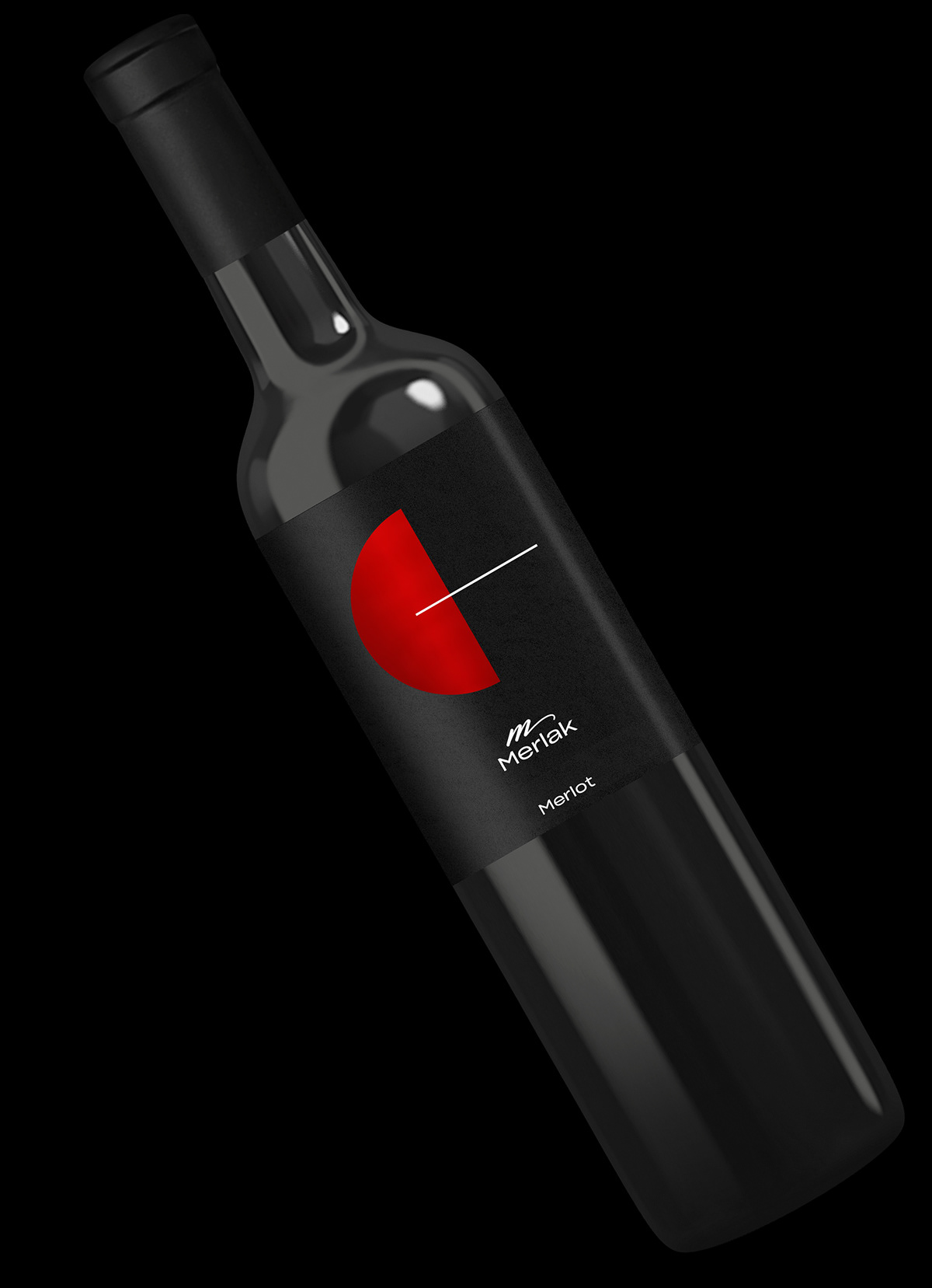
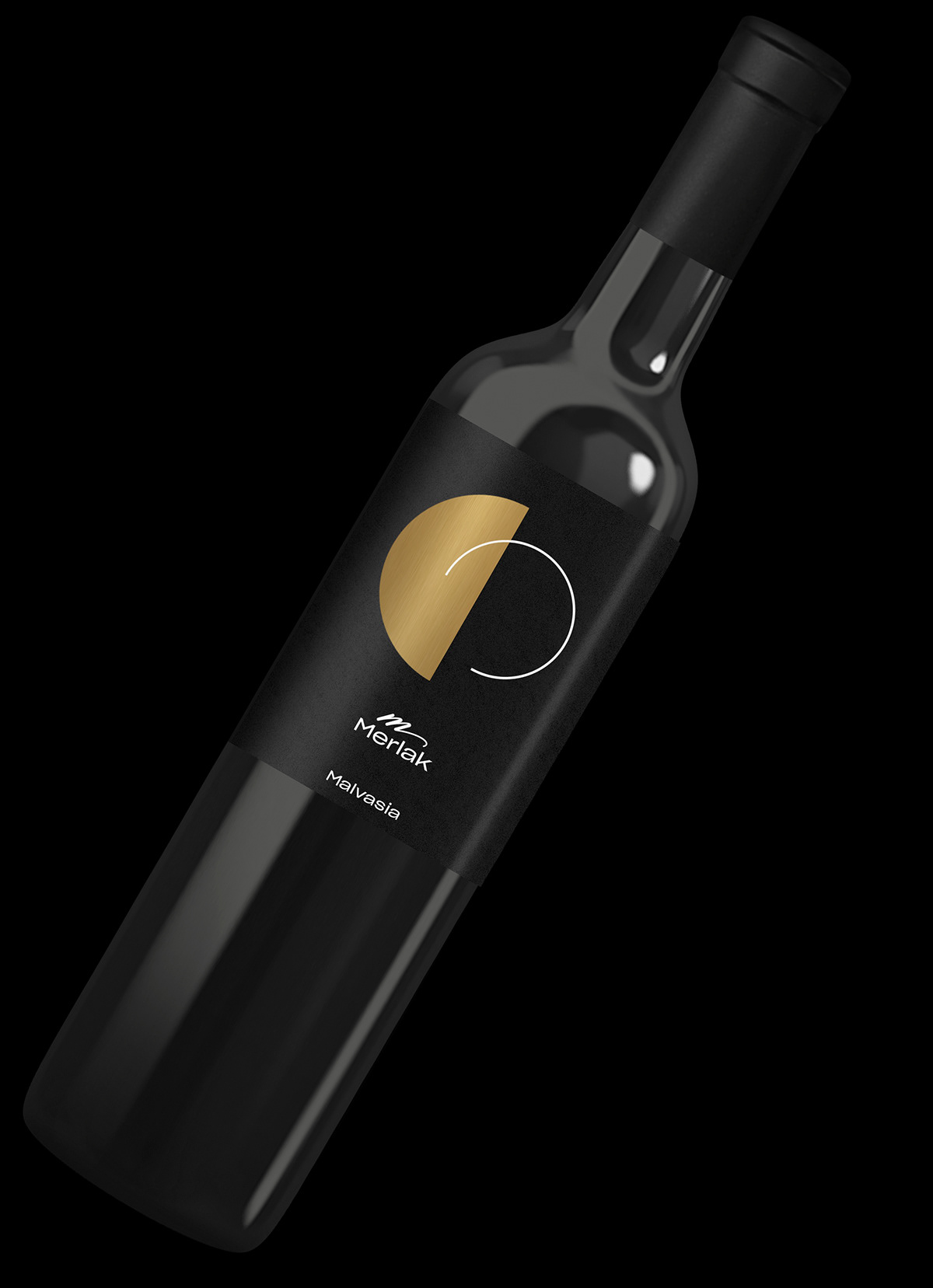
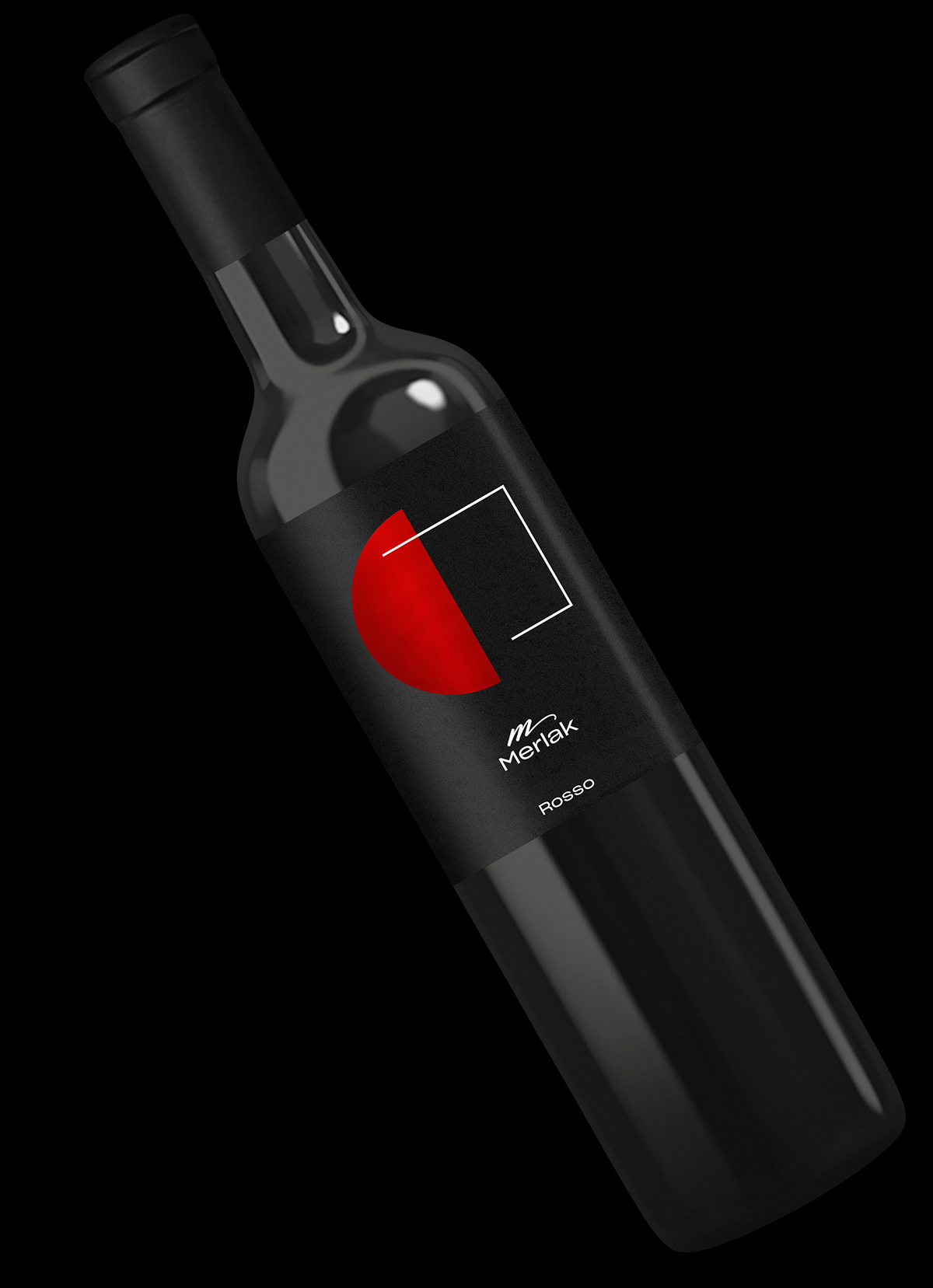
The identity of Merlak Wines aims to communicate quality and wine-peculiarities by using simple and basic forms. The logo is neat and closely related to winemaking (the sign is inspired by the tendrils of the vine). The labels feature symbols that graphically resume the various taste and aroma characteristics of Merlak wines. The graphical interpretation of winery is based on distinctive minimalistic symbols combined with a vinicultural spirit. Compositions of fixed semicircles and of thin line motifs make up a harmonious visual system built upon a black, elegant, background.


Technical details:
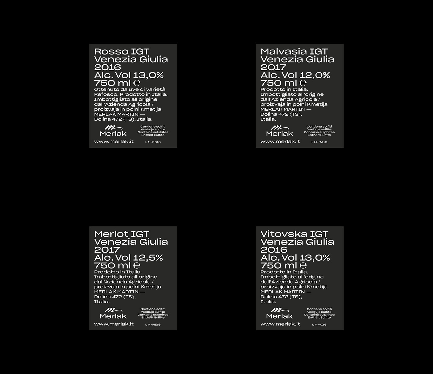
Wine labels: UMP Raflatac Silver Orion paper, white silkscreen zone print (small cut on the form part) + black silkscreen zone print (lines + typography cuts) + CMYK print on form-cut unprinted silver paper zone (to simulate realistically the gold and the red foil). Stationery: white silkscreen print on 400 gsm soft-touch black cardboard.


