


About client:
Vivace (a perennial plant :french:) is a website, structure of which is similar to a job marketplace and a project platform. Volunteers can apply to activities (events, tasks, projects, and training) created by organizations. This is my first project for Canada and French audience (it is still ongoing and will be translated to French and hopefully start-up in Quebec soon).
Services:
Logo design, branding, UI / UX design
Process:
Research > User flow > Logo & branding > Wire-frames > Mockups > Prototypes
***
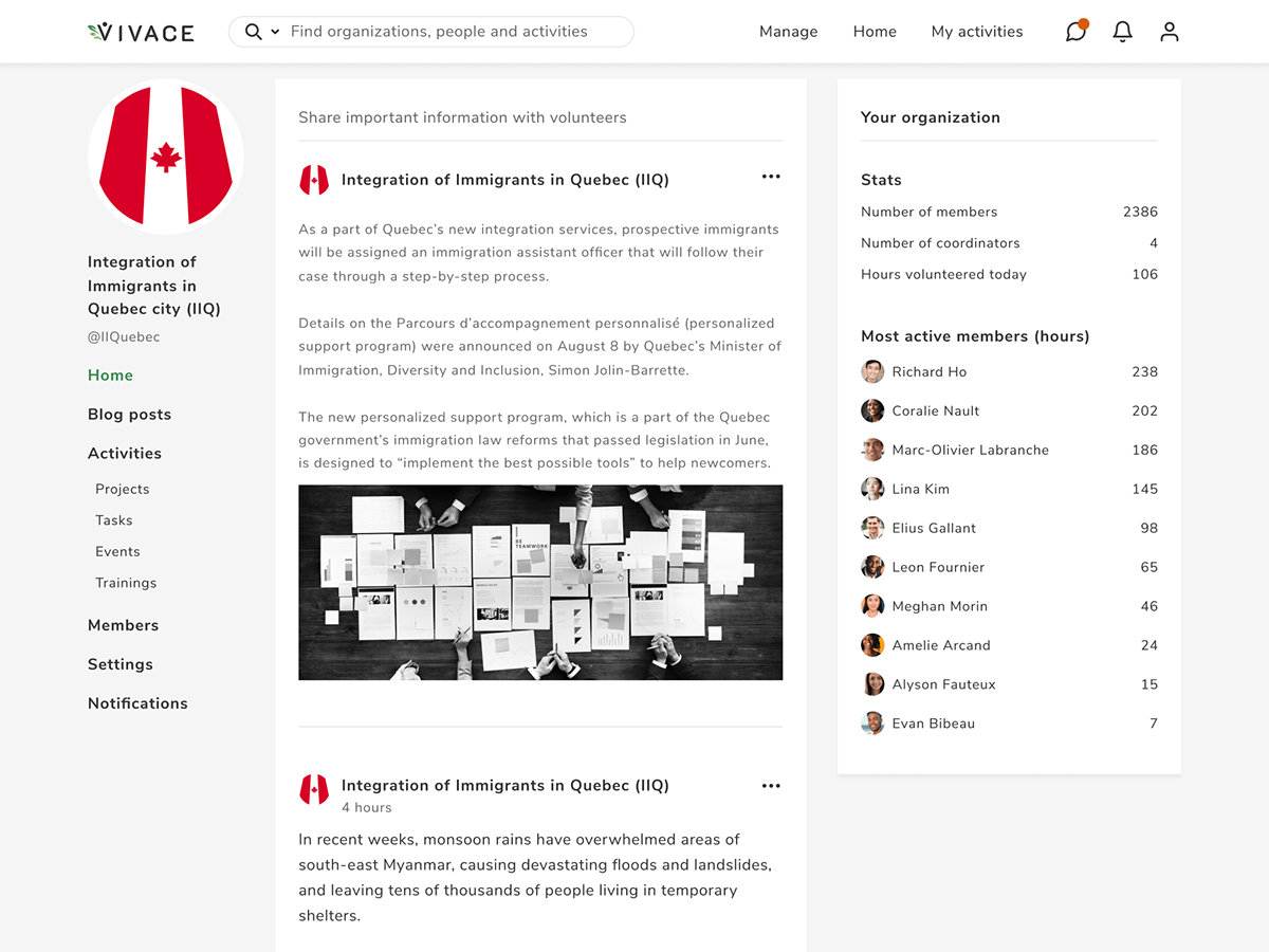
Home page
The goal of the home page is to stimulate volunteer's motivation and give recent news of organizations he/she truly cares about. We (my client Samuel and I) tried to embrace user experience by enhancing volunteer's feeling of heroism and contribution.
This is the end result, please scroll down to learn more about how this project evolved!
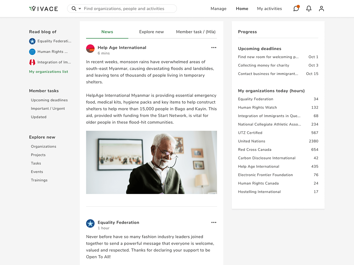
Home page
Technical task
I can say with 100% confidence that Vivace is my favorite up-to-date project, just take a look at 18 description pages I was given from the very beginning :) It definitely took me a couple of days to study, understand and visualize but it was incredibly helpful.

Technical task from a client
Page functions
First of all, I organized all the information and divided it by functions, user types, and pages. This helped to see full functionality of the website and variety of user personas.
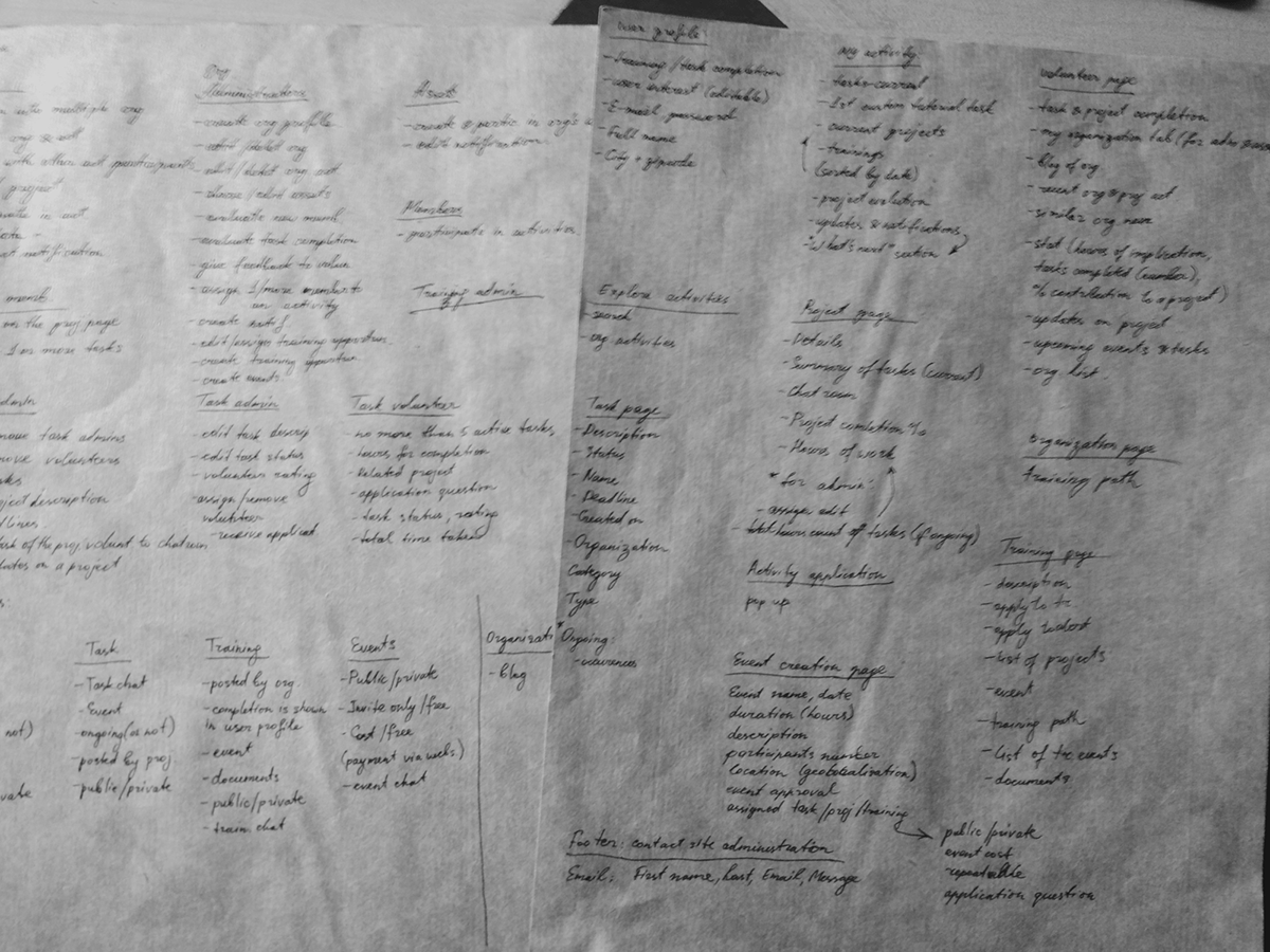
Content & functions of pages
User flow challenge
At the beginning, I tried creating user flows for user types (organization admins, assets and volunteers). My sketches seemed too complicated even for me...
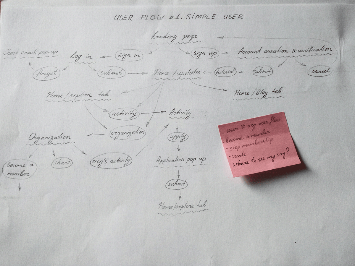
User flow (volunteer)
Final user flows
I had to come up with a different system: to show flows not depending on users but results they were coming for. Using this method, I was able to create 23 flows (I know :D) and showcase every step of every user type on every page.
Some of them are:
- Creating / deleting an organization (for admins)
- Editing organization / activity profile (for assets)
- Suggesting / applying for / quitting an activity (for volunteers)

User flows

User flows
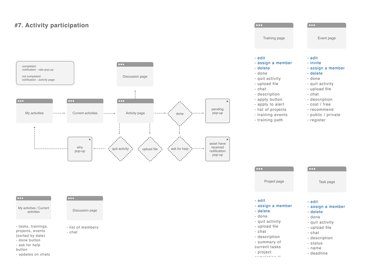
Page blocks structure & user flow example
Branding
Even though the project name gives an idea of visual concept, I asked my client to create a mood-board that inspired and represented his vision. It has allowed me to synchronize with Samuel's ideas and deliver a better quality interface. Below you can see some images he sent me.

Client’s vision mood-board (1)

Client’s vision mood-board (2)
Logo
Creating a logo, I tried to keep it simple (as always) and easy to memorize. Firstly, it started with "V" letter sketches and then evolved it to different options for the client to choose from.

Logo creation
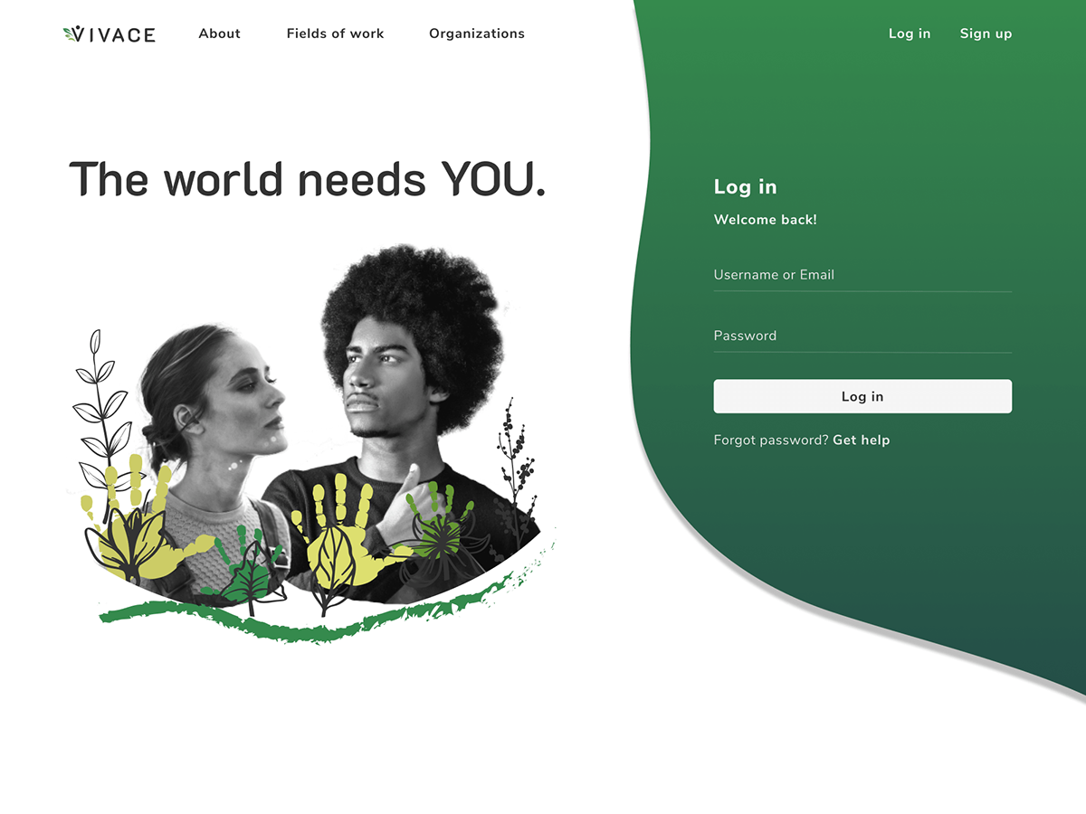
Landing page
The goal of any landing page is to attract and present an idea of a project. Visual illustrations are one of the best ways to achieve this. For Vivace, I tried to merge two concepts: volunteering (rising hands) and the project name translation (growth of perennial plants). I guess it worked out pretty well, you can see Samuel's reaction below.

Landing page illustration details
And this is how the illustration looks like on the landing page:
Landing page
Final page designs
After logging in through the landing page, users will be able to use the platform for their benefits. There are many pages designed along with the ones you can see below.
Project page
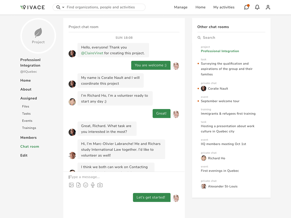
Chat room
Layout grid
8 pixels and 12 columns grids were used to achieve pixel-perfect interface.

Layout grid
Components, colors, icons & typography
Using components is an easy way to keep the work process simple and consistent. Usually, I create components for each frame group: desktop, tablet, and mobile. Also, #figma has text and color style features which I use in every project. There were 6 color styles and 7 styles of Nunito Sans font family used.
Using components is an easy way to keep the work process simple and consistent. Usually, I create components for each frame group: desktop, tablet, and mobile. Also, #figma has text and color style features which I use in every project. There were 6 color styles and 7 styles of Nunito Sans font family used.

Components, icons, typography & colors
Prototyping
For now, prototyping works as a presentation for potential investors and will hopefully evolve into all pages platform prototype.
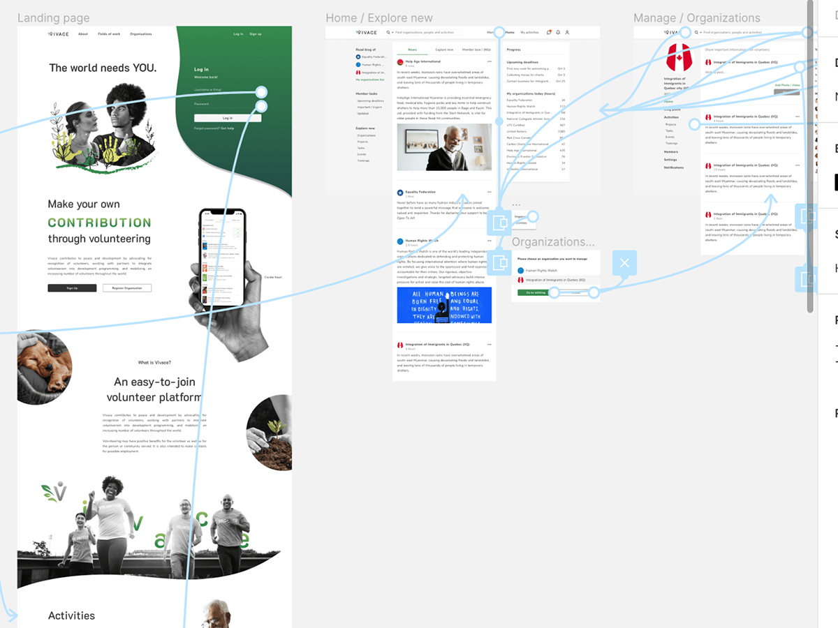
Prototyping
Credits: Samuel Dinel
Thank you!


