
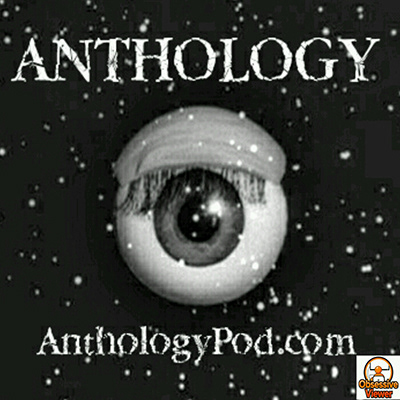
Anthology Podcast Cover Art
A podcast exploring classic sci-fi anthology television

Introduction
Anthology is a podcast hosted by Matt Hurt. In the show, Matt explores and reviews one episode of a classic sci-fi series each week, starting with The Twilight Zone. Since Matt hasn’t seen the show before, the audience isn’t just getting Matt’s opinion on the show, they are actually discovering it along with him. Anthology includes bonus reviews and discussions about related series and topics. After trucking through all 156 episodes of The Twilight Zone, Matt plans to continue his show by taking on different sci-fi anthologies such as Tales of Tomorrow and The Outer Limits.
Direction
After exploring a number of different directions, I chose to retain the basic vision of the old cover. The previous design had a strong concept, playing directly to the Twilight Zone opening sequence. The eye also works as a visual cue that the show is about Matt watching these classic shows. Where the old cover fell short was mostly in the execution and standing out from the competition.
However, I wanted to allow room for the future flexibility of the show by making the visual ties to The Twilight Zone a little more ambiguous and subtle. The main priority was to evoke that classic sci-fi feel rather than connecting Anthology exclusively with The Twilight Zone. I wanted to bring a strong visual style to the podcast; something that would make Matt’s show stand out visually in the same way that the actual content differs from other shows about The Twilight Zone.
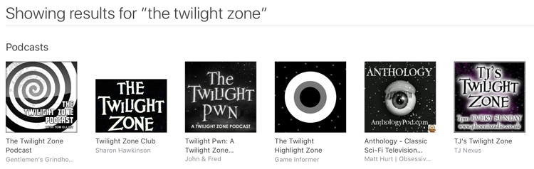
If you search for “the twilight zone” in iTunes, you will quickly see that almost all of them use a black and white color scheme and recreate the original Twilight Zone typographic style. I wanted to show that Anthology is different; it’s a modern take on a classic genre.
Process
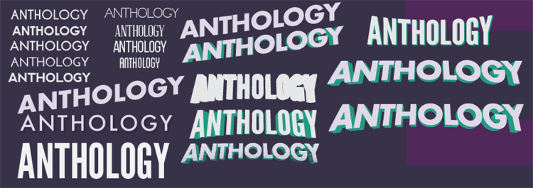
As always, I started my design process with a ton of research. I mentioned earlier that I looked into competing podcasts, but I also researched a lot of historical sci-fi art and designs. I took note of typography, color schemes, styles and compositions.
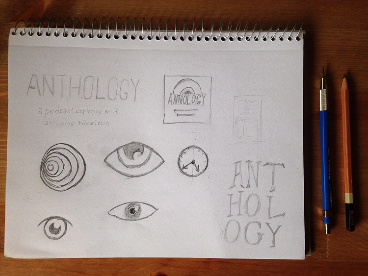
I took the insights that I gleaned and started putting pencil to paper, exploring different concepts and layout. As I said, I chose to stay with the ‘floating eyeball’ concept fairly early on in my process so a lot of sketching was dedicated to exploring different visual styles for the eye as well as various arrangements for the main elements of the design.


As always, I started my design process with a ton of research. I mentioned earlier that I looked into competing podcasts, but I also researched a lot of historical sci-fi art and designs. I took note of typography, color schemes, styles and compositions.
I took the insights that I gleaned and started putting pencil to paper, exploring different concepts and layout. As I said, I chose to stay with the ‘floating eyeball’ concept fairly early on in my process so a lot of sketching was dedicated to exploring different visual styles for the eye as well as various arrangements for the main elements of the design.
The eye is the center of composition and dictates the overall style and feel of the cover. It evokes the Twilight Zone eye while being totally distinct in form and mood. The stars and subtle “Twilight Zone Swirl” were added both as a nod to the godfather of sci-fi anthologies and to add some depth to the layout.

Final
Overall, the final cover art is very eye-catching even at small sizes and stands out distinctly from the competition. It is a contemporary reimagining of classic science fiction style that segues perfectly into the content of the Anthology podcast.


