
SAFID CO. LTD.
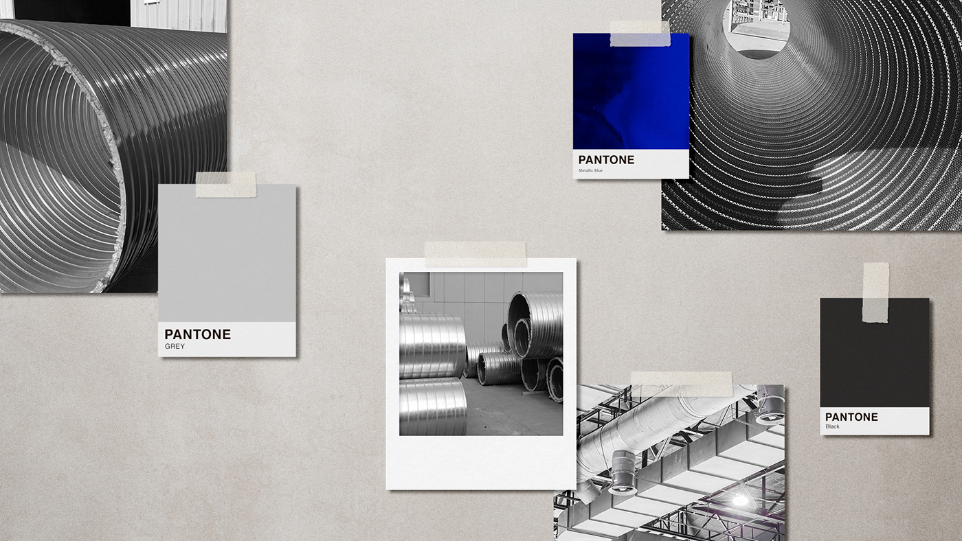
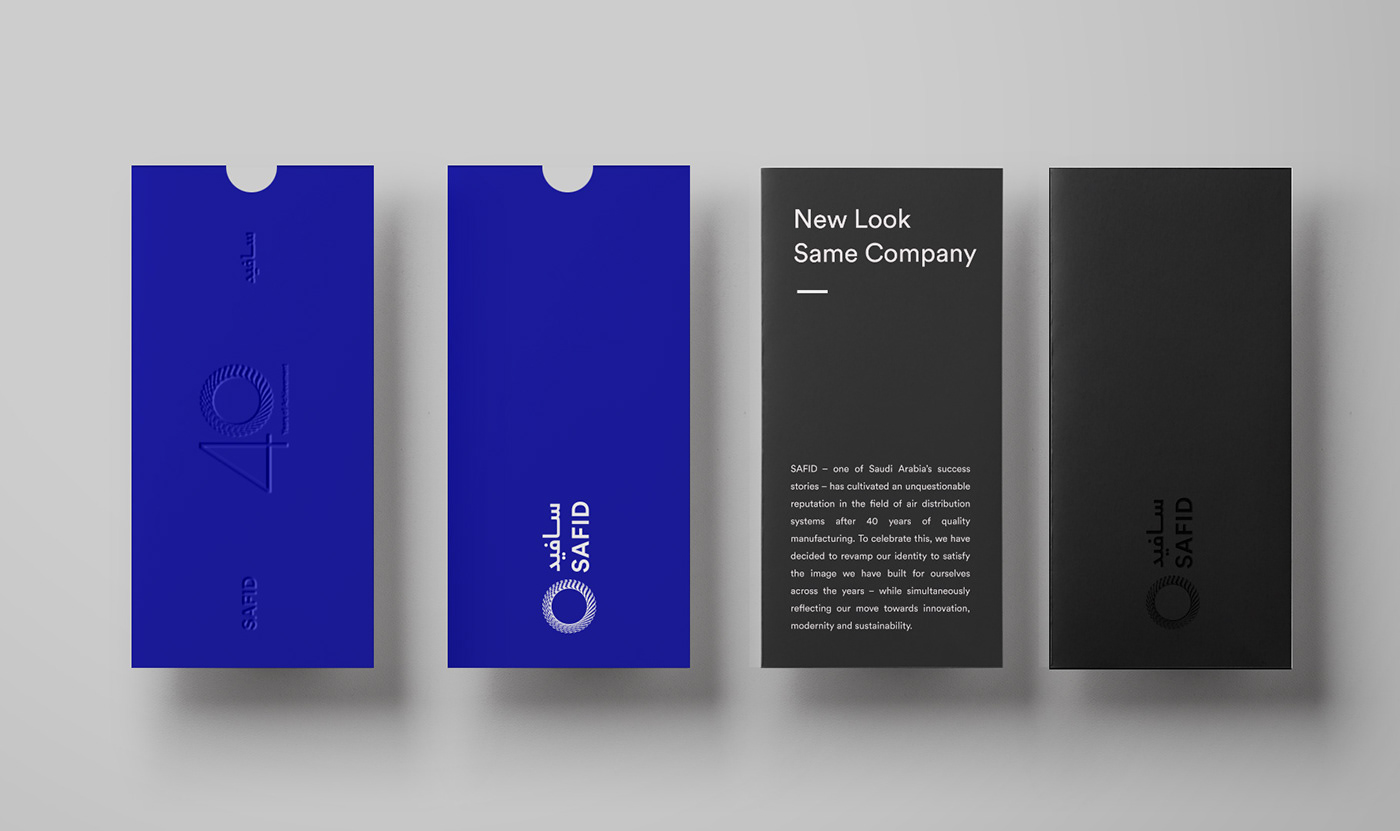
SAFID – one of Saudi Arabia’s success stories – has cultivated an unquestionable reputation in the field of air distribution systems after 40 years of quality manufacturing.
THE PROJECT VOL.1
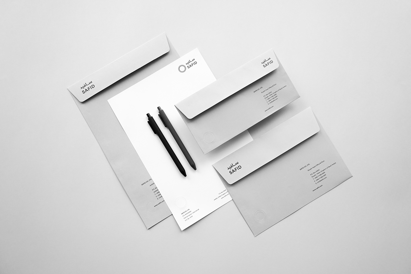
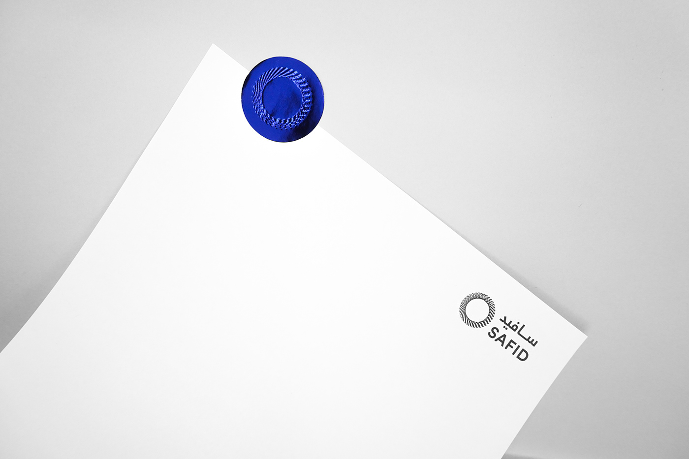
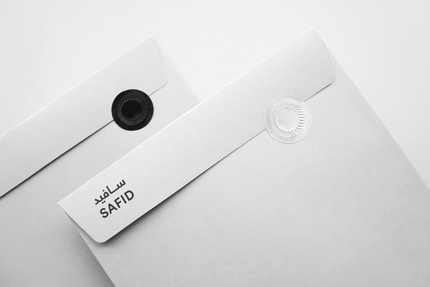
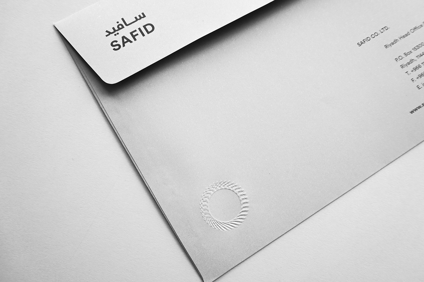
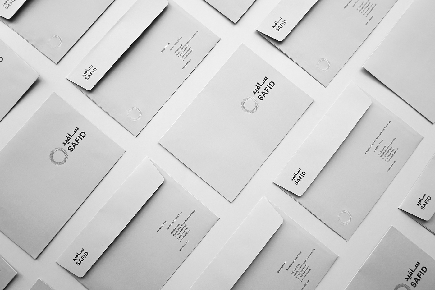
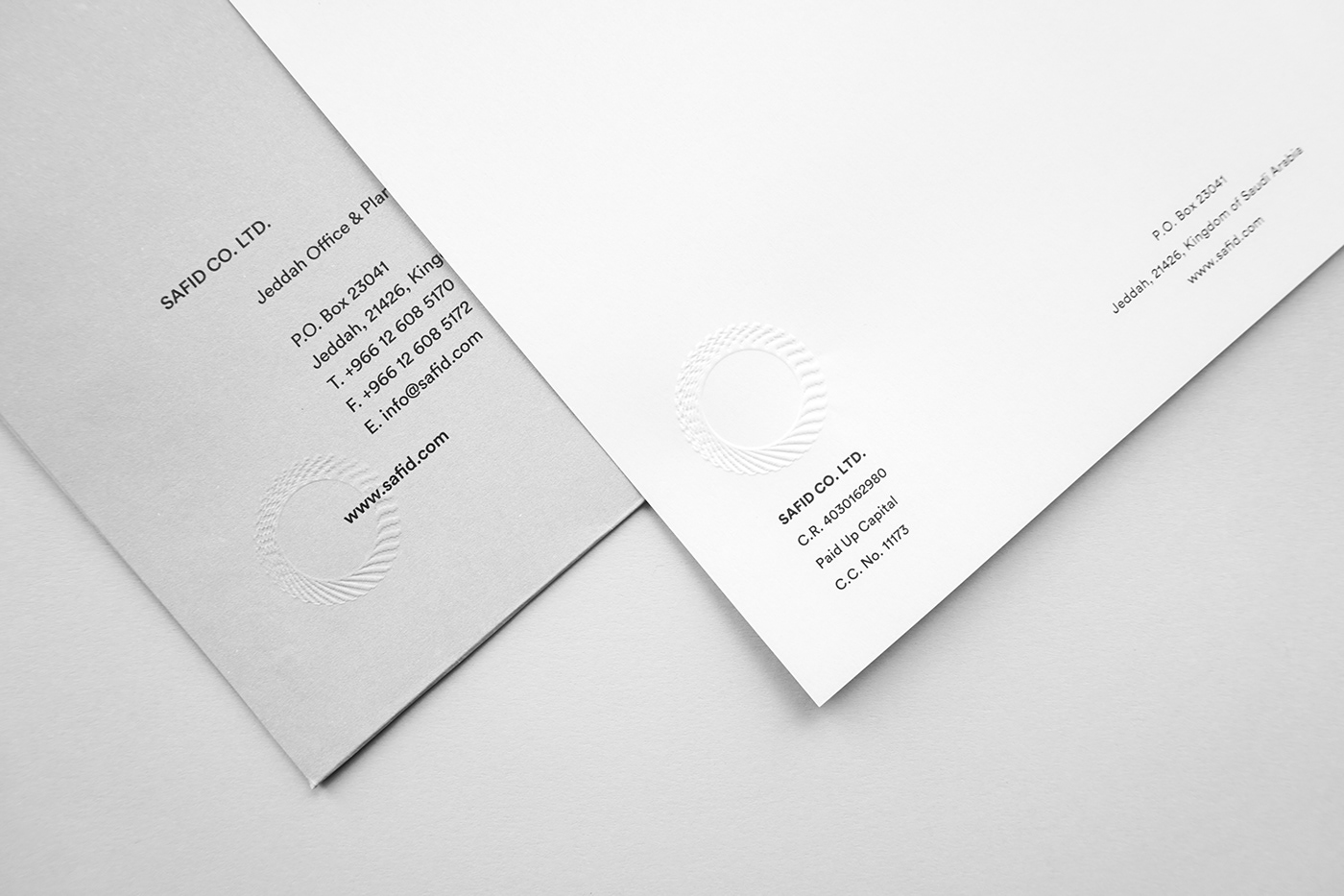
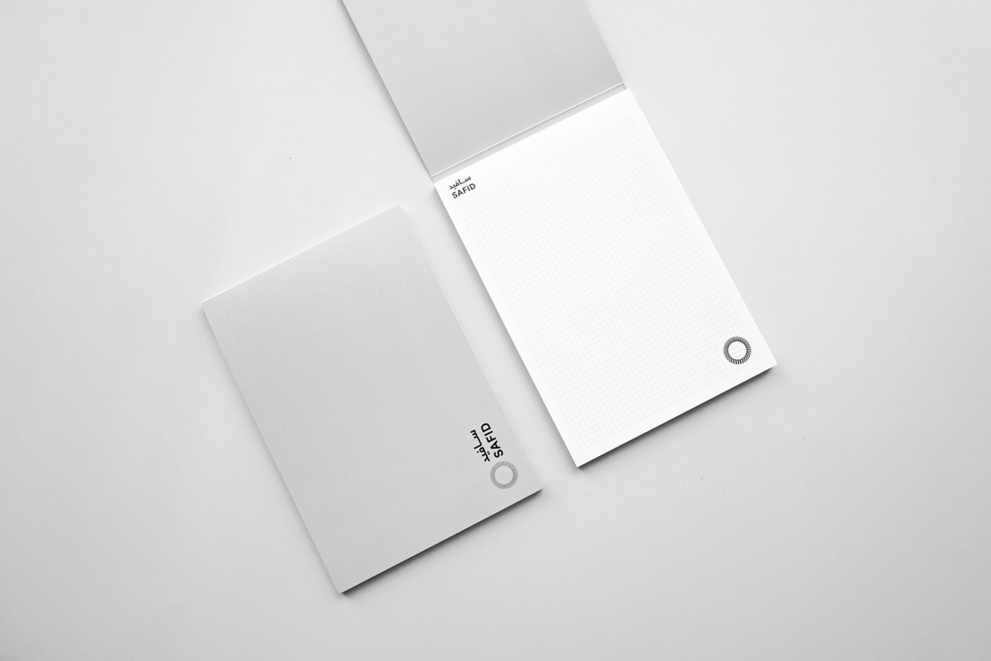
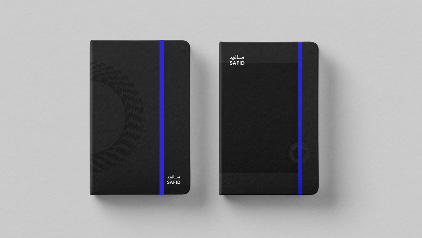
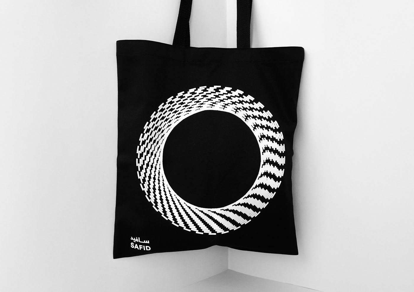
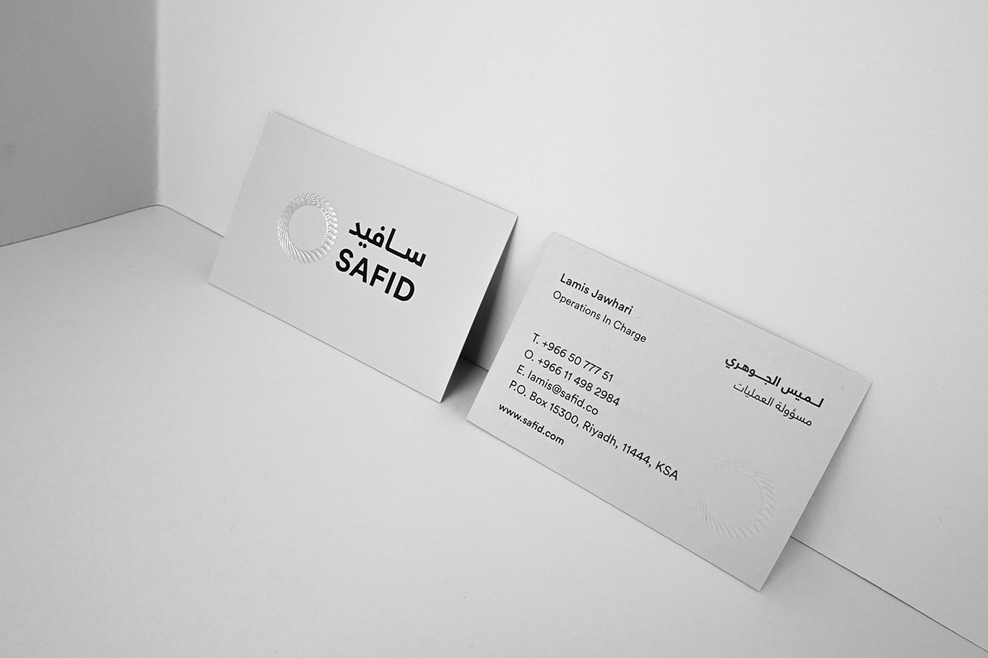
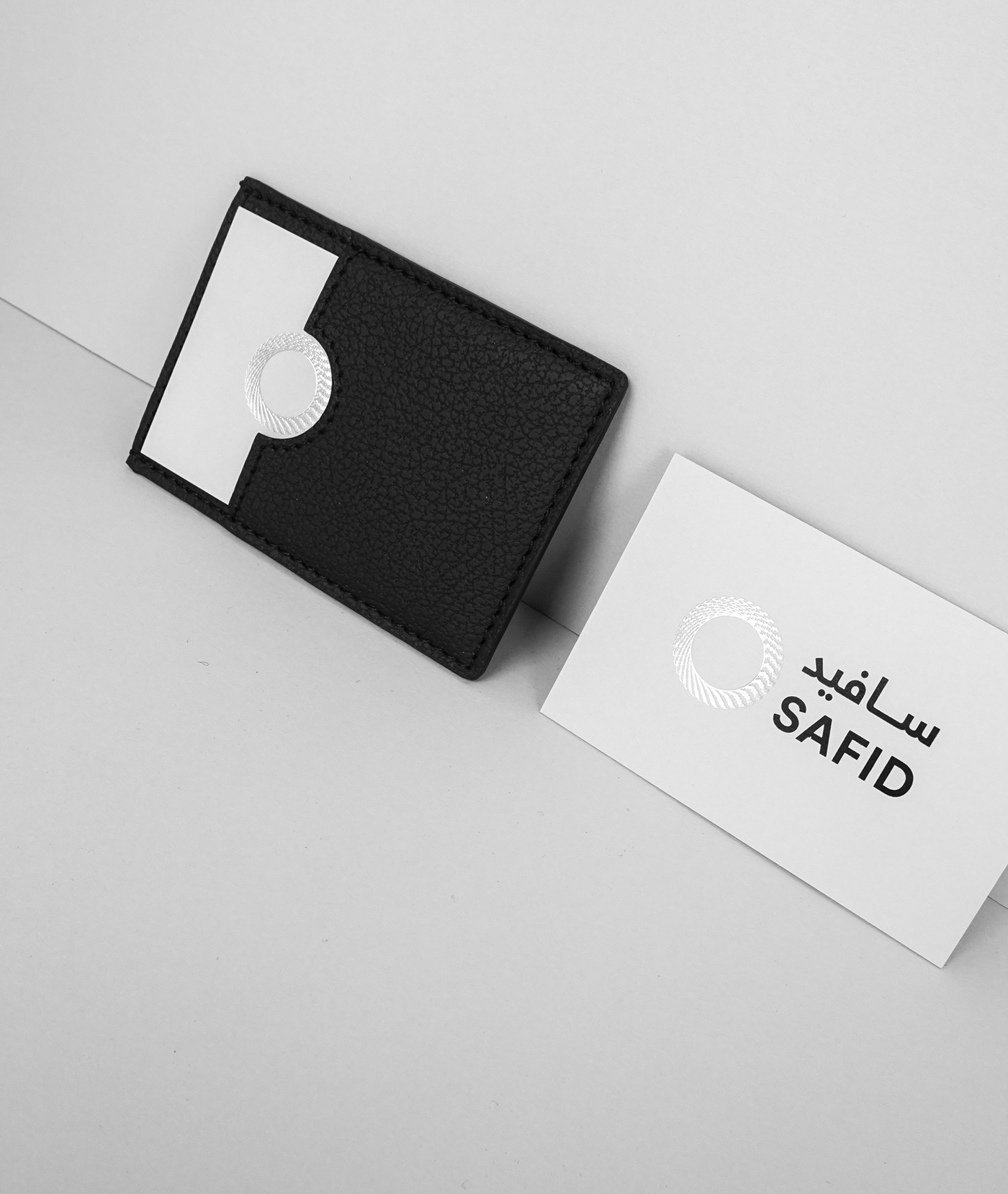
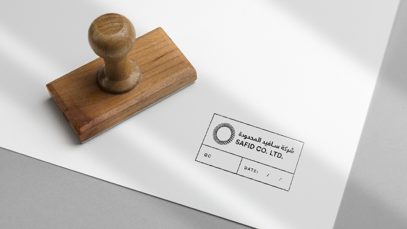
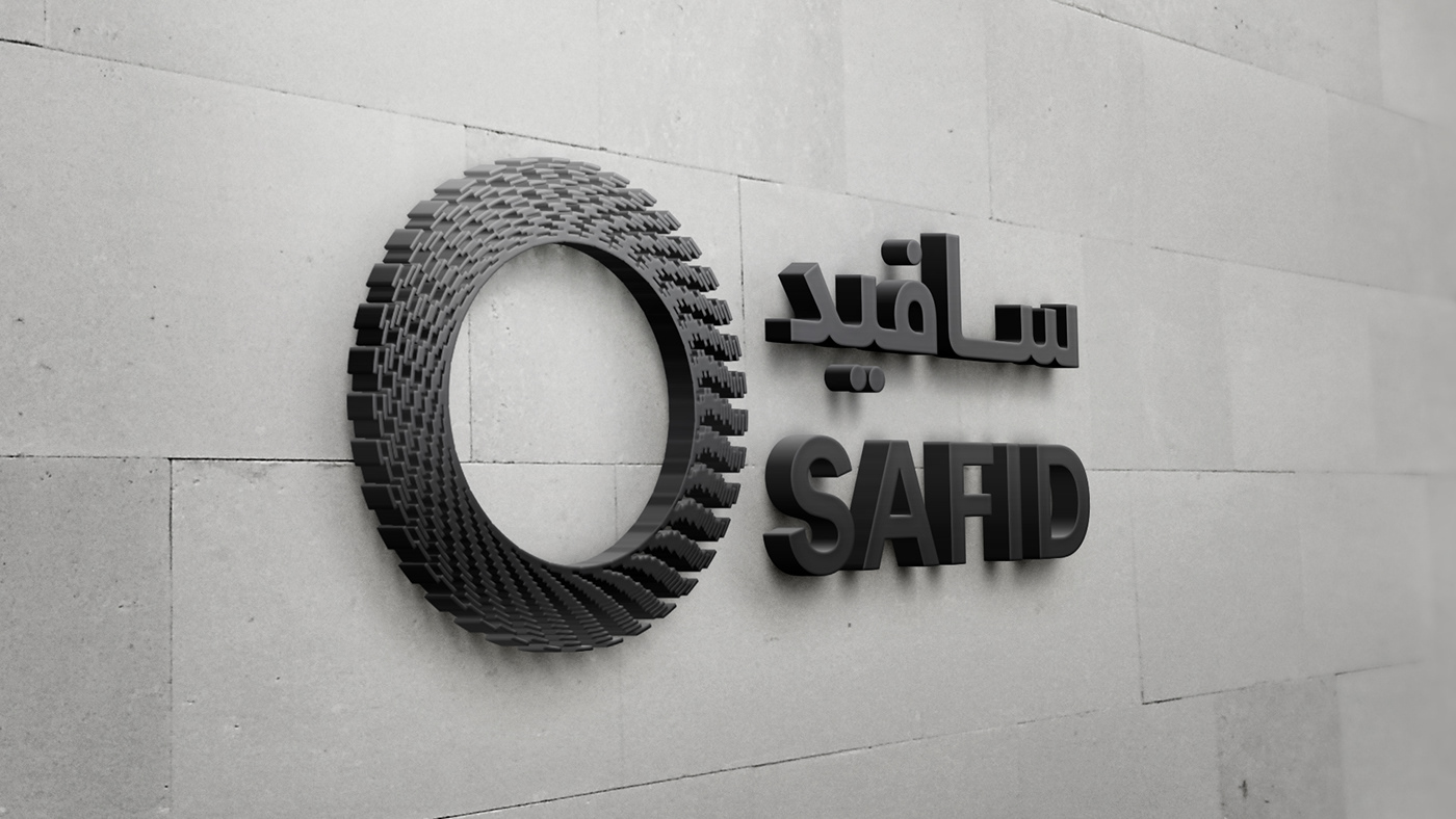
The company approached us to do rebranding for their identity as a celebration of their 40th anniversary. The new logo presents the shape of their air duct when you look at It from the front which has an interesting look that inspired us in the creation of the new symbol. The symbol gives the illusion of air movement and at the same time promote the eco-friendly side of the company. We used simple san-serif font to go along the symbol in both Arabic and English. The primary colors present their products color scheme which consist of black, white and grey. The metallic blue was added as a secondary color to represent cold air.
www.safid.com