
Mechanic identity
The mechanic develops three areas of business: the sale of elevator equipment, installation and service. The comfort and safety of passengers depend on the quality of provided services.
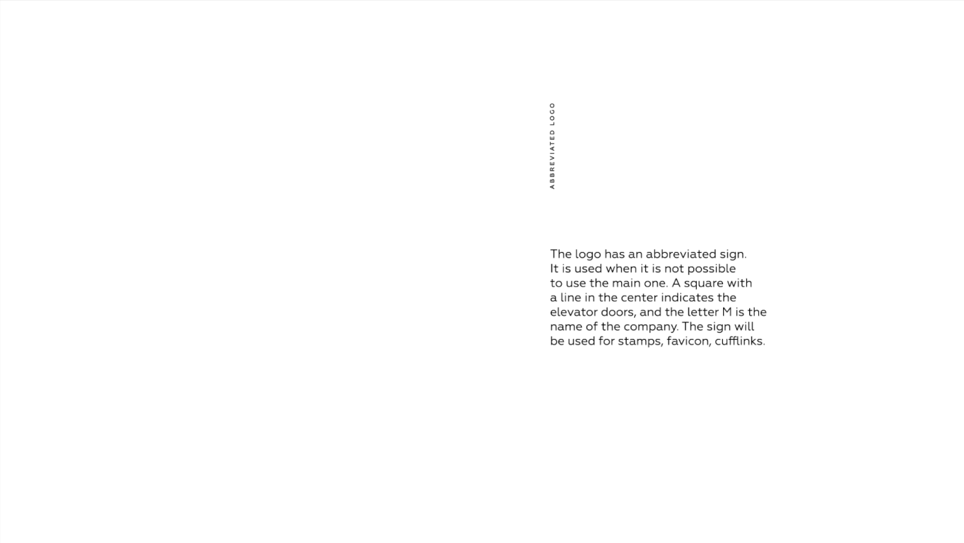
The idea of identity is that any visual communication is a building. For example, a business card can be a cottage, and a website with a lot of pages can be a skyscraper. The human factor is behind any mechanics from design to operation. This is reflected in the naming and logo. A logo is an elevator that is responsible for transporting text.
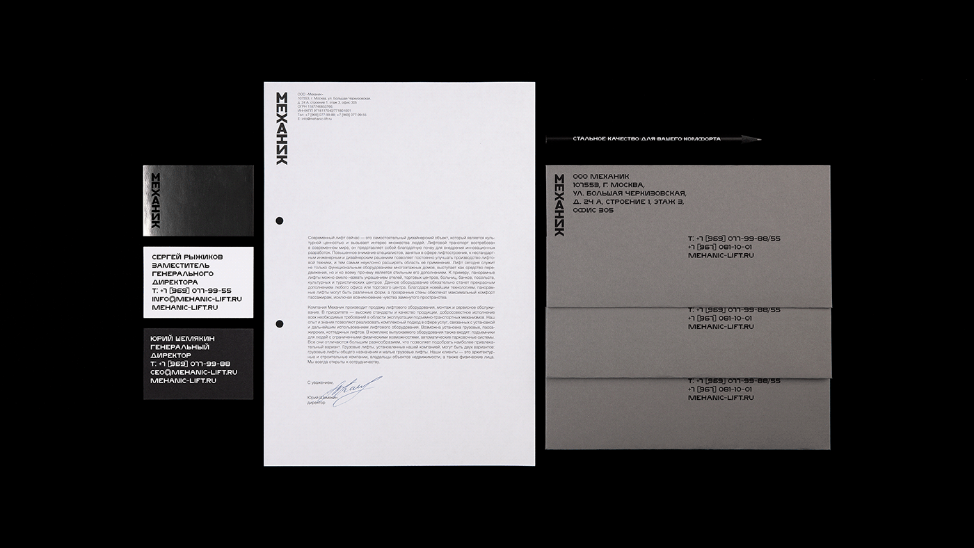
Such identification is able to solve the company's business tasks and looks preferable to competitors. It demonstrates the service sector and at the same time saves austerity and meets the high standards of the company.


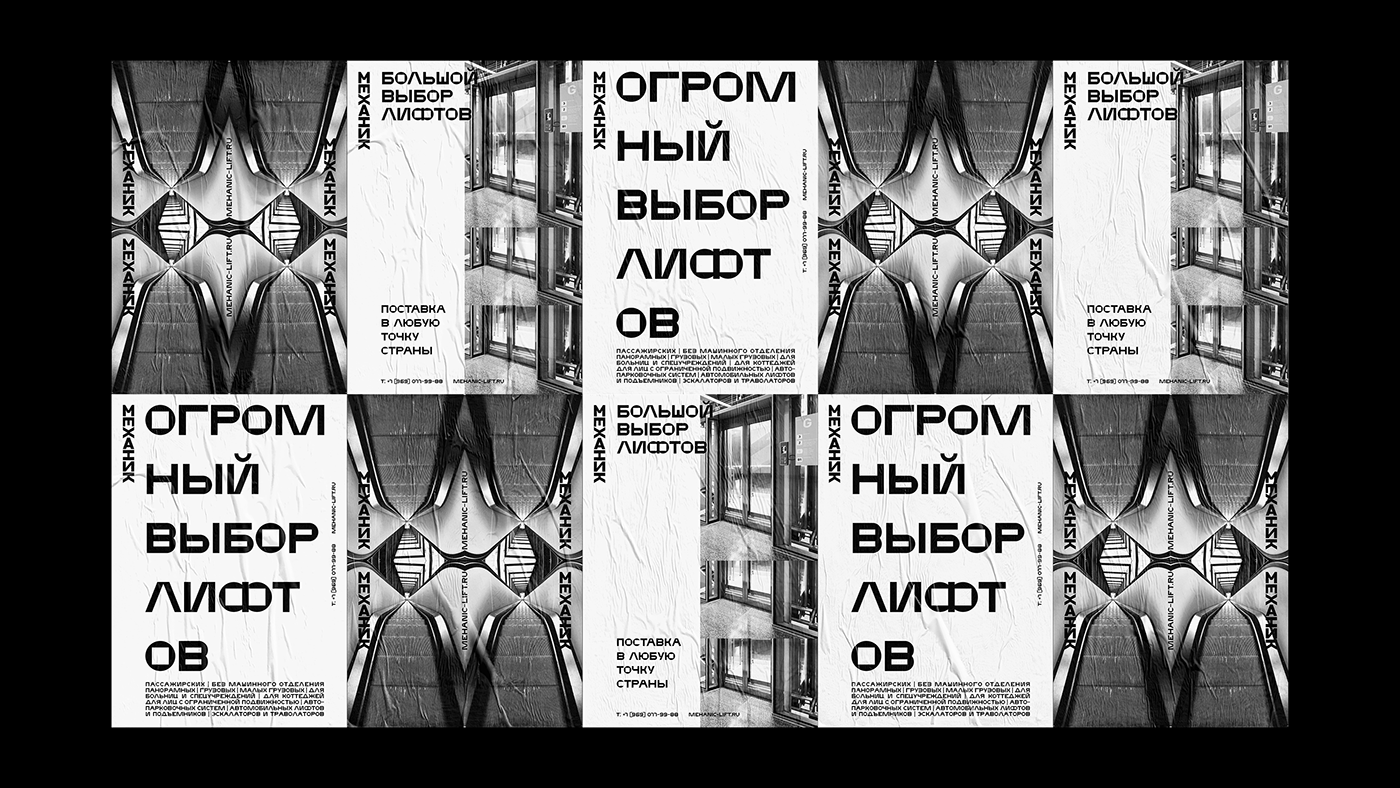


Font is an essential element of brand identity. It embodies reliability, manufacturability, and belonging to mechanics.
The font enhances brand recognition and looks great in the case set. In a large size, the letters look like a streamlined mechanism.


Worked on the project:
Alexander Cherkasov — art-direction, design
Anna Leonteva — assistant
Anatoly Karpov — photographer
Pavel Gubin — 3D visualisation
Dmitry Frolov — 3D visualisation


