Douceur - cosmetic brand which produces premium skincare solutions. Their main goal is to give your skin full hydration during the day and fresh feel like after the bath. They care about their customers and provide only new nano technological solutions in beauty industry. Douceur's products work at the DNA level of skin cells. They work on deeper level and not only give you beautiful moisturized skin but also fix the cause of the appearance of age-related changes in the skin right from the inside.
The Challenge:
Douceur wanted to create strong positioning in the minds of new customers. They wanted to attract women who already know about nanotechnological solutions but more importantly to intrigue another audience by presenting products in a sophisticated way. Their main goal was to show their main values in branding and create a premium look of products to help them worthily compete with their premium competitors' brands.
The Solution:
Brand name "Douceur" from French means tenderness, softness and sweetness. They wanted to show these feelings through every touch point with brand. After we determined their main goals, create brand position statement and define their core brand values we've chosen soft and modern visual language to interpret it to customers.
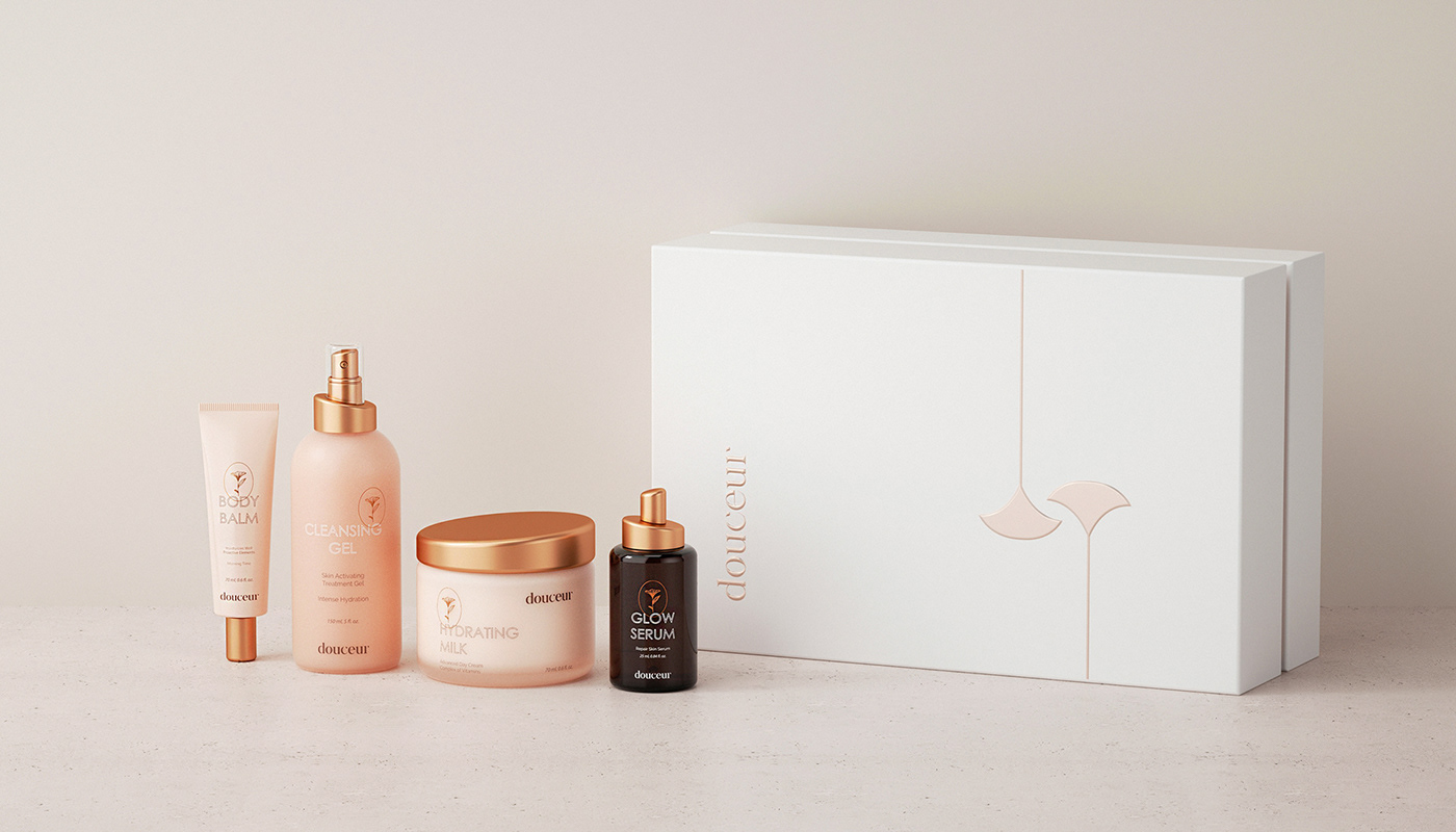
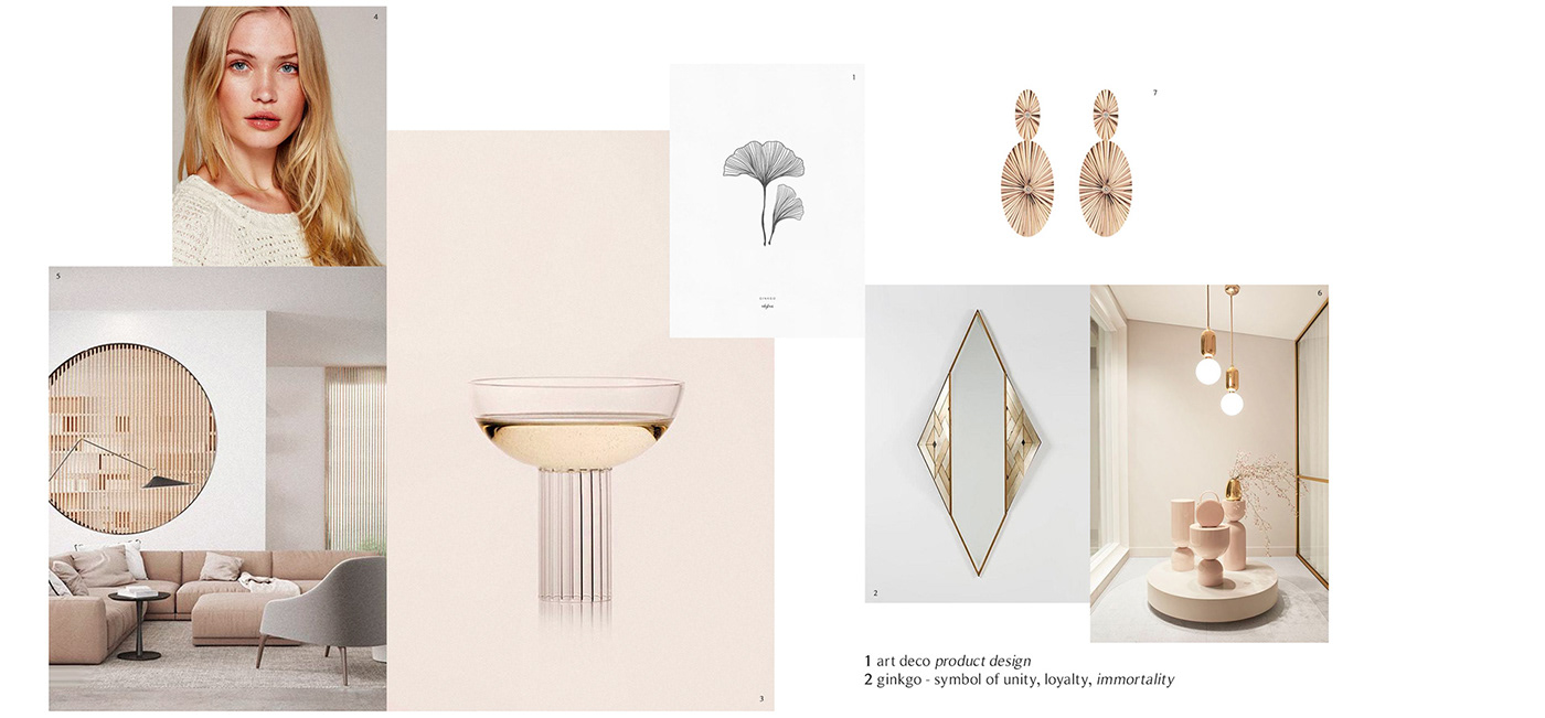
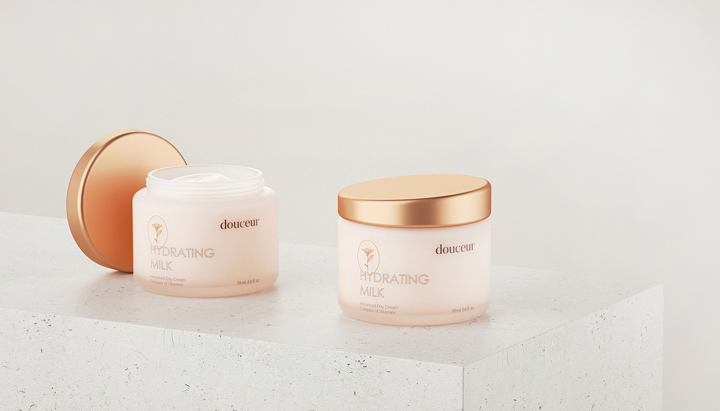
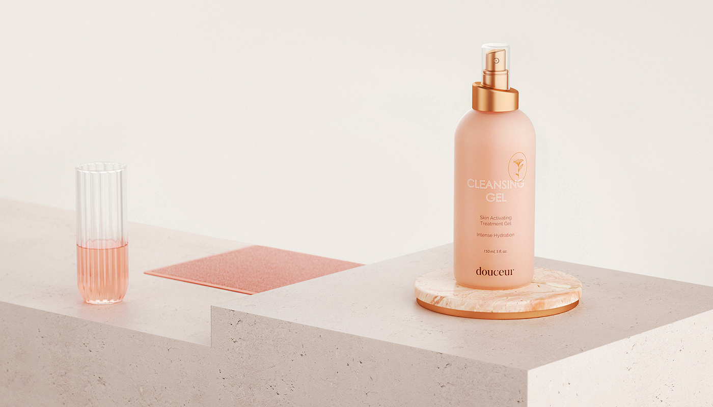
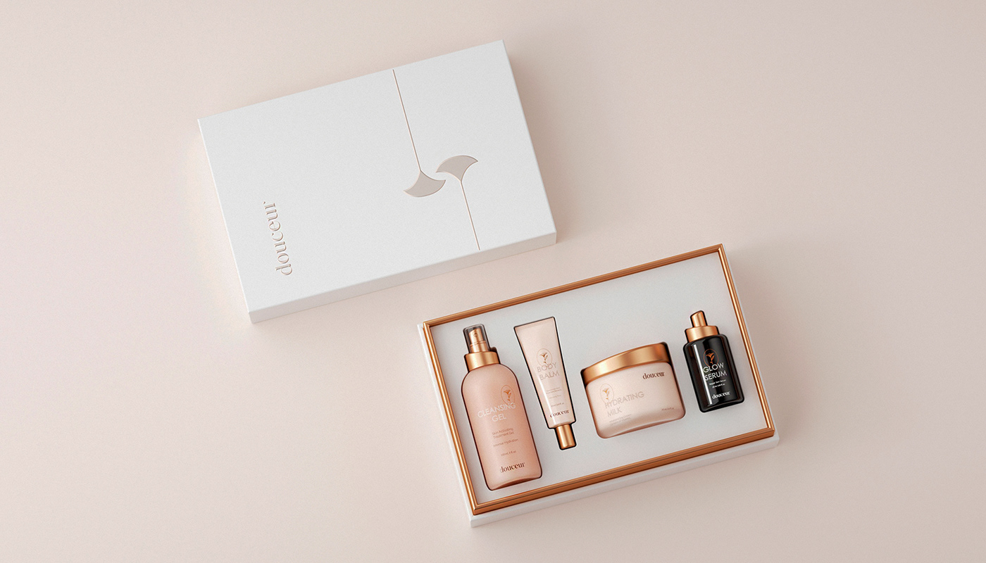
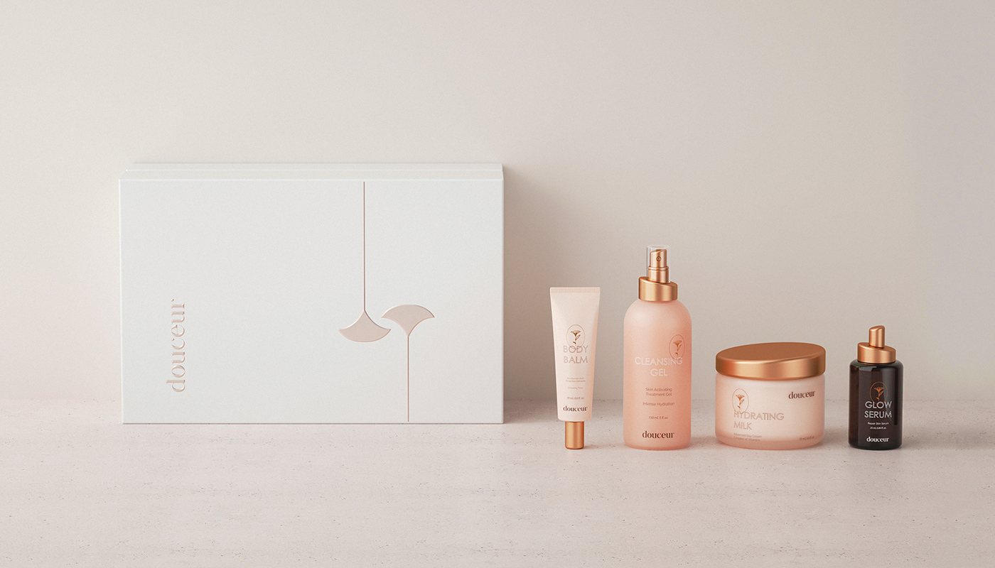
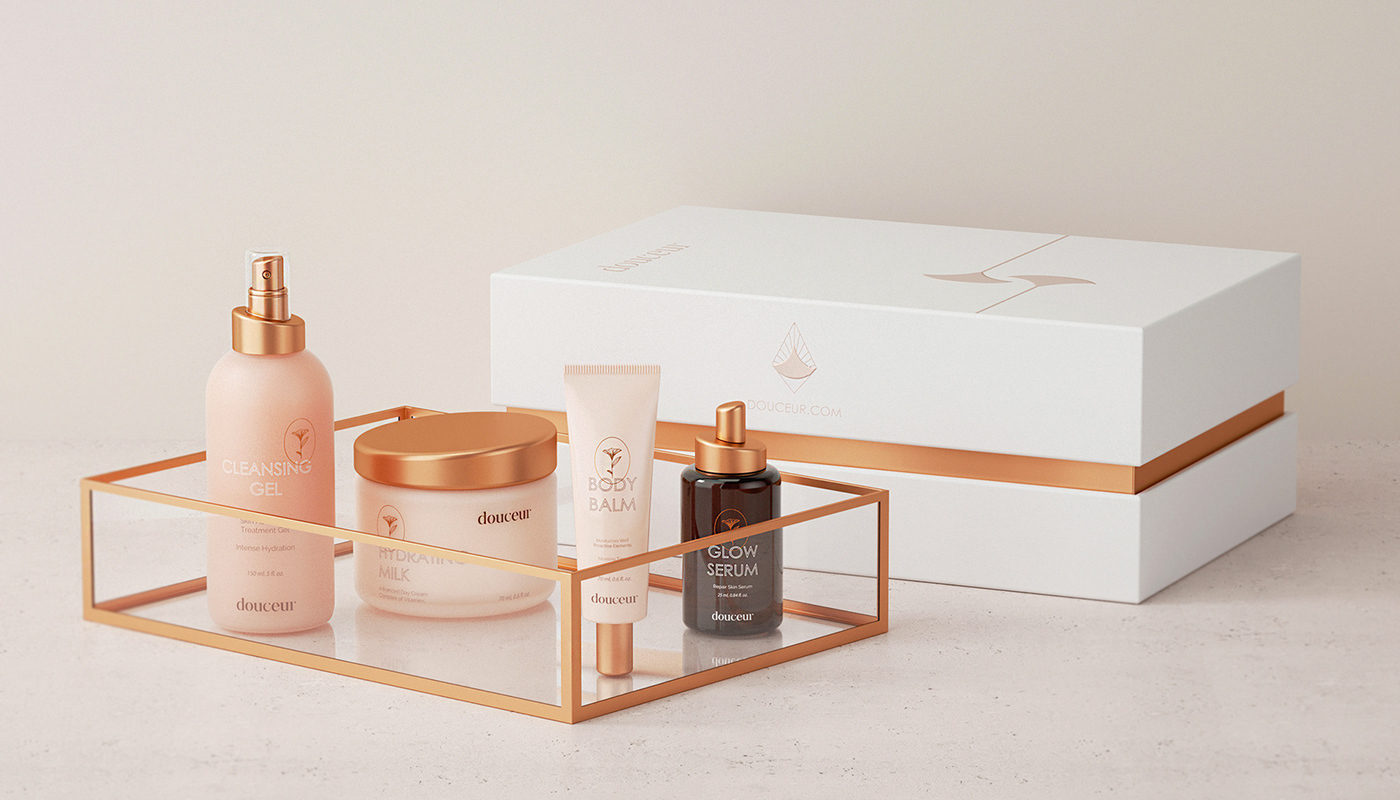
It was decided to choose light gentle colors close to sun light and milk. Brand color palette are light beige, soft gold, light pink and lots of white space in promo materials. Whole visual language was inspired by the art deco movement, minimalism, and nature. Combination of these fields create modern but at the same time elegant look. Cold geometrical lines support natural illustration in label design and shapes of the products. Typography also show us combination of old and new age. Strong outlined sans serif fonts complement bold serifs from logo letters. This combination creates whole technological but artistic brand style.
Brand name "Douceur" from French means tenderness, softness and sweetness. They wanted to show these feelings through every touch point with brand. After we determined their main goals, create brand position statement and define their core brand values we've chosen soft and modern visual language to interpret it to customers.
It was decided to choose light gentle colors close to sun light and milk. Brand color palette are light beige, soft gold, light pink and lots of white space in promo materials. Whole visual language was inspired by the art deco movement, minimalism, and nature. Combination of these fields create modern but at the same time elegant look. Cold geometrical lines support natural illustration in label design and shapes of the products. Typography also show us combination of old and new age. Strong outlined sans serif fonts complement bold serifs from logo letters. This combination creates whole technological but artistic brand style.
Details:
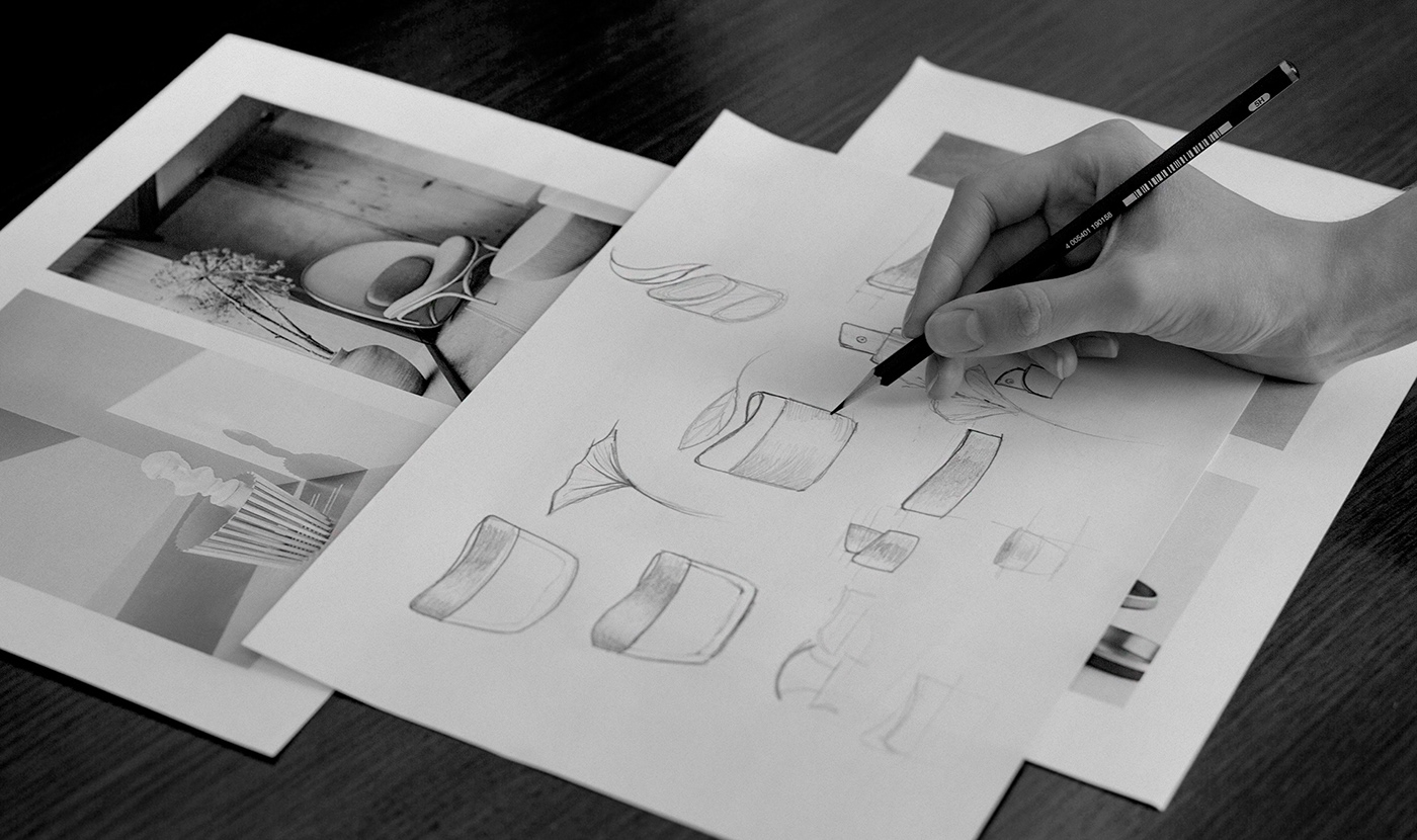
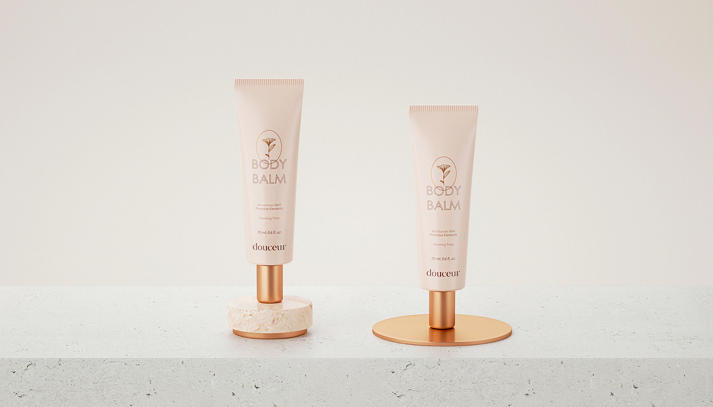
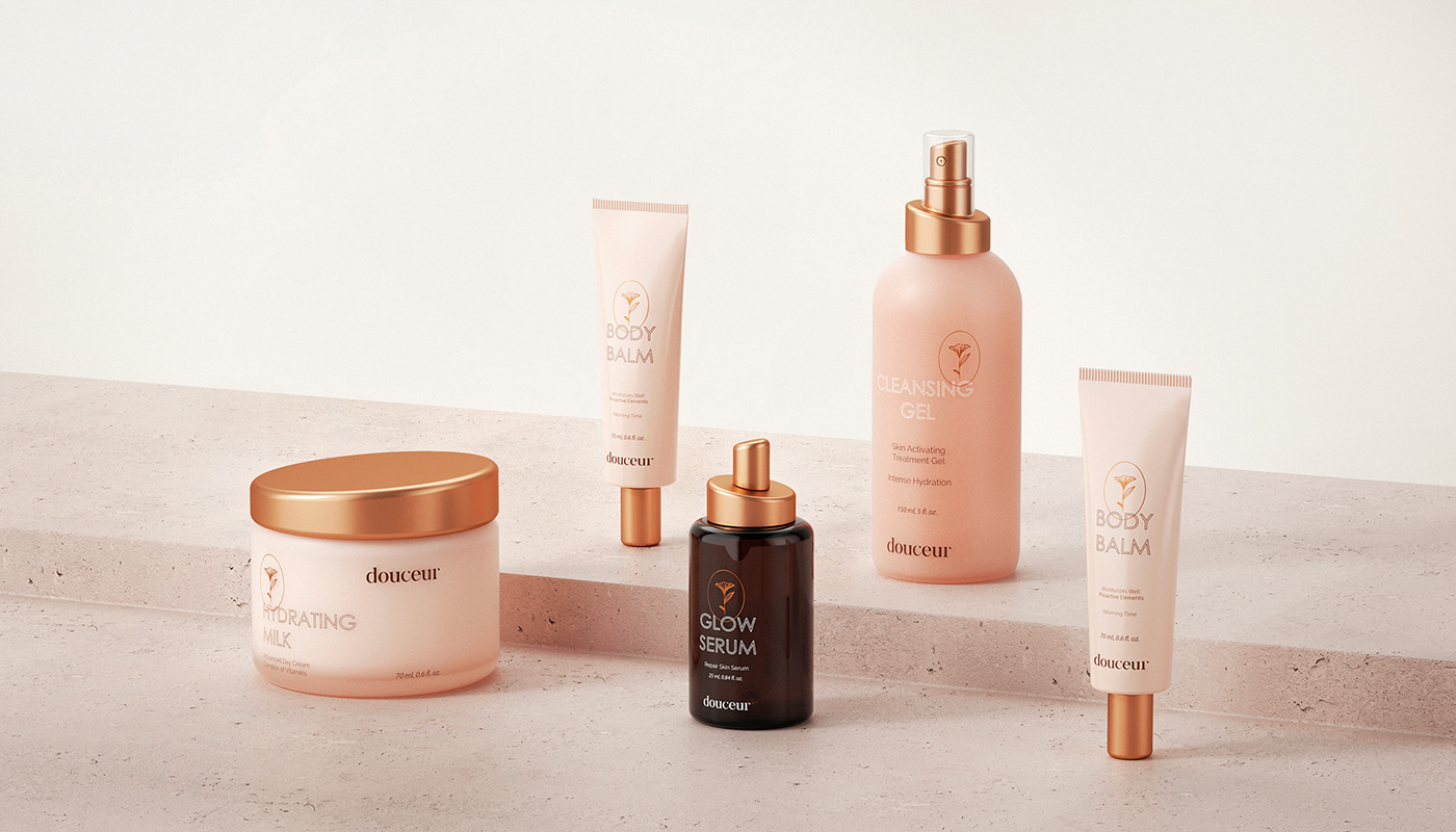
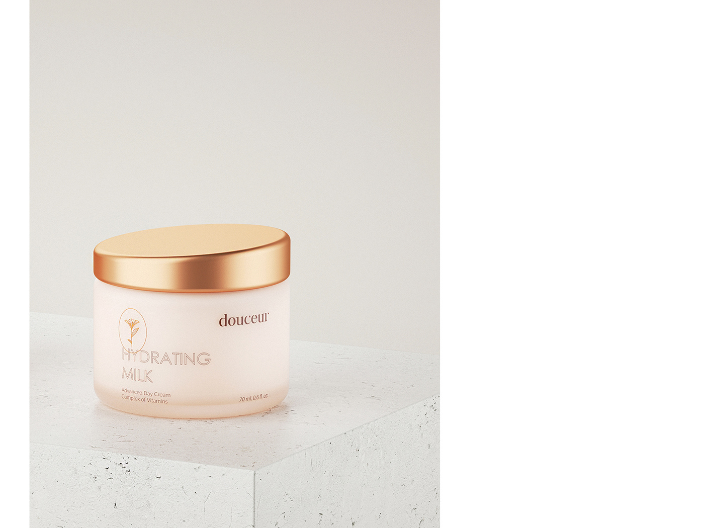
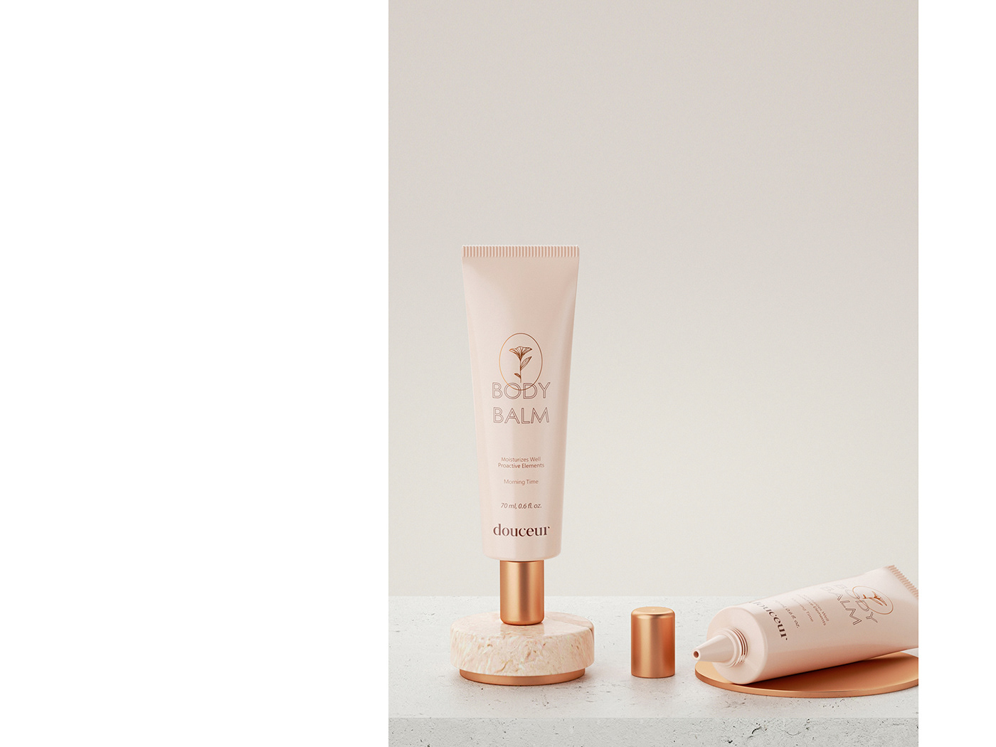
As we were focused on technology side of the brand as main functional advantage, we decided to come up with unique product shape. Modern style in our case meant elegant and sophisticated. Because of that we decided to combine technology with floral motives. We've used graceful shapes that reminds us about nature and leaves. Product's caps are resembling sunrise. Rounded edges create a delicate but at the same time technological image.
Main focus in brand's product design was to show products as piece of art. We are not focusing only on utilitarian use of the product: buy - use - throw away. We are thinking of second usage of the product and wanted to present cosmetic products as beautiful element of decor and a part of your everyday lifestyle.
Client: Douceur
Service: Brand Strategy, Brand Identity, Art Direction,
Publications: Packaging of the World | Oh My Code


C R E D I T S
3D Visualization - Pavel Gubin
3D Visualization - Pavel Gubin
Photo materials reserved to their owners,
used to showcase the work only and not in the commercial purpose.
used to showcase the work only and not in the commercial purpose.