


Full Page Magazine Ad


Small ad (3.75 x 3.25) for Drag Racing Magazine - background composite in Photoshop. Ad built in Illustrator.

Full page ad for Home Show Directory. The house was unfinished. The foreground consisted of mud and debris, and the front step hadn't been installed. I added the step, grass, landscaping, sidewalk and driveway in Photoshop.

A comparison between my ad (top left) and one created by the competition's centralized production department (bottom right). Same content - same event. It's shameful what passes for ad design these days. The bottom ad is what happens when design/production depts aren't held to a higher standard of quality and creativity. Surely advertisers' expectations haven't lowered that much?
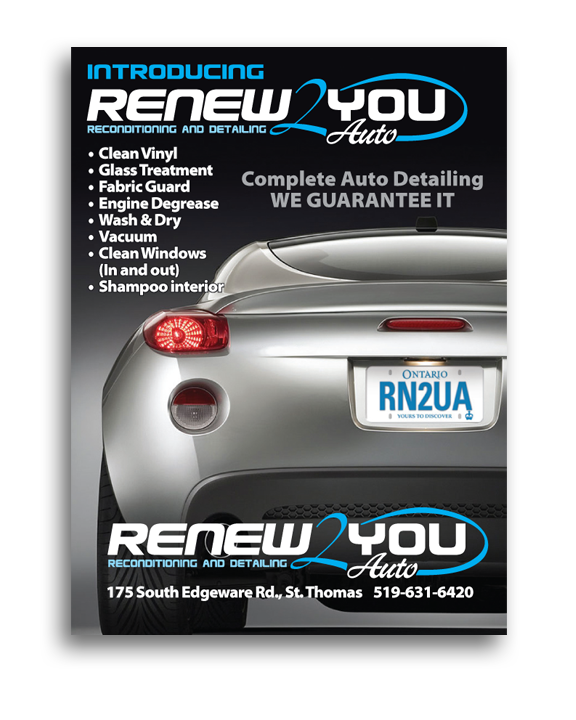
This ad needed to be built very quickly. Client had no logo. I developed the logo, handled the Photoshop work on the car (removed emblems and created and added license plate) then built the ad in Illustrator. Less than an hour.
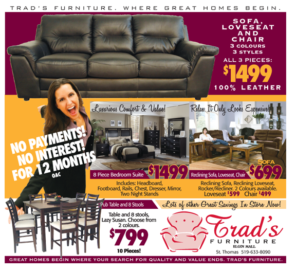
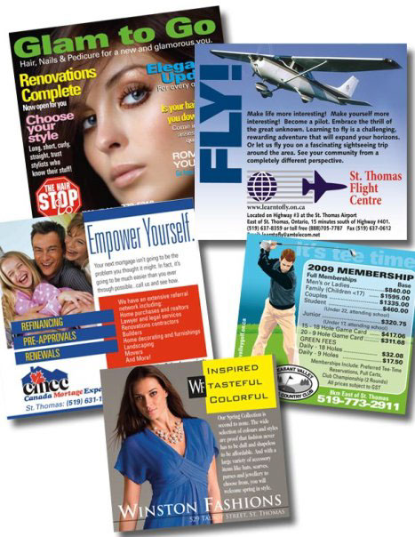
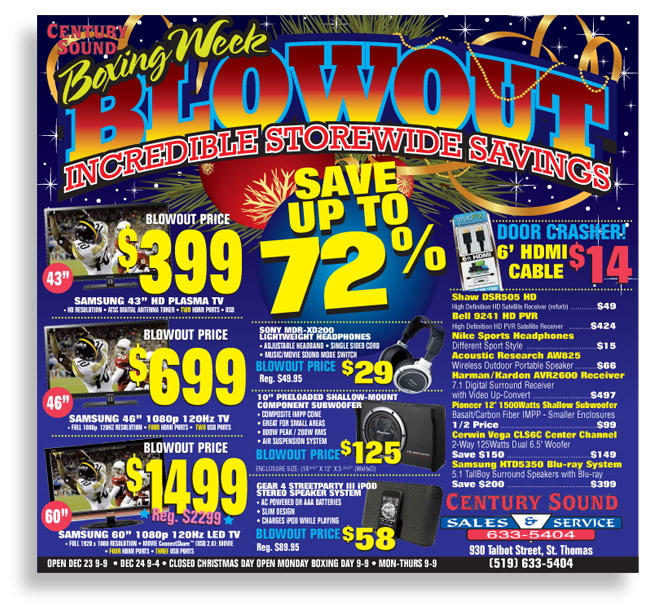
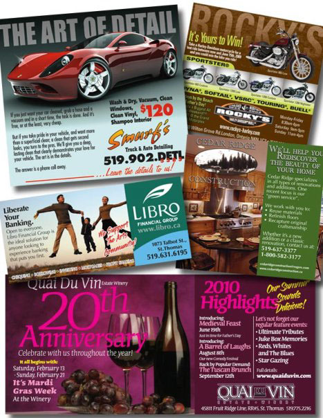
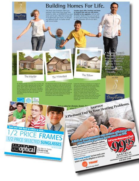
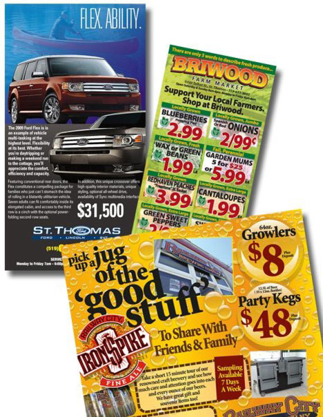
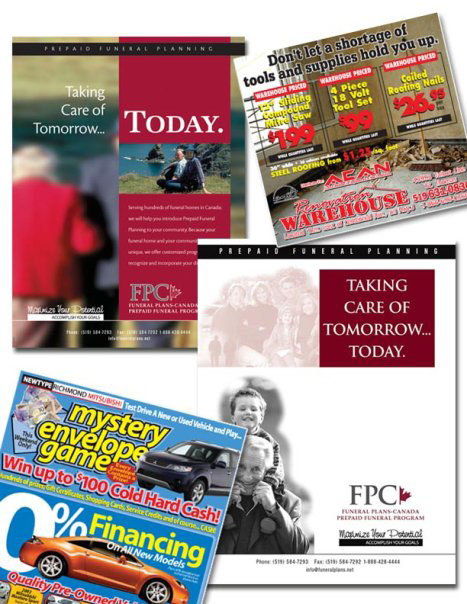
The following composites are a sampling of some of the ads I have designed and produced over the last year or so. It was more efficient to group them than present them individually.


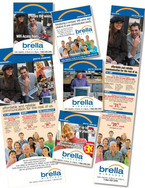
Part of a branding package built for a B.C. company.


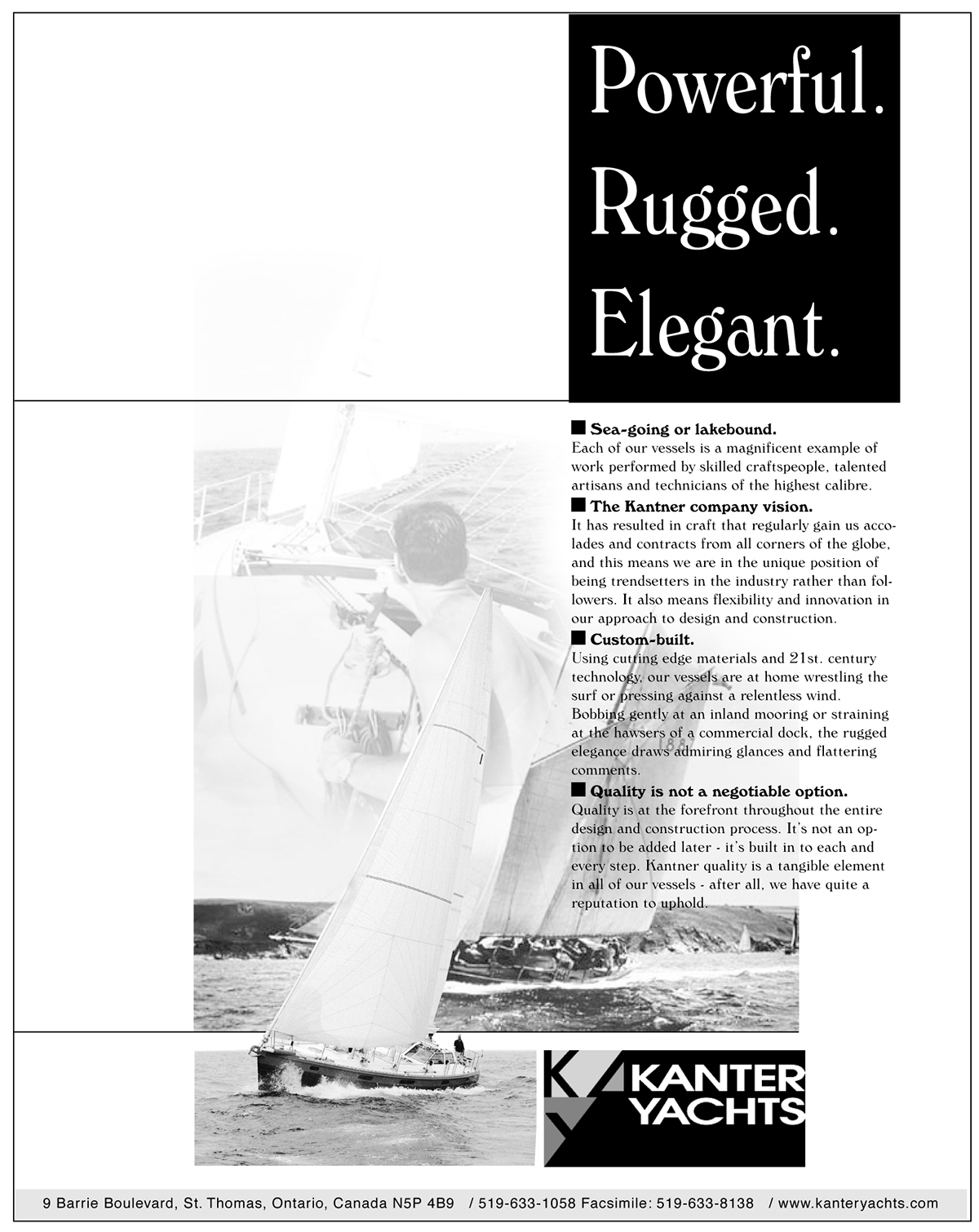
A full page magazine ad. Built in Illustrator.

An ad from the nineties. It's too hard to read the copy, but I wrote, produced and built this piece.
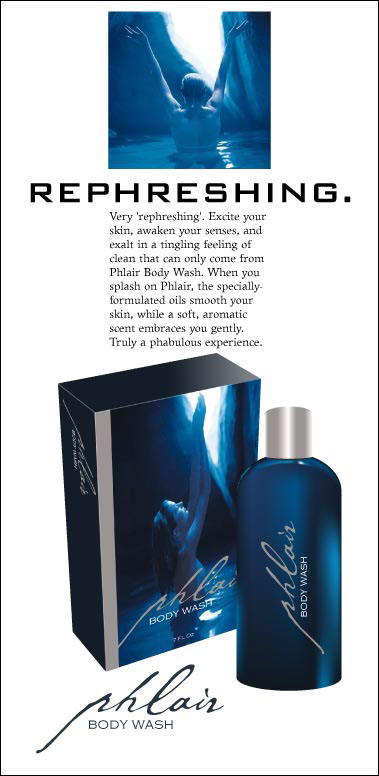
This is part of a branding exercise - the product doesn't exist. I wrote the ad, developed the logo and created the art.

The second ad in the branding exercise. I wrote, designed and produced the piece. For more on this exercise, see the Commercial Printing category.
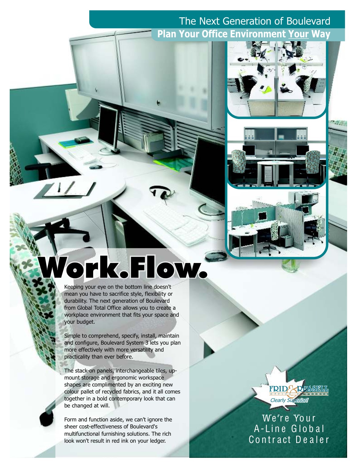
This is a page from a much larger catalogue. I wrote the copy and designed and produced the piece.
An ad from the early nineties. I wrote, designed and produced this one.

It's hard to read here, but I wrote the copy for (and designed and produced) this ad.

Sometimes the minimalist approach is effective. I don't know that this works in a retail advertising environment, but the client was happy.

I also developed the logo for this one.

Not a great ad, but I'm pleased with the Photoshop composite work. The original pic had U.S. dollars in the man's hand.

Again - not a particularly good ad, but the background was created in Photoshop from bits and pieces.
Another example of extensive Photoshop work. It's not a particularly good ad, but again, I'm happy with the composite.

A couple of quick ads - Photoshop, Illustrator and Quark. Less than 20 minutes for both from blank document to PDF proof. Ads are both 8.25" wide.
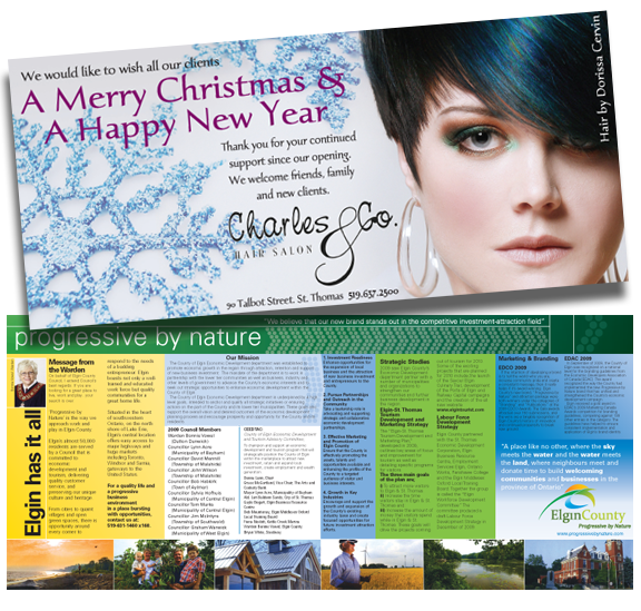
The Charles & Co. ad was a quickie built in Photoshop and Quark (10.25" x 4.625"). The 'Progressive By Nature' ad was a centrespread (21.5" x 9.5") - built from a hodgepodge of copy and instructions. Tough to organize that much information - but I managed. It should have been a 4 page spread to properly pull this one off, but budgets are budgets.

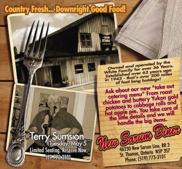
Another 'quickie', built in Illustrator in about 40 minutes.

Another ' quickie'. Actual size: 10.25 x 9.5. About 45 minutes in Illustrator/Quark.

I wrote the copy for this one (as I do for most of my ads) - and I also developed the logo.


Built in Illustrator. I also developed the American Iron logo.


