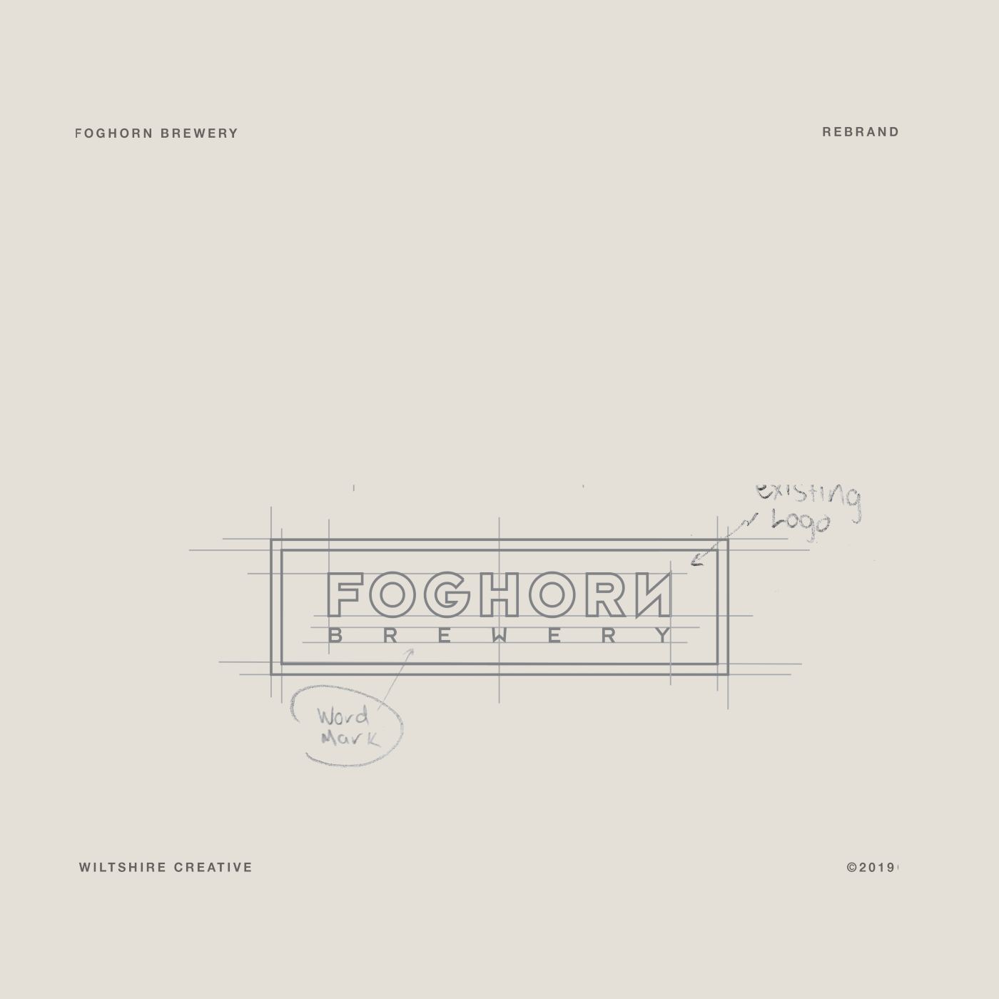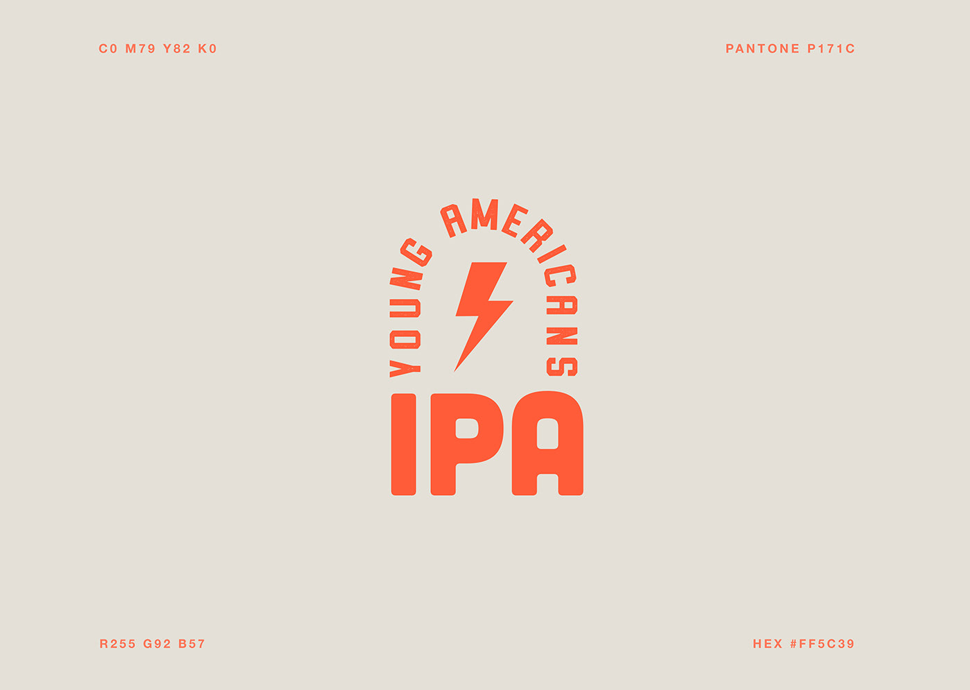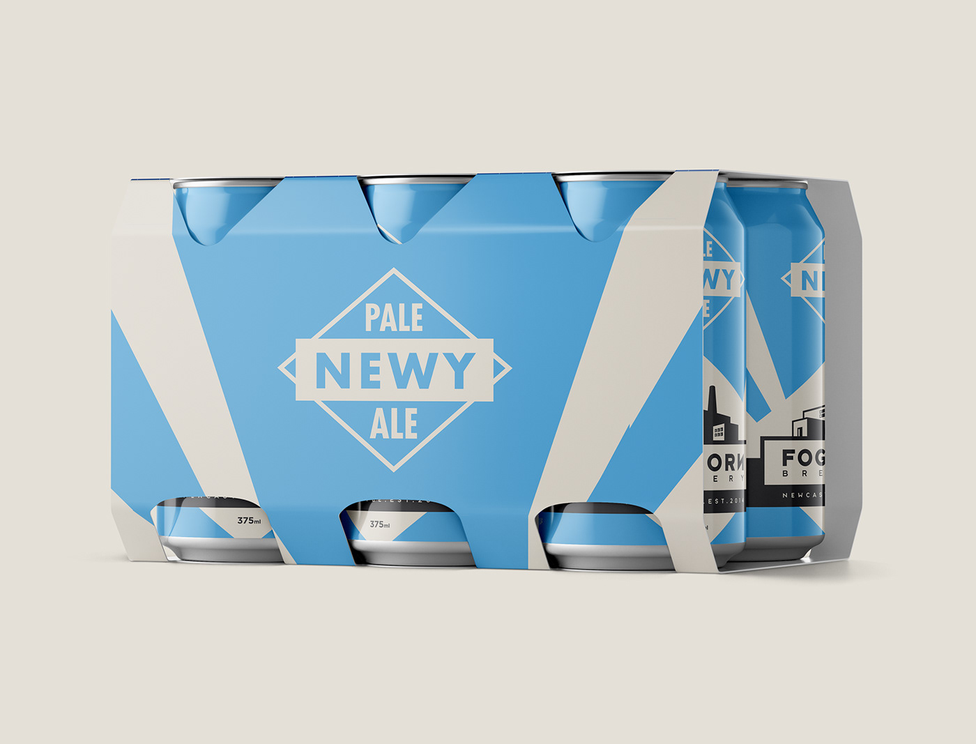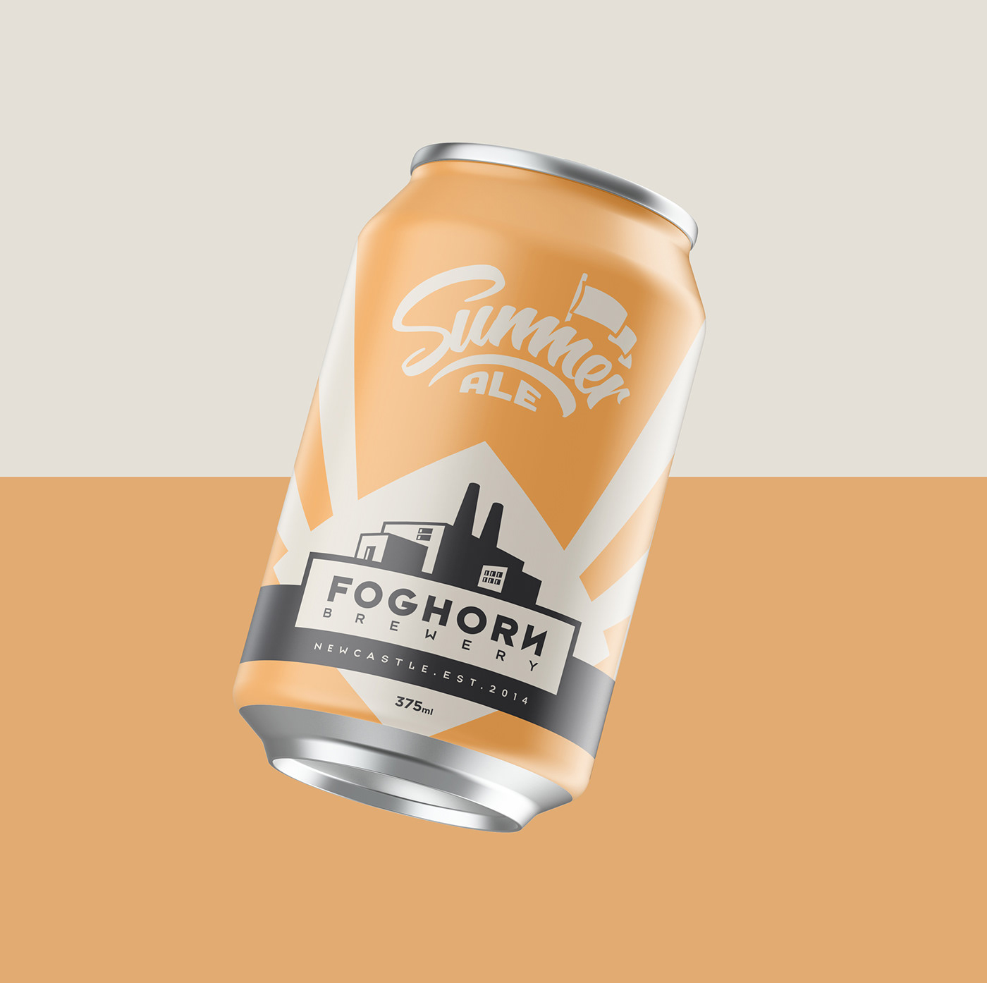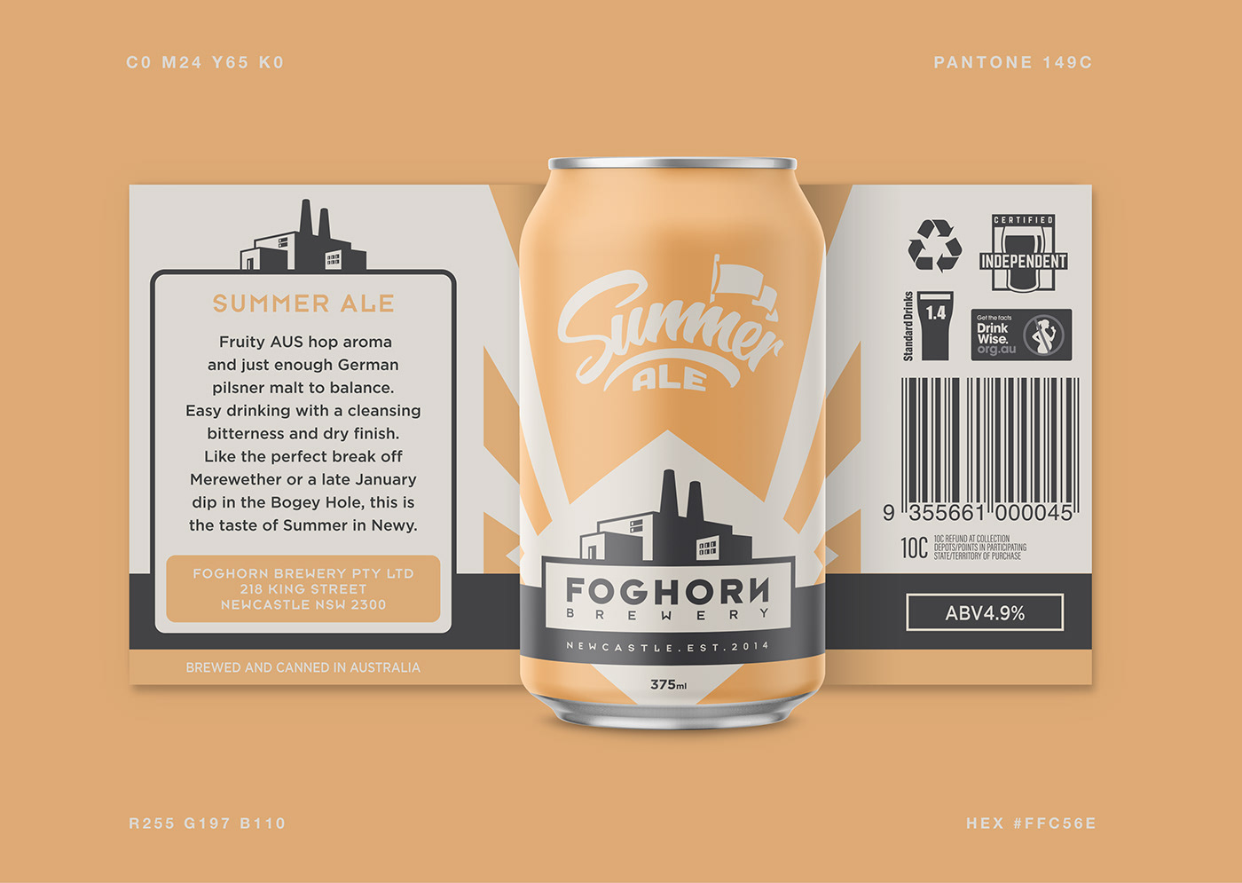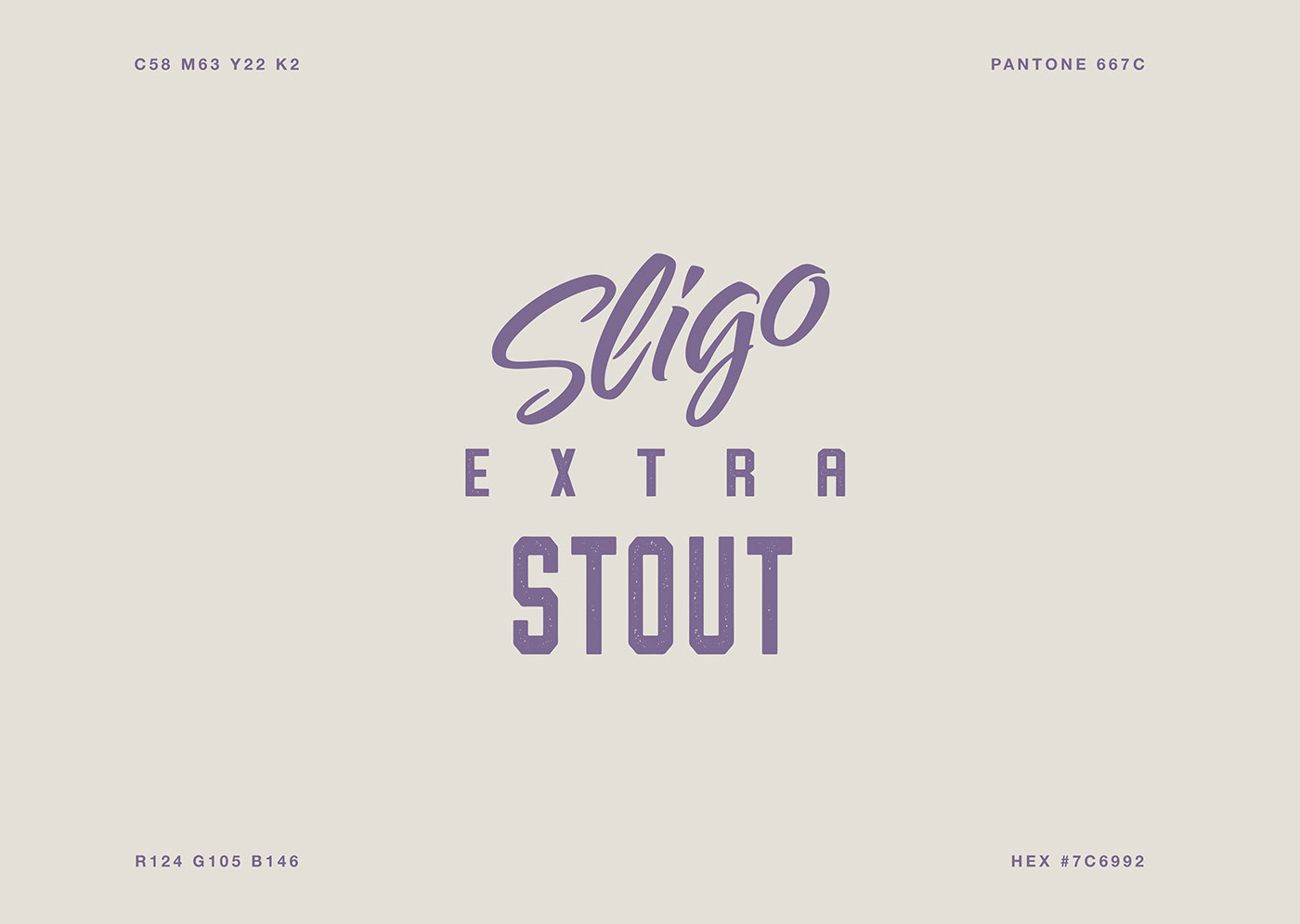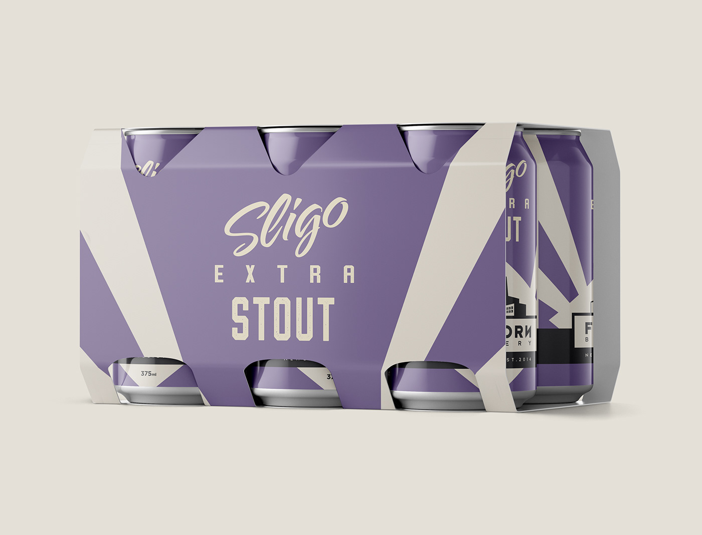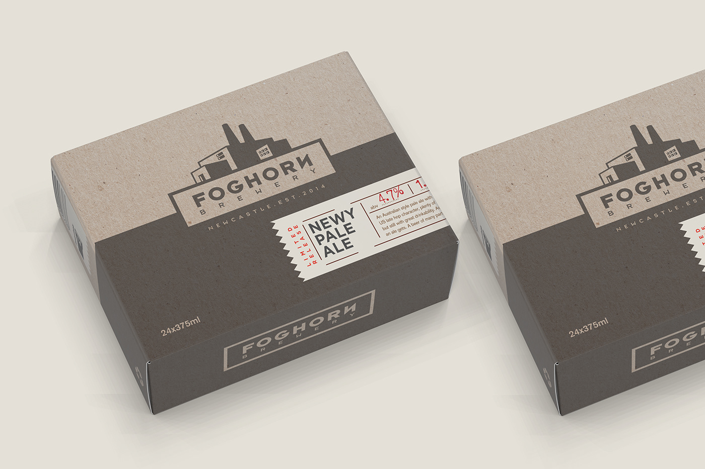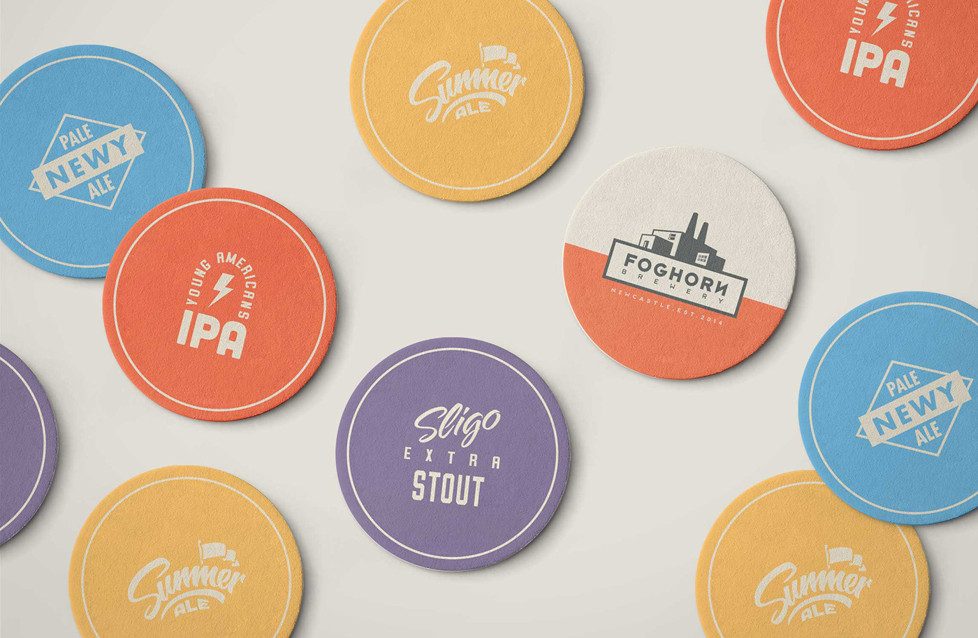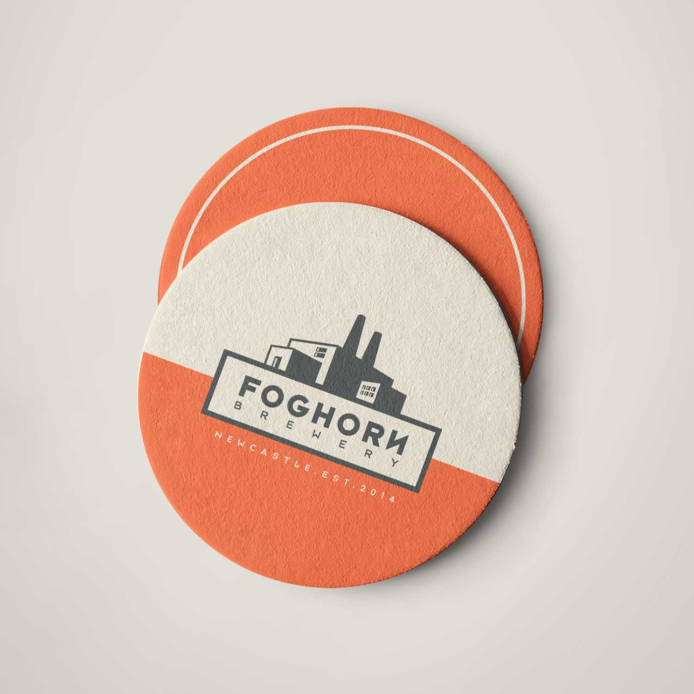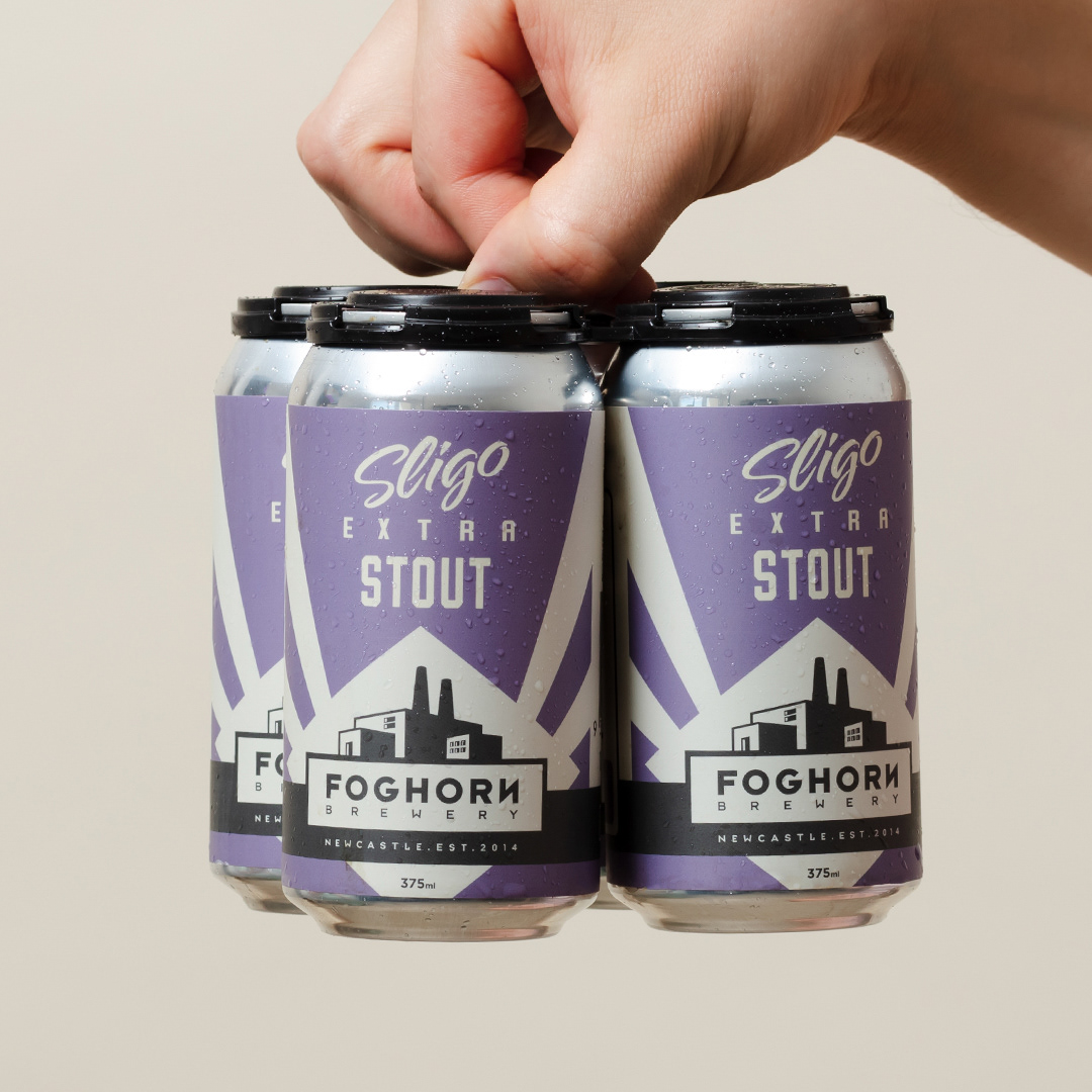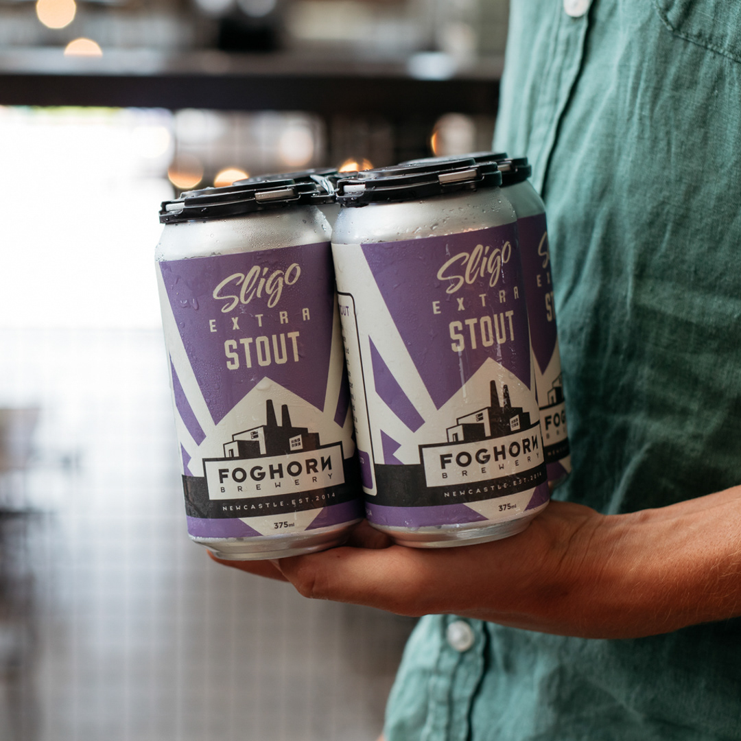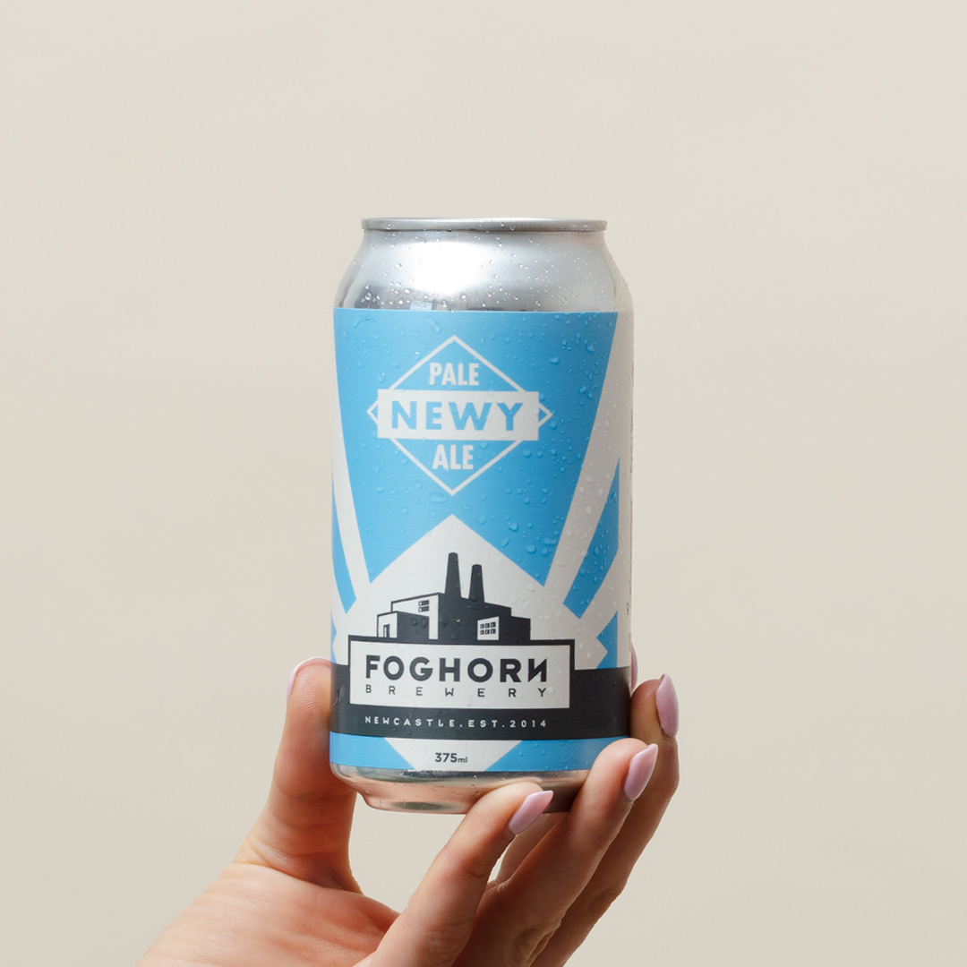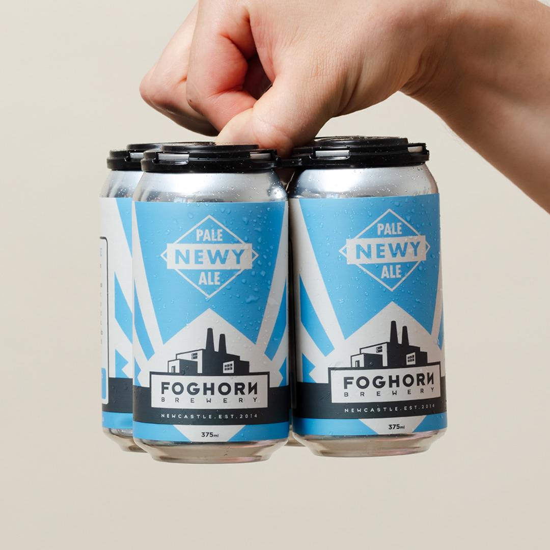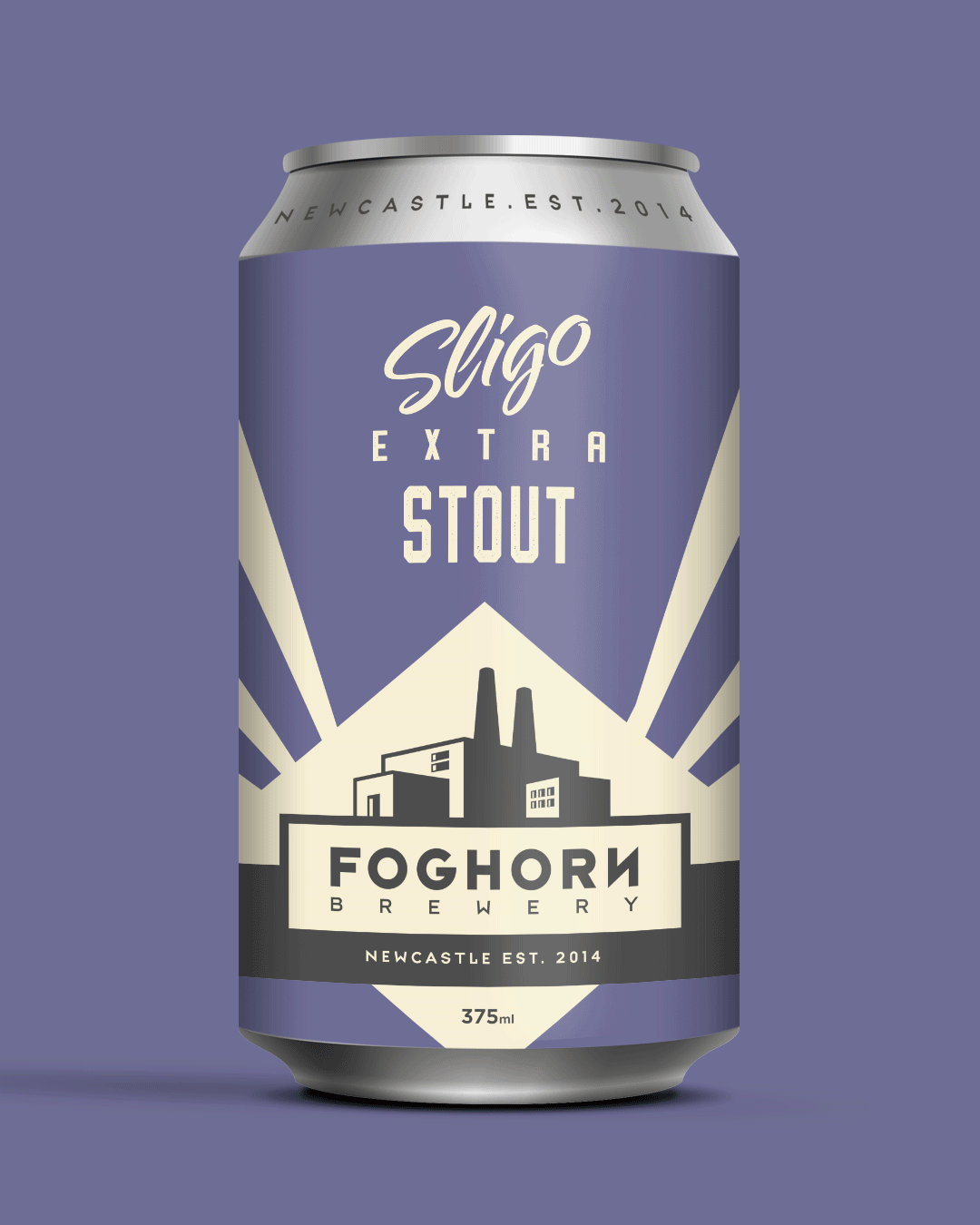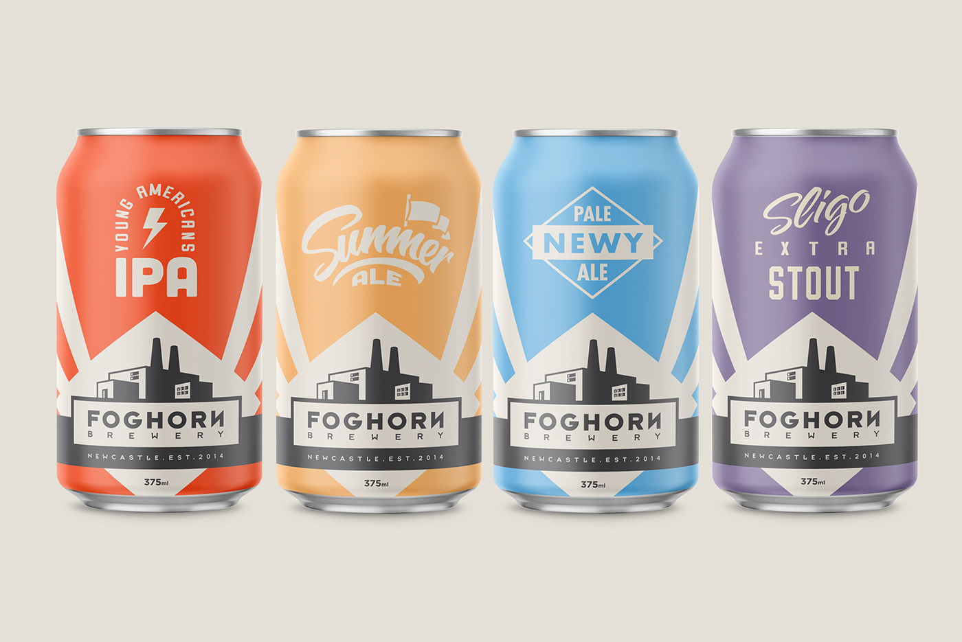
Foghorn Brewery
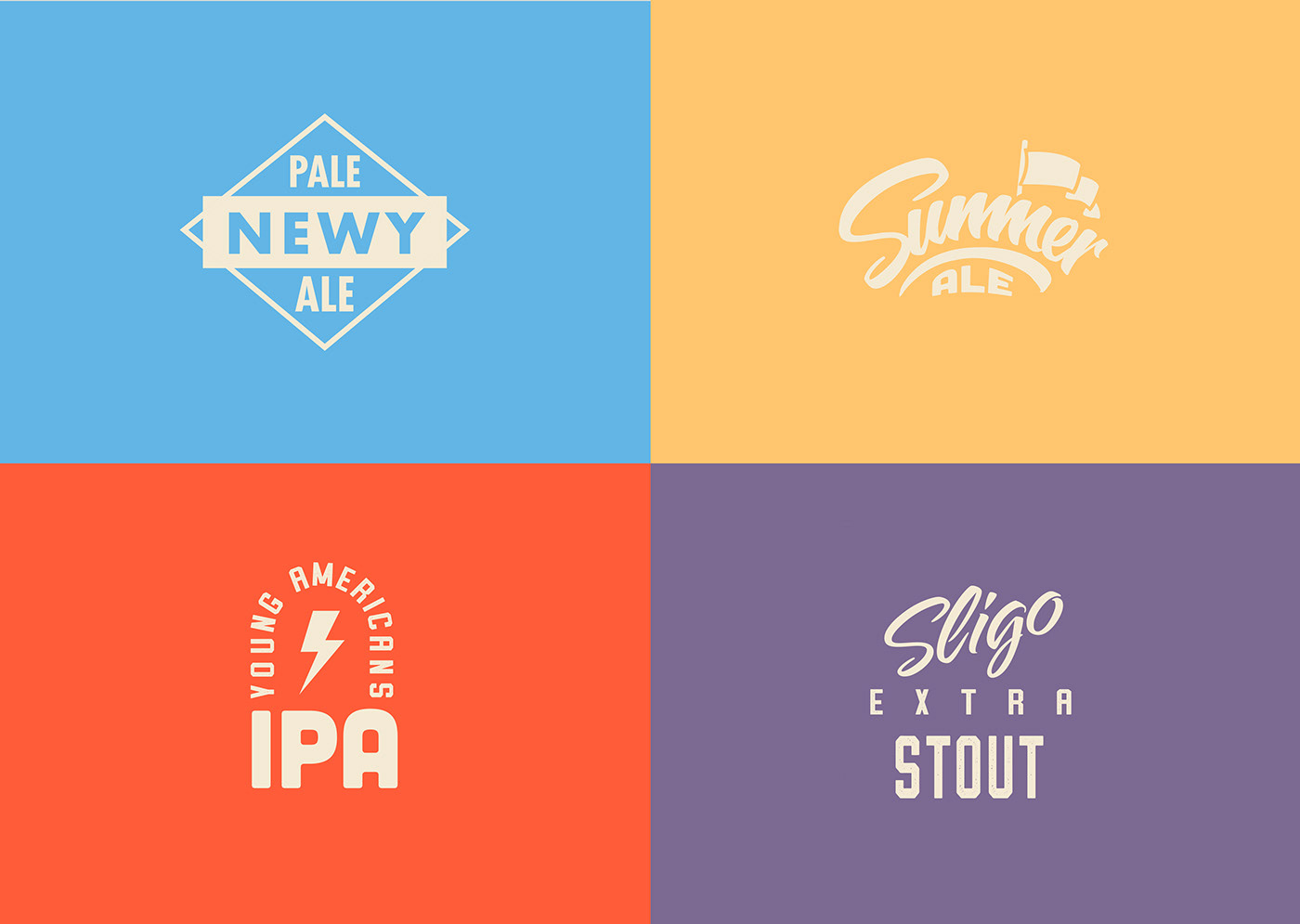
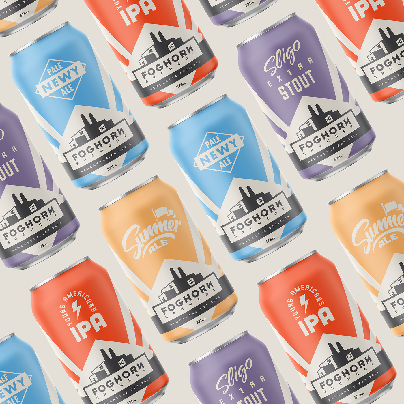
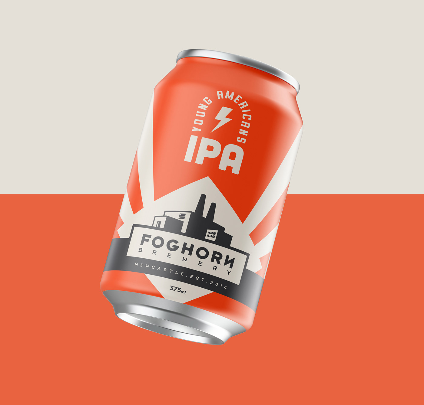
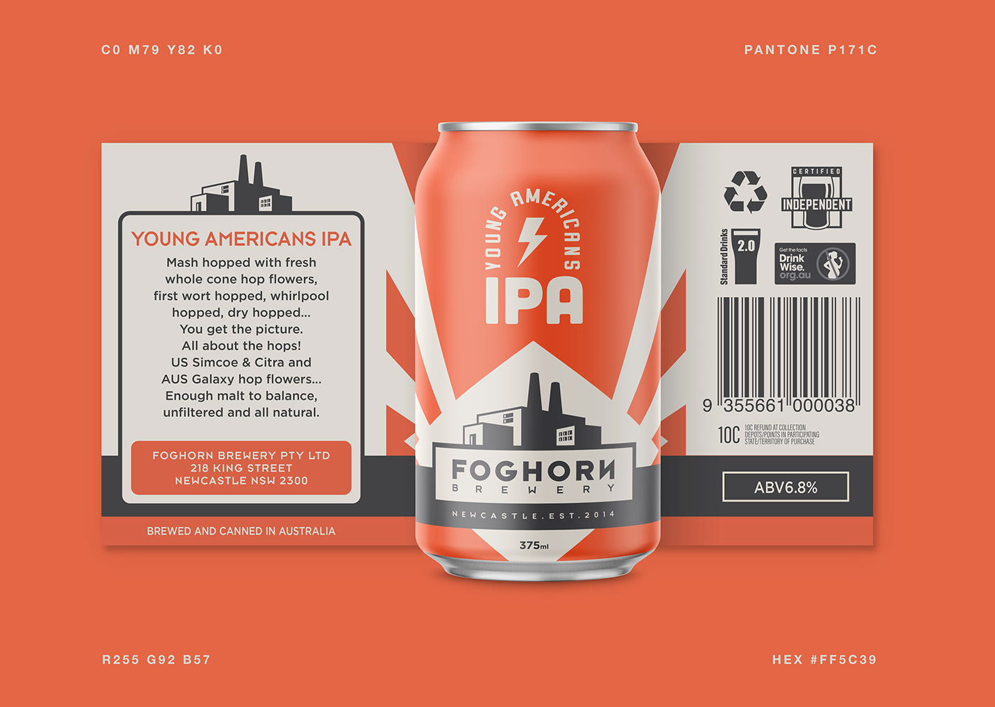
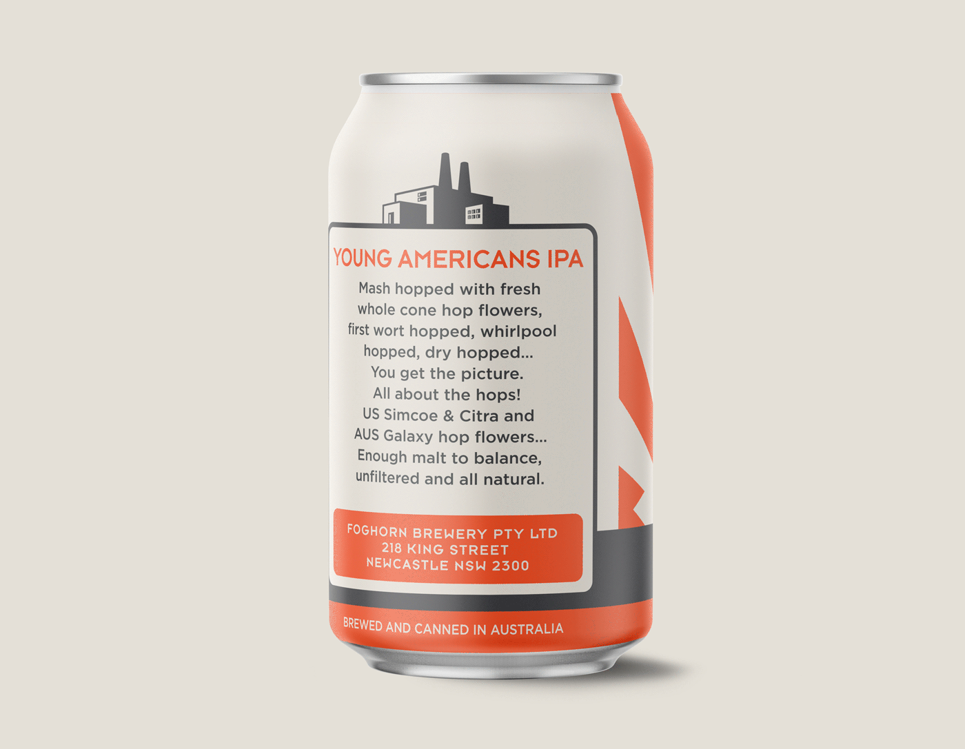
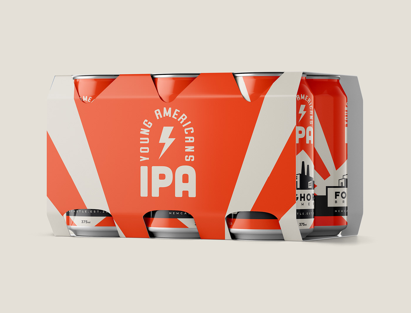
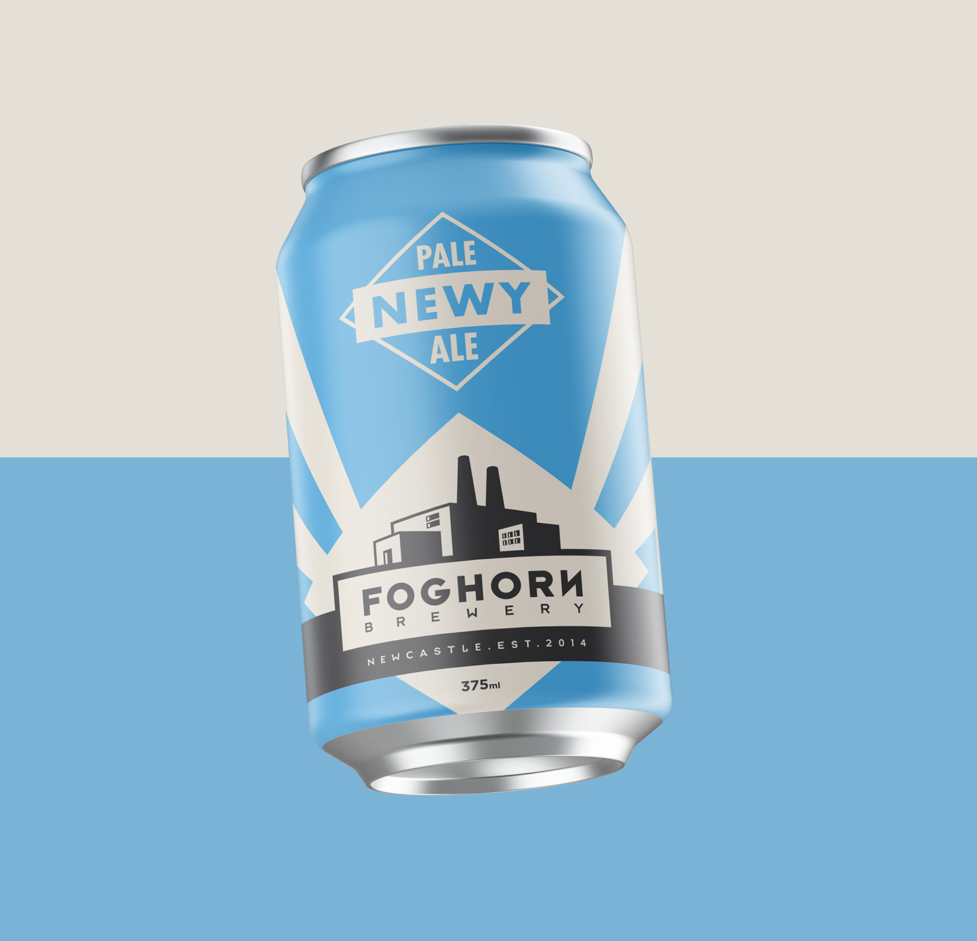
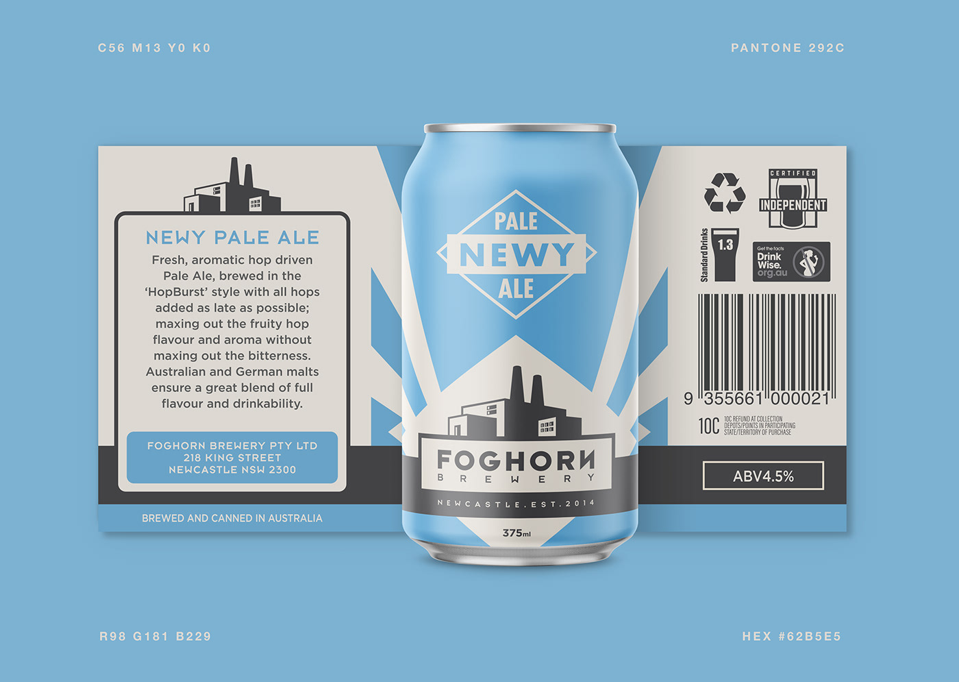
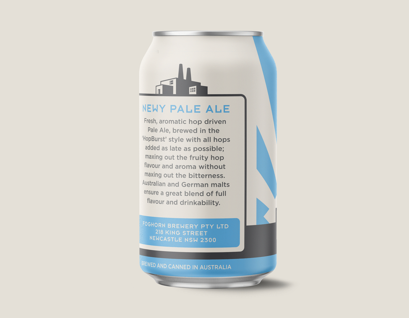
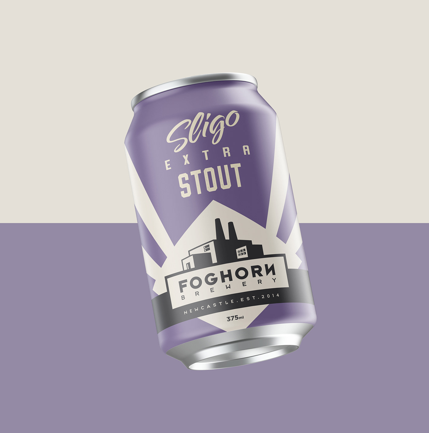
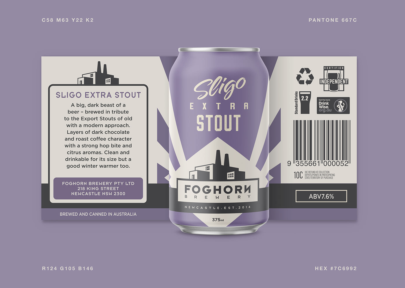
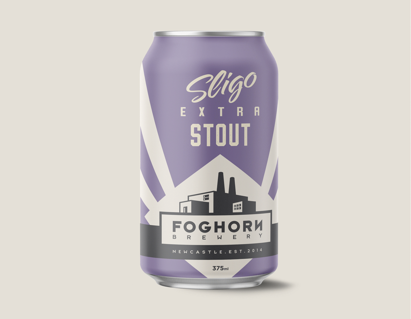
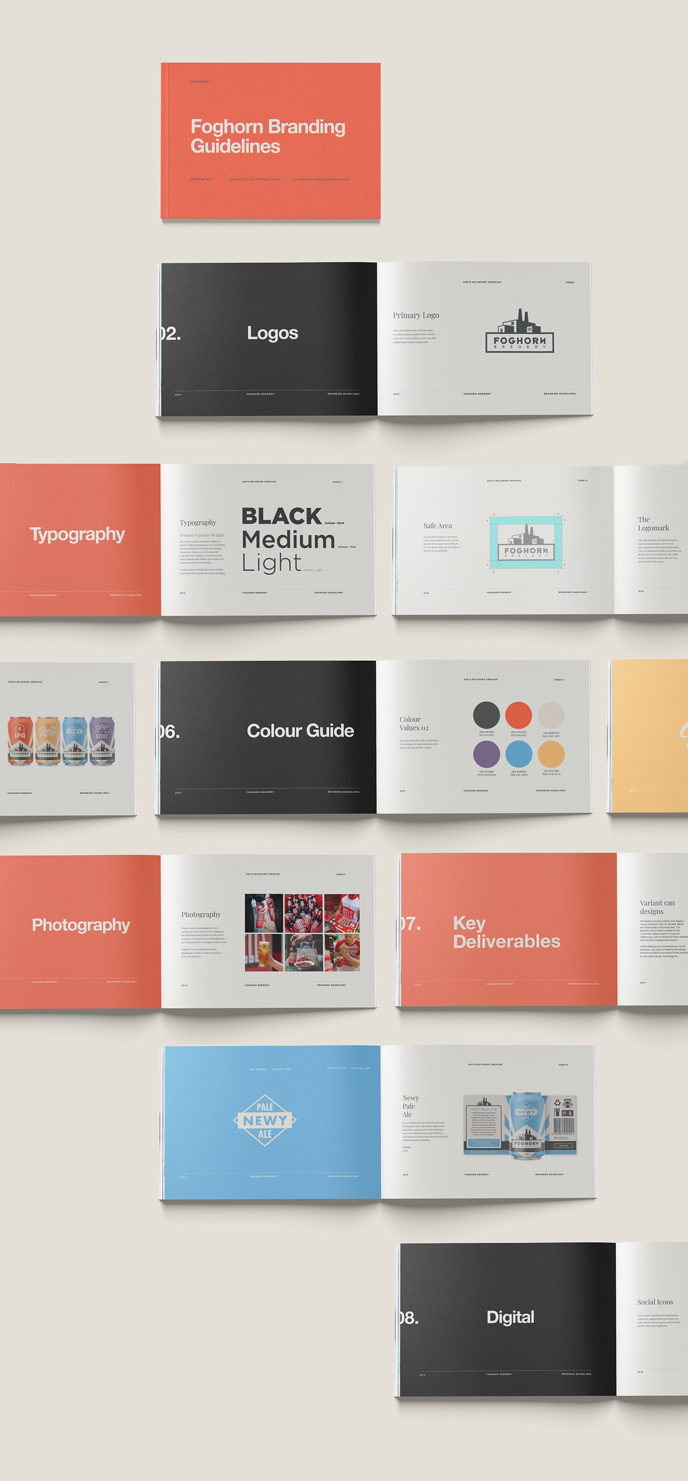
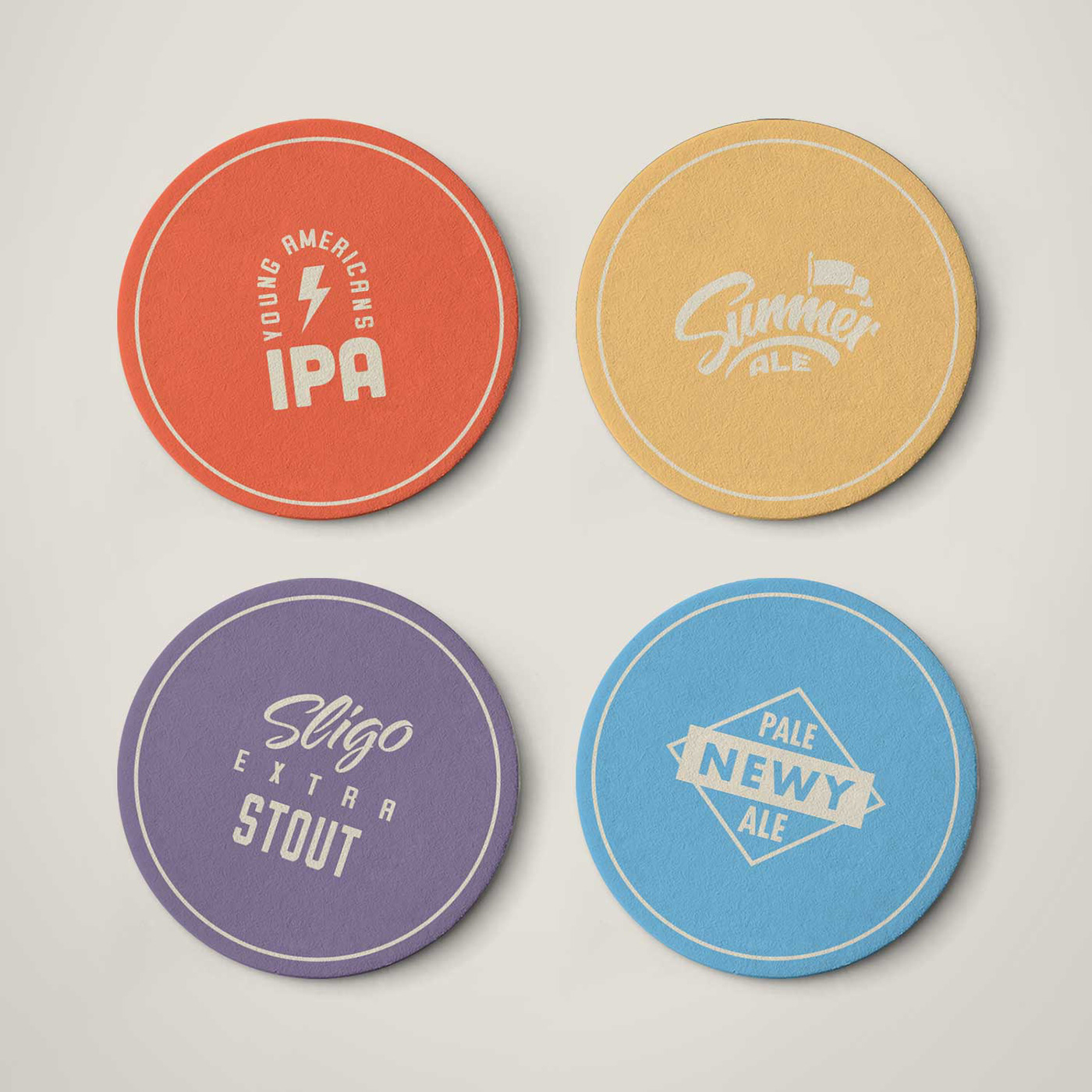
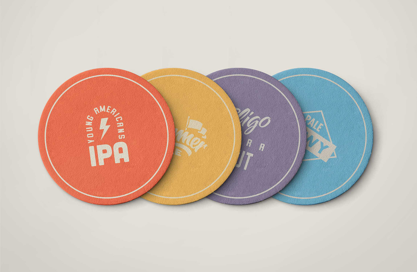
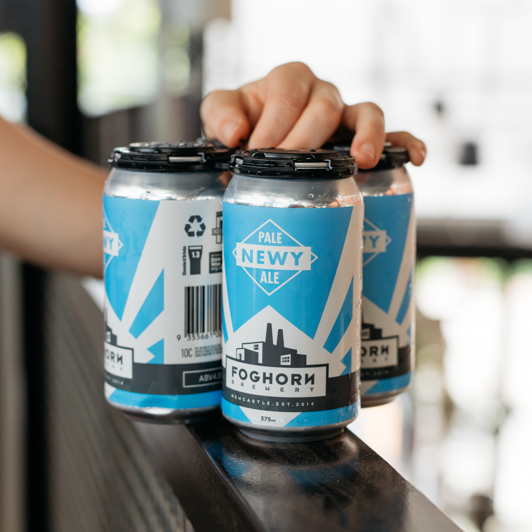
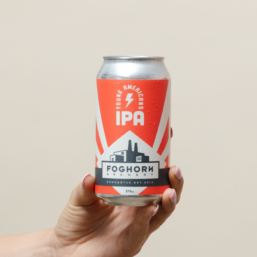
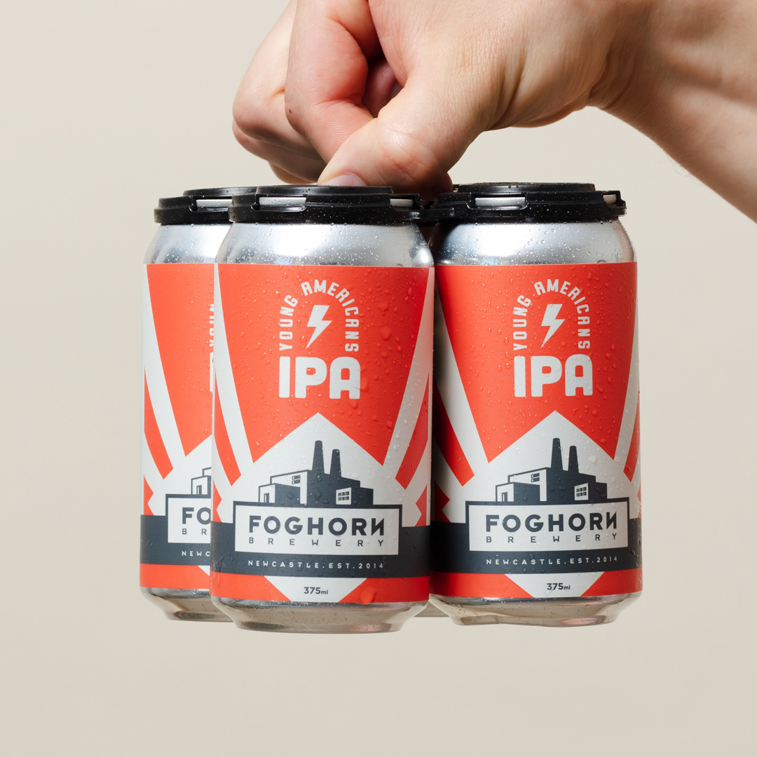
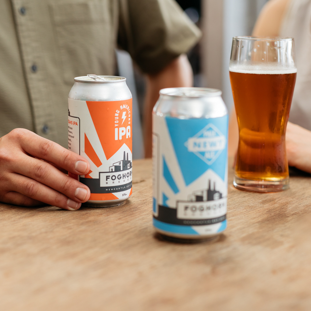
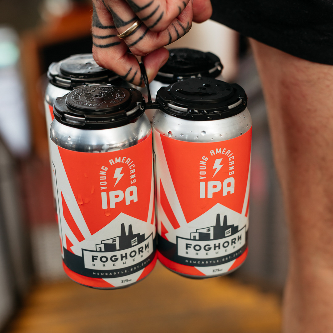
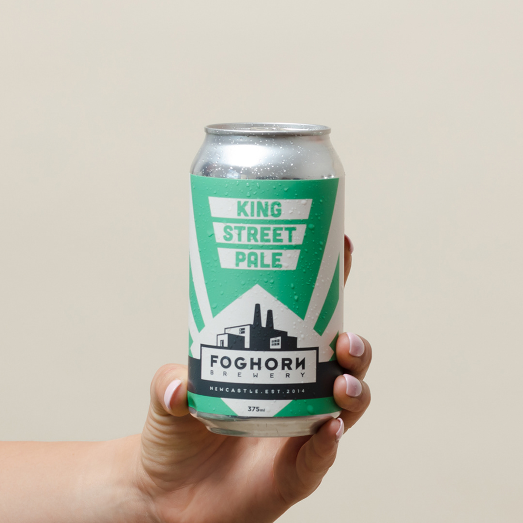
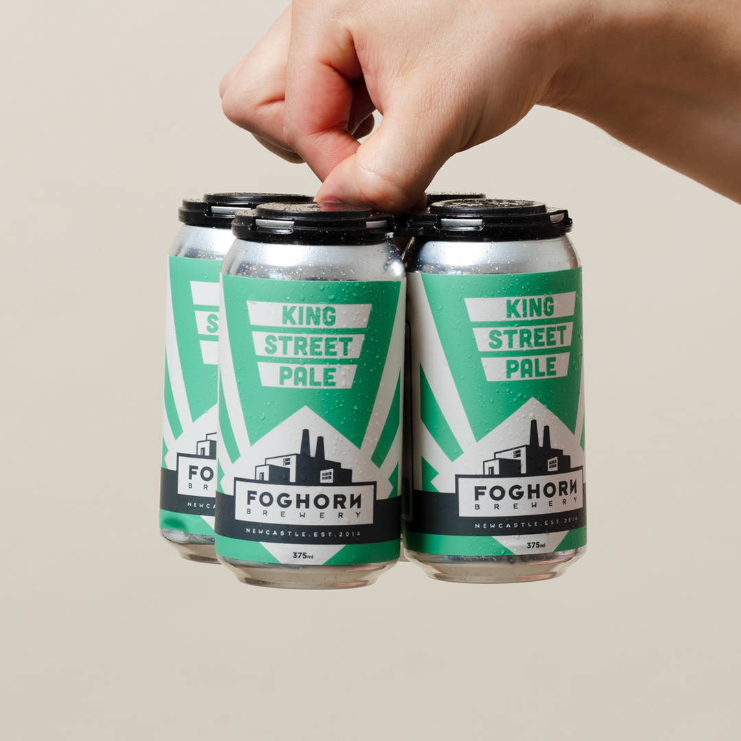
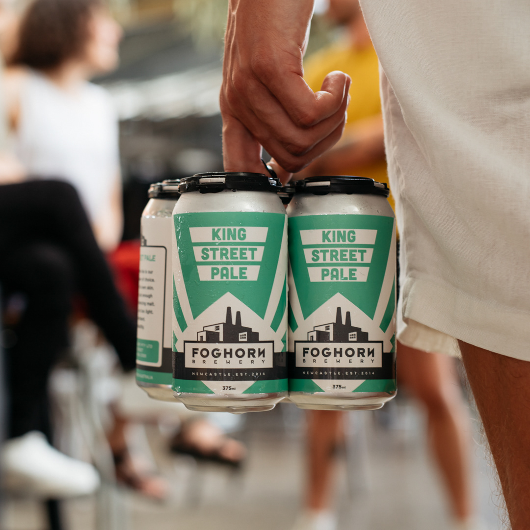
Early in 2019 Foghorn Brewery approached me for a rebrand, they were looking for an improved logo design, identity design, and packaging. The identity and packaging system, I created for them features bold, colourful, and minimal forms, that are a nod to the solid industrial background of Newcastle.
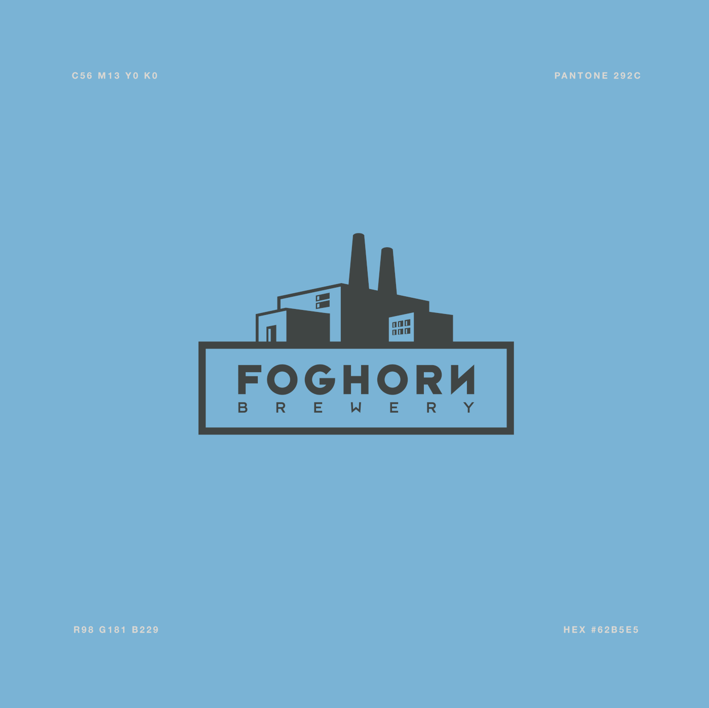
The factory motif is rendered in a tonal dropped style that references the block printing process of the 1930s-1950s and poster art, giving both impact to the image as well as hinting to the city’s strong working-class roots.
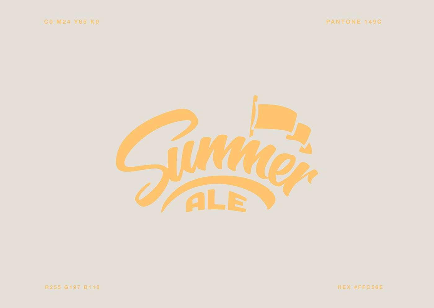
The brand conveys solidity and quality. Visual elements refer to socialist ideals and Newcastle’s industrial past. The graphics are aimed to appeal to the buyer’s appreciation of cultural references, such as Shepard Fairey's artwork and socialist propaganda posters.
Whilst feeling very contemporary, much attention was paid to keeping the design timeless by being conscious of not jumping on the latest design bandwagons.